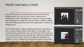
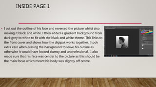
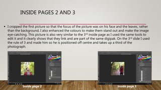
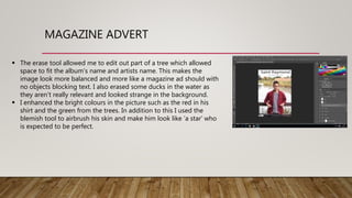
EDITING MY
ANCILLARY TEXTS
FRONT AND BACK COVER
For my front cover, I took the photo of the artist looking
sideways and cut it out so that it wasn’t attached to a
background. I then overlapped this with the original image
and reversed it to create the mirrored effect. I added a black
and white effect and chose the fonts specifically to match my
magazine ad.
For the back cover, I again used the erase tool to edit out a
line of trees and also some of the ducks in the water. This
meant that the photo had room to fit the list of the tracks on
and looks professional and natural (not obviously edited out).
I enhanced the colours and put an effect on the photo. In
addition to this I created two production logos to put in the
bottom left hand corner of the album as these are always a
feature of albums.
INSIDE PAGE 1
• I cut out the outline of his face and reversed the picture whilst also
making it black and white. I then added a gradient background from
dark grey to white to fit with the black and white theme. This links to
the front cover and shows how the digipak works together. I took
extra care when erasing the background to leave his outline as
otherwise it would have looked clumsy and unprofessional. I also
made sure that his face was central to the picture as this should be
the main focus which meant his body was slightly off centre.
INSIDE PAGES 2 AND 3
 I cropped the first picture so that the focus of the picture was on his face and the leaves, rather
than the background, I also enhanced the colours to make them stand out and make the image
eye-catching. This picture is also very similar to the 3rd inside page as I used the same tools to
edit it and it clearly shows that they link and are part of the same digipak. On the 3rd slide I used
the rule of 3 and made him so he is positioned off centre and takes up a third of the
photograph.
Inside page 2 Inside page 3
MAGAZINE ADVERT
 The erase tool allowed me to edit out part of a tree which allowed
space to fit the album’s name and artists name. This makes the
image look more balanced and more like a magazine ad should with
no objects blocking text. I also erased some ducks in the water as
they aren’t really relevant and looked strange in the background.
 I enhanced the bright colours in the picture such as the red in his
shirt and the green from the trees. In addition to this I used the
blemish tool to airbrush his skin and make him look like ’a star’ who
is expected to be perfect.

Editing ancils

  • 1.
  • 2.
    FRONT AND BACKCOVER For my front cover, I took the photo of the artist looking sideways and cut it out so that it wasn’t attached to a background. I then overlapped this with the original image and reversed it to create the mirrored effect. I added a black and white effect and chose the fonts specifically to match my magazine ad. For the back cover, I again used the erase tool to edit out a line of trees and also some of the ducks in the water. This meant that the photo had room to fit the list of the tracks on and looks professional and natural (not obviously edited out). I enhanced the colours and put an effect on the photo. In addition to this I created two production logos to put in the bottom left hand corner of the album as these are always a feature of albums.
  • 3.
    INSIDE PAGE 1 •I cut out the outline of his face and reversed the picture whilst also making it black and white. I then added a gradient background from dark grey to white to fit with the black and white theme. This links to the front cover and shows how the digipak works together. I took extra care when erasing the background to leave his outline as otherwise it would have looked clumsy and unprofessional. I also made sure that his face was central to the picture as this should be the main focus which meant his body was slightly off centre.
  • 4.
    INSIDE PAGES 2AND 3  I cropped the first picture so that the focus of the picture was on his face and the leaves, rather than the background, I also enhanced the colours to make them stand out and make the image eye-catching. This picture is also very similar to the 3rd inside page as I used the same tools to edit it and it clearly shows that they link and are part of the same digipak. On the 3rd slide I used the rule of 3 and made him so he is positioned off centre and takes up a third of the photograph. Inside page 2 Inside page 3
  • 5.
    MAGAZINE ADVERT  Theerase tool allowed me to edit out part of a tree which allowed space to fit the album’s name and artists name. This makes the image look more balanced and more like a magazine ad should with no objects blocking text. I also erased some ducks in the water as they aren’t really relevant and looked strange in the background.  I enhanced the bright colours in the picture such as the red in his shirt and the green from the trees. In addition to this I used the blemish tool to airbrush his skin and make him look like ’a star’ who is expected to be perfect.