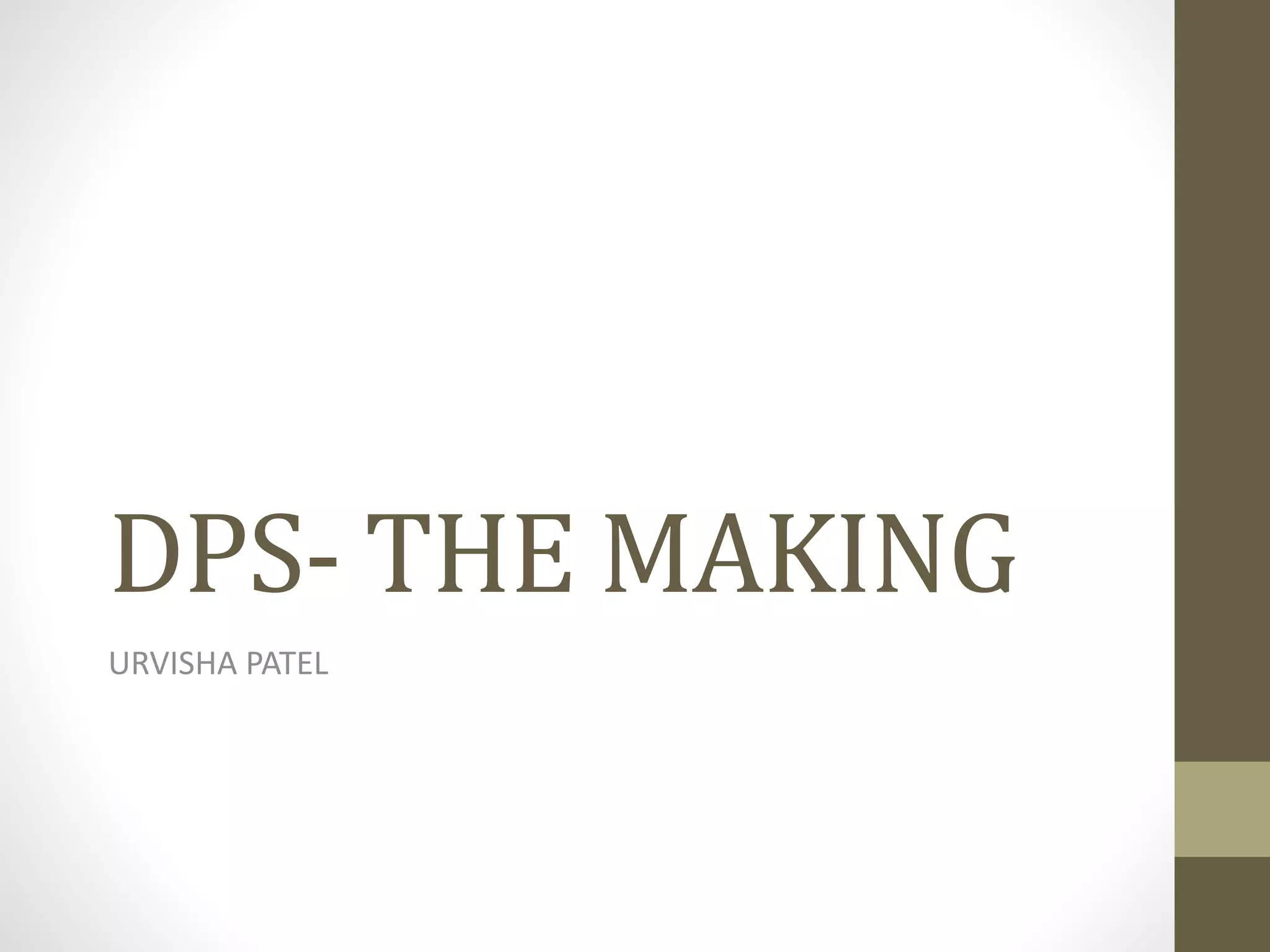
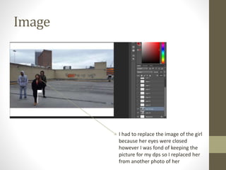
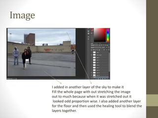
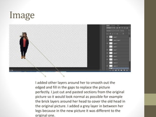
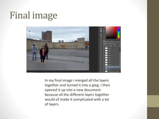
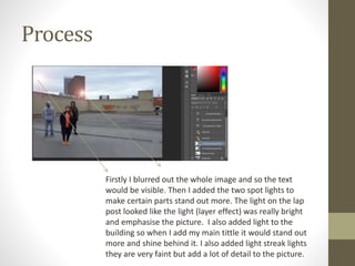
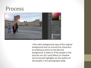
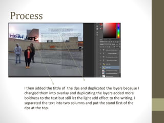
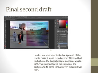
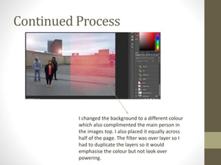
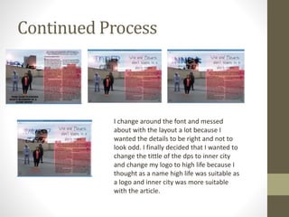
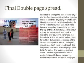
DPS- THE MAKING
URVISHA PATEL
Image
I had to replace the image of the girl
because her eyes were closed
however I was fond of keeping the
picture for my dps so I replaced her
from another photo of her
Image
I added in another layer of the sky to make it
Fill the whole page with out stretching the image
out to much because when it was stretched out it
looked odd proportion wise. I also added another layer
for the floor and then used the healing tool to blend the
layers together.
Image
I then took the image on the left and cut
it out from its original image to replace
the picture as perfect as I can. I then
changed the brightness and auto
transferred it to make sure it doesn’t
look obvious and looks normal.
Image
I added other layers around her to smooth out the
edged and fill in the gaps to replace the picture
perfectly. I just cut and pasted sections from the original
picture so it would look normal as possible for example
the brick layers around her head to cover the old head in
the original picture. I added a grey layer in between her
legs because in the new picture it was different to the
original one.
Final image
In my final image I merged all the layers
together and turned it into a jpeg. I then
opened it up into a new document
because all the different layers together
would of made it complicated with a lot
of layers.
Process
Firstly I blurred out the whole image and so the text
would be visible. Then I added the two spot lights to
make certain parts stand out more. The light on the lap
post looked like the light (layer effect) was really bright
and emphasise the picture. I also added light to the
building so when I add my main tittle it would stand out
more and shine behind it. I also added light streak lights
they are very faint but add a lot of detail to the picture.
Process
I then did a background copy of the original
background and cut around the characters
to emphasise them on the blurred
background. It looks as if the people in the
pictures are 3d I used affects on shadow
and increased highlights on the outline of
the people in the photographs body.
Process
I then added the tittle of the dps and duplicated the layers because I
changed them into overlay and duplicating the layers added more
boldness to the text but still let the light add effect to the writing. I
separated the text into two columns and put the stand first of the
dps at the top.
Final second draft
I added a ombre layer in the background of the
text to make it stand I used overlay filter so I had
to duplicate the layers because one layer was to
light. Two layers allowed the colours of the
background to come through even though it was
faint.
Continued Process
I changed the background to a different colour
which also complimented the main person in
the images top. I also placed it equally across
half of the page. The filter was over layer so I
had to duplicate the layers so it would
emphasise the colour but not look over
powering.
Continued Process
I change around the font and messed
about with the layout a lot because I
wanted the details to be right and not to
look odd. I finally decided that I wanted to
change the tittle of the dps to inner city
and change my logo to high life because I
thought as a name high life was suitable as
a logo and inner city was more suitable
with the article.
Final Double page spread.
I decided to change the font to Inner city a
city like font because it is still clear but also
matches the tittle physically in what it says
I kept it the same in which I duplicated the
layers so the text would stand out more
because is overlay. I moved the quote to
the top of the article I changed the colour
to grey because when it was black it
looked to over powering. I changed the
font of the article because it looked more
formal but it also matches the rest of the
article. I changed the font of the logo to
make it stand out more even though it is
very small. The stand first is highlighted in
bold. As well as the quotes in the text
which I have changed the colour of in
white. I also added page numbers in
standard font at the bottom of the pages.

Dps the making

  • 1.
  • 2.
    Image I had toreplace the image of the girl because her eyes were closed however I was fond of keeping the picture for my dps so I replaced her from another photo of her
  • 3.
    Image I added inanother layer of the sky to make it Fill the whole page with out stretching the image out to much because when it was stretched out it looked odd proportion wise. I also added another layer for the floor and then used the healing tool to blend the layers together.
  • 4.
    Image I then tookthe image on the left and cut it out from its original image to replace the picture as perfect as I can. I then changed the brightness and auto transferred it to make sure it doesn’t look obvious and looks normal.
  • 5.
    Image I added otherlayers around her to smooth out the edged and fill in the gaps to replace the picture perfectly. I just cut and pasted sections from the original picture so it would look normal as possible for example the brick layers around her head to cover the old head in the original picture. I added a grey layer in between her legs because in the new picture it was different to the original one.
  • 6.
    Final image In myfinal image I merged all the layers together and turned it into a jpeg. I then opened it up into a new document because all the different layers together would of made it complicated with a lot of layers.
  • 7.
    Process Firstly I blurredout the whole image and so the text would be visible. Then I added the two spot lights to make certain parts stand out more. The light on the lap post looked like the light (layer effect) was really bright and emphasise the picture. I also added light to the building so when I add my main tittle it would stand out more and shine behind it. I also added light streak lights they are very faint but add a lot of detail to the picture.
  • 8.
    Process I then dida background copy of the original background and cut around the characters to emphasise them on the blurred background. It looks as if the people in the pictures are 3d I used affects on shadow and increased highlights on the outline of the people in the photographs body.
  • 9.
    Process I then addedthe tittle of the dps and duplicated the layers because I changed them into overlay and duplicating the layers added more boldness to the text but still let the light add effect to the writing. I separated the text into two columns and put the stand first of the dps at the top.
  • 10.
    Final second draft Iadded a ombre layer in the background of the text to make it stand I used overlay filter so I had to duplicate the layers because one layer was to light. Two layers allowed the colours of the background to come through even though it was faint.
  • 11.
    Continued Process I changedthe background to a different colour which also complimented the main person in the images top. I also placed it equally across half of the page. The filter was over layer so I had to duplicate the layers so it would emphasise the colour but not look over powering.
  • 12.
    Continued Process I changearound the font and messed about with the layout a lot because I wanted the details to be right and not to look odd. I finally decided that I wanted to change the tittle of the dps to inner city and change my logo to high life because I thought as a name high life was suitable as a logo and inner city was more suitable with the article.
  • 13.
    Final Double pagespread. I decided to change the font to Inner city a city like font because it is still clear but also matches the tittle physically in what it says I kept it the same in which I duplicated the layers so the text would stand out more because is overlay. I moved the quote to the top of the article I changed the colour to grey because when it was black it looked to over powering. I changed the font of the article because it looked more formal but it also matches the rest of the article. I changed the font of the logo to make it stand out more even though it is very small. The stand first is highlighted in bold. As well as the quotes in the text which I have changed the colour of in white. I also added page numbers in standard font at the bottom of the pages.