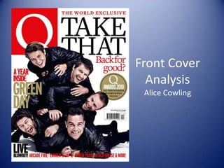
The document analyzes the front cover design of a magazine. It notes that the artists on the cover are wearing leather jackets to represent their rebellious attitude. The large, simple masthead is highly recognizable. The use of gold makes the magazine look exclusive, while the white background focuses attention on the content. The tagline uses a pun that is also a song lyric, relevant to the band. Stating it is a "World Exclusive" helps the magazine appeal to an international audience.
This is my annotation of local Newspapers.
I have brainstormed different elements of a newspaper and have wrote a detailed analysis comparing a local newspaper with its website. I have learnt newspaper terminology and discovered key factors to creating a newspaper.
This is my annotation of local Newspapers.
I have brainstormed different elements of a newspaper and have wrote a detailed analysis comparing a local newspaper with its website. I have learnt newspaper terminology and discovered key factors to creating a newspaper.
Something incredible is five billion kilometers away from Earth!
After more than nine years of travel, the inspirational New Horizons spacecraft darted past Pluto, coming closer than we have ever been to the planet and its moons.
Our “App Creation Guide” will show you the step by step process to create your mobile app with the 3D Issue App Platform. You don’t need any coding knowledge!
2. Image
All of the artists are wearing leather jackets which
not only suits the magazine formatting and colour
scheme but also represents their rebellious and fun
attitude. They are all lying on each other and
laughing which could be done on purpose so their
reputation of how they were before all the
popularity is retrieved. This is a brave encounter for
the magazine to use however it is also assured
because of their loyal fan base, so even if they did
something unexpected they wouldn’t lose their fan
base. The image shows how close they are and how
they appear to be enjoying each others company.
This all links back to the heading ‘back for good’.
3. Masthead Barcode
The magazine masthead is highly recognisable as it
is large and simple. It is red with a white ‘q’ on, this
is the same on each of their magazine
issues, because it is at eyesight, the buyer would be
able to spot it easily. Because the image overlaps
the masthead slightly it suggests that because the
magazine is so well known it doesn’t matter if some
of it is covered up .For the magazine to be easily
scanned and seem legit to the audience the
barcode has been placed on the front of the
magazine, it is small though so It doesn’t draw
attention away from the main features of the
magazine.
4. Background and Use of Gold
The use of the colour gold makes the magazine
look as though it is either limited edition or
contains some official information. The gold on
the magazine is set out like a badge which I
think highlights the fact its an event. The
background is all white which focuses the
attention fully to the content of the front cover.
5. Tagline
The magazine have used a pun as the tag
line, the tag line is also a song lyric as well as
being relevant to the topic of the band. The
tagline gives the reader a good idea of what the
magazine is going to be about. It is in a red font
which compliments the house style. The same
font is used throughout the whole front cover so
it isn’t too confusing nor busy, it therefore looks
legit and professional and fits the housestyle
they are known for.
6. Skyline
‘World Exclusive’ is the skyline of the This
automatically makes the reader want to read more
magazine. As it shows that not only is the magazine
popular and official in one country but it is also
popular around the world and that the news it
contains is world wide news. The cover story is on the
same level as the skyline, so both can be seen on a
store shelf so the audience are more likely to see it
and buy it. At the bottom of the front cover is
information set out similarly to the skyline, this is an
indication of what the reader can expect to find inside
of the magazine. It is in red font which fits the
stereotypical theme of pop colours (red, white and
black).
7. Masthead
‘World Exclusive’ is the skyline of the This
automatically makes the reader want to read
more magazine. As it shows that not only is the
magazine popular and official in one country but
it is also popular around the world and that the
news it contains is world wide news. The cover
story is on the same level as the skyline, so both
can be seen on a store shelf so the audience are
more likely to see it and buy it.
8. Cover Lines
‘World Exclusive’ is the skyline of the This
automatically makes the reader want to read
more magazine. As it shows that not only is the
magazine popular and official in one country but
it is also popular around the world and that the
news it contains is world wide news. The cover
story is on the same level as the skyline, so both
can be seen on a store shelf so the audience are
more likely to see it and buy it.
9. Extra Info
‘World Exclusive’ is the skyline of the This
automatically makes the reader want to read
more magazine. As it shows that not only is the
magazine popular and official in one country but
it is also popular around the world and that the
news it contains is world wide news. The cover
story is on the same level as the skyline, so both
can be seen on a store shelf so the audience are
more likely to see it and buy it.