
Recommended
More Related Content
What's hot
What's hot (20)
Similar to Cover Page Analysis - Hammer Magazine
Similar to Cover Page Analysis - Hammer Magazine (20)
Recently uploaded
Recently uploaded (20)
Cover Page Analysis - Hammer Magazine
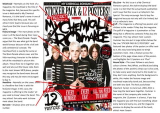
- 1. Sky Line – As this issue is a My Chemical Romance special, the skyline displays the band name in a font that the actual band used before and it says that this issue is a Collector’s Fan Special. This may encourage fans to buy the magazine because not only will it be limited, but it is a collector’s item. Masthead – Normally on the front of a magazine, the masthead is the title of the magazine. But, because this specific issue is dedicated to My Chemical Romance, it is the band’s name in one of many fonts that they used. This will attract more buyers because you can clearly see that the issue is focusing on MCR. Puff – The magazine is offering free posters and stickers to the reader if they buy the magazine. The puff of a magazine is a promotion or free thing that is offered to someone if they buy the magazine. This may attract more custom. Hammer has also put in large letters below the Sky Line ‘STICKER PACK & 12 POSTERS!’ and featured two photos of the posters on offer next to it, this may have being done to tempt customers more. And, a feature across the bottom of the page shows more of the posters and highlights the 12 posters as a ‘Plus!’ Feature Image – The main photo on the cover is of the band during their most iconic era – The Black Parade. People argue that this was what got the band world famous because of the slick look and controversial concept. The masthead font is exactly the same on The Black Parade album cover and the little marching character to the bottom left of the masthead is also on this album. These three tie in together very well and also suit the house style. Back to the most known MCR phase, people may recognise the band more dressed this way and may be more encouraged to buy it. Headline – Normally on the cover, there is a headline that links in with the featured image. In this case, the magazine is offering to the reader ‘all you need to know’ about the band. This may attract fans who want to know more about the band. House Style – The cover follows a very basic colour scheme. Red, White, and Black (excluding the photos of the posters). Drop cap is also used, to make every word stand out to the reader so they don’t miss anything. And the background is white, this makes the feature image and masthead especially stands out, because they are both very dark. The Red used allows important factors to stand out, 2001-2013 is how long the band were together, Hammer is the name of the company who make the magazine, the 12 posters is a bonus, if you buy the magazine you will find out everything about every band and every era, and the magazine promise to display the secrets of the band; attract more buyers. Barcode – Displays price and issue number.