SlideShare a Scribd company logo
1 of 5
POSTER ANALYSIS 2
‘The Amityville Horror’ is a 2005 remake of the classic 1970s supernatural horror film of the
same name, centred around a haunted house that drove a father of two to murder his entire
family. Due to its focus on the house itself as a source of evil, the film draws many
comparisons with my own, and the numerous demons and ghosts that haunt the estate
interlink with my idea to create a vast array of paranormal entities. Because of this, analysing
the poster for such a film will be very useful, as it will allow me to understand what an
audience would come to expect from a horror film of this calibre, and how I can twist their
expectations with my own unique take on a poster.
Overall, this poster mainly abides by the conventions of its form – implying that the film
itself is relatively formulaic in providing its scares, and caters towards fans of the original
instead of bringing anything new to the classic tale. This respect for conventions can be seen
in the large image, dominating the entirety of the frame, and a basic application of the rule of
thirds, where the character and threat are placed within the middle third and the title and
institutional information are placed in the bottom third. Much like other posters of the
subgenre, a tagline is used; however, the tagline is placed directly underneath the title instead
of its usual placement at the top of the frame, which is taken up instead by information about
the film’s producer. It can be argued that this has been done in the knowledge that the
majority of audiences will already be familiar with the plot of the film, and that they will
therefore be more interested in who has been tasked with remaking it, as it will provide them
with a hint into what the film will be like. However, despite the prime placement at the top of
the frame, this strip of information is substantially smaller in terms of font size than the
tagline, suggesting that it merely serves to introduce the film as opposed to giving an insight
into the plot. This instead has been tasked to the tagline, but due to the notoriety of the
narrative, it is simplified and abdicated to a lesser position.
The focal point within the image itself is the house, as it looms over the smaller main
character and appears to be the source of the evil. By using washed out blacks, greys and
sepia tones to depict its recognisable ‘face’, the house is portrayed as something ancient and
powerful, controlled by some sinister undying force beyond comprehension. In conjunction
with this, the scratched, grainy quality of the image further adds to the idea that the house has
been the cause of innumerable tragedies for centuries, and will continue to inflict terror upon
its residents for centuries to come. Also, this hand-me-down quality is reminiscent of the
original poster for the 1970s film, which will suggest to fans that this version will be a
faithful remake to the original and will retain the authenticity of the era in which it was
filmed in. Proceeding on from this, the aforementioned ‘face’ of the house is on full display
in this poster, as no other houses of note look like it. It also gives a warped sense of life to the
house itself, enforcing how this inanimate structure is the actual source of the horror
throughout this film and has a mind of its own in controlling its victims. The low angle shot
only serves to exemplify its power over the comparatively small protagonist, which hints
towards the way in which the house will slowly take control of him as the film progresses.
Despite it’s clear individuality, however, this house (and all the events that transpire within it)
falls comfortably within the conventions of a supernatural horror film – it’s large, distinctive,
and old-fashioned, like every other haunted house within the supernatural subgenre.
Beneath the house, the main character of George can be seen centrally within the frame. He is
hunched over and facing towards the house, almost pained in his body language, and is
holding a shotgun limply in his right hand. The fact that he is hunched over further demeans
his role as a human being, and shows that he is of secondary importance as a character to the
house itself. Moreover, the placement of the house directly above him suggests that the
oppression of the house is physically causing him to stoop, and this gives an indication of
how it possesses George both physically and mentally. Overall this shows how he is merely a
puppet to the dominant power of the Amityville house, channelling the supernatural evils
through his own physical abilities, and will eventually serve as the primary antagonist within
the film because of this. This idea is strengthened by the fact that he is holding a shotgun - a
more realistic take on the usual knives and axes associated with the subgenre. Guns are also
commonly seen as more impersonal weapons than the standard melee weapons of horror, and
this also shows how George isn’t motivated by personal hatred or desire, but is completely
out of control of his own thoughts and actions. Furthermore, the contrast of white and black
in his clothing suggests the conflict of his innocence and the impending evil that is taking him
over, and it is this conflict that the film will revolve around and play upon within its
narrative. Also, an aura of light is also noticeable around George. Although light is usually
associated with divinity and heavenly purpose, the light here is tainted yellow, and appears to
be radiating from the house itself. This further enforces how it is corrupting all things that
were previously associated with goodness and purity, and filling them with malignant
purpose.
Unusually, only a portion of the image is actually shown in this poster, as the house appears
to be rising out of some form of darkness or decay that is gradually pressing in on the sides. It
is reminiscent of a glimpse through a windscreen wiper, rubbing dirt off a screen in order to
view a distorted, tainted landscape. In relation to the Amityville horror, however, it signifies
the deteriorating state of mind of the central character and how the sharp-edged darkness of
the house is rapidly contributing to his loss of sanity. Although the audience sees George at a
distance, this dirt-speckled image almost appears to be placing the audience into the
characters perspective as the darkness takes hold and begins to seep its way into his thoughts.
This shows that George will be the character that the audience will be most likely to affiliate
with, and will take up most of the screen time, and it is this empathy with his situation that
will allow the audience to experience the horror as though it is happening to themselves,
creating a lasting effect. It also illustrates how, after the credits have rolled, the film will have
‘tainted’ the lives of the audience members due to its shocking nature and visceral horror,
made all the more real by the fact that it is ‘based on a true story’. Essentially, therefore, the
evil that resides within the house will have taken the audience as its victims, as well as the
fictional protagonist himself, and it is this guarantee of terror that is likely to draw audiences
to watch the film.
Furthermore, in terms of the composition of the poster, the house itself is slanted and tilted
towards the sky, taking up over half of the actual image. Due to this tilted position, it gives
the impression that the house has risen from the ground itself and not been constructed by
normal builders and architects, and this evidently emphasises its otherworldly nature. It also
allows the audience to entertain the idea that the Amityville house is rising from hell itself,
and that the force within its walls is related to the Devil in some way or another. George’s
position beneath it, therefore, renders him vastly inferior to its power, and yet it is clear to the
audience that his aggressive state of mind (seen from his body language/weapon) is linked
directly to the house, consolidating how it is using him as a pawn through which to channel
its evil. Indeed, the open door in front of George is representative of a huge, gaping mouth,
and his close proximity to it suggests that it is about to swallow him whole and fully take
control of his life. The fact that we can only see his back only serves to dehumanise him
more, clearly demonstrating how any attachment felt towards George will soon be replaced
by fear and pity.
Interestingly, the words ‘Katch ‘em and kill ‘em’ appear lopsided and unconventional on the
border of the bottom third of the poster. They are placed intentionally to run through the title
and into the institutional information, and could potentially serve as an extra tagline for the
film despite their unconventional placement. It can be argued that the reason for their
positioning is that they serve as an indication into George’s thoughts, and that due to the
unstable nature of his mind, they are sporadically placed to represent how his thoughts are
messy, unstructured, and disturbed. The faint, drooping font of the words reinforces this
point, as they appear almost translucent – as though some otherworldly entity have placed
them there, and they are rapidly fading into the darkness of George’s mind, becoming part of
his unconscious thought process. Also, the purposeful misspelling and abbreviations used
within this phrase serve to highlight the undoing of his mind, as all knowledge of spelling and
grammar is being erased by the possessive force inside his head. ‘K’ is also a significantly
more plosive sound than ‘C’, which adds an undercurrent of violence to the protagonist’s
thoughts that we as an audience know will manifest itself into physical aggression. In
addition to this, the phrase has a certain singsong nature to it, and the simplicity of the rhyme
and alliteration draws associations with nursery songs, which subsequently juxtaposes with
the threatening nature of the phrase. The idea of creepy children and contrapuntal childish
music is another convention of the subgenre, and the use of this phrase therefore serves to
root the film even more firmly within the supernatural category – especially because the
narrative also contains both of these features. Ultimately, the phrase of ‘Katch ‘em & Kill
‘Em’ creates a tagline catchy enough to embed itself into the audiences sub consciousness,
allowing them to unconsciously be reminded of the film whenever they next hear a similar
sounding nursery rhyme. Evidently, however, the poster deems the ‘based on a true story’
tagline to be more relevant to the film, as it is given a bolder font and a more central
placement. This may be because audiences can only truly be scared if they find the nature of
the horror relatable to their own daily lives; so if it was a true story, they are substantially
more likely to be scared by it, thus increasing their likelihood of watching the film.
The title of the film, ‘The Amityville Horror’, anchors the image, and provides a name for the
dominant house that takes up the majority of the frame. By using the word ‘the’, audiences
are instantly able to grasp the fact that this is a well-known, one of a kind horror story that
has been immortalised over time and will continue to be remembered as time goes on. Again,
by using the actual name of the ‘Amityville’ estate, the director is staying faithful to the
original and heavily relying upon the notion that everybody going to see the film will already
be familiar with the story behind it. This expands the target audience from fans of the original
film to all lovers of horror tales/fables, meaning a large variety of people are likely to see this
movie based upon the infamy of the tale alone. In terms of the design of the title itself, a red
serif font is used in order to evoke a menacing feeling that works in conjunction with the
proposed evil of the image. Using a red font is usually more typical of slasher horror films,
but due to the violent, bloody subject of The Amityville Horror, it is appropriately used here
to symbolise the bloodshed caused by the Amityville house. The serif font, however, firmly
anchors the film within the supernatural subgenre, as it is this subgenre that is often
considered to be more sophisticated/intellectually stimulating than other slasher or gothic
films, and the serif font mirrors that degree of professionalism, hence why it is used in so
many modern-day supernatural films. Moreover, the word ‘Amityville’ is enlarged in relation
to the other words, placing further significance on the house itself, and perhaps indicating that
there will be more focus and information on the history of the house than there was in the
original film. Indeed, the fact that the ‘Y’ is dripping down further strengthens this idea, as
the elongated length of the letter could be symbolic of the long bloody history of the house
and its former residents. Within the letters themselves, a slight orange tinge can also be seen,
which brings associations with fire and hell, enforcing the previously mentioned idea that the
house appears to be rising from hell itself.
This poster heavily influences my own, primarily with the unique aesthetic that makes it
appear as though the image is eroding/ripping down the sides. I feel as though this adds a
unique dynamic to the poster, as though one were seeing it through the distorted vision of the
protagonist, and this will be reflected in my use of leaking walls in the promotional poster for
‘The Basement’. This concept of dripping/leaking will be a reflection of the protagonist’s
degrading mental state and will subsequently blur the line between reality and nightmares. In
addition to this, the subtle tint used on the title of ‘The Amityville Horror’ seems to raise the
text, as though it is leaping out of the page, as well as drawing associations with corruption
and possession of malignant darkness. For this reason, a subtle red tint will be used on the
poster of ‘The Basement’ in order to reflect the corruption of Joel’s innocence by the devil.

More Related Content

What's hot

Media2014 the basement (narrative, poster, mag, trailer ideas)
Media2014 the basement (narrative, poster, mag, trailer ideas)Media2014 the basement (narrative, poster, mag, trailer ideas)
Media2014 the basement (narrative, poster, mag, trailer ideas)
Jake Shelvey
 
Media2014 trailer analysis
Media2014 trailer analysisMedia2014 trailer analysis
Media2014 trailer analysis
Jake Shelvey
 
Media2014 audience research
Media2014 audience researchMedia2014 audience research
Media2014 audience research
Jake Shelvey
 
Media2014 poster analysis
Media2014 poster analysisMedia2014 poster analysis
Media2014 poster analysis
Jake Shelvey
 
Media2014 film trailer overview
Media2014 film trailer overviewMedia2014 film trailer overview
Media2014 film trailer overview
Jake Shelvey
 

What's hot (20)

Media2014 the basement (narrative, poster, mag, trailer ideas)
Media2014 the basement (narrative, poster, mag, trailer ideas)Media2014 the basement (narrative, poster, mag, trailer ideas)
Media2014 the basement (narrative, poster, mag, trailer ideas)
 
Media2014 trailer analysis
Media2014 trailer analysisMedia2014 trailer analysis
Media2014 trailer analysis
 
Props
PropsProps
Props
 
Horror and subgenres
Horror and subgenresHorror and subgenres
Horror and subgenres
 
Media2014 audience research
Media2014 audience researchMedia2014 audience research
Media2014 audience research
 
Original brief
Original briefOriginal brief
Original brief
 
A study into kubrick
A study into kubrickA study into kubrick
A study into kubrick
 
Media2014 poster analysis
Media2014 poster analysisMedia2014 poster analysis
Media2014 poster analysis
 
Analysis of 2 similar texts
Analysis of 2 similar textsAnalysis of 2 similar texts
Analysis of 2 similar texts
 
Evaluation 4
Evaluation 4Evaluation 4
Evaluation 4
 
5) how did you attract address your audience?
5) how did you attract address your audience?5) how did you attract address your audience?
5) how did you attract address your audience?
 
Titles Analysis
Titles AnalysisTitles Analysis
Titles Analysis
 
Evaluation 2&4
Evaluation 2&4Evaluation 2&4
Evaluation 2&4
 
Moonrise Kingdom Review - Analysis
Moonrise Kingdom Review - AnalysisMoonrise Kingdom Review - Analysis
Moonrise Kingdom Review - Analysis
 
Final Idea Evaluation
Final Idea EvaluationFinal Idea Evaluation
Final Idea Evaluation
 
Trailer overview
Trailer overview Trailer overview
Trailer overview
 
Analysis of 2 similar texts
Analysis of 2 similar textsAnalysis of 2 similar texts
Analysis of 2 similar texts
 
Poster analyses
Poster analysesPoster analyses
Poster analyses
 
Opening sequence analysis- What Lies Beneath
Opening sequence analysis- What Lies Beneath Opening sequence analysis- What Lies Beneath
Opening sequence analysis- What Lies Beneath
 
Media2014 film trailer overview
Media2014 film trailer overviewMedia2014 film trailer overview
Media2014 film trailer overview
 

Viewers also liked

Media2014 front cover conventions
Media2014 front cover conventionsMedia2014 front cover conventions
Media2014 front cover conventions
Jake Shelvey
 
Media2014 front cover overview
Media2014 front cover overviewMedia2014 front cover overview
Media2014 front cover overview
Jake Shelvey
 
Media2014 location ideas
Media2014 location ideasMedia2014 location ideas
Media2014 location ideas
Jake Shelvey
 
Media2014 film mag analysis
Media2014 film mag analysisMedia2014 film mag analysis
Media2014 film mag analysis
Jake Shelvey
 
Media2014 introduction to characters
Media2014 introduction to charactersMedia2014 introduction to characters
Media2014 introduction to characters
Jake Shelvey
 
Media2014 questionnaire
Media2014 questionnaireMedia2014 questionnaire
Media2014 questionnaire
Jake Shelvey
 
Media2014 new sound ideas
Media2014 new sound ideasMedia2014 new sound ideas
Media2014 new sound ideas
Jake Shelvey
 
Media2014 trailer analysis 2
Media2014 trailer analysis 2Media2014 trailer analysis 2
Media2014 trailer analysis 2
Jake Shelvey
 
Target audience profile
Target audience profileTarget audience profile
Target audience profile
Jake Shelvey
 

Viewers also liked (14)

Media2014 front cover conventions
Media2014 front cover conventionsMedia2014 front cover conventions
Media2014 front cover conventions
 
Media2014 front cover overview
Media2014 front cover overviewMedia2014 front cover overview
Media2014 front cover overview
 
Film mag analysis 2
Film mag analysis 2Film mag analysis 2
Film mag analysis 2
 
Media2014 location ideas
Media2014 location ideasMedia2014 location ideas
Media2014 location ideas
 
Media2014 call sheet 1
Media2014 call sheet 1Media2014 call sheet 1
Media2014 call sheet 1
 
Media2014 film mag analysis
Media2014 film mag analysisMedia2014 film mag analysis
Media2014 film mag analysis
 
Media2014 call sheet 2
Media2014 call sheet 2Media2014 call sheet 2
Media2014 call sheet 2
 
Media2014 trailer conventions
Media2014 trailer conventionsMedia2014 trailer conventions
Media2014 trailer conventions
 
Media2014 introduction to characters
Media2014 introduction to charactersMedia2014 introduction to characters
Media2014 introduction to characters
 
Media2014 questionnaire
Media2014 questionnaireMedia2014 questionnaire
Media2014 questionnaire
 
Media2014 new sound ideas
Media2014 new sound ideasMedia2014 new sound ideas
Media2014 new sound ideas
 
Media2014 trailer analysis 2
Media2014 trailer analysis 2Media2014 trailer analysis 2
Media2014 trailer analysis 2
 
Target audience profile
Target audience profileTarget audience profile
Target audience profile
 
Media2014 call sheet 3
Media2014 call sheet 3Media2014 call sheet 3
Media2014 call sheet 3
 

Similar to Poster analysis 2

The sinister poster
The sinister posterThe sinister poster
The sinister poster
rachaeltara_
 
The sinister poster
The sinister posterThe sinister poster
The sinister poster
rachaeltara_
 
Horror film analysis
Horror film analysisHorror film analysis
Horror film analysis
a07cmakondo
 
Migrain – film trailers
Migrain – film trailersMigrain – film trailers
Migrain – film trailers
ezreen_b
 
Film poster analysis
Film poster analysisFilm poster analysis
Film poster analysis
KB160923
 

Similar to Poster analysis 2 (20)

POSTER ANALYSIS - THE AMITYVILLE HORROR
POSTER ANALYSIS - THE AMITYVILLE HORRORPOSTER ANALYSIS - THE AMITYVILLE HORROR
POSTER ANALYSIS - THE AMITYVILLE HORROR
 
Poster Analysis 3
Poster Analysis 3Poster Analysis 3
Poster Analysis 3
 
Poster analysis one
Poster analysis onePoster analysis one
Poster analysis one
 
The sinister poster
The sinister posterThe sinister poster
The sinister poster
 
Poster analysis one
Poster analysis onePoster analysis one
Poster analysis one
 
Poster analysis three
Poster analysis threePoster analysis three
Poster analysis three
 
Poster analysis three
Poster analysis threePoster analysis three
Poster analysis three
 
Poster analysis two horror
Poster analysis two horrorPoster analysis two horror
Poster analysis two horror
 
The sinister poster
The sinister posterThe sinister poster
The sinister poster
 
Analyse existing media texts
Analyse existing media textsAnalyse existing media texts
Analyse existing media texts
 
Poster analysis 2 (2)
Poster analysis 2 (2)Poster analysis 2 (2)
Poster analysis 2 (2)
 
Horror film analysis
Horror film analysisHorror film analysis
Horror film analysis
 
Horror Film Poster Analysis
Horror Film Poster AnalysisHorror Film Poster Analysis
Horror Film Poster Analysis
 
Enemy
EnemyEnemy
Enemy
 
Poster analysis two horror
Poster analysis two horrorPoster analysis two horror
Poster analysis two horror
 
POSTER ANALYSIS - THE CONJURING
POSTER ANALYSIS - THE CONJURINGPOSTER ANALYSIS - THE CONJURING
POSTER ANALYSIS - THE CONJURING
 
Migrain – film trailers
Migrain – film trailersMigrain – film trailers
Migrain – film trailers
 
Annotations of existing horror movie posters
Annotations of existing horror movie postersAnnotations of existing horror movie posters
Annotations of existing horror movie posters
 
Film poster analysis
Film poster analysisFilm poster analysis
Film poster analysis
 
Trailer analysis 2
Trailer analysis 2Trailer analysis 2
Trailer analysis 2
 

More from Jake Shelvey

More from Jake Shelvey (11)

Media2014 post production questionnaire
Media2014 post production questionnaireMedia2014 post production questionnaire
Media2014 post production questionnaire
 
Evaluation 2 (1)
Evaluation 2 (1)Evaluation 2 (1)
Evaluation 2 (1)
 
Media2014 practice shots
Media2014 practice shotsMedia2014 practice shots
Media2014 practice shots
 
Media2014 trailer analysis 2
Media2014 trailer analysis 2Media2014 trailer analysis 2
Media2014 trailer analysis 2
 
Case study
Case studyCase study
Case study
 
Original brief
Original briefOriginal brief
Original brief
 
Original brief
Original briefOriginal brief
Original brief
 
Media2014 focus group analysis and links
Media2014 focus group analysis and linksMedia2014 focus group analysis and links
Media2014 focus group analysis and links
 
Media2014 new sound ideas
Media2014 new sound ideasMedia2014 new sound ideas
Media2014 new sound ideas
 
Media2014 costume ideas
Media2014 costume ideasMedia2014 costume ideas
Media2014 costume ideas
 
Media2014 trailer conventions
Media2014 trailer conventionsMedia2014 trailer conventions
Media2014 trailer conventions
 

Recently uploaded

OBAT ABORSI BANYUWANGI 087776558899 💊 OBAT PENGGUGUR KANDUNGAN BANYNYUWANGI
OBAT ABORSI BANYUWANGI 087776558899 💊 OBAT PENGGUGUR KANDUNGAN BANYNYUWANGIOBAT ABORSI BANYUWANGI 087776558899 💊 OBAT PENGGUGUR KANDUNGAN BANYNYUWANGI
OBAT ABORSI BANYUWANGI 087776558899 💊 OBAT PENGGUGUR KANDUNGAN BANYNYUWANGI
Obat Cytotec
 
NON-COMMUNICABLE DISEASES.pptx...........
NON-COMMUNICABLE DISEASES.pptx...........NON-COMMUNICABLE DISEASES.pptx...........
NON-COMMUNICABLE DISEASES.pptx...........
CydeizelMercado1
 
Riya Chand Birth Certificate.pdfsssssssssssssssss
Riya Chand Birth Certificate.pdfsssssssssssssssssRiya Chand Birth Certificate.pdfsssssssssssssssss
Riya Chand Birth Certificate.pdfsssssssssssssssss
prakash164267
 
如何办理澳洲迪肯大学毕业证(Deakin毕业证书)毕业证成绩单原版一比一
如何办理澳洲迪肯大学毕业证(Deakin毕业证书)毕业证成绩单原版一比一如何办理澳洲迪肯大学毕业证(Deakin毕业证书)毕业证成绩单原版一比一
如何办理澳洲迪肯大学毕业证(Deakin毕业证书)毕业证成绩单原版一比一
avy6anjnd
 
codes and conventions of film magazine and website.pptx
codes and conventions of film magazine and website.pptxcodes and conventions of film magazine and website.pptx
codes and conventions of film magazine and website.pptx
17duffyc
 
一比一原版(MQU毕业证书)麦考瑞大学毕业证成绩单原件一模一样
一比一原版(MQU毕业证书)麦考瑞大学毕业证成绩单原件一模一样一比一原版(MQU毕业证书)麦考瑞大学毕业证成绩单原件一模一样
一比一原版(MQU毕业证书)麦考瑞大学毕业证成绩单原件一模一样
aqwaz
 
Bhakti and Sufi Traditions from 8th to 18 th Century.pptx
Bhakti and Sufi Traditions from 8th to 18 th Century.pptxBhakti and Sufi Traditions from 8th to 18 th Century.pptx
Bhakti and Sufi Traditions from 8th to 18 th Century.pptx
kashvis
 
一比一原版美国西雅图大学毕业证(Seattle毕业证书)毕业证成绩单留信认证
一比一原版美国西雅图大学毕业证(Seattle毕业证书)毕业证成绩单留信认证一比一原版美国西雅图大学毕业证(Seattle毕业证书)毕业证成绩单留信认证
一比一原版美国西雅图大学毕业证(Seattle毕业证书)毕业证成绩单留信认证
khuurq8kz
 

Recently uploaded (20)

Green Lantern the Animated Series Practice Boards by Phoebe Holmes.pdf
Green Lantern the Animated Series Practice Boards by Phoebe Holmes.pdfGreen Lantern the Animated Series Practice Boards by Phoebe Holmes.pdf
Green Lantern the Animated Series Practice Boards by Phoebe Holmes.pdf
 
Jaro je tady - Spring is here (Judith) 4
Jaro je tady - Spring is here (Judith) 4Jaro je tady - Spring is here (Judith) 4
Jaro je tady - Spring is here (Judith) 4
 
HUMA Final Presentation About Chicano Culture
HUMA Final Presentation About Chicano CultureHUMA Final Presentation About Chicano Culture
HUMA Final Presentation About Chicano Culture
 
VIP ℂall Girls Bardoli 8527049040 WhatsApp AnyTime Best Surat ℂall Girl Servi...
VIP ℂall Girls Bardoli 8527049040 WhatsApp AnyTime Best Surat ℂall Girl Servi...VIP ℂall Girls Bardoli 8527049040 WhatsApp AnyTime Best Surat ℂall Girl Servi...
VIP ℂall Girls Bardoli 8527049040 WhatsApp AnyTime Best Surat ℂall Girl Servi...
 
Helen of Troy, Queen of Sparta.ppsx
Helen  of  Troy,  Queen  of  Sparta.ppsxHelen  of  Troy,  Queen  of  Sparta.ppsx
Helen of Troy, Queen of Sparta.ppsx
 
SB_ Scott Pilgrim_ Rough_ RiverPhan (2024)
SB_ Scott Pilgrim_ Rough_ RiverPhan (2024)SB_ Scott Pilgrim_ Rough_ RiverPhan (2024)
SB_ Scott Pilgrim_ Rough_ RiverPhan (2024)
 
OBAT ABORSI BANYUWANGI 087776558899 💊 OBAT PENGGUGUR KANDUNGAN BANYNYUWANGI
OBAT ABORSI BANYUWANGI 087776558899 💊 OBAT PENGGUGUR KANDUNGAN BANYNYUWANGIOBAT ABORSI BANYUWANGI 087776558899 💊 OBAT PENGGUGUR KANDUNGAN BANYNYUWANGI
OBAT ABORSI BANYUWANGI 087776558899 💊 OBAT PENGGUGUR KANDUNGAN BANYNYUWANGI
 
Digital C-Type Printing: Revolutionizing The Future Of Photographic Prints
Digital C-Type Printing: Revolutionizing The Future Of Photographic PrintsDigital C-Type Printing: Revolutionizing The Future Of Photographic Prints
Digital C-Type Printing: Revolutionizing The Future Of Photographic Prints
 
NON-COMMUNICABLE DISEASES.pptx...........
NON-COMMUNICABLE DISEASES.pptx...........NON-COMMUNICABLE DISEASES.pptx...........
NON-COMMUNICABLE DISEASES.pptx...........
 
Museum Quality__Published in PrintAction.pdf
Museum Quality__Published in PrintAction.pdfMuseum Quality__Published in PrintAction.pdf
Museum Quality__Published in PrintAction.pdf
 
Riya Chand Birth Certificate.pdfsssssssssssssssss
Riya Chand Birth Certificate.pdfsssssssssssssssssRiya Chand Birth Certificate.pdfsssssssssssssssss
Riya Chand Birth Certificate.pdfsssssssssssssssss
 
Turn Off The Air Con - The Singapore Punk Scene
Turn Off The Air Con - The Singapore Punk SceneTurn Off The Air Con - The Singapore Punk Scene
Turn Off The Air Con - The Singapore Punk Scene
 
如何办理澳洲迪肯大学毕业证(Deakin毕业证书)毕业证成绩单原版一比一
如何办理澳洲迪肯大学毕业证(Deakin毕业证书)毕业证成绩单原版一比一如何办理澳洲迪肯大学毕业证(Deakin毕业证书)毕业证成绩单原版一比一
如何办理澳洲迪肯大学毕业证(Deakin毕业证书)毕业证成绩单原版一比一
 
codes and conventions of film magazine and website.pptx
codes and conventions of film magazine and website.pptxcodes and conventions of film magazine and website.pptx
codes and conventions of film magazine and website.pptx
 
Magical World of Resin Art Creations.pdf
Magical World of Resin Art Creations.pdfMagical World of Resin Art Creations.pdf
Magical World of Resin Art Creations.pdf
 
一比一原版(MQU毕业证书)麦考瑞大学毕业证成绩单原件一模一样
一比一原版(MQU毕业证书)麦考瑞大学毕业证成绩单原件一模一样一比一原版(MQU毕业证书)麦考瑞大学毕业证成绩单原件一模一样
一比一原版(MQU毕业证书)麦考瑞大学毕业证成绩单原件一模一样
 
SB_ Pretzel and the puppies_ Rough_ RiverPhan (2024)
SB_ Pretzel and the puppies_ Rough_ RiverPhan (2024)SB_ Pretzel and the puppies_ Rough_ RiverPhan (2024)
SB_ Pretzel and the puppies_ Rough_ RiverPhan (2024)
 
DeFeliceKitley_Resume_BFAVCDGraduated2024
DeFeliceKitley_Resume_BFAVCDGraduated2024DeFeliceKitley_Resume_BFAVCDGraduated2024
DeFeliceKitley_Resume_BFAVCDGraduated2024
 
Bhakti and Sufi Traditions from 8th to 18 th Century.pptx
Bhakti and Sufi Traditions from 8th to 18 th Century.pptxBhakti and Sufi Traditions from 8th to 18 th Century.pptx
Bhakti and Sufi Traditions from 8th to 18 th Century.pptx
 
一比一原版美国西雅图大学毕业证(Seattle毕业证书)毕业证成绩单留信认证
一比一原版美国西雅图大学毕业证(Seattle毕业证书)毕业证成绩单留信认证一比一原版美国西雅图大学毕业证(Seattle毕业证书)毕业证成绩单留信认证
一比一原版美国西雅图大学毕业证(Seattle毕业证书)毕业证成绩单留信认证
 

Poster analysis 2

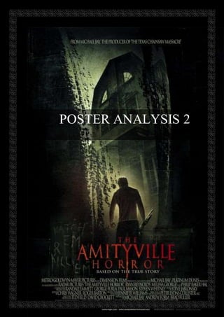
  • 2. ‘The Amityville Horror’ is a 2005 remake of the classic 1970s supernatural horror film of the same name, centred around a haunted house that drove a father of two to murder his entire family. Due to its focus on the house itself as a source of evil, the film draws many comparisons with my own, and the numerous demons and ghosts that haunt the estate interlink with my idea to create a vast array of paranormal entities. Because of this, analysing the poster for such a film will be very useful, as it will allow me to understand what an audience would come to expect from a horror film of this calibre, and how I can twist their expectations with my own unique take on a poster. Overall, this poster mainly abides by the conventions of its form – implying that the film itself is relatively formulaic in providing its scares, and caters towards fans of the original instead of bringing anything new to the classic tale. This respect for conventions can be seen in the large image, dominating the entirety of the frame, and a basic application of the rule of thirds, where the character and threat are placed within the middle third and the title and institutional information are placed in the bottom third. Much like other posters of the subgenre, a tagline is used; however, the tagline is placed directly underneath the title instead of its usual placement at the top of the frame, which is taken up instead by information about the film’s producer. It can be argued that this has been done in the knowledge that the majority of audiences will already be familiar with the plot of the film, and that they will therefore be more interested in who has been tasked with remaking it, as it will provide them with a hint into what the film will be like. However, despite the prime placement at the top of the frame, this strip of information is substantially smaller in terms of font size than the tagline, suggesting that it merely serves to introduce the film as opposed to giving an insight into the plot. This instead has been tasked to the tagline, but due to the notoriety of the narrative, it is simplified and abdicated to a lesser position. The focal point within the image itself is the house, as it looms over the smaller main character and appears to be the source of the evil. By using washed out blacks, greys and sepia tones to depict its recognisable ‘face’, the house is portrayed as something ancient and powerful, controlled by some sinister undying force beyond comprehension. In conjunction with this, the scratched, grainy quality of the image further adds to the idea that the house has been the cause of innumerable tragedies for centuries, and will continue to inflict terror upon its residents for centuries to come. Also, this hand-me-down quality is reminiscent of the original poster for the 1970s film, which will suggest to fans that this version will be a faithful remake to the original and will retain the authenticity of the era in which it was filmed in. Proceeding on from this, the aforementioned ‘face’ of the house is on full display in this poster, as no other houses of note look like it. It also gives a warped sense of life to the house itself, enforcing how this inanimate structure is the actual source of the horror throughout this film and has a mind of its own in controlling its victims. The low angle shot only serves to exemplify its power over the comparatively small protagonist, which hints towards the way in which the house will slowly take control of him as the film progresses. Despite it’s clear individuality, however, this house (and all the events that transpire within it) falls comfortably within the conventions of a supernatural horror film – it’s large, distinctive, and old-fashioned, like every other haunted house within the supernatural subgenre. Beneath the house, the main character of George can be seen centrally within the frame. He is hunched over and facing towards the house, almost pained in his body language, and is holding a shotgun limply in his right hand. The fact that he is hunched over further demeans his role as a human being, and shows that he is of secondary importance as a character to the house itself. Moreover, the placement of the house directly above him suggests that the oppression of the house is physically causing him to stoop, and this gives an indication of how it possesses George both physically and mentally. Overall this shows how he is merely a puppet to the dominant power of the Amityville house, channelling the supernatural evils
  • 3. through his own physical abilities, and will eventually serve as the primary antagonist within the film because of this. This idea is strengthened by the fact that he is holding a shotgun - a more realistic take on the usual knives and axes associated with the subgenre. Guns are also commonly seen as more impersonal weapons than the standard melee weapons of horror, and this also shows how George isn’t motivated by personal hatred or desire, but is completely out of control of his own thoughts and actions. Furthermore, the contrast of white and black in his clothing suggests the conflict of his innocence and the impending evil that is taking him over, and it is this conflict that the film will revolve around and play upon within its narrative. Also, an aura of light is also noticeable around George. Although light is usually associated with divinity and heavenly purpose, the light here is tainted yellow, and appears to be radiating from the house itself. This further enforces how it is corrupting all things that were previously associated with goodness and purity, and filling them with malignant purpose. Unusually, only a portion of the image is actually shown in this poster, as the house appears to be rising out of some form of darkness or decay that is gradually pressing in on the sides. It is reminiscent of a glimpse through a windscreen wiper, rubbing dirt off a screen in order to view a distorted, tainted landscape. In relation to the Amityville horror, however, it signifies the deteriorating state of mind of the central character and how the sharp-edged darkness of the house is rapidly contributing to his loss of sanity. Although the audience sees George at a distance, this dirt-speckled image almost appears to be placing the audience into the characters perspective as the darkness takes hold and begins to seep its way into his thoughts. This shows that George will be the character that the audience will be most likely to affiliate with, and will take up most of the screen time, and it is this empathy with his situation that will allow the audience to experience the horror as though it is happening to themselves, creating a lasting effect. It also illustrates how, after the credits have rolled, the film will have ‘tainted’ the lives of the audience members due to its shocking nature and visceral horror, made all the more real by the fact that it is ‘based on a true story’. Essentially, therefore, the evil that resides within the house will have taken the audience as its victims, as well as the fictional protagonist himself, and it is this guarantee of terror that is likely to draw audiences to watch the film. Furthermore, in terms of the composition of the poster, the house itself is slanted and tilted towards the sky, taking up over half of the actual image. Due to this tilted position, it gives the impression that the house has risen from the ground itself and not been constructed by normal builders and architects, and this evidently emphasises its otherworldly nature. It also allows the audience to entertain the idea that the Amityville house is rising from hell itself, and that the force within its walls is related to the Devil in some way or another. George’s position beneath it, therefore, renders him vastly inferior to its power, and yet it is clear to the audience that his aggressive state of mind (seen from his body language/weapon) is linked directly to the house, consolidating how it is using him as a pawn through which to channel its evil. Indeed, the open door in front of George is representative of a huge, gaping mouth, and his close proximity to it suggests that it is about to swallow him whole and fully take control of his life. The fact that we can only see his back only serves to dehumanise him more, clearly demonstrating how any attachment felt towards George will soon be replaced by fear and pity. Interestingly, the words ‘Katch ‘em and kill ‘em’ appear lopsided and unconventional on the border of the bottom third of the poster. They are placed intentionally to run through the title and into the institutional information, and could potentially serve as an extra tagline for the film despite their unconventional placement. It can be argued that the reason for their positioning is that they serve as an indication into George’s thoughts, and that due to the unstable nature of his mind, they are sporadically placed to represent how his thoughts are
  • 4. messy, unstructured, and disturbed. The faint, drooping font of the words reinforces this point, as they appear almost translucent – as though some otherworldly entity have placed them there, and they are rapidly fading into the darkness of George’s mind, becoming part of his unconscious thought process. Also, the purposeful misspelling and abbreviations used within this phrase serve to highlight the undoing of his mind, as all knowledge of spelling and grammar is being erased by the possessive force inside his head. ‘K’ is also a significantly more plosive sound than ‘C’, which adds an undercurrent of violence to the protagonist’s thoughts that we as an audience know will manifest itself into physical aggression. In addition to this, the phrase has a certain singsong nature to it, and the simplicity of the rhyme and alliteration draws associations with nursery songs, which subsequently juxtaposes with the threatening nature of the phrase. The idea of creepy children and contrapuntal childish music is another convention of the subgenre, and the use of this phrase therefore serves to root the film even more firmly within the supernatural category – especially because the narrative also contains both of these features. Ultimately, the phrase of ‘Katch ‘em & Kill ‘Em’ creates a tagline catchy enough to embed itself into the audiences sub consciousness, allowing them to unconsciously be reminded of the film whenever they next hear a similar sounding nursery rhyme. Evidently, however, the poster deems the ‘based on a true story’ tagline to be more relevant to the film, as it is given a bolder font and a more central placement. This may be because audiences can only truly be scared if they find the nature of the horror relatable to their own daily lives; so if it was a true story, they are substantially more likely to be scared by it, thus increasing their likelihood of watching the film. The title of the film, ‘The Amityville Horror’, anchors the image, and provides a name for the dominant house that takes up the majority of the frame. By using the word ‘the’, audiences are instantly able to grasp the fact that this is a well-known, one of a kind horror story that has been immortalised over time and will continue to be remembered as time goes on. Again, by using the actual name of the ‘Amityville’ estate, the director is staying faithful to the original and heavily relying upon the notion that everybody going to see the film will already be familiar with the story behind it. This expands the target audience from fans of the original film to all lovers of horror tales/fables, meaning a large variety of people are likely to see this movie based upon the infamy of the tale alone. In terms of the design of the title itself, a red serif font is used in order to evoke a menacing feeling that works in conjunction with the proposed evil of the image. Using a red font is usually more typical of slasher horror films, but due to the violent, bloody subject of The Amityville Horror, it is appropriately used here to symbolise the bloodshed caused by the Amityville house. The serif font, however, firmly anchors the film within the supernatural subgenre, as it is this subgenre that is often considered to be more sophisticated/intellectually stimulating than other slasher or gothic films, and the serif font mirrors that degree of professionalism, hence why it is used in so many modern-day supernatural films. Moreover, the word ‘Amityville’ is enlarged in relation to the other words, placing further significance on the house itself, and perhaps indicating that there will be more focus and information on the history of the house than there was in the original film. Indeed, the fact that the ‘Y’ is dripping down further strengthens this idea, as the elongated length of the letter could be symbolic of the long bloody history of the house and its former residents. Within the letters themselves, a slight orange tinge can also be seen, which brings associations with fire and hell, enforcing the previously mentioned idea that the house appears to be rising from hell itself. This poster heavily influences my own, primarily with the unique aesthetic that makes it appear as though the image is eroding/ripping down the sides. I feel as though this adds a unique dynamic to the poster, as though one were seeing it through the distorted vision of the protagonist, and this will be reflected in my use of leaking walls in the promotional poster for ‘The Basement’. This concept of dripping/leaking will be a reflection of the protagonist’s
  • 5. degrading mental state and will subsequently blur the line between reality and nightmares. In addition to this, the subtle tint used on the title of ‘The Amityville Horror’ seems to raise the text, as though it is leaping out of the page, as well as drawing associations with corruption and possession of malignant darkness. For this reason, a subtle red tint will be used on the poster of ‘The Basement’ in order to reflect the corruption of Joel’s innocence by the devil.