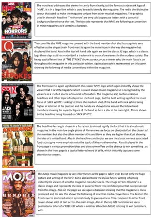
1. The masthead addresses the viewer instantly from clearly just the famous trade mark logo of ‘NME’. It is in a large font which is used to easily identify the magazine. The red is the distinctive colour that used to make the magazine unique from other musical magazines. The graphics used in the main headline ‘The Horrors’ are very cold uppercase letters with a colourful background to enhance the text. The barcode represents that NME are following a convention of most magazines as it contains a barcode.-838200-809625<br />This Mojo music magazine is very informative as the page is taken over by not only the huge picture and writing of ‘Hendrix’ but is also contains the classic MOJO writing informing instantly the viewer of who the magazine manufacture is. The image of ‘Jimi Hendrix’ is a classic image and represents the idea of superior from this confident pose that is represented from this image. Also on the page we see again a barcode showing that the magazine is mass produced and for sale this shows the following of essential media conventions. The text on this front cover is scattered almost symmetrically to give neatness. This compared to other front covers shows allot of text across the main image. Also in the top left hand side we see a promotional offer of a ‘FREE CD’ which is another attraction MOJO is trying to win customers with. The headline Kerrang is shown in a fuzzy font to almost signify the fact that it is a loud music magazine. In the main low angle photo of Nirvana we see focus on obviously Kurt the closest of the members but also the other members Kris and Dave as they are higher than Kurt showing the idea of a united band. Also in the headlines and topics we see the classic nirvana associated font to just give more emphasis onto the topic of Nirvana themselves. Also displayed in the front page is various promotion ideas and also some offers on the chance to win something , as shown in the front page is a capital lettered word of WIN, which instantly captures some attention to viewers. The front cover is again signified with the classic ‘SPIN’ logo which again instantly shows the viewer that it is SPIN magazine which is a well known music magazine so is recognised by the viewers as a trusted source of musical information. The magazine also contains various headlines and other topics displayed on the front page, but the bold writing signifies the main focus of ‘JACK WHITE’. Linking to this is the medium shot of the band with Jack White being higher in location of his position and his hands are shown to be around the fellow band members showing his superior figure of the band as he is a star in his own right. This is shown by the headline being focused on ‘JACK WHITE’.-15297156706870The cover like the NME magazine covered with the band members but the focus again is very effective as the singer (main front man) is again the main focus in the way the magazine has displayed the band. Also in the top left hand side again we see the classic Q logo, which is a classic logo these days as it has made itself a trademark to musical awareness in the modern society. The heavy capital letter font of ‘THE STROKE’ shows us exactly as a viewer who the main focus is on throughout this magazine in this particular edition. Again a barcode is represented on this cover showing the following of media conventions within the magazine.-15271754458970-15678152477770-1565275401320<br />