Download to read offline
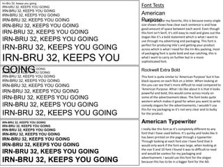
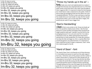
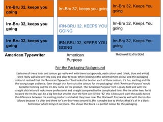
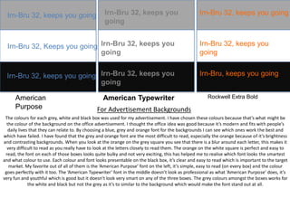
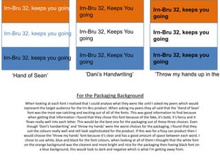
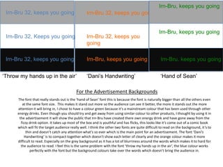
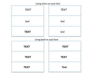
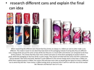
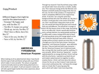
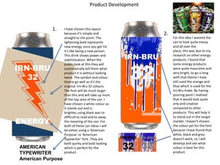

The document discusses font and packaging design options for a new Irn-Bru energy drink product. It evaluates several fonts for suitability for packaging labels and advertisements. The "Hand of Sean" font is identified as the best option for labels because it is bold, clear, and catches attention. For advertisements, the same font works well in green on a white background. A 500ml tall can size is selected to be consistent with competitors. The final can design concept features a blue background with a small central gray box and splattered paint effect to distinguish it from traditional Irn-Bru cans.


