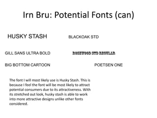
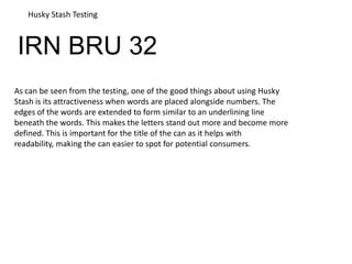
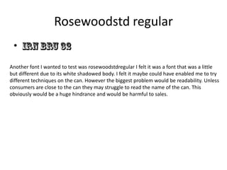
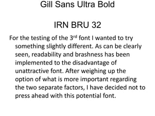
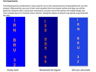
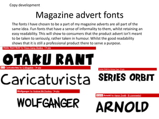
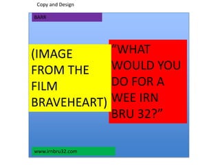
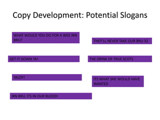
Task 4 and 5
Irn Bru: Potential Colours (Can)
Possible blue to use:
Pure Blue Dark Blue Persian Blue
International Klein
Blue
Possible Orange to use:
Pure Orange Yellow Orange Dark Orange
Deep
Orange
Orange and blue will
be chosen for my can
design to continue
with Irn Bru’s
traditional colours.
Maintaining traditional
colours bring brand
recognition. This is
something existing and
potential consumers
will appreciate as many
consumers enjoy
familiarity.
Irn Bru: Potential Fonts (can)
HUSKY STASH
GILL SANS ULTRA BOLD
BIG BOTTOM CARTOON
BLACKOAK STD
POETSEN ONE
The font I will most likely use is Husky Stash. This is
because I feel the font will be most likely to attract
potential consumers due to its attractiveness. With
its stretched out look, husky stash is able to work
into more attractive designs unlike other fonts
considered.
Potential Advert Images
IRN BRU 32
Husky Stash Testing
As can be seen from the testing, one of the good things about using Husky
Stash is its attractiveness when words are placed alongside numbers. The
edges of the words are extended to form similar to an underlining line
beneath the words. This makes the letters stand out more and become more
defined. This is important for the title of the can as it helps with
readability, making the can easier to spot for potential consumers.
Rosewoodstd regular
•
Another font I wanted to test was rosewoodstdregular I felt it was a font that was a little
but different due to its white shadowed body. I felt it maybe could have enabled me to try
different techniques on the can. However the biggest problem would be readability. Unless
consumers are close to the can they may struggle to read the name of the can. This
obviously would be a huge hindrance and would be harmful to sales.
Gill Sans Ultra Bold
IRN BRU 32
For the testing of the 3rd font I wanted to try
something slightly different. As can be clearly
seen, readability and brashness has been
implemented to the disadvantage of
unattractive font. After weighing up the
option of what is more important regarding
the two separate factors, I have decided not to
press ahead with this potential font.
I
R
N
B
R
U
3
2
I
R
N
B
R
U
3
2
Font Experiments
The following three combinations I have used for my Irn-Bru mood board are all possibilities for my final
product. Obviously the cans are in their most simplistic form but a basic outline and ideas can still be
gathered. However after a quick peer assessment, my peer was of the opinion the middle design was
most suitable due to it’s Scottish colour scheme. Taking this advice on board I may decide to go forthwith
the idea.
Husky stash Gill sans ultra boldRosewood std regular
Magazine advert fonts
The fonts I have chosen to be a part of my magazine adverts are all part of the
same idea. Fun fonts that have a sense of informality to them, whilst retaining an
easy readability. This will show to consumers that the product advert isn’t meant
to be taken to seriously, rather taken in humour. Whilst the good readability
shows that it is still a professional product there to serve a purpose.
Copy development
Magazine Image Ideas
Product
development
Copy and Design
“WHAT
WOULD YOU
DO FOR A
WEE IRN
BRU 32?”
(IMAGE
FROM THE
FILM
BRAVEHEART)
www.irnbru32.com
BARR
Copy Development: Potential Slogans
WHAT WOULD YOU DO FOR A WEE IRN
BRU?
GET IT DOWN YA!
YALDY!
IRN BRU, ITS IN OUR BLOOD!
THEY’LL NEVER TAKE OUR BRU 32
THE DRINK OF TRUE SCOTS
ITS WHAT SHE WOULD HAVE
WANTED

Task4 mood board irn bru

  • 1.
  • 2.
    Irn Bru: PotentialColours (Can) Possible blue to use: Pure Blue Dark Blue Persian Blue International Klein Blue Possible Orange to use: Pure Orange Yellow Orange Dark Orange Deep Orange Orange and blue will be chosen for my can design to continue with Irn Bru’s traditional colours. Maintaining traditional colours bring brand recognition. This is something existing and potential consumers will appreciate as many consumers enjoy familiarity.
  • 3.
    Irn Bru: PotentialFonts (can) HUSKY STASH GILL SANS ULTRA BOLD BIG BOTTOM CARTOON BLACKOAK STD POETSEN ONE The font I will most likely use is Husky Stash. This is because I feel the font will be most likely to attract potential consumers due to its attractiveness. With its stretched out look, husky stash is able to work into more attractive designs unlike other fonts considered.
  • 4.
  • 5.
    IRN BRU 32 HuskyStash Testing As can be seen from the testing, one of the good things about using Husky Stash is its attractiveness when words are placed alongside numbers. The edges of the words are extended to form similar to an underlining line beneath the words. This makes the letters stand out more and become more defined. This is important for the title of the can as it helps with readability, making the can easier to spot for potential consumers.
  • 6.
    Rosewoodstd regular • Another fontI wanted to test was rosewoodstdregular I felt it was a font that was a little but different due to its white shadowed body. I felt it maybe could have enabled me to try different techniques on the can. However the biggest problem would be readability. Unless consumers are close to the can they may struggle to read the name of the can. This obviously would be a huge hindrance and would be harmful to sales.
  • 7.
    Gill Sans UltraBold IRN BRU 32 For the testing of the 3rd font I wanted to try something slightly different. As can be clearly seen, readability and brashness has been implemented to the disadvantage of unattractive font. After weighing up the option of what is more important regarding the two separate factors, I have decided not to press ahead with this potential font.
  • 8.
    I R N B R U 3 2 I R N B R U 3 2 Font Experiments The followingthree combinations I have used for my Irn-Bru mood board are all possibilities for my final product. Obviously the cans are in their most simplistic form but a basic outline and ideas can still be gathered. However after a quick peer assessment, my peer was of the opinion the middle design was most suitable due to it’s Scottish colour scheme. Taking this advice on board I may decide to go forthwith the idea. Husky stash Gill sans ultra boldRosewood std regular
  • 9.
    Magazine advert fonts Thefonts I have chosen to be a part of my magazine adverts are all part of the same idea. Fun fonts that have a sense of informality to them, whilst retaining an easy readability. This will show to consumers that the product advert isn’t meant to be taken to seriously, rather taken in humour. Whilst the good readability shows that it is still a professional product there to serve a purpose. Copy development
  • 10.
  • 11.
    Copy and Design “WHAT WOULDYOU DO FOR A WEE IRN BRU 32?” (IMAGE FROM THE FILM BRAVEHEART) www.irnbru32.com BARR
  • 12.
    Copy Development: PotentialSlogans WHAT WOULD YOU DO FOR A WEE IRN BRU? GET IT DOWN YA! YALDY! IRN BRU, ITS IN OUR BLOOD! THEY’LL NEVER TAKE OUR BRU 32 THE DRINK OF TRUE SCOTS ITS WHAT SHE WOULD HAVE WANTED