Downloaded 656 times
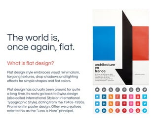


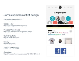

Flat design is a minimalist style that prioritizes simple shapes, flat colors, and typography, moving away from skeuomorphic designs that mimic real-world textures. This trend is influenced by modern interfaces like Microsoft's Metro UI and Apple's iOS redesign, making it suitable for responsive environments while enhancing usability. However, designers must balance aesthetics with user experience to avoid confusion, ensuring that the functional aspects of interfaces are clear.