Download as PDF, PPTX


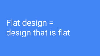


The document explores flat design as a reaction against skeuomorphic and realist styles, emphasizing its characteristics and origins rooted in minimalist and Swiss design. It discusses the adoption of flat design by major companies like Microsoft and Apple, noting its focus on content and usability while also acknowledging its shortcomings such as reduced discoverability. The concept of Flat 2.0 is introduced as a solution that retains the aesthetics of flat design while integrating subtle elements to enhance user experience.