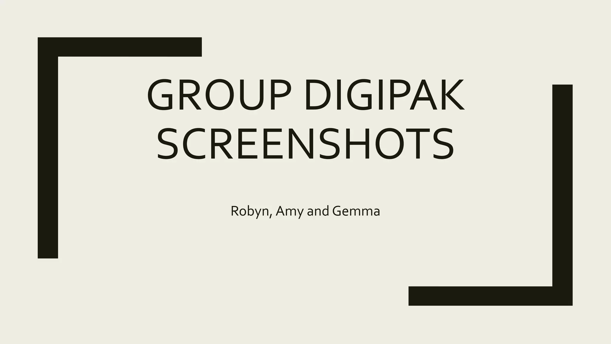
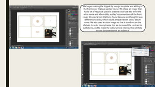
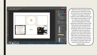
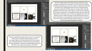
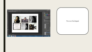
GROUP DIGIPAK
SCREENSHOTS
Robyn, Amy and Gemma
We began making the digipak by using a template and adding in
the front cover that we wanted to use.We chose an image that
had a lot of negative space so that we could use it to write the
artist name and album title, as they’re conventions of the front
cover. We used a font thatAmy found because we thought it was
different and bold; which would attract viewers to our album
cover. We also used a colour image so that it stood out on the
shelves. In order to emphasise this we increased the contrast to
add drama, and to make the colours more intense; this will help
attract the attention of an audience.
We then started working on the
inside cover, we wanted to include
lyrics from the music video that we
created on this page, so that the
audience could understand the song
more. Because we wanted to stick
to a black and white theme we
found a white page with a black
background, that looks quite scruffy
like a paint brush has painted the
background; this is similar to the
artists logo. After the lyrics that we
included we used a curly font to
write Ava K so that it looked like a
signature, this makes the audience
feel closer to the artist because it
feels more personal. We used the
first 2 verses and the chorus so that
the audience could get a feel more
the genre of the music that our
artist creates.
We then added a black and white portrait as the back cover,
because we wanted to incorporate a mixture of colour and black
and white images because our music video is in black and white. We
decided to use a photograph that had a lot of negative space
because we had a lot of information to include on this side.We
decided to write the artists name again to create artist recognition,
and so that it would stick in the audiences head, we also wrote the
release date on the back cover however we decided to remove this
because it wasn’t really necessary and we felt like there was too
music information on one page.We wrote the track list in the same
font that we had used for the album title and the lyrics in order to
create continuity throughout our design.
We then added the barcode because this is a convention
that msut be included so that the album can be
purchased.We put it on the bottom left so that it wasn’t
too noticeable and didn’t distract the viewers attention.
We also used Robyn’s production label design because we
felt that it was unique and suited our artist well.
This is our final digipak

Final printscreens

  • 1.
  • 2.
    We began makingthe digipak by using a template and adding in the front cover that we wanted to use.We chose an image that had a lot of negative space so that we could use it to write the artist name and album title, as they’re conventions of the front cover. We used a font thatAmy found because we thought it was different and bold; which would attract viewers to our album cover. We also used a colour image so that it stood out on the shelves. In order to emphasise this we increased the contrast to add drama, and to make the colours more intense; this will help attract the attention of an audience.
  • 3.
    We then startedworking on the inside cover, we wanted to include lyrics from the music video that we created on this page, so that the audience could understand the song more. Because we wanted to stick to a black and white theme we found a white page with a black background, that looks quite scruffy like a paint brush has painted the background; this is similar to the artists logo. After the lyrics that we included we used a curly font to write Ava K so that it looked like a signature, this makes the audience feel closer to the artist because it feels more personal. We used the first 2 verses and the chorus so that the audience could get a feel more the genre of the music that our artist creates.
  • 4.
    We then addeda black and white portrait as the back cover, because we wanted to incorporate a mixture of colour and black and white images because our music video is in black and white. We decided to use a photograph that had a lot of negative space because we had a lot of information to include on this side.We decided to write the artists name again to create artist recognition, and so that it would stick in the audiences head, we also wrote the release date on the back cover however we decided to remove this because it wasn’t really necessary and we felt like there was too music information on one page.We wrote the track list in the same font that we had used for the album title and the lyrics in order to create continuity throughout our design. We then added the barcode because this is a convention that msut be included so that the album can be purchased.We put it on the bottom left so that it wasn’t too noticeable and didn’t distract the viewers attention. We also used Robyn’s production label design because we felt that it was unique and suited our artist well.
  • 6.
    This is ourfinal digipak