Download as PDF, PPTX

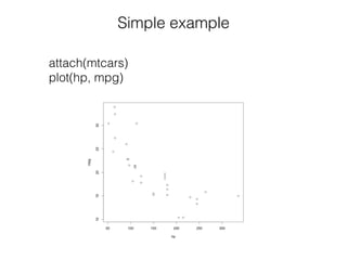
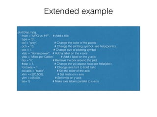
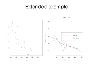
![Example
attach(mtcars)
head(mtcars[, c("hp", "mpg")])
plot(hp, mpg)](https://image.slidesharecdn.com/presentation-151117051541-lva1-app6892/85/Presentation-Plotting-Systems-in-R-5-320.jpg)
![Example
attach(mtcars)
head(mtcars[, c("hp", "mpg")])
plot(hp, mpg)
title("MPG vs. hp”) # Add a title](https://image.slidesharecdn.com/presentation-151117051541-lva1-app6892/85/Presentation-Plotting-Systems-in-R-6-320.jpg)
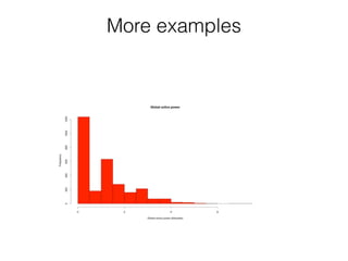
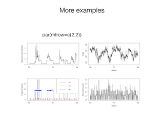
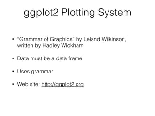
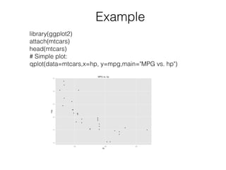
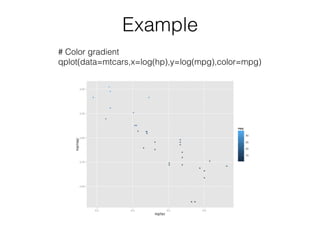
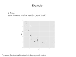
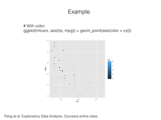
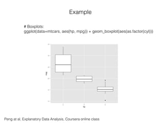
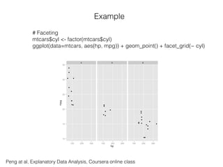


The document provides an overview of plotting systems in R, including base, lattice, and ggplot2, explaining how to create and save plots using various functions. It details the various graphic devices, plotting functions, and layered approaches in ggplot2 for visualizing data, with examples using the 'mtcars' dataset. Additionally, it includes resources for further learning about R graphics.