Downloaded 11 times
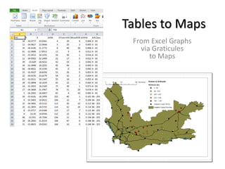


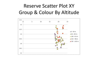

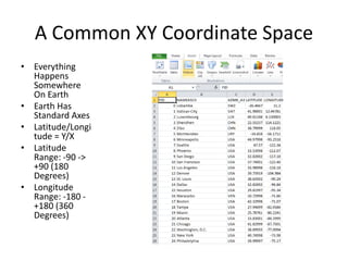
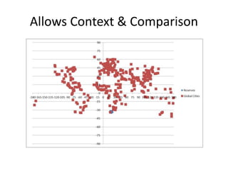


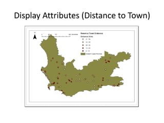


This document discusses how to take tabular nature reserve data and visualize it on maps to better understand relationships between data points and their external context. It recommends plotting the tabular data on a common XY coordinate space using latitude and longitude, then mapping the points to allow for easy comparison between reserves while showing additional attributes through cartographic techniques like labeling, coloring, and proportional symbols. This standardized approach to mapping tabular data provides an at-a-glance visualization with important external geographic context.


