Evaluation 3
•Download as ODT, PDF•
0 likes•163 views

The document compares the style sheet of the student's magazine to another magazine called Kerrang. Both magazines have large prominent mastheads at the top of the page. The main images are close-up shots, though the student's magazine uses a profile shot in black and white while Kerrang uses a direct face shot. The main articles are large and stand out on the page, though Kerrang's is not brightly colored like the student's. Both magazines include smaller images highlighting articles, quotes of the week, and an offer of a free poster. In general, the layout and elements are quite similar between the two magazines, with the student indicating Kerrang as inspiration.
Report
Share
Report
Share

Recommended
Question 1
The document discusses the design and layout conventions used in the creator's music magazine. Key points include:
- Featuring an image of the main artist on the cover to represent and promote the main feature article.
- Using headings, images, page numbers and other design elements to clearly organize and navigate between articles.
- Drawing inspiration from real magazines like Q Magazine to ensure conventions are followed properly.
- Centering the main artist as the focus by featuring their image and name prominently.
Evaluation
The document discusses conventions of music magazine front covers and articles that the author observed in their research. It then analyzes how their own mock magazine front cover, contents page, and double-page article both follow conventions such as placing the magazine title at the top and categorizing articles, and break conventions through creative design choices like unique layouts and images to attract readers. The author concludes they successfully incorporated typical magazine conventions while also displaying elements differently from researched magazines.
Evaluation 1
The document discusses the conventions of music magazines and how the author's magazine challenges these conventions. It describes how a typical music magazine would have a colorful cover with many headlines trying to attract readers, while the author's magazine has a simplistic design with plain colors and a large double-page photo on the cover. It also explains that a common contents page layout is clustered and hard to read, whereas the author uses a simple layout with sections and rectangular pictures indicating each section. Throughout the process, the author aimed to create a contemporary and unique design that stands out from other typical music magazine designs.
Analysing contents pages
This document analyzes the contents pages of three music magazines: Q, Billboard, and Q again. It finds that they all follow typical conventions for magazine contents pages, including: having a large central image related to the main feature; smaller additional images and their corresponding page numbers; section headings and subheadings to categorize articles; listings of articles alongside their page numbers; placement of the magazine title; and consistency in house style colors, fonts and layout throughout the issue. The document examines how these conventions help make the contents pages visually appealing, informative, and easy for readers to navigate.
Drafting
The document discusses the design plans for a magazine cover and contents page. It will feature the masthead "Aspire" with a fireworks design to connect to the target audience. The cover will have the main artist posing large to be the main focus, with the strapline "Young, Solo, New." Typical magazine elements like date and barcode will also be included. The contents page will have a banner title and list articles on the left with bigger ones highlighted on the right. The main article image will be large in the center.
Evaluation one
Mia Harrison's magazine uses, develops, and challenges conventions of real media in the following ways:
1) The magazine cover takes inspiration from existing magazines like Billboard and Vogue in its use of a natural background and font positioning, but develops these conventions by placing the masthead at the bottom rather than the side.
2) The contents page develops conventions by adding a banner and using color consistently, and challenges conventions by using a background image rather than plain color.
3) The double-page spread uses darker colors behind text like a sample magazine, but develops boxed text conventions by outlining some text lighter gray for visual interest. It also challenges conventions by making the feature image smaller to add more text
Conventions
This document discusses conventions of magazines and music videos. It explains that magazines typically include elements like a strap line, masthead, splash, kicker, barcode/price, and cover line. Music videos often tell abstract narratives that leave some elements open to interpretation. Indie music values independence and uniqueness. The document also discusses how the author's own magazine follows conventions, including a masthead, strap line, cover line, barcode/price, and contents page with pictures of features. It aims to balance images and text on double page spreads.
Evaluation question 1
This document summarizes how the author's media product uses conventions from real music magazines. The author chose a font and title similar to existing magazines to grab readers' attention. Images and text are arranged on the front cover and contents page like magazines such as Loud&Quiet and Clash to emphasize artists and guide readers. Model costumes and a city background on the cover aim to attract the target audience of "New Casuals." The double page spread adopts a typical magazine format with one page for a photo and another for text in columns, interviewing a band member.
Eval Q1
This document summarizes how the media product uses and develops conventions of real magazines. It discusses design elements like the masthead, cover images, bar codes, and cover lines. It also covers layouts for the content page, with columns, images on the left, page numbers, and fonts. The double page spread layout includes a large cover image, headlines, and 3 column writing style. Images are typically bright, large, and from a variety of locations to appeal to different audiences. While some conventions are followed, the design also challenges conventions in places like thinner mastheads and fewer images per page.
Evaluation question 1
This document summarizes how the student's media product follows conventions of real music magazines while also challenging some conventions. The front cover follows conventions like the masthead at the top and cover lines on the side. The contents page keeps a similar structure to examples but adds some of the student's own style. The double page spread challenges conventions by including more information and images than typical while still highlighting the main artist.
Question 1 article
The document summarizes the key elements and design conventions used in a magazine article about an artist named Brad. The article includes a large headline using a sans-serif font to draw readers in, a pull quote highlighting Brad's claim to be "king of rock" despite facing setbacks, and a Q&A format interview to learn more about Brad overcoming obstacles. While following conventions like large headlines and photos, the article breaks some norms by not making the first letter larger and having Brad look away from the camera to portray facing challenges. Color scheme choices also aim to modernize the article's look within the magazine's overall design.
Plan for article and draft article
The document outlines a plan for creating an article and draft article for a magazine. The plan includes guidelines for layout, such as centering the headline and justifying the text. Consistency of formatting across articles is also emphasized, including consistent text size and color. The draft article will follow the plan, featuring a large image taking up half the page alongside the article text. A well-known artist will be the subject to attract readers and potential customers to the new magazine.
Qustion1
This document discusses how the student's media production of a music magazine both uses conventions from real music magazines and puts their own spin on them. The student researched popular magazines like Q and NME to understand their styles. They adopted conventions like using one main image and close-up photos on the cover, organizing the interior content into columns, and including a masthead and tagline. However, the student also made some of their own design choices, like removing color blocks that did not look good and placing the masthead behind the cover image rather than in front. Overall, the student aimed to create a magazine that would be as professional as established publications while also including their own creative flair.
Contents page q1
This document discusses the design conventions used in a mock music magazine contents page and article. It explains that the magazine title is in a large bold font at the top of the page rather than the usual "contents" heading. The features column is on the right side as is standard. Multiple page numbers are used to help the artist easily find specific contents. Headers are made to stand out with bold text and graphics. Photographs are chosen to relate to pull quotes and create tension between artists competing for the number one record. The same color scheme is used throughout for continuity.
Photographic reserach
The document discusses the typical conventions and layout of music magazine covers, contents pages, and double page spreads. It notes that magazine covers usually feature a main central image with additional smaller images and text around the edges. Contents pages typically have a large central image surrounded by a listing of articles. Double page spreads consist of a full-page main image on one side and accompanying text and possibly smaller images on the other side. The document also examines different shot types used and how they help convey information to the reader.
Masthead Research
The document discusses different rock music magazines and their mastheads. It analyzes the mastheads of Classic Rock, Kerrang, and Rock Sound magazines. It notes design elements like font, color, and positioning relative to images. The author wants to design their own magazine masthead that stands out but is simple, like Rock Sound, with the image behind the text. Looking at other magazines helped them decide how to create their unique masthead.
Evaluation q1
The document discusses how the media product challenges and develops conventions of real magazines. It analyzes "Q" magazine's design and copies aspects like its color scheme, masthead positioning, and layout structure while making small changes to make it unique. Photos and fonts were chosen to suit the indie genre. Consistency in house style, color, and model are used across the cover, contents page, and double page spread to link the pages together and look professional. Real magazine conventions for images, text placement, and numbers are followed but also developed by adding new elements and repositioning some aspects.
Evaluation q1
The document discusses how the media product challenges and develops conventions of real media texts.
It summarizes how the front cover was inspired by "Q" magazine's color scheme, layout, and positioning of images while developing conventions through unique elements like a 3D masthead.
The contents page also draws from "Q" magazine's layout and positioning of images, numbers, and masthead while challenging conventions through additional text overlays and repositioned page numbers.
The double-page spread was similarly inspired by an existing magazine spread but developed conventions through original photography, a smiling model pose, and repositioned design elements. Consistency of style and house rules were emphasized across pages.
Question 1
The document discusses the process of researching and designing a magazine. The author looked at many existing magazines to get ideas for layouts, color schemes, fonts, and other design elements. They initially tried to copy the NME magazine but later changed to take more inspiration from another magazine called "Link" that they felt was better organized. They focused on typography and language to create a design that was easy to read but also visually appealing. Pictures were also an essential part of making the magazine appealing to the target audience and setting trends.
Evaluation Question 1
The magazine uses conventions of real magazines by having a short, attention-grabbing title in the masthead placed in the left third of the cover. Images are used prominently and strategically to represent genres and attract readers. Contents pages follow conventions like consistent colors/fonts and featuring the main article with a larger image. The double page spread splits content across two facing pages like interviews paired with a close-up image. Font, language, and layout are tailored to the target audience to portray the rap genre through visuals, style and focused content.
Evaluation question one
The document discusses how the creator of a magazine took inspiration from several existing magazines for the design of their own magazine cover and contents page. They borrowed design elements like the location of the title, placement of cover models, location of cover lines, inclusion of featured bands, and color schemes from magazines like Spin, Q, and Mojo. The goal was to emulate conventions that worked well for other magazines and engage readers effectively.
Evaluation question 1
This document discusses how the media product follows conventions of real music magazines. It provides examples of conventions used in mastheads, fonts, drop caps, pull quotes, photography styles, page numbers, color schemes, and barcodes. The document explains how the media product applies each convention, such as using a bold masthead font that stands out, medium shot artist photos centered on the page, and placing the barcode at the bottom so it does not distract from the content. Overall, the document shows how the media product adheres to typical structures and designs of real music magazines.
Contents page
This is the second textual analysis I have done for my A2 blog where I am doing a Regional Magazine. This textual analysis is about the contents pages.
Presentation1
This document describes a student's contents page for their magazine project. The student took inspiration from a Kerrang magazine contents page for its colorful and clear design. Their contents page follows conventions of real magazines, including: section headings to navigate pages, masthead on the right with date and cover image, sub-titles in boxes to highlight sections, images related to magazine topics with page numbers, and page navigators in a consistent color-coded pattern to link over 100 pages. The student aimed to attract a young audience while challenging some traditions with original elements like a shattered glass background image.
As media studies evaluation
The document discusses the process of creating a magazine cover and contents for a school assignment. It describes how the student analyzed existing magazine covers to learn conventions and then applied those conventions to their own magazine cover design. They incorporated elements like mastheads, cover lines, and color schemes based on influences from magazines like NME and Q. The student also discusses influences on other elements like the contents page and double page spreads. Overall, the document focuses on how the student developed their understanding of magazine design conventions and applied influences from real magazines to their school assignment.
As media studies evaluation
The document discusses the process of creating a magazine cover and contents for a media studies assignment. It describes how the author used conventions and influences from real magazines like NME and Q to develop their own magazine cover and layout. Key influences included using consistent colors, catchy mastheads, cover lines, and single or limited photographs on the cover like their influences. The author aimed to attract a target audience of teenagers and young adults interested in indie/rock music.
Magazine evaluation question 1 (done)
This document summarizes how the media product challenges conventions of real magazines in its design choices. The masthead uses a messy, painted font rather than a crisp one to represent the rebellious target audience. The main cover image is in black and white rather than color to look more serious and classic, appealing to an older demographic focused on a heavy music genre. Instead of a right third, it has a left third to emphasize the rebellious nature of the music. While the contents page and double page spread follow conventions, they primarily use black and white images to achieve a serious tone.
Photos used and why (done)
The document discusses photo choices for different parts of a magazine. For the cover photo, the author chose a black and white image that looked professional and reflected the target audience well. For the double page spread, another black and white image was selected that fit the theme and topic. Thumbnail images on the contents page were also chosen because they linked to the genre, cover, and double page spread.
Evaluation 5
My product represents a particular social group focused on a specific type of music. The target audience would be people drawn to that music genre. To appeal to this group, the magazine would include more pictures and articles tailored to their interests. The masthead is large and bold to catch the reader's eye. Small images and the main photo attract readers to articles by providing a visual preview of the content. Colorful, eye-catching designs are used throughout to draw customers in and make key information stand out.
More Related Content
What's hot
Eval Q1
This document summarizes how the media product uses and develops conventions of real magazines. It discusses design elements like the masthead, cover images, bar codes, and cover lines. It also covers layouts for the content page, with columns, images on the left, page numbers, and fonts. The double page spread layout includes a large cover image, headlines, and 3 column writing style. Images are typically bright, large, and from a variety of locations to appeal to different audiences. While some conventions are followed, the design also challenges conventions in places like thinner mastheads and fewer images per page.
Evaluation question 1
This document summarizes how the student's media product follows conventions of real music magazines while also challenging some conventions. The front cover follows conventions like the masthead at the top and cover lines on the side. The contents page keeps a similar structure to examples but adds some of the student's own style. The double page spread challenges conventions by including more information and images than typical while still highlighting the main artist.
Question 1 article
The document summarizes the key elements and design conventions used in a magazine article about an artist named Brad. The article includes a large headline using a sans-serif font to draw readers in, a pull quote highlighting Brad's claim to be "king of rock" despite facing setbacks, and a Q&A format interview to learn more about Brad overcoming obstacles. While following conventions like large headlines and photos, the article breaks some norms by not making the first letter larger and having Brad look away from the camera to portray facing challenges. Color scheme choices also aim to modernize the article's look within the magazine's overall design.
Plan for article and draft article
The document outlines a plan for creating an article and draft article for a magazine. The plan includes guidelines for layout, such as centering the headline and justifying the text. Consistency of formatting across articles is also emphasized, including consistent text size and color. The draft article will follow the plan, featuring a large image taking up half the page alongside the article text. A well-known artist will be the subject to attract readers and potential customers to the new magazine.
Qustion1
This document discusses how the student's media production of a music magazine both uses conventions from real music magazines and puts their own spin on them. The student researched popular magazines like Q and NME to understand their styles. They adopted conventions like using one main image and close-up photos on the cover, organizing the interior content into columns, and including a masthead and tagline. However, the student also made some of their own design choices, like removing color blocks that did not look good and placing the masthead behind the cover image rather than in front. Overall, the student aimed to create a magazine that would be as professional as established publications while also including their own creative flair.
Contents page q1
This document discusses the design conventions used in a mock music magazine contents page and article. It explains that the magazine title is in a large bold font at the top of the page rather than the usual "contents" heading. The features column is on the right side as is standard. Multiple page numbers are used to help the artist easily find specific contents. Headers are made to stand out with bold text and graphics. Photographs are chosen to relate to pull quotes and create tension between artists competing for the number one record. The same color scheme is used throughout for continuity.
Photographic reserach
The document discusses the typical conventions and layout of music magazine covers, contents pages, and double page spreads. It notes that magazine covers usually feature a main central image with additional smaller images and text around the edges. Contents pages typically have a large central image surrounded by a listing of articles. Double page spreads consist of a full-page main image on one side and accompanying text and possibly smaller images on the other side. The document also examines different shot types used and how they help convey information to the reader.
Photographic reserach
The document discusses the typical conventions and layout of music magazine covers, contents pages, and double page spreads. It notes that magazine covers usually feature a main central image with additional smaller images and text around the edges. Contents pages typically have a large central image surrounded by a listing of articles. Double page spreads consist of a full-page main image on one side and accompanying text and possibly smaller images on the other side. The document also examines different shot types used and how they help convey information to the reader.
Masthead Research
The document discusses different rock music magazines and their mastheads. It analyzes the mastheads of Classic Rock, Kerrang, and Rock Sound magazines. It notes design elements like font, color, and positioning relative to images. The author wants to design their own magazine masthead that stands out but is simple, like Rock Sound, with the image behind the text. Looking at other magazines helped them decide how to create their unique masthead.
Evaluation q1
The document discusses how the media product challenges and develops conventions of real magazines. It analyzes "Q" magazine's design and copies aspects like its color scheme, masthead positioning, and layout structure while making small changes to make it unique. Photos and fonts were chosen to suit the indie genre. Consistency in house style, color, and model are used across the cover, contents page, and double page spread to link the pages together and look professional. Real magazine conventions for images, text placement, and numbers are followed but also developed by adding new elements and repositioning some aspects.
Evaluation q1
The document discusses how the media product challenges and develops conventions of real media texts.
It summarizes how the front cover was inspired by "Q" magazine's color scheme, layout, and positioning of images while developing conventions through unique elements like a 3D masthead.
The contents page also draws from "Q" magazine's layout and positioning of images, numbers, and masthead while challenging conventions through additional text overlays and repositioned page numbers.
The double-page spread was similarly inspired by an existing magazine spread but developed conventions through original photography, a smiling model pose, and repositioned design elements. Consistency of style and house rules were emphasized across pages.
Question 1
The document discusses the process of researching and designing a magazine. The author looked at many existing magazines to get ideas for layouts, color schemes, fonts, and other design elements. They initially tried to copy the NME magazine but later changed to take more inspiration from another magazine called "Link" that they felt was better organized. They focused on typography and language to create a design that was easy to read but also visually appealing. Pictures were also an essential part of making the magazine appealing to the target audience and setting trends.
Evaluation Question 1
The magazine uses conventions of real magazines by having a short, attention-grabbing title in the masthead placed in the left third of the cover. Images are used prominently and strategically to represent genres and attract readers. Contents pages follow conventions like consistent colors/fonts and featuring the main article with a larger image. The double page spread splits content across two facing pages like interviews paired with a close-up image. Font, language, and layout are tailored to the target audience to portray the rap genre through visuals, style and focused content.
Evaluation question one
The document discusses how the creator of a magazine took inspiration from several existing magazines for the design of their own magazine cover and contents page. They borrowed design elements like the location of the title, placement of cover models, location of cover lines, inclusion of featured bands, and color schemes from magazines like Spin, Q, and Mojo. The goal was to emulate conventions that worked well for other magazines and engage readers effectively.
Evaluation question 1
This document discusses how the media product follows conventions of real music magazines. It provides examples of conventions used in mastheads, fonts, drop caps, pull quotes, photography styles, page numbers, color schemes, and barcodes. The document explains how the media product applies each convention, such as using a bold masthead font that stands out, medium shot artist photos centered on the page, and placing the barcode at the bottom so it does not distract from the content. Overall, the document shows how the media product adheres to typical structures and designs of real music magazines.
Contents page
This is the second textual analysis I have done for my A2 blog where I am doing a Regional Magazine. This textual analysis is about the contents pages.
Presentation1
This document describes a student's contents page for their magazine project. The student took inspiration from a Kerrang magazine contents page for its colorful and clear design. Their contents page follows conventions of real magazines, including: section headings to navigate pages, masthead on the right with date and cover image, sub-titles in boxes to highlight sections, images related to magazine topics with page numbers, and page navigators in a consistent color-coded pattern to link over 100 pages. The student aimed to attract a young audience while challenging some traditions with original elements like a shattered glass background image.
As media studies evaluation
The document discusses the process of creating a magazine cover and contents for a school assignment. It describes how the student analyzed existing magazine covers to learn conventions and then applied those conventions to their own magazine cover design. They incorporated elements like mastheads, cover lines, and color schemes based on influences from magazines like NME and Q. The student also discusses influences on other elements like the contents page and double page spreads. Overall, the document focuses on how the student developed their understanding of magazine design conventions and applied influences from real magazines to their school assignment.
As media studies evaluation
The document discusses the process of creating a magazine cover and contents for a media studies assignment. It describes how the author used conventions and influences from real magazines like NME and Q to develop their own magazine cover and layout. Key influences included using consistent colors, catchy mastheads, cover lines, and single or limited photographs on the cover like their influences. The author aimed to attract a target audience of teenagers and young adults interested in indie/rock music.
What's hot (19)
Viewers also liked
Magazine evaluation question 1 (done)
This document summarizes how the media product challenges conventions of real magazines in its design choices. The masthead uses a messy, painted font rather than a crisp one to represent the rebellious target audience. The main cover image is in black and white rather than color to look more serious and classic, appealing to an older demographic focused on a heavy music genre. Instead of a right third, it has a left third to emphasize the rebellious nature of the music. While the contents page and double page spread follow conventions, they primarily use black and white images to achieve a serious tone.
Photos used and why (done)
The document discusses photo choices for different parts of a magazine. For the cover photo, the author chose a black and white image that looked professional and reflected the target audience well. For the double page spread, another black and white image was selected that fit the theme and topic. Thumbnail images on the contents page were also chosen because they linked to the genre, cover, and double page spread.
Evaluation 5
My product represents a particular social group focused on a specific type of music. The target audience would be people drawn to that music genre. To appeal to this group, the magazine would include more pictures and articles tailored to their interests. The masthead is large and bold to catch the reader's eye. Small images and the main photo attract readers to articles by providing a visual preview of the content. Colorful, eye-catching designs are used throughout to draw customers in and make key information stand out.
Double page spread analysis.
The document discusses the layout and design elements of a magazine page. It analyzes several components, including the logo, text, pull quotes, images, and graphics. The summary provides that the logo and images effectively catch the reader's eye. Pull quotes give the reader insight into articles and appeal to fans. Together, these design choices help engage the reader and convey information about the content.
Magazine evaluation question 7 (done)
The document discusses how the magazine attracts its target audience of alternative rock fans through various design features. It uses dark bold colors, edgy black and white images, and ripped/broken designs that are associated with the genre. Informal language and interviews appeal to younger readers, while classic bands featured attract older fans. Free tickets, posters, and event listings would draw in music enthusiasts. The overall aesthetic is unpolished and rebellious to represent the wild nature of alternative rock.
Magazine evaluation question 4 (done)
In the progression from the preliminary task to the full magazine project, the student learned several important lessons about magazine design and layout. For the cover, they improved the professional layout but realized they should have included more articles. For the contents page, they incorporated more images and subheadings but still needed more writing to describe the articles. Overall, they learned to include more features like advertisements and addresses to make the magazine more engaging for readers. While they did not do a double page spread preliminarily, they learned layout techniques like large images and quotes that they applied in their full project.
Finished Magazine
The magazine industry has faced many challenges in recent years as more readers switch to consuming news and entertainment online rather than in print. Print magazines have seen declining circulation numbers as advertising dollars follow readers to digital platforms. However, some magazines have found ways to adapt by creating compelling digital content and communities online to complement their print editions and remain relevant sources of information for dedicated readers.
Magazine evaluation question 2 (done)
During the construction of a magazine, the student learned several technologies:
1) How to properly operate a camera and take quality photos, though initially struggled with the flash and lighting.
2) How to use Photoshop for editing photos and creating graphics, finding the program easy to use after learning the layout.
3) How to assemble the magazine using QuarkXPress, which was difficult at first but became fun and easy to use once familiar with the layout.
4) Blogger was frustrating to use for uploading documents and images, and the student did not learn much from this experience.
Contence Page Analysis
The document summarizes the key design elements of a magazine page layout. It describes the logo, title, synopsis, main image, article, masthead, issue number, features, graphic features, pull quote, and main article sections. Overall, the layout effectively uses font, color, sizing and positioning of elements to draw the reader's eye throughout the page and promote the content.
Photo shoot
These three paragraphs summarize photos taken for a magazine. The first paragraph describes photos taken at home of the document author's sister, with limited props. The second discusses photos taken in a school studio with classmates, though some were blurry. Props and lighting were better. The third evaluates the photos, finding home photos 4, 8, 11-12, and 15-18 suitable but studio photos too polished and models inappropriate for the genre.
Viewers also liked (10)
Similar to Evaluation 3
Jamie Vout AS Evaluation
The document summarizes the evaluation of a music magazine created by the author. The magazine uses bright colors and overlapping images and text to draw in younger audiences interested in popular R&B artists. Techniques like cropping photos and adding shadows were used. Feedback was provided on changes between the preliminary and final designs, including adding more color and expanding the magazine name. Potential ways to market the magazine and companies that may be interested in it are also discussed.
Sam Knappett's media magazine evaluation
This document summarizes how the media product of a music magazine challenges and develops conventions of real music magazines.
The front cover challenges conventions by placing cover lines at the bottom instead of the side and using a large black and white feature photo with 7 people instead of the typical 1-5 people. The contents page challenges conventions by including more information and less photos than typical contents pages.
The double page spread challenges conventions by using a single background photo instead of multiple photos or white space, and not separating the text with pull quotes or a gap between pages. It also does not change the style from the front cover.
The magazine represents its target urban, rap/hip-hop audience through the clothing, poses,
Question 1
This document evaluates the effectiveness of magazine design elements on the front cover and contents page of a magazine. It contains two sections:
1. The first section analyzes the front cover of an actual magazine and finds that the large main image, masculine font, and effective cover stories make the design conventional for the genre.
2. The second section evaluates the contents page design of the sample magazine and the author's own design. It determines that key elements like the masthead, main image placement, features list, and pull quotes are similarly structured and therefore make the author's design conventional compared to an actual magazine.
As coursework production
The document provides details about Billy Hearn's AS coursework to create a front cover and contents page for a school magazine. It discusses researching existing magazines, drafting a manual sketch, editing photos, and what was learned from the process. The goal is to gain experience with the necessary software and skills in preparation for creating a music magazine as the main coursework task. Research was conducted on school magazines and various elements that could be included like reviews, quizzes, and profiles.
Evaluation question 1
The document provides an evaluation of the forms and conventions used in the student's media magazine product. It discusses several key conventions used in the front cover, contents page, and article page. The front cover uses conventions like the masthead, cover lines, selling line, and cover image. The contents page includes page numbers, columns, editor's letter, and context. The article page features a large cover image, columns for text, drop caps, pull quotes, and adheres to the color scheme. The student also drew inspiration from existing magazines and discussed how some magazines challenge conventions by not including cover lines or positioning the masthead differently.
Evaluation question 1
The document provides an evaluation of the forms and conventions used in the student's media magazine product. It discusses several key conventions used in the front cover, contents page, and article page that align with real music magazines. This includes the masthead, cover lines, cover image, color scheme, columns, and page numbers. The student also discusses how they drew inspiration from existing magazines and developed some elements while maintaining the overall conventions. Finally, it analyzes some magazines that challenge conventions in their designs.
1. research
The document summarizes research on existing magazine designs. It notes several common features among the researched magazines, including large mastheads on the front cover that stand out, specific article layouts, prominent front cover photos, and interior photos. It discusses which aspects of the research will be applied to the author's own magazine design, such as a big front cover title for visibility, a main front cover photo to draw readers, and interior photos for context. The document also includes a bibliography citing interviews with target audiences and examples of magazines reviewed.
3. Caitlin
This document discusses the distribution of music magazines. It notes that magazines get funding from sponsors and advertisements to distribute copies. Music magazines are commonly found in newsagents and music shops. They can also be subscribed to or viewed online. The document provides specifics on the magazine NME, noting it is owned by IPC IGNITE which is part of the large media company Time Warner that owns numerous magazines, television networks, and film studios.
1. research
This document summarizes three fashion magazines that were researched. All three magazines have a minimalist style with many photos and little text. They focus on high-end fashion. The first magazine uses symbolism on the cover and has sections with color themes. The second appears to be a lookbook rather than a magazine, with words like "Knife" written on photos. The third has a clean, typewriter-inspired font and double-page spreads with Supreme products and their influence on culture. Key aspects the researcher will incorporate are minimalism, large photos, clear text boxes, and potential cover symbolism.
Question 1- evaluation
The document discusses the evaluation of a magazine cover and contents page. It analyzes several key elements:
1. The main image on the magazine cover takes up most space, making it conventional. Cover lines and stories are also effective at catching readers' eyes.
2. The student's magazine cover design is similar to the actual magazine, with comparable main image, masthead, and cover lines. To make it more conventional, the student needs more cover stories.
3. Elements like masthead, date, features, and pull quotes on the contents page make the student's design conventional like an actual magazine. Headings help readers understand the magazine contents.
Evaluation,Question 1
The document describes the design choices made for the cover and inside pages of a magazine. For the cover, conventions like using a medium shot of an artist were followed, while the pose challenged expectations. Inside, a contents page included images and listings like other magazines. A double-page feature spread placed the image on the left, with a long-shot of the artist in black and white. Fonts, colors and layouts were consistent throughout to resemble an authentic magazine. While some conventions were followed, some were challenged to make the magazine stand out.
Powerpoint research
The document discusses and compares the effectiveness of the designs and layouts of several magazine covers and contents pages. It provides analysis of the use of colors, images, logos and how well they represent the topic and draw attention. Overall, the Vibe Magazine contents page is found to be most effective with its traditional layout and use of colors and images, though it could provide more insight into the magazine's topics. The Experience magazine and City magazine contents pages also receive positive reviews for their designs.
Unit 30- LO2
Thank you for sharing the draft interview. A few suggestions:
- Add follow up questions to get more details on the artist's responses. For example, after they mention making fans happy, you could ask what their favorite fan interaction was.
- Vary the question types, such as asking about their creative process, influences, dreams for the future, etc. This makes the interview more interesting.
- Consider including a brief bio at the start to introduce the artist to readers who may not know them.
- Proofread for typos.
- Format the questions differently than answers, like making questions bold or a larger font size, to make it easy for readers to follow.
- Include an attention-
Josh lewis
The document provides an analysis of magazine front covers, contents pages, and double page spreads from music magazines such as Q, Kerrang, Vibe, and Mojo. Key points analyzed include the use of focal images to draw readers in, house styles to provide consistency, listings of magazine contents, and the use of varied fonts, images, and text sizes to engage readers. The overall purpose is to understand effective magazine design techniques.
Research
This document summarizes and analyzes various aspects of different magazine covers and articles.
It discusses the color themes, layouts, typography, images and target audiences of the front covers and articles from several magazines focused on feminism, including Debate, That's What She Said, and Teen Breathe. Key aspects noted include the use of pastel colors, illustrations, simple and clear layouts and fonts. Comparisons are drawn between the different magazines' styles and design elements. The document examines what visual elements would appeal most to the target audiences and draws inspiration for the creator's own feminist magazine.
Question 1 - Evaluation
This document summarizes how the media product challenges and uses conventions of real magazine covers and contents pages. Key conventions used include a model with direct eye contact, varied colorful cover lines, lures to encourage buying, and headings to separate contents. Conventions challenged include a unique masthead design, non-sequential page numbers, and excessive use of images and font variations to make the pages more eye-catching. The product aims to attract its target audience while putting an original spin on standard magazine formatting.
Evaluation question 1 fin
The document discusses the design choices made for various elements of a student-created music magazine, including the masthead, front cover, contents page, double-page spread, costumes, camerawork/framing, artists featured, and color scheme. The student aims to create an original magazine that stands out from existing publications like NME, Clash, and Q through unique layouts, shots, styling, and a pastel green color theme. While some elements are inspired by or similar to conventions from other magazines, the overall design strives to be distinctive and appeal to the target indie audience.
Deconstruction
This document provides examples and analysis of magazine design conventions from various magazines. It deconstructs elements like front covers, contents pages, and double page spreads. The author notes conventions like using a single dominant image, color schemes, fonts, and layout of text and images. The goal is to understand how different magazines appeal to their target audiences and apply useful conventions to their own punk magazine. Key lessons include using images that represent the genre, bold colors and fonts, and featuring content clearly for the target readership.
My preliminary task research evidense
This document summarizes Daniel Williams' preliminary research task on learning various editing skills using computer programs. It discusses his learning of photo editing techniques like changing colors and overlapping images. It also discusses learning word editing skills like changing font sizes and colors. Daniel found these skills helpful for his coursework by allowing him to style his work. The document evaluates magazine covers and contents pages to learn effective design techniques to apply to his own school magazine.
Similar to Evaluation 3 (20)
More from Lynley Sykes
Digipak Analysis
The document analyzes different layout options for a digipak album cover. It examines using panoramic shots for the CD and panel, with one option having the artist's logo on the CD. It also discusses spine designs, front covers with simple landscape images and central artist names, back covers with images on one side and text on the other, and provides an example six-panel digipak to draw inspiration from.
Language Used
This document analyzes the language used in alternative rock magazines. It finds that the magazines often use language related to negativity, violence, and intimidation. Words like "knock them over" and "blood on the dance floor" are commonly found on covers. Some magazines also include censored swearing. This language is likely used to appeal to the target audience and represent the bands. The document concludes that when making their own magazine, they will aim to follow these conventions regarding language used in alternative rock magazines.
Semiotics (Signs and Symbols)
This document discusses symbols and signs in magazines and their meanings. It analyzes photos of artists and the symbols conveyed through their body language and clothing. Red can symbolize passion or anger, while a skull can symbolize death. The way the artists are standing, their hand gestures, clothing colors and designs all provide signs that symbolize ideas like surprise, hostility, invitation, and darkness.
Survey Results
The document summarizes the results of a survey about alternative rock music preferences. It shows that respondents preferred "MadWorld" as the best name for an alternative rock magazine. For a female model in the magazine, respondents expected dark colors like black and leather with some brighter colors like red. The most commonly associated colors with alternative rock were black and red. The most well-known bands respondents listened to regularly were Linkin Park, Nirvana, Green Day, and Foo Fighters.
Good and Bad Magazine
The document compares a bad student magazine to a good magazine. The bad magazine has an unflattering image that is not professionally cut out, clashing fonts that are hard to read, and a lack of neatness that would not attract an audience. The good magazine has an appealing image with a plain background, neatly arranged text in different fonts that make the page look professional, and smaller features that add to the professional look.
New DPS Style Model
This document proposes a new style model for a DPS (double page spread) layout. For the left side, a single large color image would be used along with the artist's name, a quote, and minor details. This style is chosen for its simplicity and effectiveness. For the right side, a smaller secondary image and text-heavy layout is proposed, with minor changes to suit the magazine and ensure cohesion across pages.
Magazine Study
The document analyzes and summarizes the key elements of a magazine featuring the band Fall Out Boy. It notes that the front cover image depicts the band members looking "wild" and "alternative" to promote their image. Throughout the magazine, related photos from the same photoshoot are used, such as boxing gloves, to maintain visual cohesion and highlight that Fall Out Boy is the main feature. Bold colors and repeating images make the content easy for readers to navigate and keep their attention.
Costumes - LS
Female actors should wear checked shirts or t-shirts, plain comfortable trousers suited for camping, interesting but not large jackets, and practical sneakers or boots. Accessories like casual earrings, jewelry, and woolen scarves are recommended to make the cast look youthful for their camping trip video while keeping their costumes practical and appealing to the audience.
Magazine Advertisement Analysis
The document discusses and analyzes several magazine advertisements and album covers for consistency between the images used and important information presented. It finds that advertisements generally use the same images as the album covers to create clear synergy and recognition for consumers. Key details like the artist's name and album title are prominently displayed in a simple, clear format across advertisements. Consistency in imagery and information presentation helps drive album sales and recognition.
Previouse Years Photoshoot
These photographs were taken by the author for their magazine, some at home and some in a studio. There are a variety of shots including long shots, close-ups, profiles, and some photoshopped images. The home images used the author's sister as a model with limited props. The studio images used classmates and the author as models and had better access to props, but some were blurry. The author analyzes several images for their suitability as the magazine cover or interior pages, considering how well they represent the chosen music genre.
Theory applicable to magazine production
The uses and gratification theory explains that people use media to fulfill certain needs, rather than media having effects on people. It identifies five main needs that drive media usage: cognitive needs for information, affective needs for emotions, personal integrative needs for self-esteem, social integrative needs for socialization, and tension-free needs for escapism. The theory focuses on how individuals actively use media rather than media's effects, unlike the magic bullet theory. It is useful for understanding why audiences consume certain media texts and creating media to meet audience needs.
Gender and sexuality
This document discusses gender, sexuality, and the male gaze. It defines gender characteristics and stereotypes associated with males and females. It then discusses the concept of the male gaze in film theory, which refers to the perspective of the heterosexual male viewer and how it can objectify female characters. Key theorists discussed include Freud, Mulvey, and Schroeder. The document also addresses criticism of male gaze theory and provides examples of how the gaze is used in everyday life such as advertising. It concludes with definitions of different sexual orientations.
DPS-Analysis
The document discusses various design elements used in magazine layouts and advertisements. It provides analysis of elements like main images, pull quotes, logos, and article text. Main images are described as eye-catching to draw the reader's attention. Pull quotes give the reader insight into the article and can increase appeal for fans of the subject. Logos identify the magazine and its genre. Article text uses good contrast against backgrounds while large identifying letters help readers find the beginning. Graphics provide additional context for main images. Overall the document focuses on how layout and design elements are effective at engaging the reader and providing necessary information.
Screenplay Storyboard
This document provides details for filming a music video, including 11 scenes with descriptions of location, costumes, props, mood, and camera shots. The story involves a group of friends going camping in the forest where they discover mysterious dancers performing magic near a campfire. They join in the dancing and festivities. In the final scene, back in his bedroom, one of the boys finds a photo of the magical night in the woods.
Filming Checklist
This checklist outlines equipment, tasks, assignments, and details for a film shoot involving a campfire scene. It includes camera equipment, lighting equipment, props, costumes, safety checks, filming schedule, photography assignments, and tasks for actors, crew members and characters. Responsibilities are assigned to specific crew members for location setup, safety checks, filming focus, obtaining props and costumes, developing the storyboard, conducting interviews, and bringing food and supplies.
Magazine Double Page Spread Research
This document discusses several rock music magazine double page spreads (DPS), analyzing their layout, design, and use of images and colors to appeal to audiences. Key points made include:
- DPS feature well-known bands to attract mainstream audiences and increase sales. Photos are configured to identify band leaders and styles suit genres like heavy metal.
- Dark colors, violence themes, and aged backgrounds portray bands as mysterious and appeal to older rock audiences. Facial tattoos also suit some genres.
- Recognizable bands and catchy titles draw readers' attention. Stereotypical rock styles and defiance themes create a sense of rebellion.
- Configurations identify band leaders. Coordinated colors
Photo shoot
The document discusses photos taken for a magazine, including some shot in a studio and at home with limited props. The photos are sorted into categories and some were photoshopped. The document analyzes various photos for their suitability for the magazine's front cover and other uses based on representing the genre of music.
Magazine evaluation question 1 (done)
This document summarizes how the media product challenges conventions of real magazines in its design choices. The masthead uses a messy, painted font rather than a crisp one to represent the rebellious target audience. The main cover image is in black and white rather than color to look more serious and classic, appealing to an older demographic focused on heavy, rebellious music. Instead of a traditional right third, it has a left third to emphasize the rebellious genre. While the contents page and double page spread follow conventions, the predominant use of black and white images makes the magazine feel more serious.
Evaluation 4
Lynley Sykes reflects on progress made from the preliminary college magazine task to the full music magazine product. The music magazine showed improvement over the simpler preliminary version through a more advanced contents page and front cover with additional features. Through the course, Lynley learned more about magazine conventions and layout, and became more proficient with design programs after research into different magazines inspired the final music magazine project.
More from Lynley Sykes (19)
Recently uploaded
BÀI TẬP BỔ TRỢ TIẾNG ANH 8 CẢ NĂM - GLOBAL SUCCESS - NĂM HỌC 2023-2024 (CÓ FI...
BÀI TẬP BỔ TRỢ TIẾNG ANH 8 CẢ NĂM - GLOBAL SUCCESS - NĂM HỌC 2023-2024 (CÓ FI...Nguyen Thanh Tu Collection
https://app.box.com/s/y977uz6bpd3af4qsebv7r9b7s21935vdTraditional Musical Instruments of Arunachal Pradesh and Uttar Pradesh - RAYH...
Traditional Musical Instruments of Arunachal Pradesh and Uttar Pradesh
South African Journal of Science: Writing with integrity workshop (2024)
South African Journal of Science: Writing with integrity workshop (2024)Academy of Science of South Africa
A workshop hosted by the South African Journal of Science aimed at postgraduate students and early career researchers with little or no experience in writing and publishing journal articles.clinical examination of hip joint (1).pdf
described clinical examination all orthopeadic conditions .
Your Skill Boost Masterclass: Strategies for Effective Upskilling
Your Skill Boost Masterclass: Strategies for Effective UpskillingExcellence Foundation for South Sudan
Strategies for Effective Upskilling is a presentation by Chinwendu Peace in a Your Skill Boost Masterclass organisation by the Excellence Foundation for South Sudan on 08th and 09th June 2024 from 1 PM to 3 PM on each day.How to Fix the Import Error in the Odoo 17
An import error occurs when a program fails to import a module or library, disrupting its execution. In languages like Python, this issue arises when the specified module cannot be found or accessed, hindering the program's functionality. Resolving import errors is crucial for maintaining smooth software operation and uninterrupted development processes.
Chapter wise All Notes of First year Basic Civil Engineering.pptx
Chapter wise All Notes of First year Basic Civil Engineering
Syllabus
Chapter-1
Introduction to objective, scope and outcome the subject
Chapter 2
Introduction: Scope and Specialization of Civil Engineering, Role of civil Engineer in Society, Impact of infrastructural development on economy of country.
Chapter 3
Surveying: Object Principles & Types of Surveying; Site Plans, Plans & Maps; Scales & Unit of different Measurements.
Linear Measurements: Instruments used. Linear Measurement by Tape, Ranging out Survey Lines and overcoming Obstructions; Measurements on sloping ground; Tape corrections, conventional symbols. Angular Measurements: Instruments used; Introduction to Compass Surveying, Bearings and Longitude & Latitude of a Line, Introduction to total station.
Levelling: Instrument used Object of levelling, Methods of levelling in brief, and Contour maps.
Chapter 4
Buildings: Selection of site for Buildings, Layout of Building Plan, Types of buildings, Plinth area, carpet area, floor space index, Introduction to building byelaws, concept of sun light & ventilation. Components of Buildings & their functions, Basic concept of R.C.C., Introduction to types of foundation
Chapter 5
Transportation: Introduction to Transportation Engineering; Traffic and Road Safety: Types and Characteristics of Various Modes of Transportation; Various Road Traffic Signs, Causes of Accidents and Road Safety Measures.
Chapter 6
Environmental Engineering: Environmental Pollution, Environmental Acts and Regulations, Functional Concepts of Ecology, Basics of Species, Biodiversity, Ecosystem, Hydrological Cycle; Chemical Cycles: Carbon, Nitrogen & Phosphorus; Energy Flow in Ecosystems.
Water Pollution: Water Quality standards, Introduction to Treatment & Disposal of Waste Water. Reuse and Saving of Water, Rain Water Harvesting. Solid Waste Management: Classification of Solid Waste, Collection, Transportation and Disposal of Solid. Recycling of Solid Waste: Energy Recovery, Sanitary Landfill, On-Site Sanitation. Air & Noise Pollution: Primary and Secondary air pollutants, Harmful effects of Air Pollution, Control of Air Pollution. . Noise Pollution Harmful Effects of noise pollution, control of noise pollution, Global warming & Climate Change, Ozone depletion, Greenhouse effect
Text Books:
1. Palancharmy, Basic Civil Engineering, McGraw Hill publishers.
2. Satheesh Gopi, Basic Civil Engineering, Pearson Publishers.
3. Ketki Rangwala Dalal, Essentials of Civil Engineering, Charotar Publishing House.
4. BCP, Surveying volume 1
ANATOMY AND BIOMECHANICS OF HIP JOINT.pdf
it describes the bony anatomy including the femoral head , acetabulum, labrum . also discusses the capsule , ligaments . muscle that act on the hip joint and the range of motion are outlined. factors affecting hip joint stability and weight transmission through the joint are summarized.
The Diamonds of 2023-2024 in the IGRA collection
A review of the growth of the Israel Genealogy Research Association Database Collection for the last 12 months. Our collection is now passed the 3 million mark and still growing. See which archives have contributed the most. See the different types of records we have, and which years have had records added. You can also see what we have for the future.
Reimagining Your Library Space: How to Increase the Vibes in Your Library No ...
Librarians are leading the way in creating future-ready citizens – now we need to update our spaces to match. In this session, attendees will get inspiration for transforming their library spaces. You’ll learn how to survey students and patrons, create a focus group, and use design thinking to brainstorm ideas for your space. We’ll discuss budget friendly ways to change your space as well as how to find funding. No matter where you’re at, you’ll find ideas for reimagining your space in this session.
Pollock and Snow "DEIA in the Scholarly Landscape, Session One: Setting Expec...
Pollock and Snow "DEIA in the Scholarly Landscape, Session One: Setting Expec...National Information Standards Organization (NISO)
This presentation was provided by Steph Pollock of The American Psychological Association’s Journals Program, and Damita Snow, of The American Society of Civil Engineers (ASCE), for the initial session of NISO's 2024 Training Series "DEIA in the Scholarly Landscape." Session One: 'Setting Expectations: a DEIA Primer,' was held June 6, 2024.The History of Stoke Newington Street Names
Presented at the Stoke Newington Literary Festival on 9th June 2024
www.StokeNewingtonHistory.com
Recently uploaded (20)
BÀI TẬP BỔ TRỢ TIẾNG ANH 8 CẢ NĂM - GLOBAL SUCCESS - NĂM HỌC 2023-2024 (CÓ FI...
BÀI TẬP BỔ TRỢ TIẾNG ANH 8 CẢ NĂM - GLOBAL SUCCESS - NĂM HỌC 2023-2024 (CÓ FI...
Traditional Musical Instruments of Arunachal Pradesh and Uttar Pradesh - RAYH...
Traditional Musical Instruments of Arunachal Pradesh and Uttar Pradesh - RAYH...
South African Journal of Science: Writing with integrity workshop (2024)
South African Journal of Science: Writing with integrity workshop (2024)
Your Skill Boost Masterclass: Strategies for Effective Upskilling
Your Skill Boost Masterclass: Strategies for Effective Upskilling
Chapter wise All Notes of First year Basic Civil Engineering.pptx
Chapter wise All Notes of First year Basic Civil Engineering.pptx
Reimagining Your Library Space: How to Increase the Vibes in Your Library No ...
Reimagining Your Library Space: How to Increase the Vibes in Your Library No ...
Liberal Approach to the Study of Indian Politics.pdf
Liberal Approach to the Study of Indian Politics.pdf
Pollock and Snow "DEIA in the Scholarly Landscape, Session One: Setting Expec...
Pollock and Snow "DEIA in the Scholarly Landscape, Session One: Setting Expec...
spot a liar (Haiqa 146).pptx Technical writhing and presentation skills
spot a liar (Haiqa 146).pptx Technical writhing and presentation skills
Evaluation 3
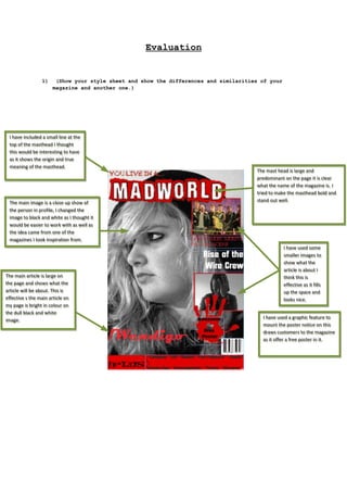
- 1. Evaluation 1) (Show your style sheet and show the differences and similarities of your magazine and another one.) II have included a small line at the have included a small line at the top of the masthead II thought top of the masthead thought this would be interesting to have this would be interesting to have as it shows the origin and true as it shows the origin and true meaning of the masthead. meaning of the masthead. The main image is a close up show of The main image is a close up show of the person in profile, II changed the the person in profile, changed the image to black and white as II thought it image to black and white as thought it would be easier to work with as well as would be easier to work with as well as the idea came from one of the the idea came from one of the magazines II took inspiration from. magazines took inspiration from. The main article is large on The main article is large on the page and shows what the the page and shows what the article will be about. This is article will be about. This is effective s the main article on effective s the main article on my page is bright in colour on my page is bright in colour on the dull black and white the dull black and white image. image. The mast head is large and The mast head is large and predominant on the page it is clear predominant on the page it is clear what the name of the magazine is. II what the name of the magazine is. tried to make the masthead bold and tried to make the masthead bold and stand out well. stand out well. II have used some have used some smaller images to smaller images to show what the show what the article is about II article is about think this is think this is effective as it fills effective as it fills up the space and up the space and looks nice. looks nice. II have used a graphic feature to have used a graphic feature to mount the poster notice on this mount the poster notice on this draws customers to the magazine draws customers to the magazine as it offer a free poster in it. as it offer a free poster in it.
- 2. There is a header bar; my magazine There is a header bar; my magazine does not have a header bar as II does not have a header bar as thought it was not necessary. thought it was not necessary. The masthead is large The masthead is large and predominant and and predominant and takes the top of the takes the top of the page the same as my page the same as my magazine. magazine. The main image is a direct The main image is a direct mode of address unlike my mode of address unlike my magazine which is a profile magazine which is a profile shot; however both have a shot; however both have a close up shot as the main close up shot as the main image. image. The main article is large The main article is large and predominant on the and predominant on the page the same as mine page the same as mine this one is however not a this one is however not a bright colour but it bright colour but it stands out none the less. stands out none the less. There is a “quote on this magazine as There is a “quote on this magazine as well the same as mine. It shows like well the same as mine. It shows like a saying of the week much like my a saying of the week much like my magazine. magazine. This magazine also This magazine also includes a free poster in it includes a free poster in it the same as mine. the same as mine. This magazine also has smaller This magazine also has smaller images to highlight the articles images to highlight the articles that are in the magazine. This that are in the magazine. This magazine has a right third the magazine has a right third the same as my magazine. same as my magazine. This magazine also has a This magazine also has a section showing what else the section showing what else the magazine includes. magazine includes. In general both magazines are quite similar although there is a definite difference in style and colour the layout is quite similar on both. That can be expected as the Kerrang magazine was used as inspiration.