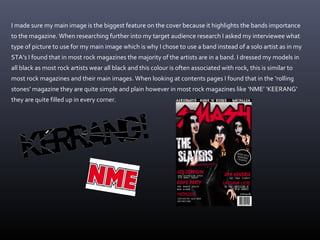
The student analyzed several rock magazines to inform the design of their own magazine. They used a dark color scheme and bold masthead like rock magazines. Fonts and headlines were styled similarly to draw attention. While the student kept the contents page simple against conventions, they included repeated elements like issue numbers found on covers. The double page spread featured an article and outdoor band photo, matching conventions from analyzed magazines. The student drew from real magazines to both conform to and experiment with genre conventions in their own media product.