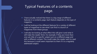
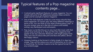
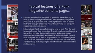
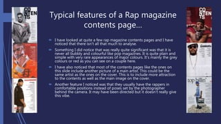
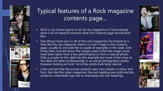
Form Research –
Contents Page
By Cerys Mee
Typical Features of a contents
page.
 I have actually noticed that there is a big range of different
features in a contents page. Each feature depends on the type of
magazine.
 I will be looking at the different features for a variety of different
types of magazines to see what I can find in a bunch of
magazines from these groups.
 I will also be looking at what effect this will give it and what it
will make the reader think. For example, if they put more than
one sub-title of a specific subject just on a different page and
with a different context. This could make the reader want to read
this because it could seem important to them if it is a regularly
addressed subject.
Typical features of a Pop magazine
contents page…
 I noticed quite significant features of a pop magazine. You can
already tell some of the differences between these contents
pages and for example a fashion magazine.
 One of the main features is that it is a lot more colourful than
most magazines. Of course ‘pop’ has many different meanings in
terms of art. You can think of a lot when thinking about ‘pop’. In
the arty context, pop art is like lots of colours and bubbly
writing, very flamboyant and enthusiastic.
 Pop music is a lot like this as it is very much like music with that
certain buzz and pop to it. They put this into magazines that
appear to be very colourful, florescent, with bright poppy fonts.
They use a lot of colours like pink and blue and yellow, almost
like happy colours.
 However looking at the format it is fairly simple. It is clear but
simple. They use the colours as a sort of distraction so it’s mostly
a visual thing. For format it seems to be the typical format for
any contents page.
Typical features of a Punk
magazine contents page…
 I am not really familiar with punk in general however looking at
most punk music magazines I have a feel of the kind of style that
punk uses. It is quite dark with some slight colour on it. It is most
likely only a couple of colours. You will never really see any punk
magazines with much colour.
 I also noticed that It is usually the same kind of font. Also the text
isn’t usually more than one colour. The sub-headings are always in a
bolder font to make them stand out more and the sentences
underneath are most likely a smaller size and not in bold. You will
most likely see this in a lot of magazines of lots of different genres.
This is to make them more prominent and obvious because these
are thee things that are going to make the reader want to read that
particular page
Typical features of a Rap magazine
contents page…
 I have looked at quite a few rap magazine contents pages and I have
noticed that there isn’t all that much to analyse.
 Something I did notice that was really quite significant was that it is
never all bubbly and colourful like pop magazines. It is quite plain and
simple with very rare appearances of major colours. It’s mainly the grey
colours or red as you can see on a couple here.
 I have also noticed that most of the contents pages like the ones on
this slide include another picture of a main artist. This could be the
same artist as the ones on the cover. This is to include more attraction
to the contents as well as the main image on the cover.
 Another feature I noticed was that they usually have the rappers in
comfortable positions instead of poses set by the photographer
behind the camera. It may have been directed but it doesn’t really give
this vibe.
Typical features of a Rock magazine
contents page…
 Rock is my chosen genre to do for my magazine so I have already
done a lot of research towards what the contents page should look
like.
 One thing I have seen in all of the rock magazines I’ve looked at is
that, like the rap magazine, there is a main image in the contents
page, usually to one side like a couple of examples in this slide. One
thing I also noticed about the images used is that the image could
have been taken from a live performance or from a natural photo.
Only a couple on this slide has this example but most of the ones on
this slide are taken professionally in an actual photography studio.
However looking at most lot of the artists look fairly natural.
 I also noticed that the actual contents were very simple in colour and
font. Also like the other magazines the sub-heading was bold and the
sentence underneath was not to emphasise the sub-headings.

From research 2 - Contents Page

  • 1.
    Form Research – ContentsPage By Cerys Mee
  • 2.
    Typical Features ofa contents page.  I have actually noticed that there is a big range of different features in a contents page. Each feature depends on the type of magazine.  I will be looking at the different features for a variety of different types of magazines to see what I can find in a bunch of magazines from these groups.  I will also be looking at what effect this will give it and what it will make the reader think. For example, if they put more than one sub-title of a specific subject just on a different page and with a different context. This could make the reader want to read this because it could seem important to them if it is a regularly addressed subject.
  • 3.
    Typical features ofa Pop magazine contents page…  I noticed quite significant features of a pop magazine. You can already tell some of the differences between these contents pages and for example a fashion magazine.  One of the main features is that it is a lot more colourful than most magazines. Of course ‘pop’ has many different meanings in terms of art. You can think of a lot when thinking about ‘pop’. In the arty context, pop art is like lots of colours and bubbly writing, very flamboyant and enthusiastic.  Pop music is a lot like this as it is very much like music with that certain buzz and pop to it. They put this into magazines that appear to be very colourful, florescent, with bright poppy fonts. They use a lot of colours like pink and blue and yellow, almost like happy colours.  However looking at the format it is fairly simple. It is clear but simple. They use the colours as a sort of distraction so it’s mostly a visual thing. For format it seems to be the typical format for any contents page.
  • 4.
    Typical features ofa Punk magazine contents page…  I am not really familiar with punk in general however looking at most punk music magazines I have a feel of the kind of style that punk uses. It is quite dark with some slight colour on it. It is most likely only a couple of colours. You will never really see any punk magazines with much colour.  I also noticed that It is usually the same kind of font. Also the text isn’t usually more than one colour. The sub-headings are always in a bolder font to make them stand out more and the sentences underneath are most likely a smaller size and not in bold. You will most likely see this in a lot of magazines of lots of different genres. This is to make them more prominent and obvious because these are thee things that are going to make the reader want to read that particular page
  • 5.
    Typical features ofa Rap magazine contents page…  I have looked at quite a few rap magazine contents pages and I have noticed that there isn’t all that much to analyse.  Something I did notice that was really quite significant was that it is never all bubbly and colourful like pop magazines. It is quite plain and simple with very rare appearances of major colours. It’s mainly the grey colours or red as you can see on a couple here.  I have also noticed that most of the contents pages like the ones on this slide include another picture of a main artist. This could be the same artist as the ones on the cover. This is to include more attraction to the contents as well as the main image on the cover.  Another feature I noticed was that they usually have the rappers in comfortable positions instead of poses set by the photographer behind the camera. It may have been directed but it doesn’t really give this vibe.
  • 6.
    Typical features ofa Rock magazine contents page…  Rock is my chosen genre to do for my magazine so I have already done a lot of research towards what the contents page should look like.  One thing I have seen in all of the rock magazines I’ve looked at is that, like the rap magazine, there is a main image in the contents page, usually to one side like a couple of examples in this slide. One thing I also noticed about the images used is that the image could have been taken from a live performance or from a natural photo. Only a couple on this slide has this example but most of the ones on this slide are taken professionally in an actual photography studio. However looking at most lot of the artists look fairly natural.  I also noticed that the actual contents were very simple in colour and font. Also like the other magazines the sub-heading was bold and the sentence underneath was not to emphasise the sub-headings.