The document discusses what the author learned from their preliminary college magazine task to their final production. Some key lessons learned included using professional lighting techniques, varying fonts and colors for visual interest, choosing unique and identifying masthead fonts, using different shot types to establish subjects and genres, and manipulating photos for higher quality. The author also learned about including appealing and interesting journalism, contents page layout conventions, and house style considerations like using complementary yet contrasting colors. Overall, the author felt they gained valuable knowledge around fonts, color schemes, and journalism to create a more professional-looking magazine.
Acetabularia Information For Class 9 .docxvaibhavrinwa19
Acetabularia acetabulum is a single-celled green alga that in its vegetative state is morphologically differentiated into a basal rhizoid and an axially elongated stalk, which bears whorls of branching hairs. The single diploid nucleus resides in the rhizoid.
The French Revolution, which began in 1789, was a period of radical social and political upheaval in France. It marked the decline of absolute monarchies, the rise of secular and democratic republics, and the eventual rise of Napoleon Bonaparte. This revolutionary period is crucial in understanding the transition from feudalism to modernity in Europe.
For more information, visit-www.vavaclasses.com
2024.06.01 Introducing a competency framework for languag learning materials ...Sandy Millin
http://sandymillin.wordpress.com/iateflwebinar2024
Published classroom materials form the basis of syllabuses, drive teacher professional development, and have a potentially huge influence on learners, teachers and education systems. All teachers also create their own materials, whether a few sentences on a blackboard, a highly-structured fully-realised online course, or anything in between. Despite this, the knowledge and skills needed to create effective language learning materials are rarely part of teacher training, and are mostly learnt by trial and error.
Knowledge and skills frameworks, generally called competency frameworks, for ELT teachers, trainers and managers have existed for a few years now. However, until I created one for my MA dissertation, there wasn’t one drawing together what we need to know and do to be able to effectively produce language learning materials.
This webinar will introduce you to my framework, highlighting the key competencies I identified from my research. It will also show how anybody involved in language teaching (any language, not just English!), teacher training, managing schools or developing language learning materials can benefit from using the framework.
Introduction to AI for Nonprofits with Tapp NetworkTechSoup
Dive into the world of AI! Experts Jon Hill and Tareq Monaur will guide you through AI's role in enhancing nonprofit websites and basic marketing strategies, making it easy to understand and apply.
Biological screening of herbal drugs: Introduction and Need for
Phyto-Pharmacological Screening, New Strategies for evaluating
Natural Products, In vitro evaluation techniques for Antioxidants, Antimicrobial and Anticancer drugs. In vivo evaluation techniques
for Anti-inflammatory, Antiulcer, Anticancer, Wound healing, Antidiabetic, Hepatoprotective, Cardio protective, Diuretics and
Antifertility, Toxicity studies as per OECD guidelines
Macroeconomics- Movie Location
This will be used as part of your Personal Professional Portfolio once graded.
Objective:
Prepare a presentation or a paper using research, basic comparative analysis, data organization and application of economic information. You will make an informed assessment of an economic climate outside of the United States to accomplish an entertainment industry objective.
Unit 8 - Information and Communication Technology (Paper I).pdfThiyagu K
This slides describes the basic concepts of ICT, basics of Email, Emerging Technology and Digital Initiatives in Education. This presentations aligns with the UGC Paper I syllabus.
June 3, 2024 Anti-Semitism Letter Sent to MIT President Kornbluth and MIT Cor...Levi Shapiro
Letter from the Congress of the United States regarding Anti-Semitism sent June 3rd to MIT President Sally Kornbluth, MIT Corp Chair, Mark Gorenberg
Dear Dr. Kornbluth and Mr. Gorenberg,
The US House of Representatives is deeply concerned by ongoing and pervasive acts of antisemitic
harassment and intimidation at the Massachusetts Institute of Technology (MIT). Failing to act decisively to ensure a safe learning environment for all students would be a grave dereliction of your responsibilities as President of MIT and Chair of the MIT Corporation.
This Congress will not stand idly by and allow an environment hostile to Jewish students to persist. The House believes that your institution is in violation of Title VI of the Civil Rights Act, and the inability or
unwillingness to rectify this violation through action requires accountability.
Postsecondary education is a unique opportunity for students to learn and have their ideas and beliefs challenged. However, universities receiving hundreds of millions of federal funds annually have denied
students that opportunity and have been hijacked to become venues for the promotion of terrorism, antisemitic harassment and intimidation, unlawful encampments, and in some cases, assaults and riots.
The House of Representatives will not countenance the use of federal funds to indoctrinate students into hateful, antisemitic, anti-American supporters of terrorism. Investigations into campus antisemitism by the Committee on Education and the Workforce and the Committee on Ways and Means have been expanded into a Congress-wide probe across all relevant jurisdictions to address this national crisis. The undersigned Committees will conduct oversight into the use of federal funds at MIT and its learning environment under authorities granted to each Committee.
• The Committee on Education and the Workforce has been investigating your institution since December 7, 2023. The Committee has broad jurisdiction over postsecondary education, including its compliance with Title VI of the Civil Rights Act, campus safety concerns over disruptions to the learning environment, and the awarding of federal student aid under the Higher Education Act.
• The Committee on Oversight and Accountability is investigating the sources of funding and other support flowing to groups espousing pro-Hamas propaganda and engaged in antisemitic harassment and intimidation of students. The Committee on Oversight and Accountability is the principal oversight committee of the US House of Representatives and has broad authority to investigate “any matter” at “any time” under House Rule X.
• The Committee on Ways and Means has been investigating several universities since November 15, 2023, when the Committee held a hearing entitled From Ivory Towers to Dark Corners: Investigating the Nexus Between Antisemitism, Tax-Exempt Universities, and Terror Financing. The Committee followed the hearing with letters to those institutions on January 10, 202
Francesca Gottschalk - How can education support child empowerment.pptxEduSkills OECD
Francesca Gottschalk from the OECD’s Centre for Educational Research and Innovation presents at the Ask an Expert Webinar: How can education support child empowerment?
Synthetic Fiber Construction in lab .pptxPavel ( NSTU)
Synthetic fiber production is a fascinating and complex field that blends chemistry, engineering, and environmental science. By understanding these aspects, students can gain a comprehensive view of synthetic fiber production, its impact on society and the environment, and the potential for future innovations. Synthetic fibers play a crucial role in modern society, impacting various aspects of daily life, industry, and the environment. ynthetic fibers are integral to modern life, offering a range of benefits from cost-effectiveness and versatility to innovative applications and performance characteristics. While they pose environmental challenges, ongoing research and development aim to create more sustainable and eco-friendly alternatives. Understanding the importance of synthetic fibers helps in appreciating their role in the economy, industry, and daily life, while also emphasizing the need for sustainable practices and innovation.
Instructions for Submissions thorugh G- Classroom.pptxJheel Barad
This presentation provides a briefing on how to upload submissions and documents in Google Classroom. It was prepared as part of an orientation for new Sainik School in-service teacher trainees. As a training officer, my goal is to ensure that you are comfortable and proficient with this essential tool for managing assignments and fostering student engagement.
Instructions for Submissions thorugh G- Classroom.pptx
Evaluation question7
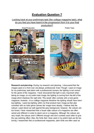
1. Evaluation Question 7
Looking back at your preliminary task (the college magazine task), what
do you feel you have learnt in the progression from it to your final
production?
Final Production Prelim Task
Research and planning- During my research and planning, i discovered that the
images used on a front over are always professional. Even Though i used an image
for my preliminary task taken with a professional camera, the lighting is not correct
for the genre of the magazine. I have discovered that light is very important when
taking an image; on my prelim task image, the lighting is coming from the left of the
image which shadows the right side. This would often connote with a rock genre
magazine; however, it is a college magazine therefore the lighting should have been
key lighting. I used key lighting within my final product main image as that also
connoted with an indie genre (shows the image more clearly). I believe that the
colours i used stood out well against the grey background, however, the colours are
too broad. I have researched that a house style colours of a magazine are often
varied and different in order to stand out on a magazine. Although the colours are
very bright, the colours aren’t different enough and don’t contrast each other to give
the eye catching effect. Also, the fonts that i have used in my prelim task are far too
boring. I researched that on professional magazines, plain fonts are often used as
2. sell lines. I used very plain sans serif fonts all across my college magazine which
obviously doesn’t make the magazine interesting. Therefore, after i researched a lot
of different magazines, i realised that in order to have a professional looking
magazine, you need a variation of interesting and plain fonts.
Mastheads- The masthead i used for my college prelim magazine task was very
bold and large. I have discovered throughout my
research that this is typical for a lot of
magazines. However, the masthead font is too
plain. The sans serif font is seen a lot as it is a
popular font. Professional magazines often use a
unique font in order to attract the audience, but to also give that
magazine a specific identity thus making it more well known.
The font i used doesn’t have that appeal as it is very boring.
That is why, for my final product masthead, i used a unique font
as it will furthermore give the magazine some identity but will also be easier to
identify what magazine it is. Moreover, the colour of the prelim masthead is too
similar to the background colour. Even though the background is grey and the
masthead colour is blue, the colours don’t contrast against each other enough to
become eye catching. Therefore, for my final product masthead, i used the colour
yellow as it stands out against the grey background and makes the magazine easy
to identify.
Titles and headings- I used a variation of different
headings and titles for my preliminary task as i had
already seen a range of different magazines. However, my
titles, headings and sell lines are very boring and lack
interest especially for the spectator. Therefore, i
researched a lot of different magazines to get a clear
idea of what sell lines, titles and headings usually look
like in order to appeal and interest the audience.
Furthermore, for my final product, i used different fonts
and colours for my sell lines (all included in my house
style) to attract the eye of my audience. Whereas, even
though i used a range of different colours i didn’t choose different fonts. Overall i
have learnt that a range of different fonts and colours can make my magazine look
more appealing and professional.
Shot type- In my college magazine, i used a mid-shot for my image as i had already
seen magazines that showed the subject from the waist up, especially of magazine
front covers (however i didn’t know it was called a mid-shot until i researched it).
Therefore, i was quite pleased with the main image for my preliminary task as it was
my first attempt at creating a magazine cover. Moreover, i also used a mid-shot for
my image on my final product as i researched and discovered that a mid-shot is
3. often to establish the subject and the genre of the magazine. For my magazine
contents page i used a candid image which was at a long shot to get the whole body
on the subject. I did this to establish the subject and the genre. Also, my double page
spread image is a long shot to establish the surroundings and the subject too, this
would present the genre, subject and the implication of what type of person the
subject is. I researched this from other magazines and shot types.
Spotlights and Footers- Spotlights and footers often present the implication of
professionalism and interest. I used both
on my prelim college magazine, as again
i had viewed magazines in the
past that had these details.
However, mine are very boring
and lack ability to interest. Even
Though the colours contrast well to catch the eye of the audience, the font and the
use of a simple white and blue/yellow just makes the magazine very bland.
Consequently, i decided to look further into my research to find the right idea to add
to my magazine and to make it interesting. I found that the more different the font
and colours, the more outstanding they would be.
Colour Scheme- For my prelim task, my college magazine front cover had 6
different colours; Yellow, white, black, red, orange and blue. Although the magazine
has a variation of colours, some of them such as; orange, red and yellow don’t
contrast against each other enough. Therefore the house style of my magazine was
far too broad. Therefore, I only used 5 colours for my final product;
red,white,black,yellow and blue. I still believe that this is a wide variety of colours,
however they all compliment each other well by contrasting and becoming eye
catching. I learnt that the more contrast within the colours, the more they will stand
out.
Puff- I used a puff on both projects, on the other hand, i have to admit that the prelim
college magazine’s puff doesn’t stand out well and is pretty plain. Therefore, i
decided to use contrasting colours and a more bold font in order to
become eye catching.
Images on contents page- Even Though I only made a prelim mock
up contents page, i had a clear idea of where i would have presented
my image if i had more time to create it. The
image would have been placed at the right
side of the page. However, for my final product
my images is on the left hand side of the page
as due to my research, i noticed that a large
percent of magazine contents pages involved
an image on the left hand side.
4. Journalism- The journalism between both of my magazines has changed quite
dramatically. For my prelim task i didn’t have a clear idea of what would be placed as
information on the front of a college magazine, furthermore, that is why the text is so
tedious. On the contrary, for my final product, i had a lot of time to research and look
into real magazines to see what kind of information is presented throughout a music
magazine. Therefore, i learnt what would be interesting and appealing to a real
audience.
Photo manipulation- For my prelim task, i didn’t use any kind of photo manipulation
because i didn’t believe the image to need any. In contrast, i manipulated all three of
my images for my cover page, contents page and double page spread. I took away
the blemishes on the subjects face, but also sharpened them to look of a higher
quality. With my contents and double page spread, i also increased the brightness
and contrast in order to make the images stand out more as they weren’t taken with
a professional camera.
Locations- My main images for my college magazine was taken in a studio, which is
also the same location of my final product front cover image. The contents page and
double page spread both had outside locations to establish the genre. Therefore
making my magazine look professional.
Overall, i have learnt quite a lot in order to create a magazine to look professional
and presentable. The main thing i learnt overall, was the fonts and the colour
scheme as that plays a huge part in the presentation of the magazine. However i
may also argue that journalism was also a large learning curve for me as it was the
hardest part of creating my magazine.