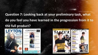
1. Question 7: Looking back at your preliminary task, what
do you feel you have learned in the progression from it to
the full product?
2. Development- Font scheme
I developed my use of font because as we can see, in my college
magazine I did not follow the rule of maximum 3 fonts being used.
One of the biggest mistakes I made was having a different font for
‘Contents’ because it did not look like it was part of the front cover.
However, In my music magazine, after experience I figured out that
using the same/similar font would look a lot more special so I used
the same font without the spikes. Also, the font of the skyline
matched the font I used throughout the magazine. However the
skyline font on my college magazine was a completely different font
compared to the rest of the magazine. In addition, as we can see
the word ‘STYLE’ covers the models head in my college magazine. I
believe not having any writings covering the models face made my
music magazine look a lot more professional. Overall I learnt that
using more than 3 fonts made my college magazine look
unprofessional whereas using less than 3 made my music
magazine look a lot more put together and more professional.
3. Development- Photography
I developed my photography skills because as we can see, in the first image the
model looks like a typical person that I stopped in the college to take a picture of
however in the second picture we can see there is a lot of work behind it for the
picture to come out looking professional to that extent. The reason the first image
does not have a great quality is because it was taken on an IPhone 6, whereas the
second image was taken using a DSLR Canon Camera. The quality plays an
important role as many people just look at the visually pleasing images before
picking up a magazine. Also, I did not do any touch ups to the first image which I
used in my college magazine however I completely transformed the second image
by adding tattoos, piercings, and different clothing including a light leak on top for it
to suit the colour scheme of my magazine. In addition, as we can see my model
looks like she was forced to smile and this is because the surrounding area was not
a professional place as the image was taken in front of a wall. I developed my
photography skills as for my college magazine I was in a studio allowing me to take
an image using a white drop. Also, the models facial expressions and body
language was planned and looks professional because it reflects the genre and it
does not look forced because it looks natural whereas the college magazine image
looks forced.
4. Development- Colour Scheme
I developed my colour scheme because in my preliminary task, I did
not know about the colors that complemented each other however
when starting my music magazine I was taught a website called
color.adobe.com which showed colours that complemented
eachtoher. It was very easy to pick the two colours I decided to use
for my magazine which were yellow and purple. However for my
college magazine I used 3 different shades of blue along with the
colour orange/red for the puff. This made my college magazine look
messy and it was lacking in professionalism. The clothing of the
model in my magazine had to complement the colour scheme, and
whilst taking the image for my college magazine I was not organised
which meant I had to take the picture regardless of what the model
was wearing. As she was wearing blues, my colour scheme had to
include different shades of blue too. However as my music magazine
photoshoot was organised, I was able to pick the clothing and I
decided to go for the colour black as it goes with many colours
including the fact that it significantly reflects my genre.
5. Development- Layout
As we can see, the layout of my music magazine is very
similar because I was inspired by the case studies that I
looked at. I was inspired by both RockSound and Kerrang!
magazine which means I not only got inspiration but I also
changed some of the parts to make it looks even more
professional like changing where the band names were
written. However for my college magazine I had to make it
up myself and it looks very amateor. The cover lines are
placed anywhere and the puff/flash looks very out of place.
However for my music magazine I was able to get a puff
and place it in an appropriate place. In addition the
placement of the barcode, date and the price also looks out
of space in my college magazine whereas in my music
magazine it almost looks hidden because there are a lot of
things going on the front cover which is a good thing as the
price wouldn’t be as eye-catching and the customers
wouldn’t notice it straight away.
?
6. Overall...
I have learnt a lot as I changed many things in my music magazine.
I made sure the puff/flash on the front cover looked a lot more eye-
catching for it to attract many customers, I changed the layout of my
magazine and made my music magazine look a lot more
professional. I made sure I was following the rule of using maximum
3 colours for the magazine and also maximum of 3 different fonts to
ensure the magazine was significantly high is professionalism. I
also went from taking amateur images to taking HQ images for my
magazine to be visually pleasing, use lively colours to not make my
magazine simple and boring and made many other small changed
which made a big difference.