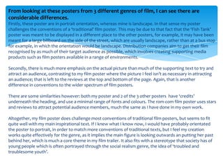
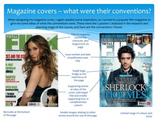
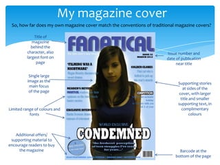
1) The film poster and magazine cover created by the student follow many conventions of real media products in their genres. Both utilize a limited color palette, minimal fonts, and emphasize key information like the title and credits.
2) However, the film poster challenges some conventions by having a landscape orientation rather than portrait. The magazine cover is also missing smaller supplementary images around the border.
3) Overall, the student's work fits conventions well through techniques like central images, supporting information placement, and technical design choices. But some conventions from a wider range of examples were not incorporated.