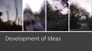
2. Front Cover
For the development of my album front cover, I took a mid-shot of the main
protagonist and ensured the lighting was low key, naturalistic and minimal in order to
create the effect of a silhouette. This idea of silhouette's and low key lighting was
coherent across all of my print productions, it is further reinforced through the dark
and bare trees resembling the decay of nature. Although this photograph connotes
sadness, loneliness and longing; I feel it also shows glimpses of prosperity and hope,
shown through the yellow sky. As much as I wanted the initial emotions to be
displayed, I also wanted to amplify the positive feelings.
In order to follow a key theme of which I raise within my production, one of
disorientation after fractured and fragmented relationships, I used Photoshop to
create various layers of the same image. By adding layers and positioning them slightly
to the right and left of the original image; a fractured look is seen. As well as this I
increased the Brightness and Hue/Saturation of the image, this allowed me to
emphasize the yellow sky and further add to the distorted nature of the piece.
For the text, I chose to use two opposing colours; firstly to reinforce symbolism of
chess with black vs white, and the connotations the colours hold. Secondly, as the
contrast of black to white allows it to stand out more, whilst still having a distant
quality to it and fading into the background.
3. Inside Cover
For my inside cover, I knew I wanted to continue to reinforce the theme of distortion
and follow the conventions and features of the Psychedelic art movement that
influenced my design. Compared to the front cover, this panel underwent a large
amount of change and alteration. I wanted to create a frenzy of colours that would
suggest a fragmented and fractured individual after the breakdown of a relationship.
By once again featuring the protagonist and maintaining a sustained and coherent
image through synergy. Furthermore, I followed various similar features to that of the
front cover, such as a naturalistic setting – of which can be seen in all areas of my
production to comply with Indie genre conventions, and a mid-shot displaying the
protagonist in a distant and indirect manner.
In terms of the developments made in Photoshop on this image, I once again used
layers to create distortion and fragmentation, holding metaphorical meaning of a
former self. Then, I increased the brightness to create a mirror type piece and amplify
the reflective nature of the picture through the water and sharp sky.
Too align with the Psychedelic art influence, and to further exemplify the emotions
conveyed in the music and image, I played around with the Hue/Saturation, thusly
exposing the greens and purples of the picture and dramatically increasing the idea of
a breakdown in structure and fragmentation.
4. Inside Back Cover
For my inside back cover, I further explored this
distorted and fragmented style. Rather than
choosing another shot of the male protagonist, I
wanted my inside back cover to be purely
naturalistic and be a setting shot. As seen from the
screenshot in the bottom right, to begin with the
shot was simple, basic and not eye catching.
However, it did lay the basis for the developments I
made throughout. By gradually building up layers
with different levels of Hue/Saturation, I was able to
have sharp purples, deep greens and browns then
have sparks of yellow. These certain developments
helped me dive into the fantastical world created by
the music and narrative; as well as maintaining
synergy. The next development of this panel, was
the most significant as it challenges any typical
conventions commonly seen. I created a distorted
effect by taking parts of the photo and employing
them in other areas.
5. Back Cover
For my back cover, I wanted, similarly to that of the panel prior, to choose a purely
setting shot, as this is a large part of typical indie conventions. I wanted to maintain
synergy across my pieces, and ensure a cohesive product was produced; so I followed
the similar colour scheme created through adjusting the Hue/Saturation. A pink sky
was incorporated through this adjustment, paying reference to its connotations of
love and beauty. The common theme across all my panels is this decaying of nature,
but the sheer beauty within this decay. Overall, I feel I followed a very aesthetic and
photogenic style for my album covers and the back cover is no exception. For this
panel, I didn't feel there was a whole lot to change, other than the Hue/Saturation.
This was due to the fact I wanted a minimal style to mirror the minimalistic and
simplicity of the text on the album back cover.
6. Magazine Advert
The magazine advert is crucial, it has to be captivating, eye catching and
clear. I chose to use a very similar picture as my front cover, to maintain
synergy and a cohesive image through the integration of the male
protagonist once again. This design, although simple to some extent, does
hold properties of complexity and innovation. My hardest task was to resize
the image into the poster template; however my image was completely off
proportions. So, I mirrored the top of the image, copied and pasted it at the
top of the template. This worked tremendously as it gave it a fragmented
look but maintained a slick and clear design. The colour scheme was similar
to the panels prior, easily done through adjusting the Hue/Saturation once
again. The gap at the bottom of the picture proved perfect for the
information of the album to sit nicely without hassle.
I integrated the social media pages of Choose Wisely down at the bottom, as
social media is a huge part of the marketing plan for indie artists, as this is
how their demographics are targeted. As well as a review from NME and
Mojo Magazine, both whom write commonly about this style of music.