What have you learned from
your audience feedback?
My target audience
• To gain accurate audience feedback and to be able to
accurately pitch my promotional package, I needed to
establish an accurate target audience. I did this through
both primary and secondary research.
• I established that the male/female balance is slightly female
biased and roughly 16-24 years of age.
• This told me that when seeking audience feedback, ideally it
needed to be from both males and females of 16-24 years
old. My class peers fitted this demographic and thus
frequent and accurate audience feedback was both quick
and easy to obtain.
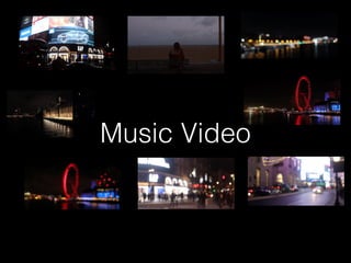
Music Video
Hot Desking
• Following the first edit of my music video I
asked my audience a number of questions
relating to the pace of the editing of my
video. At this point it was of slight concern
to me and I felt it was vital to have some
feedback on it viewed through someone
else’s eyes.
• Following this feedback, I decided on
reshooting as the feedback suggested to
me that I was lacking in footage.
• A benefit to hot desking is that the
feedback is anonymous and thus I would
expect it to be more critical than other
forms of gaining feedback such as a
viewing in front of peers.
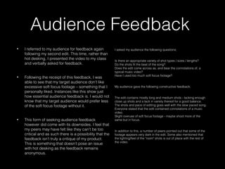
Audience Feedback
• I referred to my audience for feedback again
following my second edit. This time, rather than
hot desking, I presented the video to my class
and verbally asked for feedback.
• Following the receipt of this feedback, I was
able to see that my target audience don’t like
excessive soft focus footage – something that I
personally liked. Instances like this show just
how essential audience feedback is. I would not
know that my target audience would prefer less
of the soft focus footage without it.
• This form of seeking audience feedback
however did come with its downsides. I feel that
my peers may have felt like they can’t be too
critical and as such there is a possibility that the
feedback isn’t truly a critique of my product.
This is something that doesn’t pose an issue
with hot desking as the feedback remains
anonymous.
I asked my audience the following questions;
Is there an appropriate variety of shot types / sizes / lengths? 
Do the shots fit the beat of the song?
Does the edit come across as, and bear the connotations of, a
typical music video?
Have I used too much soft focus footage?
My audience gave the following constructive feedback;
The edit contains mostly long and medium shots - lacking enough
close up shots and a lack in variety thereof for a good balance.
The shots and pace of editing goes well with the slow paced song.
Everyone stated that the edit contained connotations of a music
video.
Slight overuse of soft focus footage - maybe shoot more of the
same but in focus.
In addition to this, a number of peers pointed out that some of the
footage appears very dark in the edit. Some also mentioned that
the lighting/feel of the "room" shots is out of place with the rest of
the video.
Digipak & Advert
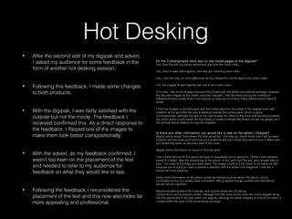
Hot Desking
• After the second edit of my digipak and advert,
I asked my audience for some feedback in the
form of another hot desking session.
• Following this feedback, I made some changes
to both products.
• With the digipak, I was fairly satisfied with the
outside but not the inside. The feedback I
received confirmed this. As a direct response to
the feedback, I flipped one of the images to
make them look better compositionally.
• With the advert, as my feedback confirmed, I
wasn’t too keen on the placement of the text
and needed to refer to my audience for
feedback on what they would like to see.
• Following the feedback I reconsidered the
placement of the text and this now also looks far
more appealing and professional.
Do the 3 photographs work well on the inside pages of the digipak?
Yes, they link with the album advert and also with the music video.
Yes, they fit really well together, like they are ‘mirroring’ each other.
Yes, I feel that they do work effectively as this follows the overall style in the music video.
Yes, the images fit well together and link to the music video.
It’s lovely. I like all the images because they fit well with the whole promotional package. However,
the two side images on the inside could be changed. I feel like there should be a variety of
different pictures inside. Even if you just put a close up of his face, that’s different and makes it
better.
I think the images on the left panel and the centre panel on the inside of the digipak work well
together as the girl looks like she is walking towards the centre panel, which is good
compositionally, although the one on the right breaks the effect of the brick wall travelling towards
the centre panel (could easily flip the image to create a triangle like shape, as well as appear as if
the girl has almost walked through the digipak).
Is there any other information you would like to see on the advert / Digipak?
Maybe add a visual circle where the disk would be – this way you would know how it will be layer
properly and because you’ll see how your audience will see it when they want to buy it. Make sure
you repeat the spine on the other side of the cover.
Maybe some information on where to find the artist.
I don’t think the font fits the genre and type of digipak/ad you’re going for. I think a serif typeface
would fit it better. Also the positioning on the advert of the “we’ll light the sky” and release date is
poor. Too close to the edge and feels slack. The image could be a bit closer to the figure as well
because you’re trying to catch a person’s attention with the advert in a magazine. I feel like it
should be more personal.
Some more information on the advert would be needed such as where the album can be
purchased as this is a widely used convention. Also a layered image of where the disk will be
placed will be important.
Maybe something about the musician and a circle where the CD will go.
I would like to see a properly written message from the artist on the inner first of the digipak along
with the placement of the disc within the digipak, although the basic imagery is nice for the effect it
creates within the style of the promotional package
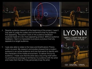
• Despite audience research at the beginning of the project, I wasn’t
fully able to judge the codes and conventions that my audience
find appealing. The action I took on the audience feedback
received made for a far more appealing product. Without audience
feedback, I feel it is impossible to produce a product that fully
appeals to a target audience.
• I was also able to relate to the Uses and Gratifications Theory
within my work. My research and studies showed that a modern
audience is an active audience and one that wants to identify with
the characters of the media environment. To deliver this to my
audience, I made sure that the artist was a recurring motif within
my promotional package to familiarise my audience with the artist
and make them feel as if they personally know the artist.

Evaluation Q3

  • 1.
    What have youlearned from your audience feedback?
  • 2.
    My target audience •To gain accurate audience feedback and to be able to accurately pitch my promotional package, I needed to establish an accurate target audience. I did this through both primary and secondary research. • I established that the male/female balance is slightly female biased and roughly 16-24 years of age. • This told me that when seeking audience feedback, ideally it needed to be from both males and females of 16-24 years old. My class peers fitted this demographic and thus frequent and accurate audience feedback was both quick and easy to obtain.
  • 3.
  • 4.
    Hot Desking • Followingthe first edit of my music video I asked my audience a number of questions relating to the pace of the editing of my video. At this point it was of slight concern to me and I felt it was vital to have some feedback on it viewed through someone else’s eyes. • Following this feedback, I decided on reshooting as the feedback suggested to me that I was lacking in footage. • A benefit to hot desking is that the feedback is anonymous and thus I would expect it to be more critical than other forms of gaining feedback such as a viewing in front of peers.
  • 5.
    Audience Feedback • Ireferred to my audience for feedback again following my second edit. This time, rather than hot desking, I presented the video to my class and verbally asked for feedback. • Following the receipt of this feedback, I was able to see that my target audience don’t like excessive soft focus footage – something that I personally liked. Instances like this show just how essential audience feedback is. I would not know that my target audience would prefer less of the soft focus footage without it. • This form of seeking audience feedback however did come with its downsides. I feel that my peers may have felt like they can’t be too critical and as such there is a possibility that the feedback isn’t truly a critique of my product. This is something that doesn’t pose an issue with hot desking as the feedback remains anonymous. I asked my audience the following questions; Is there an appropriate variety of shot types / sizes / lengths?  Do the shots fit the beat of the song? Does the edit come across as, and bear the connotations of, a typical music video? Have I used too much soft focus footage? My audience gave the following constructive feedback; The edit contains mostly long and medium shots - lacking enough close up shots and a lack in variety thereof for a good balance. The shots and pace of editing goes well with the slow paced song. Everyone stated that the edit contained connotations of a music video. Slight overuse of soft focus footage - maybe shoot more of the same but in focus. In addition to this, a number of peers pointed out that some of the footage appears very dark in the edit. Some also mentioned that the lighting/feel of the "room" shots is out of place with the rest of the video.
  • 6.
  • 7.
    Hot Desking • Afterthe second edit of my digipak and advert, I asked my audience for some feedback in the form of another hot desking session. • Following this feedback, I made some changes to both products. • With the digipak, I was fairly satisfied with the outside but not the inside. The feedback I received confirmed this. As a direct response to the feedback, I flipped one of the images to make them look better compositionally. • With the advert, as my feedback confirmed, I wasn’t too keen on the placement of the text and needed to refer to my audience for feedback on what they would like to see. • Following the feedback I reconsidered the placement of the text and this now also looks far more appealing and professional. Do the 3 photographs work well on the inside pages of the digipak? Yes, they link with the album advert and also with the music video. Yes, they fit really well together, like they are ‘mirroring’ each other. Yes, I feel that they do work effectively as this follows the overall style in the music video. Yes, the images fit well together and link to the music video. It’s lovely. I like all the images because they fit well with the whole promotional package. However, the two side images on the inside could be changed. I feel like there should be a variety of different pictures inside. Even if you just put a close up of his face, that’s different and makes it better. I think the images on the left panel and the centre panel on the inside of the digipak work well together as the girl looks like she is walking towards the centre panel, which is good compositionally, although the one on the right breaks the effect of the brick wall travelling towards the centre panel (could easily flip the image to create a triangle like shape, as well as appear as if the girl has almost walked through the digipak). Is there any other information you would like to see on the advert / Digipak? Maybe add a visual circle where the disk would be – this way you would know how it will be layer properly and because you’ll see how your audience will see it when they want to buy it. Make sure you repeat the spine on the other side of the cover. Maybe some information on where to find the artist. I don’t think the font fits the genre and type of digipak/ad you’re going for. I think a serif typeface would fit it better. Also the positioning on the advert of the “we’ll light the sky” and release date is poor. Too close to the edge and feels slack. The image could be a bit closer to the figure as well because you’re trying to catch a person’s attention with the advert in a magazine. I feel like it should be more personal. Some more information on the advert would be needed such as where the album can be purchased as this is a widely used convention. Also a layered image of where the disk will be placed will be important. Maybe something about the musician and a circle where the CD will go. I would like to see a properly written message from the artist on the inner first of the digipak along with the placement of the disc within the digipak, although the basic imagery is nice for the effect it creates within the style of the promotional package
  • 8.
    • Despite audienceresearch at the beginning of the project, I wasn’t fully able to judge the codes and conventions that my audience find appealing. The action I took on the audience feedback received made for a far more appealing product. Without audience feedback, I feel it is impossible to produce a product that fully appeals to a target audience. • I was also able to relate to the Uses and Gratifications Theory within my work. My research and studies showed that a modern audience is an active audience and one that wants to identify with the characters of the media environment. To deliver this to my audience, I made sure that the artist was a recurring motif within my promotional package to familiarise my audience with the artist and make them feel as if they personally know the artist.