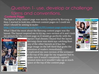
SlideShare a Scribd company logo
In what ways does your media product use,
develop or challenge forms and conventions of
real media products?
Throughout my magazine I tried to used a variety of generic
conventions. I learnt and experimented with these conventions
whilst completing my Codes and Conventions task at the start of
the year: http://j4k360.blogspot.co.uk/2014/10/c-task.html
I looked further into codes and conventions by looking
at magazines that cover the genre of music that I will
look into to see how they used the codes and
conventions:
http://j4k360.blogspot.co.uk/2014/09/magazine-front-
cover.html
Front Cover:
When making my front cover I tried to include as
many codes and conventions that I could. The
conventions that I have included have been
highlighted in a blue box. One of the main
conventions I used was the left third. To achieve this I
put all of my cover lines into the left portion of the
page and I have done the same with my mast head
and the cover star credit.
the decisions for the layout and design of my magazine were greatly influenced by
one of kerrangs front cover that featured Hayley Williams. I think I focused on
that in particular cover because it featured a female rock artist which was the
main focus of my magazine.
I have highlighted the similarities of my magazine and kerrangs
to show where I have got my inspiration
from. I tried to replicate the cover star
credit and how they change the font and
the font colour. If I included more text in
cover star credit I think it would have
looked more like kerrangs cover. I used
similar fonts to kerrangs cover such as the
font of the screamer at the bottom and the
top of my magazine as they are near
enough identical.
Influences:
Challenges and development:
I didn’t challenge the generic conventions of the
magazine as I was quite worried that if I did so I
would make my magazine look unprofessional and
of poor quality. I kept to all the conventions by
placing my pugs, masthead, barcode, cover star etc.
in the normal places (cover star on the right and the
cover lines, pugs etc. around it). I think by not
challenging the conventions my magazine fits in
with other magazines of the same genre as they tend
to not challenge conventions.
Contents Page:
The layout of my content page was mainly inspired by Kerrang as
they. I started to look into different content pages so I could see
what I should be aiming to make:
http://j4k360.blogspot.co.uk/2014/09/content-page-analysis.html
What I liked the most about the Kerrang content pages was the
layout. The layout inspired me to try my own version of it and i took
my picture for the content page so it would go perfectly with the
layout I had chosen. I found that the layout
Kerrang chose was more eye catching than
any of the other layouts as it has the
huge image on the left third that grabs the
attention of readers immediately.
I replicated my own version of the screamer
at the top of the page for my magazine but to
make sure it wasn’t completely copied I
rotated mine so it wouldn’t take up as much
space at the top of the content page.
Contents Page:
I kept to my house style of red, black and white, this
was quite important as all of the rock magazines
never break the house style they always keep to it
on every page. By doing the same I believe that it
made my magazine look more professional. I kept
my content page consistent with the front cover as
all of the bands that I named on my front cover I
have included in my double page spread. I also
included the cover story in the content page by
writing a quote that relates to the cover story
underneath the featuring artist. To keep the focus on
my artist I used the effects on Paint.net to make her
lipstick brighter so it would stand out. I chose for
my artist to have red lipstick so I could keep to the
house style.
Double Page Spread:
My inspiration for the layout came
from one of kerrangs double page
spread:
http://j4k360.blogspot.co.uk/2014/1
0/double-page-spread-analysis.html
I wanted my double page spread to
look similar to this because I like the
image to take up the whole right side
of the magazine so it will grab the
reader. Although I said in my blog
post that I wouldn’t include a image
on the left side of the magazine I
changed my mind because the picture
creates an effect of mystery and as it
also relates to the article directly
above the image.
I kept to the house style on my double
page spread but I feel as if I didn’t really
use black at all. My article is written in a Q
& A format. The questions are written in
red writing so they can easily be
distinguished from the rest of the text. The
Kerrang double page spread didn’t use the
Q & A style of article but with my chosen
house style and layout the question and
answer style worked better.
How does your media product represent
particular social groups?
My magazine was aimed at teenagers and young adults who enjoyed rock/Indi music. I
kept to the same target audience as kerrang (15-24)and by doing so I was able to see
how I can make my magazine to be suitable for the people I wanted
to reach:
http://j4k360.blogspot.co.uk/2014/11/target-audience_19.html
Cover Star:
My cover star “Meth” showed that she is someone
who doesn’t show a lot of her self away which is
shown by her appearance. I did this to give her a
strong female persona which reflects how young
women can be strong and independent and can
reflect how young people as a whole are also in the
same frame of mind. She always looked at the
camera and always hid her face which was exactly
the way I wanted to portray my cover star. I did this
so my cover star could relate to her target audience
as teenagers are always quite secretive and they
don’t want to share their emotions. I believe I that I
captured that look from the pictures I used as I
believe it shows the view of teenagers very well
and my target audience will be able to relate to her.
What kind of media institution might distribute
you media product why?
The genre and audience of “Hurt” magazine is very similar to the ones of Kerrang. I can
see my magazine working with a major distributer that produces magazines of the
same genre and target audience.
I researched into two major distribution
companies:
http://j4k360.blogspot.co.uk/2014/10/orga
nisation-location.html
Including IPC media
IPC distribute huge magazines such as NME and UN
CUT. But IPC only produce two music magazines and
I don’t think that they are a suitable company for my
magazine as they don’t make magazines that would
reach my target audience and match the genre of my
magazine.
The distributor I have chosen is Bauer Media Group
http://www.bauermedia.co.uk/
I have chosen them because of their wide range of magazines, including Kerrang, Q
magazine and more. I have also chosen them because they are involved in such a wide
range of media as they are involved in Magazines, Radio, Television, Mobile and online.
Hurt magazine will fit in well with them as they produce the same genre of magazines
and they are continually looking at my target audience.
Who would be the audience for your media
product?
My magazine is aimed at male and female teenagers
and young adults aged between 15-24.
I asked people between 15-24 to answer a
questionnaire that would help me with the
development of my magazine:
http://j4k360.blogspot.co.uk/2014/10/organisatio
n_21.html
The results of the questionnaire helped me to find
out how I could make my magazine appeal to my
target audience as I got the target audience to tell me
what they wanted in the magazine.
How did you attract/address your audience?
works well for teenagers as they have a lot of pressure with exams and
work so they wont have to think very hard to remember the name of the
magazine. I used the font for Hurt because my target audience chose it
when I asked them in my survey. In the survey I included a number of
fonts for my audience to choose from. I felt that the font they selected
was suitable for the magazine as its lettering is very bold and sharp. The
sharp ending to the letters goes well with the genre of music as it is very
intense. The choice of red for the masthead was a good idea as it stands
out when using my other house colours and it was easy to incorporate
into the rest of the magazine.
Masthead:
I think the name of my magazine is
quite catchy. I think it is a good way to
describe the genre of the magazine as
a lot of rock songs are about pain. I
like the simplicity of the name makes
it better for my target audience as the
name is easy to remember which
I used the three colours that my target audience
chose from my survey. I used this so I could reach
my target audiences wants and needs.
Black is usually seen in rock magazines for its
connotations of mystery and sinister nature.
Black was the best for the text as it was easy to
read and it worked well with red which was my
secondary text colour.
White was mainly my base colour as it made the
black or red text that I used stand out even more.
I used red lipstick on my cover star as it connotes
danger, power and strength which is what most
rock stars show when they are portrayed in the
media. I also used red for my secondary font
colour as it made the questions and the pull quote
in my article stand out and allowed me to split up
the questions from the text.
Colour:
Cover lines:
Cover lines are used to show the audience what
else is going to be included in the magazine and
they draw in more attention from readers as they
can see that other bands that they like are
included. By using bold and bright colours for my
cover lines it makes it easier for the reader to
notice them when they walk past the magazine. I
have also used a readable font so the reader can
read the cover line without a problem.
Images:
In all of my pictures I made sure that my cover artist
was making eye contact wit the audience. By using
direct address it built a relationship between the
artist and the audience. However some of the
relationship is broken as at all times we don’t see the
other side of her face so the artist is only looking at
you with her one eye. This can still attract the
audience as the relationship between them is made
complex and mysterious due to the eye contact.
What have you learnt about technologies from
the process of constructing the product?
Whilst making my product I had to use different programs to construct my magazine. I
had to use: Paint .NET, Microsoft Word and Page-Plus
Here are the strengths of each program:
Paint.NET Microsoft Word Page-Plus
Very easy to use and understand Easy to use and understand Pre made layout for us to put the
different parts of the magazine into the
correct space
Ability to add effects. And has
useful tools like magic wand to
easily remove parts of objects
and images
Able to go back and change
mistakes easily
Ability to save document as a PDF and a
JPEG
Allows you to have multiple
layers to the work so you can
add more depth and so you can
select the object you want
without a hassle as it makes
sure your images aren't over
crowded
Spell check prevented
spelling mistakes when
making my article
Able to go back and change mistakes
and edit pictures
Able to add shapes and text
easily
Here are the weaknesses of each program:
Paint.NET Microsoft Word Page-Plus
Unable to edit text after
unselecting the layer which
meant I had to re make a lot of
my text for the magazine which
took up a lot of time
Image placement wasn’t very
responsive and took along
time to be able to place my
images in the correct place
The positioning of the text was very
unresponsive as it would always place
the text in a uneven manor
Limited choices of shapes meant
that we had to import the
shapes as images from other
programs
Unable to save the
documents as a JPEG format
The cut out studio wasn’t very
responsive as it would always try to
delete parts of my cover star instead of
the background
the effects were of low quality and
made images look extremely pixilated
The layers weren't divided so when
trying to select the a shape it would
select the text instead
All of the programs that I used helped me in the development of my magazine. The most useful was
Paint.NET as it had the best tools like magic wand that made it possible for me to create my front cover and
content page. The effects on Paint.NET were far superior to the effects on Page-Plus as they were of higher
quality. I preferred the placement of text on Paint.NET over Microsoft word as Paint.NET gave me the
freedom to place my text where I wanted it without a problem.
Photographic Choices
Before taking photos of my cover star I had
to have a general idea of how my cover star
would look and act for the photo-shoot. I
looked into other female rock stars and how
they posed for their photos and the facial
expressions they gave for the photo-shoot:
http://j4k360.blogspot.co.uk/2014/11/orga
nisation_21.html
This research made my photo-shoot a lot
easier as I already knew how a rock-star
should look. In a lot of the Kerrang front
covers the cover star will either give eye
contact and give no emotion or they will look
away from the camera and give no emotion. I
wanted to do the opposite so I could make
my cover star relate to her target audience
(15-24) so I wanted my cover star to give eye
contact to create a relationship and give no
emotion to give her the mysterious and dark
look that most rock-stars have.
Blogger was a way that I could show the process I
went through to whilst I was making my
magazine. I found it difficult to use as I'm not very
good at describing why I did certain things in my
work. So my blog posts weren't as detailed as
they could have been as I would struggle to write
about my choices. Blogger was I good website
though as I could access my work at anytime
which made it easier than storing all of my work
in a folder. And I liked the ability to go back and
edit my work as much as I wanted so I could go
and add another picture or more information to
an old blog post.
Blogger:
Looking back to your preliminary task, what do
you feel that you have learnt in the progression
from it to the full product?
Preliminary Task: Main Final Task:
In my preliminary task the cover lines are unreadable as the background clashes with them. The
layout I used Is simple so it leaves a lot of space around the magazine which makes the magazine
look empty.
Overall I am happy with the way that my magazine turned out. I think that I have
fulfilled the brief in the making of my music magazine “Hurt”. I have created a Rock
magazine with a appearance that stands out due to the use of bold fonts and eye
catching colours. I think my strongest part of my product is the content page due to
what is my favourite image and the layout of the content information.

More Related Content

What's hot

Actual evaluation
Actual evaluationActual evaluation
Actual evaluationmegan
 
G321 AS Media Studies
G321 AS Media Studies G321 AS Media Studies
G321 AS Media Studies
Lauren Oakley
 
Shannon Haines' evaluation
Shannon Haines' evaluationShannon Haines' evaluation
Shannon Haines' evaluationmrsmwlms
 
Connor Hanna's Evaluation
Connor Hanna's EvaluationConnor Hanna's Evaluation
Connor Hanna's Evaluation
Connor Hanna
 
Media presentation
Media presentationMedia presentation
Media presentationjsmith93
 
Evaluation Slideshow Jack Lay-Flurrie
Evaluation Slideshow Jack Lay-FlurrieEvaluation Slideshow Jack Lay-Flurrie
Evaluation Slideshow Jack Lay-Flurrie
JackLayFlurrie
 
My magazine power point for as new 1
My magazine power point for as new 1My magazine power point for as new 1
My magazine power point for as new 1
ammz786
 
Mood boards
Mood boardsMood boards
Mood boards
Melissa Ococ
 
Music magazine evaluation
Music magazine evaluationMusic magazine evaluation
Music magazine evaluationscottquirk
 
My Media Evaluation
My Media EvaluationMy Media Evaluation
My Media Evaluation
daniellaaaaa
 
As media evaluation – asmaa tanveer
As media evaluation – asmaa tanveerAs media evaluation – asmaa tanveer
As media evaluation – asmaa tanveerasmaa786
 
Media Draft Evaluation
Media Draft EvaluationMedia Draft Evaluation
Media Draft EvaluationMeg Rhodes
 
In what ways does your music magazine use, develop or challenge forms and con...
In what ways does your music magazine use, develop or challenge forms and con...In what ways does your music magazine use, develop or challenge forms and con...
In what ways does your music magazine use, develop or challenge forms and con...Toddy888
 

What's hot (18)

Actual evaluation
Actual evaluationActual evaluation
Actual evaluation
 
Evaluation 2
Evaluation 2Evaluation 2
Evaluation 2
 
G321 AS Media Studies
G321 AS Media Studies G321 AS Media Studies
G321 AS Media Studies
 
Shannon Haines' evaluation
Shannon Haines' evaluationShannon Haines' evaluation
Shannon Haines' evaluation
 
Connor Hanna's Evaluation
Connor Hanna's EvaluationConnor Hanna's Evaluation
Connor Hanna's Evaluation
 
Media presentation
Media presentationMedia presentation
Media presentation
 
Evaluation Slideshow Jack Lay-Flurrie
Evaluation Slideshow Jack Lay-FlurrieEvaluation Slideshow Jack Lay-Flurrie
Evaluation Slideshow Jack Lay-Flurrie
 
My magazine power point for as new 1
My magazine power point for as new 1My magazine power point for as new 1
My magazine power point for as new 1
 
media
mediamedia
media
 
Mood boards
Mood boardsMood boards
Mood boards
 
Music magazine evaluation
Music magazine evaluationMusic magazine evaluation
Music magazine evaluation
 
Evaluation in word
Evaluation in wordEvaluation in word
Evaluation in word
 
My Media Evaluation
My Media EvaluationMy Media Evaluation
My Media Evaluation
 
As media evaluation – asmaa tanveer
As media evaluation – asmaa tanveerAs media evaluation – asmaa tanveer
As media evaluation – asmaa tanveer
 
Magazine
MagazineMagazine
Magazine
 
Evaluation
EvaluationEvaluation
Evaluation
 
Media Draft Evaluation
Media Draft EvaluationMedia Draft Evaluation
Media Draft Evaluation
 
In what ways does your music magazine use, develop or challenge forms and con...
In what ways does your music magazine use, develop or challenge forms and con...In what ways does your music magazine use, develop or challenge forms and con...
In what ways does your music magazine use, develop or challenge forms and con...
 

Viewers also liked

As media evaluation jake
As media evaluation jakeAs media evaluation jake
As media evaluation jake
J4K360
 
Hayatin sirri
Hayatin sirriHayatin sirri
Hayatin sirriendaze41
 
Teorías y estándares internacionales para la construcción de
Teorías y estándares internacionales para la construcción deTeorías y estándares internacionales para la construcción de
Teorías y estándares internacionales para la construcción de
ldu_galo
 
Desart presentation irca1 apr15
Desart presentation irca1 apr15Desart presentation irca1 apr15
Desart presentation irca1 apr15Desart Inc
 
My PhD trajectory
My PhD trajectoryMy PhD trajectory
My PhD trajectory
Stijn Geuens
 
Towards Better Online Personalization: A Framework for Empirical Evaluation a...
Towards Better Online Personalization: A Framework for Empirical Evaluation a...Towards Better Online Personalization: A Framework for Empirical Evaluation a...
Towards Better Online Personalization: A Framework for Empirical Evaluation a...
Stijn Geuens
 
Film pitch for class on the 22nd of october
Film pitch for class on the 22nd of octoberFilm pitch for class on the 22nd of october
Film pitch for class on the 22nd of october
J4K360
 
Ulasan jurnal
Ulasan jurnalUlasan jurnal
Ulasan jurnal
noursham
 
Cableado estructurado
Cableado estructuradoCableado estructurado
Cableado estructurado
ldu_galo
 
Escuela inteligente
Escuela inteligenteEscuela inteligente
Escuela inteligente
ldu_galo
 
게임 캐릭터의 실시간 렌더링을 위한 리깅 테크닉 공개용
게임 캐릭터의 실시간 렌더링을 위한 리깅 테크닉   공개용게임 캐릭터의 실시간 렌더링을 위한 리깅 테크닉   공개용
게임 캐릭터의 실시간 렌더링을 위한 리깅 테크닉 공개용
lswsox
 

Viewers also liked (11)

As media evaluation jake
As media evaluation jakeAs media evaluation jake
As media evaluation jake
 
Hayatin sirri
Hayatin sirriHayatin sirri
Hayatin sirri
 
Teorías y estándares internacionales para la construcción de
Teorías y estándares internacionales para la construcción deTeorías y estándares internacionales para la construcción de
Teorías y estándares internacionales para la construcción de
 
Desart presentation irca1 apr15
Desart presentation irca1 apr15Desart presentation irca1 apr15
Desart presentation irca1 apr15
 
My PhD trajectory
My PhD trajectoryMy PhD trajectory
My PhD trajectory
 
Towards Better Online Personalization: A Framework for Empirical Evaluation a...
Towards Better Online Personalization: A Framework for Empirical Evaluation a...Towards Better Online Personalization: A Framework for Empirical Evaluation a...
Towards Better Online Personalization: A Framework for Empirical Evaluation a...
 
Film pitch for class on the 22nd of october
Film pitch for class on the 22nd of octoberFilm pitch for class on the 22nd of october
Film pitch for class on the 22nd of october
 
Ulasan jurnal
Ulasan jurnalUlasan jurnal
Ulasan jurnal
 
Cableado estructurado
Cableado estructuradoCableado estructurado
Cableado estructurado
 
Escuela inteligente
Escuela inteligenteEscuela inteligente
Escuela inteligente
 
게임 캐릭터의 실시간 렌더링을 위한 리깅 테크닉 공개용
게임 캐릭터의 실시간 렌더링을 위한 리깅 테크닉   공개용게임 캐릭터의 실시간 렌더링을 위한 리깅 테크닉   공개용
게임 캐릭터의 실시간 렌더링을 위한 리깅 테크닉 공개용
 

Similar to As media evaluation jake

Evaluation
EvaluationEvaluation
Evaluation
Caitlin_C
 
Evaluation final
Evaluation finalEvaluation final
Evaluation finalCaitlin_C
 
Rosie's Evaluation 2010
Rosie's Evaluation 2010Rosie's Evaluation 2010
Rosie's Evaluation 2010Rosie Tully
 
Evaluation
Evaluation Evaluation
Evaluation bev
 
As media studies evaluation
As media studies evaluationAs media studies evaluation
As media studies evaluationtaliagaye
 
As media studies evaluation (1)
As media studies evaluation (1)As media studies evaluation (1)
As media studies evaluation (1)taliagaye
 
Media evaluation 1 and 2
Media evaluation 1 and 2Media evaluation 1 and 2
Media evaluation 1 and 2shaunahughes
 
Q1 done
Q1  doneQ1  done
Q1 doneStacey
 
As media studies evaluation
As media studies evaluationAs media studies evaluation
As media studies evaluationtaliagaye
 
As media studies evaluation
As media studies evaluationAs media studies evaluation
As media studies evaluationtaliagaye
 
As media studies evaluation
As media studies evaluationAs media studies evaluation
As media studies evaluation
taliagaye
 
As media studies evaluation
As media studies evaluation As media studies evaluation
As media studies evaluation taliagaye
 
Question 1
Question 1Question 1
Question 1Romany2
 
Question 1
Question 1Question 1
Question 1Romany2
 
Question 1
Question 1Question 1
Question 1Romany2
 
Question 1
Question 1Question 1
Question 1Romany2
 

Similar to As media evaluation jake (20)

Evaluation
EvaluationEvaluation
Evaluation
 
Evaluation
EvaluationEvaluation
Evaluation
 
Evaluation final
Evaluation finalEvaluation final
Evaluation final
 
Evaluation
EvaluationEvaluation
Evaluation
 
Rosie's Evaluation 2010
Rosie's Evaluation 2010Rosie's Evaluation 2010
Rosie's Evaluation 2010
 
Evaluation
Evaluation Evaluation
Evaluation
 
My final evaluation
My final evaluationMy final evaluation
My final evaluation
 
My final evaluation
My final evaluationMy final evaluation
My final evaluation
 
As media studies evaluation
As media studies evaluationAs media studies evaluation
As media studies evaluation
 
As media studies evaluation (1)
As media studies evaluation (1)As media studies evaluation (1)
As media studies evaluation (1)
 
Media evaluation 1 and 2
Media evaluation 1 and 2Media evaluation 1 and 2
Media evaluation 1 and 2
 
Q1 done
Q1  doneQ1  done
Q1 done
 
As media studies evaluation
As media studies evaluationAs media studies evaluation
As media studies evaluation
 
As media studies evaluation
As media studies evaluationAs media studies evaluation
As media studies evaluation
 
As media studies evaluation
As media studies evaluationAs media studies evaluation
As media studies evaluation
 
As media studies evaluation
As media studies evaluation As media studies evaluation
As media studies evaluation
 
Question 1
Question 1Question 1
Question 1
 
Question 1
Question 1Question 1
Question 1
 
Question 1
Question 1Question 1
Question 1
 
Question 1
Question 1Question 1
Question 1
 

Recently uploaded

Multilingual SEO Services | Multilingual Keyword Research | Filose
Multilingual SEO Services |  Multilingual Keyword Research | FiloseMultilingual SEO Services |  Multilingual Keyword Research | Filose
Multilingual SEO Services | Multilingual Keyword Research | Filose
madisonsmith478075
 
Buy Pinterest Followers, Reactions & Repins Go Viral on Pinterest with Socio...
Buy Pinterest Followers, Reactions & Repins  Go Viral on Pinterest with Socio...Buy Pinterest Followers, Reactions & Repins  Go Viral on Pinterest with Socio...
Buy Pinterest Followers, Reactions & Repins Go Viral on Pinterest with Socio...
SocioCosmos
 
Grow Your Reddit Community Fast.........
Grow Your Reddit Community Fast.........Grow Your Reddit Community Fast.........
Grow Your Reddit Community Fast.........
SocioCosmos
 
7 Tips on Social Media Marketing strategy
7 Tips on Social Media Marketing strategy7 Tips on Social Media Marketing strategy
7 Tips on Social Media Marketing strategy
Digital Marketing Lab
 
Your Path to YouTube Stardom Starts Here
Your Path to YouTube Stardom Starts HereYour Path to YouTube Stardom Starts Here
Your Path to YouTube Stardom Starts Here
SocioCosmos
 
“To be integrated is to feel secure, to feel connected.” The views and experi...
“To be integrated is to feel secure, to feel connected.” The views and experi...“To be integrated is to feel secure, to feel connected.” The views and experi...
“To be integrated is to feel secure, to feel connected.” The views and experi...
AJHSSR Journal
 
Social Media Marketing Strategies .
Social Media Marketing Strategies                     .Social Media Marketing Strategies                     .
Social Media Marketing Strategies .
Virtual Real Design
 
Unlock TikTok Success with Sociocosmos..
Unlock TikTok Success with Sociocosmos..Unlock TikTok Success with Sociocosmos..
Unlock TikTok Success with Sociocosmos..
SocioCosmos
 
Improving Workplace Safety Performance in Malaysian SMEs: The Role of Safety ...
Improving Workplace Safety Performance in Malaysian SMEs: The Role of Safety ...Improving Workplace Safety Performance in Malaysian SMEs: The Role of Safety ...
Improving Workplace Safety Performance in Malaysian SMEs: The Role of Safety ...
AJHSSR Journal
 
SluggerPunk Angel Investor Final Proposal
SluggerPunk Angel Investor Final ProposalSluggerPunk Angel Investor Final Proposal
SluggerPunk Angel Investor Final Proposal
grogshiregames
 
SluggerPunk Final Angel Investor Proposal
SluggerPunk Final Angel Investor ProposalSluggerPunk Final Angel Investor Proposal
SluggerPunk Final Angel Investor Proposal
grogshiregames
 
LORRAINE ANDREI_LEQUIGAN_HOW TO USE TRELLO
LORRAINE ANDREI_LEQUIGAN_HOW TO USE TRELLOLORRAINE ANDREI_LEQUIGAN_HOW TO USE TRELLO
LORRAINE ANDREI_LEQUIGAN_HOW TO USE TRELLO
lorraineandreiamcidl
 
Surat Digital Marketing School - course curriculum
Surat Digital Marketing School - course curriculumSurat Digital Marketing School - course curriculum
Surat Digital Marketing School - course curriculum
digitalcourseshop4
 

Recently uploaded (13)

Multilingual SEO Services | Multilingual Keyword Research | Filose
Multilingual SEO Services |  Multilingual Keyword Research | FiloseMultilingual SEO Services |  Multilingual Keyword Research | Filose
Multilingual SEO Services | Multilingual Keyword Research | Filose
 
Buy Pinterest Followers, Reactions & Repins Go Viral on Pinterest with Socio...
Buy Pinterest Followers, Reactions & Repins  Go Viral on Pinterest with Socio...Buy Pinterest Followers, Reactions & Repins  Go Viral on Pinterest with Socio...
Buy Pinterest Followers, Reactions & Repins Go Viral on Pinterest with Socio...
 
Grow Your Reddit Community Fast.........
Grow Your Reddit Community Fast.........Grow Your Reddit Community Fast.........
Grow Your Reddit Community Fast.........
 
7 Tips on Social Media Marketing strategy
7 Tips on Social Media Marketing strategy7 Tips on Social Media Marketing strategy
7 Tips on Social Media Marketing strategy
 
Your Path to YouTube Stardom Starts Here
Your Path to YouTube Stardom Starts HereYour Path to YouTube Stardom Starts Here
Your Path to YouTube Stardom Starts Here
 
“To be integrated is to feel secure, to feel connected.” The views and experi...
“To be integrated is to feel secure, to feel connected.” The views and experi...“To be integrated is to feel secure, to feel connected.” The views and experi...
“To be integrated is to feel secure, to feel connected.” The views and experi...
 
Social Media Marketing Strategies .
Social Media Marketing Strategies                     .Social Media Marketing Strategies                     .
Social Media Marketing Strategies .
 
Unlock TikTok Success with Sociocosmos..
Unlock TikTok Success with Sociocosmos..Unlock TikTok Success with Sociocosmos..
Unlock TikTok Success with Sociocosmos..
 
Improving Workplace Safety Performance in Malaysian SMEs: The Role of Safety ...
Improving Workplace Safety Performance in Malaysian SMEs: The Role of Safety ...Improving Workplace Safety Performance in Malaysian SMEs: The Role of Safety ...
Improving Workplace Safety Performance in Malaysian SMEs: The Role of Safety ...
 
SluggerPunk Angel Investor Final Proposal
SluggerPunk Angel Investor Final ProposalSluggerPunk Angel Investor Final Proposal
SluggerPunk Angel Investor Final Proposal
 
SluggerPunk Final Angel Investor Proposal
SluggerPunk Final Angel Investor ProposalSluggerPunk Final Angel Investor Proposal
SluggerPunk Final Angel Investor Proposal
 
LORRAINE ANDREI_LEQUIGAN_HOW TO USE TRELLO
LORRAINE ANDREI_LEQUIGAN_HOW TO USE TRELLOLORRAINE ANDREI_LEQUIGAN_HOW TO USE TRELLO
LORRAINE ANDREI_LEQUIGAN_HOW TO USE TRELLO
 
Surat Digital Marketing School - course curriculum
Surat Digital Marketing School - course curriculumSurat Digital Marketing School - course curriculum
Surat Digital Marketing School - course curriculum
 

As media evaluation jake

  • 1.
  • 2. In what ways does your media product use, develop or challenge forms and conventions of real media products?
  • 3. Throughout my magazine I tried to used a variety of generic conventions. I learnt and experimented with these conventions whilst completing my Codes and Conventions task at the start of the year: http://j4k360.blogspot.co.uk/2014/10/c-task.html I looked further into codes and conventions by looking at magazines that cover the genre of music that I will look into to see how they used the codes and conventions: http://j4k360.blogspot.co.uk/2014/09/magazine-front- cover.html Front Cover: When making my front cover I tried to include as many codes and conventions that I could. The conventions that I have included have been highlighted in a blue box. One of the main conventions I used was the left third. To achieve this I put all of my cover lines into the left portion of the page and I have done the same with my mast head and the cover star credit.
  • 4. the decisions for the layout and design of my magazine were greatly influenced by one of kerrangs front cover that featured Hayley Williams. I think I focused on that in particular cover because it featured a female rock artist which was the main focus of my magazine. I have highlighted the similarities of my magazine and kerrangs to show where I have got my inspiration from. I tried to replicate the cover star credit and how they change the font and the font colour. If I included more text in cover star credit I think it would have looked more like kerrangs cover. I used similar fonts to kerrangs cover such as the font of the screamer at the bottom and the top of my magazine as they are near enough identical. Influences:
  • 5. Challenges and development: I didn’t challenge the generic conventions of the magazine as I was quite worried that if I did so I would make my magazine look unprofessional and of poor quality. I kept to all the conventions by placing my pugs, masthead, barcode, cover star etc. in the normal places (cover star on the right and the cover lines, pugs etc. around it). I think by not challenging the conventions my magazine fits in with other magazines of the same genre as they tend to not challenge conventions.
  • 6. Contents Page: The layout of my content page was mainly inspired by Kerrang as they. I started to look into different content pages so I could see what I should be aiming to make: http://j4k360.blogspot.co.uk/2014/09/content-page-analysis.html What I liked the most about the Kerrang content pages was the layout. The layout inspired me to try my own version of it and i took my picture for the content page so it would go perfectly with the layout I had chosen. I found that the layout Kerrang chose was more eye catching than any of the other layouts as it has the huge image on the left third that grabs the attention of readers immediately. I replicated my own version of the screamer at the top of the page for my magazine but to make sure it wasn’t completely copied I rotated mine so it wouldn’t take up as much space at the top of the content page.
  • 7. Contents Page: I kept to my house style of red, black and white, this was quite important as all of the rock magazines never break the house style they always keep to it on every page. By doing the same I believe that it made my magazine look more professional. I kept my content page consistent with the front cover as all of the bands that I named on my front cover I have included in my double page spread. I also included the cover story in the content page by writing a quote that relates to the cover story underneath the featuring artist. To keep the focus on my artist I used the effects on Paint.net to make her lipstick brighter so it would stand out. I chose for my artist to have red lipstick so I could keep to the house style.
  • 8. Double Page Spread: My inspiration for the layout came from one of kerrangs double page spread: http://j4k360.blogspot.co.uk/2014/1 0/double-page-spread-analysis.html I wanted my double page spread to look similar to this because I like the image to take up the whole right side of the magazine so it will grab the reader. Although I said in my blog post that I wouldn’t include a image on the left side of the magazine I changed my mind because the picture creates an effect of mystery and as it also relates to the article directly above the image. I kept to the house style on my double page spread but I feel as if I didn’t really use black at all. My article is written in a Q & A format. The questions are written in red writing so they can easily be distinguished from the rest of the text. The Kerrang double page spread didn’t use the Q & A style of article but with my chosen house style and layout the question and answer style worked better.
  • 9. How does your media product represent particular social groups?
  • 10. My magazine was aimed at teenagers and young adults who enjoyed rock/Indi music. I kept to the same target audience as kerrang (15-24)and by doing so I was able to see how I can make my magazine to be suitable for the people I wanted to reach: http://j4k360.blogspot.co.uk/2014/11/target-audience_19.html Cover Star: My cover star “Meth” showed that she is someone who doesn’t show a lot of her self away which is shown by her appearance. I did this to give her a strong female persona which reflects how young women can be strong and independent and can reflect how young people as a whole are also in the same frame of mind. She always looked at the camera and always hid her face which was exactly the way I wanted to portray my cover star. I did this so my cover star could relate to her target audience as teenagers are always quite secretive and they don’t want to share their emotions. I believe I that I captured that look from the pictures I used as I believe it shows the view of teenagers very well and my target audience will be able to relate to her.
  • 11. What kind of media institution might distribute you media product why?
  • 12. The genre and audience of “Hurt” magazine is very similar to the ones of Kerrang. I can see my magazine working with a major distributer that produces magazines of the same genre and target audience. I researched into two major distribution companies: http://j4k360.blogspot.co.uk/2014/10/orga nisation-location.html Including IPC media IPC distribute huge magazines such as NME and UN CUT. But IPC only produce two music magazines and I don’t think that they are a suitable company for my magazine as they don’t make magazines that would reach my target audience and match the genre of my magazine.
  • 13. The distributor I have chosen is Bauer Media Group http://www.bauermedia.co.uk/ I have chosen them because of their wide range of magazines, including Kerrang, Q magazine and more. I have also chosen them because they are involved in such a wide range of media as they are involved in Magazines, Radio, Television, Mobile and online. Hurt magazine will fit in well with them as they produce the same genre of magazines and they are continually looking at my target audience.
  • 14. Who would be the audience for your media product?
  • 15. My magazine is aimed at male and female teenagers and young adults aged between 15-24. I asked people between 15-24 to answer a questionnaire that would help me with the development of my magazine: http://j4k360.blogspot.co.uk/2014/10/organisatio n_21.html The results of the questionnaire helped me to find out how I could make my magazine appeal to my target audience as I got the target audience to tell me what they wanted in the magazine.
  • 16. How did you attract/address your audience?
  • 17. works well for teenagers as they have a lot of pressure with exams and work so they wont have to think very hard to remember the name of the magazine. I used the font for Hurt because my target audience chose it when I asked them in my survey. In the survey I included a number of fonts for my audience to choose from. I felt that the font they selected was suitable for the magazine as its lettering is very bold and sharp. The sharp ending to the letters goes well with the genre of music as it is very intense. The choice of red for the masthead was a good idea as it stands out when using my other house colours and it was easy to incorporate into the rest of the magazine. Masthead: I think the name of my magazine is quite catchy. I think it is a good way to describe the genre of the magazine as a lot of rock songs are about pain. I like the simplicity of the name makes it better for my target audience as the name is easy to remember which
  • 18. I used the three colours that my target audience chose from my survey. I used this so I could reach my target audiences wants and needs. Black is usually seen in rock magazines for its connotations of mystery and sinister nature. Black was the best for the text as it was easy to read and it worked well with red which was my secondary text colour. White was mainly my base colour as it made the black or red text that I used stand out even more. I used red lipstick on my cover star as it connotes danger, power and strength which is what most rock stars show when they are portrayed in the media. I also used red for my secondary font colour as it made the questions and the pull quote in my article stand out and allowed me to split up the questions from the text. Colour:
  • 19. Cover lines: Cover lines are used to show the audience what else is going to be included in the magazine and they draw in more attention from readers as they can see that other bands that they like are included. By using bold and bright colours for my cover lines it makes it easier for the reader to notice them when they walk past the magazine. I have also used a readable font so the reader can read the cover line without a problem. Images: In all of my pictures I made sure that my cover artist was making eye contact wit the audience. By using direct address it built a relationship between the artist and the audience. However some of the relationship is broken as at all times we don’t see the other side of her face so the artist is only looking at you with her one eye. This can still attract the audience as the relationship between them is made complex and mysterious due to the eye contact.
  • 20. What have you learnt about technologies from the process of constructing the product?
  • 21. Whilst making my product I had to use different programs to construct my magazine. I had to use: Paint .NET, Microsoft Word and Page-Plus Here are the strengths of each program: Paint.NET Microsoft Word Page-Plus Very easy to use and understand Easy to use and understand Pre made layout for us to put the different parts of the magazine into the correct space Ability to add effects. And has useful tools like magic wand to easily remove parts of objects and images Able to go back and change mistakes easily Ability to save document as a PDF and a JPEG Allows you to have multiple layers to the work so you can add more depth and so you can select the object you want without a hassle as it makes sure your images aren't over crowded Spell check prevented spelling mistakes when making my article Able to go back and change mistakes and edit pictures Able to add shapes and text easily
  • 22. Here are the weaknesses of each program: Paint.NET Microsoft Word Page-Plus Unable to edit text after unselecting the layer which meant I had to re make a lot of my text for the magazine which took up a lot of time Image placement wasn’t very responsive and took along time to be able to place my images in the correct place The positioning of the text was very unresponsive as it would always place the text in a uneven manor Limited choices of shapes meant that we had to import the shapes as images from other programs Unable to save the documents as a JPEG format The cut out studio wasn’t very responsive as it would always try to delete parts of my cover star instead of the background the effects were of low quality and made images look extremely pixilated The layers weren't divided so when trying to select the a shape it would select the text instead All of the programs that I used helped me in the development of my magazine. The most useful was Paint.NET as it had the best tools like magic wand that made it possible for me to create my front cover and content page. The effects on Paint.NET were far superior to the effects on Page-Plus as they were of higher quality. I preferred the placement of text on Paint.NET over Microsoft word as Paint.NET gave me the freedom to place my text where I wanted it without a problem.
  • 23. Photographic Choices Before taking photos of my cover star I had to have a general idea of how my cover star would look and act for the photo-shoot. I looked into other female rock stars and how they posed for their photos and the facial expressions they gave for the photo-shoot: http://j4k360.blogspot.co.uk/2014/11/orga nisation_21.html This research made my photo-shoot a lot easier as I already knew how a rock-star should look. In a lot of the Kerrang front covers the cover star will either give eye contact and give no emotion or they will look away from the camera and give no emotion. I wanted to do the opposite so I could make my cover star relate to her target audience (15-24) so I wanted my cover star to give eye contact to create a relationship and give no emotion to give her the mysterious and dark look that most rock-stars have.
  • 24. Blogger was a way that I could show the process I went through to whilst I was making my magazine. I found it difficult to use as I'm not very good at describing why I did certain things in my work. So my blog posts weren't as detailed as they could have been as I would struggle to write about my choices. Blogger was I good website though as I could access my work at anytime which made it easier than storing all of my work in a folder. And I liked the ability to go back and edit my work as much as I wanted so I could go and add another picture or more information to an old blog post. Blogger:
  • 25. Looking back to your preliminary task, what do you feel that you have learnt in the progression from it to the full product?
  • 26. Preliminary Task: Main Final Task: In my preliminary task the cover lines are unreadable as the background clashes with them. The layout I used Is simple so it leaves a lot of space around the magazine which makes the magazine look empty.
  • 27. Overall I am happy with the way that my magazine turned out. I think that I have fulfilled the brief in the making of my music magazine “Hurt”. I have created a Rock magazine with a appearance that stands out due to the use of bold fonts and eye catching colours. I think my strongest part of my product is the content page due to what is my favourite image and the layout of the content information.