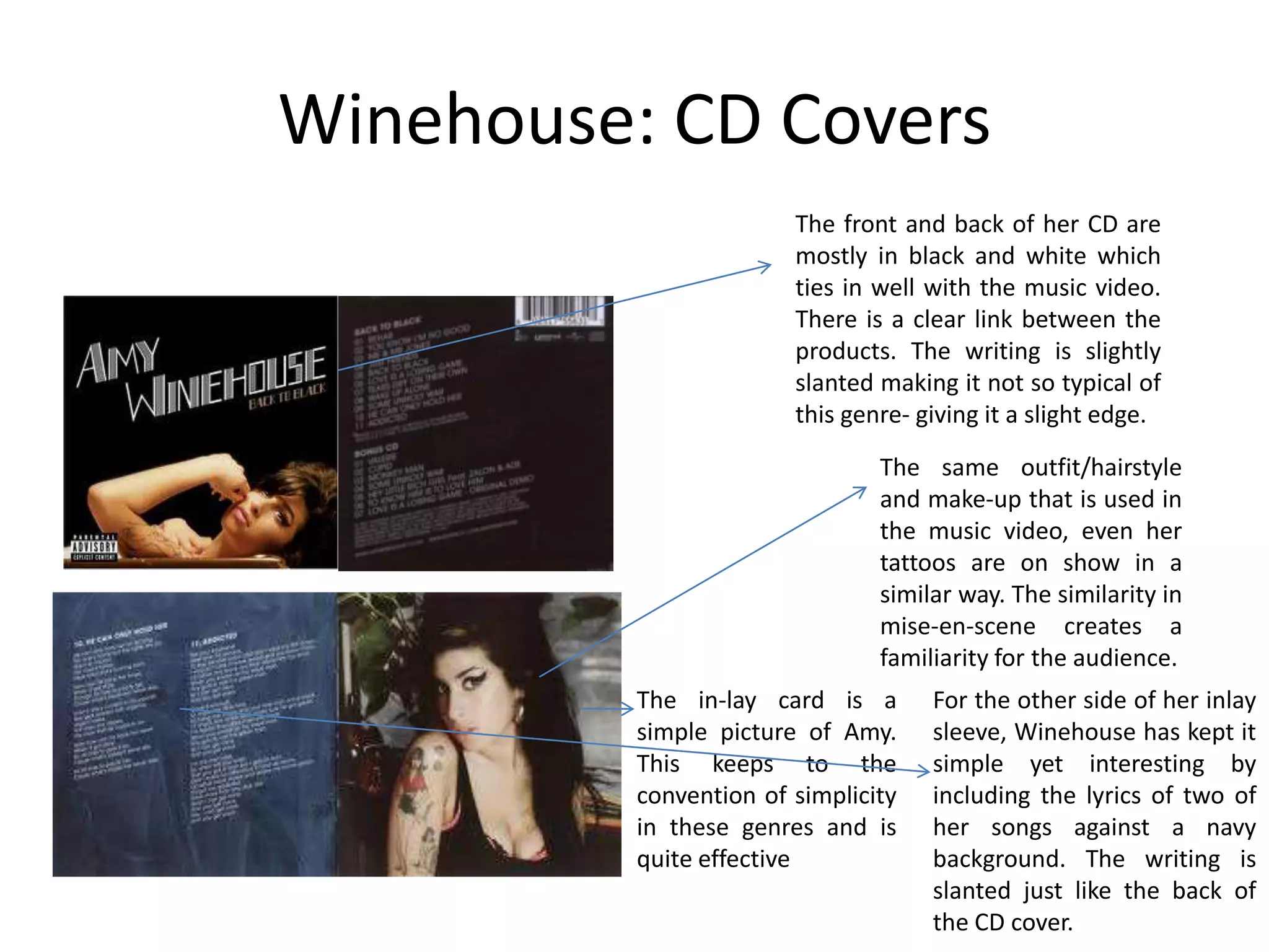
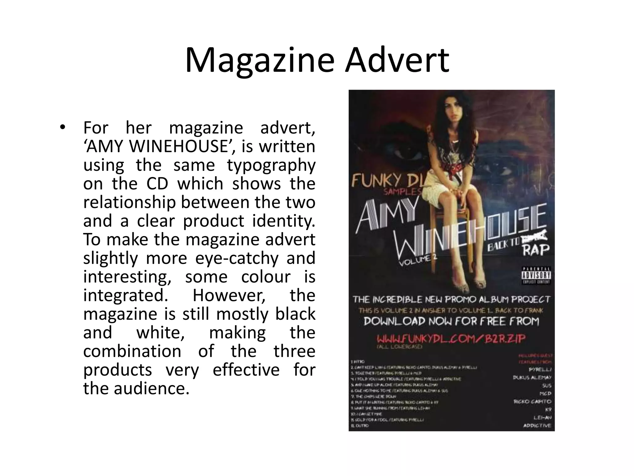
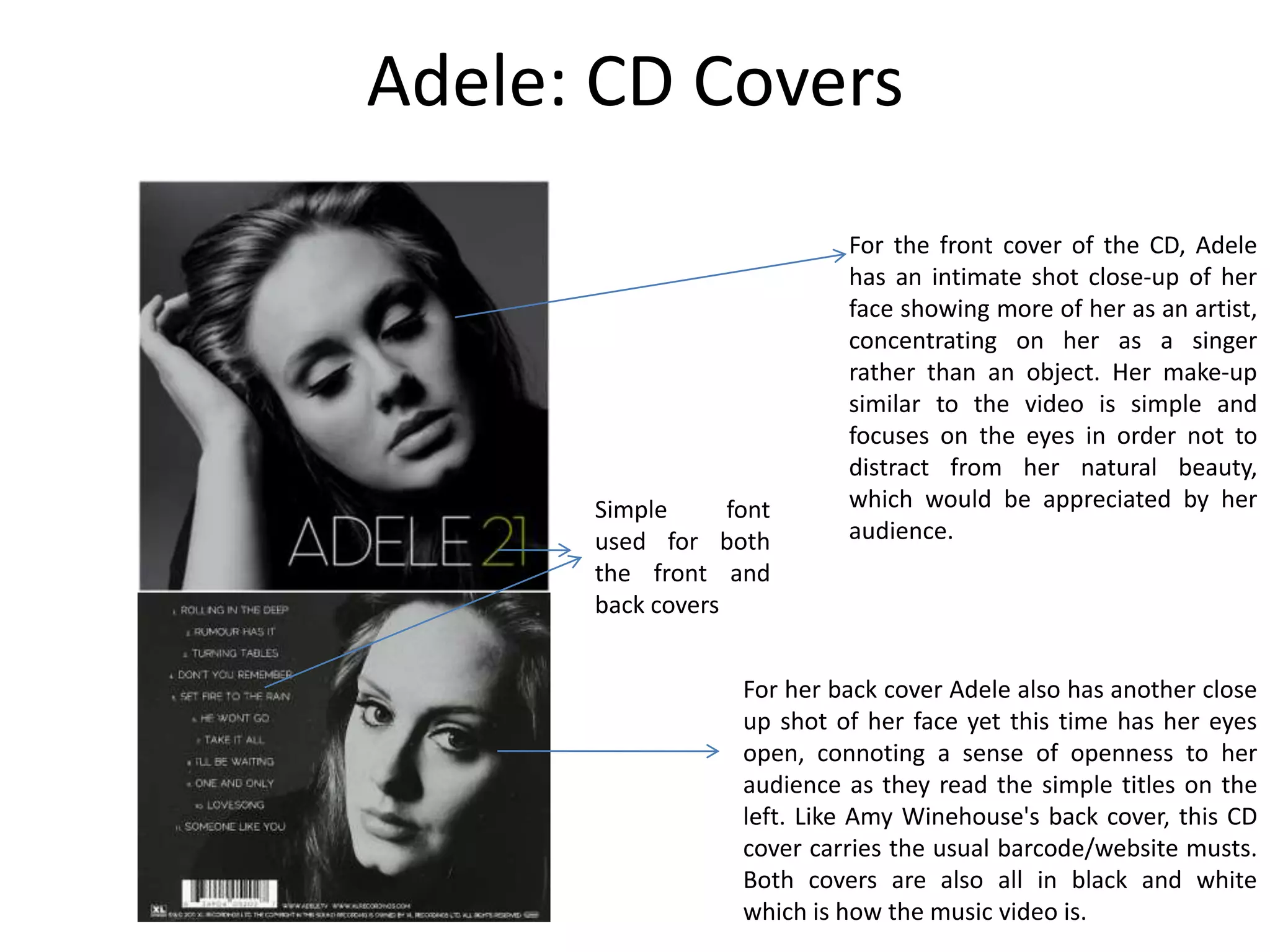
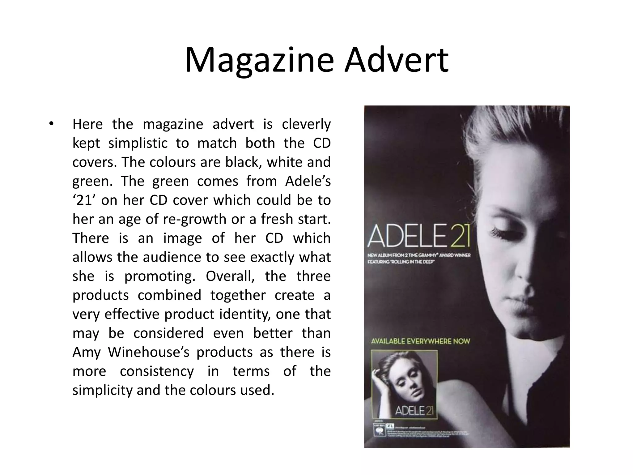
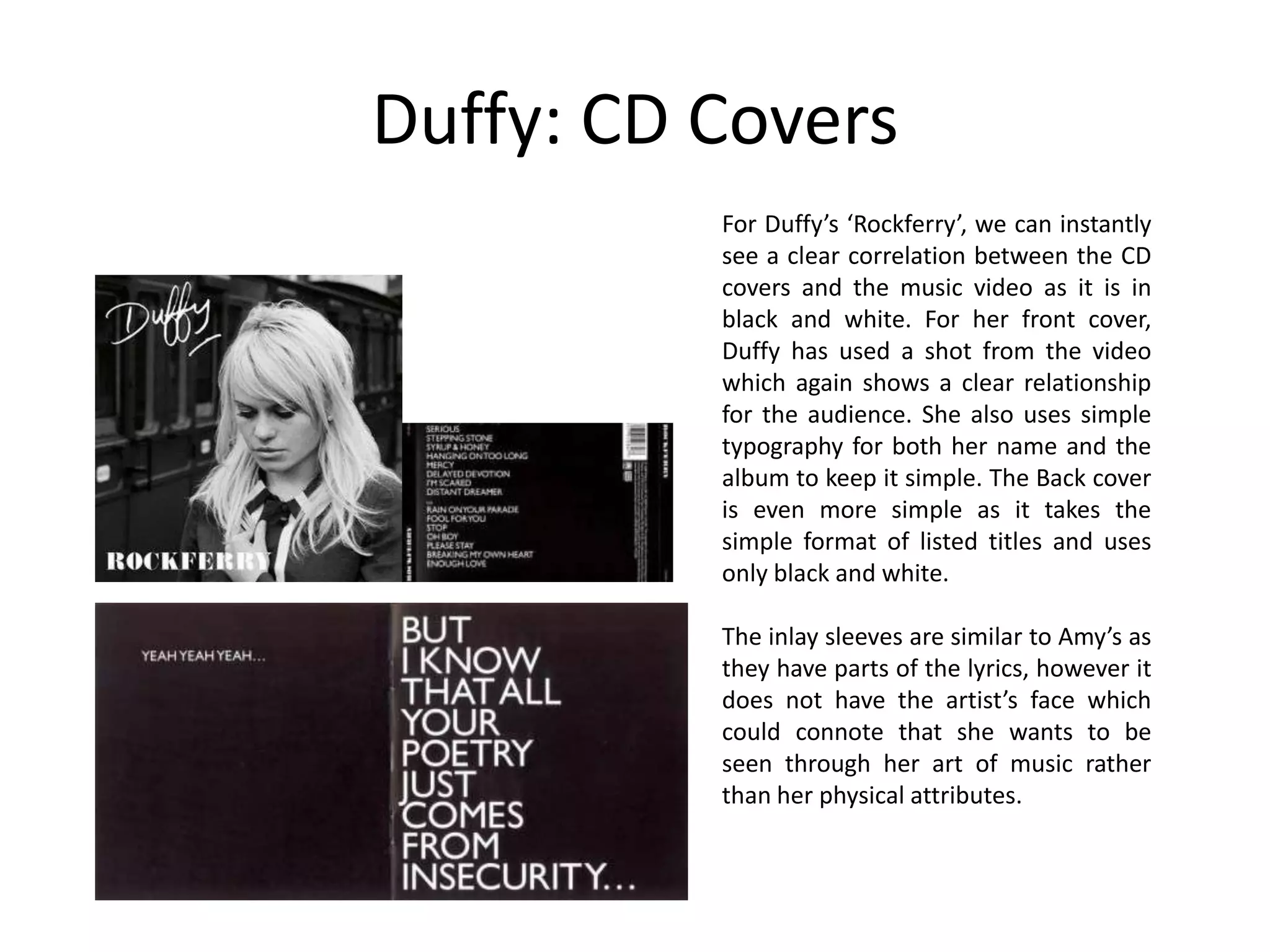
SlideShare a Scribd company logo
Evaluation Q2

How effective is the combination of
 your main product and ancillary
              texts?
Product Identity
• Knowing whether the combination of my ancillary
  texts and music video products are effective, I
  must consider branding and the term ‘product
  identity’. Brands are defined as "Name, term,
  design, symbol, or any other feature that identifies
  one seller's good or service as distinct from those
  of other sellers.“ (Wiki). Some examples of these
  are shown on the right. A music video or an artists
  album in a similar way must have it’s own ‘brand’
  which creates it’s clear own product identity. This
  means if the music video was watched on it’s own
  and then the ancillary products were seen by an
  individual they should be able to spot the branding
  through the colour scheme, the themes and other
  details. This helps audiences know exactly what is
  promoted and it becomes more and more
  recognizable with time if it were at first unknown.
Similar Concepts Overall
• In order to see how my main product is
  effective in combination to my ancillary texts, I
  must first look at how a product identity is
  created by looking at real examples from
  artists of the Soul/Jazz/Blues genre. The artists
  I will be analysing include: Adele, Amy
  Winehouse and Duffy.
Amy Winehouse:
 Back to Black
Winehouse: CD Covers
                        The front and back of her CD are
                        mostly in black and white which
                        ties in well with the music video.
                        There is a clear link between the
                        products. The writing is slightly
                        slanted making it not so typical of
                        this genre- giving it a slight edge.

                                The same outfit/hairstyle
                                and make-up that is used in
                                the music video, even her
                                tattoos are on show in a
                                similar way. The similarity in
                                mise-en-scene creates a
                                familiarity for the audience.
          The in-lay card is a       For the other side of her inlay
          simple picture of Amy.     sleeve, Winehouse has kept it
          This keeps to the          simple yet interesting by
          convention of simplicity   including the lyrics of two of
          in these genres and is     her songs against a navy
          quite effective            background. The writing is
                                     slanted just like the back of
                                     the CD cover.
Magazine Advert
• For her magazine advert,
  ‘AMY WINEHOUSE’, is written
  using the same typography
  on the CD which shows the
  relationship between the two
  and a clear product identity.
  To make the magazine advert
  slightly more eye-catchy and
  interesting, some colour is
  integrated. However, the
  magazine is still mostly black
  and white, making the
  combination of the three
  products very effective for
  the audience.
Adele: Someone Like You
Adele: CD Covers
                            For the front cover of the CD, Adele
                            has an intimate shot close-up of her
                            face showing more of her as an artist,
                            concentrating on her as a singer
                            rather than an object. Her make-up
                            similar to the video is simple and
                            focuses on the eyes in order not to
                            distract from her natural beauty,
      Simple      font      which would be appreciated by her
      used for both         audience.
      the front and
      back covers


                   For her back cover Adele also has another close
                   up shot of her face yet this time has her eyes
                   open, connoting a sense of openness to her
                   audience as they read the simple titles on the
                   left. Like Amy Winehouse's back cover, this CD
                   cover carries the usual barcode/website musts.
                   Both covers are also all in black and white
                   which is how the music video is.
Magazine Advert
•   Here the magazine advert is cleverly
    kept simplistic to match both the CD
    covers. The colours are black, white and
    green. The green comes from Adele’s
    ‘21’ on her CD cover which could be to
    her an age of re-growth or a fresh start.
    There is an image of her CD which
    allows the audience to see exactly what
    she is promoting. Overall, the three
    products combined together create a
    very effective product identity, one that
    may be considered even better than
    Amy Winehouse’s products as there is
    more consistency in terms of the
    simplicity and the colours used.
Duffy:Rockferry
Duffy: CD Covers
          For Duffy’s ‘Rockferry’, we can instantly
          see a clear correlation between the CD
          covers and the music video as it is in
          black and white. For her front cover,
          Duffy has used a shot from the video
          which again shows a clear relationship
          for the audience. She also uses simple
          typography for both her name and the
          album to keep it simple. The Back cover
          is even more simple as it takes the
          simple format of listed titles and uses
          only black and white.

          The inlay sleeves are similar to Amy’s as
          they have parts of the lyrics, however it
          does not have the artist’s face which
          could connote that she wants to be
          seen through her art of music rather
          than her physical attributes.
Music Video VS All Ancillary
•   After having analysed many artists CD covers and magazine adverts while making our ancillary
    products it was clear to us what rules we had to keep in mind, keeping it simple and showing a
    clear relationship between them and the main product was crucial.

                   First of all, looking at all the products we have
                   created I have to asses whether in
                   combination all these products go well
                   together alongside the music video which is
                   the main product that is being promoted. In
                   terms of the colour scheme we have kept to
                   the black and white. However, unlike the other
                   artists I have analysed we decided to keep the
                   balloons in colour as they signify hope. As
                   mentioned previously we felt our song did
                   become more upbeat towards the end and it
                   would have been a wasted opportunity to
                   ignore this.
                   We also kept to the warm pastel colours in the
                   in-lay card and the magazine advert which are
                   the colours that are introduced towards the
                   end of the video.
                   The images that we used of our artist was also
                   either in her narrative outfit (for the CD
                   covers) or her performance outfit creating an
                   obvious connection between these ancillary
                   products and the music video.
Music Video VS Magazine Ad
          •   For the magazine advert, it is clear that we used the
              more warm aspects of our music video in terms of
              colour scheme. We chose to do this because we felt
              the black and white was far too repetitive for our
              video. Especially as the CD cover is present at the
              bottom of the advert we wanted there to be a
              contrast. We also chose a picture of our actress in
              her performance dress rather than her narrative
              clothing to show the classy side of the genre. Her
              hair is also out to connote the more peaceful and
              hopeful situation in the video.
          •   For our modern day audience we included a website
              that they could visit to know more about the artist.
              We also replaced the HMV sign with an iTunes sign
              as audiences today tend to purchase more of their
              music digitally. Facebook and Twitter are also other
              forms of social media which are popular today.
Music Video VS CD Covers
           •   In terms of how the CD covers correlated with the music video
               we can clearly see the main narrative story on the front and
               back cover and integration of the narrative and performance
               scenes on the in-lay sleeves. First of all we decided using our
               artist holding the balloons was an important aspect of the CD
               cover as it showed what the song was really about (Goda and
               her troubles). There was a contrast with the bleakness of the
               black and white whilst the balloons stayed in colour.
           •   Inside for the first in-lay we used a picture of our artist in her
               performance outfit against the setting of the balloons and the
               park. This created a link between those two persona’s of Goda,
               showing that performing or not, she is still the same person.
               The photo has no writing and is kept simple like the front cover
               to signify the simplicity that is shown in the video. For the last
               picture there is some warm hues of pastel green/orange
               colours seeping in, to introduce some of that naturist colours
               that are present in the video and also not to make all of the
               pictures too repetitive. A quote of “So I go picking up the
               pieces..” is present to show some of the lyrics as other artists I
               have analysed have done so. This is quite effective as it makes
               the in-lay cards more interesting and also fits in well with the
               four ancillary pieces as she is holding the ‘pieces’ of the
               balloons.
           •   Overall, the covers are kept simple to reflect the simplicity of
               the music video.
Magazine Ad VS CD Covers
•   Another important element of
    making the ancillary products
    was to create a clear
    relationship between them as
    well as the music video. This
    would then create a product
    identity. We did this by keeping
    the same typography on all the
    texts, using photos of the artists
    wearing the same outfit and by
    keeping everything as simple as
    possible. We also included an
    image of our front CD cover
    which went well with the
    magazine advert and showed
    the audience exactly what we
    were promoting.
Colours
• When choosing the colours of the
  magazine advert, we initially went
  with a blue background as we
  thought this suited the ‘Blues’
  genre more. However, when put
  next to our other products the
  colour scheme did not work well
  even though some blue hues
  were on show in the music video.
  Instead we opted for a
  champagne colour which we
  picked from one of the balloons
  creating a much more effective
  combination of our products.
Typography
• Although at first we chose some overly stylistic fonts, we opted for
  a more simple one to go with our music video. We also made sure
  to have the same typography throughout all our ancillary texts to
  make it clear for the audience that they are all promoting the same
  artist. We also kept the colours of the fonts similar (black, white and
  red) to keep that product identity.
Summary
• In conclusion, I would say the combination of
  our main product (music video) and the
  ancillary products are quite effective. This is
  because they have a clear product
  identity, have shown a clear relationship and
  stayed consistent in terms of the colour
  scheme, themes and fonts.

More Related Content

What's hot (20)

Evaluation
EvaluationEvaluation
Evaluation
 
Evaluation
EvaluationEvaluation
Evaluation
 
2.
2.2.
2.
 
Media evaluation 1 (1) (1)
Media evaluation 1 (1) (1)Media evaluation 1 (1) (1)
Media evaluation 1 (1) (1)
 
Evaluation
EvaluationEvaluation
Evaluation
 
Question 1
Question 1Question 1
Question 1
 
How effective is the combination of your main product and ancillary texts?
How effective is the combination of your main product and ancillary texts?How effective is the combination of your main product and ancillary texts?
How effective is the combination of your main product and ancillary texts?
 
Evaluation question 2
Evaluation question 2Evaluation question 2
Evaluation question 2
 
Evaluation question 2
Evaluation question 2Evaluation question 2
Evaluation question 2
 
Question 2
Question 2Question 2
Question 2
 
Evaluation question 2
Evaluation question 2Evaluation question 2
Evaluation question 2
 
Q1 Section 2 DRAFT
Q1 Section 2 DRAFTQ1 Section 2 DRAFT
Q1 Section 2 DRAFT
 
Joanna powerpointbrandingdone
Joanna powerpointbrandingdoneJoanna powerpointbrandingdone
Joanna powerpointbrandingdone
 
Evaluation
EvaluationEvaluation
Evaluation
 
Presentation4
Presentation4Presentation4
Presentation4
 
A2 Media Studies Evaluation
A2 Media Studies EvaluationA2 Media Studies Evaluation
A2 Media Studies Evaluation
 
Evaluation Q1 section 2
Evaluation Q1 section 2Evaluation Q1 section 2
Evaluation Q1 section 2
 
Q2
Q2 Q2
Q2
 
Presentation4
Presentation4Presentation4
Presentation4
 
Presentation4
Presentation4Presentation4
Presentation4
 

Similar to Evaluation q2

Digi-pak Evaluation
Digi-pak Evaluation Digi-pak Evaluation
Digi-pak Evaluation
melodyquincey
 
Evaluation question 1: In what way does your media project use, develop or ch...
Evaluation question 1: In what way does your media project use, develop or ch...Evaluation question 1: In what way does your media project use, develop or ch...
Evaluation question 1: In what way does your media project use, develop or ch...
ajatuchband
 
Research and planning cd covers case studies
Research and planning cd covers case studiesResearch and planning cd covers case studies
Research and planning cd covers case studies
Nicky Campbell
 
Research and planning cd covers
Research and planning cd coversResearch and planning cd covers
Research and planning cd covers
Nicky Campbell
 
Digipak research
Digipak researchDigipak research
Digipak research
lauraraxten
 
Evaluation - Question 2
Evaluation - Question 2Evaluation - Question 2
Evaluation - Question 2
amyelizabeth93
 
Dvd textual analysis
Dvd textual analysisDvd textual analysis
Dvd textual analysis
guest1c9bed
 
Evaluation 2-How effective is the combination of your main product and ancill...
Evaluation 2-How effective is the combination of your main product and ancill...Evaluation 2-How effective is the combination of your main product and ancill...
Evaluation 2-How effective is the combination of your main product and ancill...
rachael swan
 
Evaluation Question 2
Evaluation Question 2Evaluation Question 2
Evaluation Question 2
enosd1
 
Evaluation question 2
Evaluation question 2Evaluation question 2
Evaluation question 2
adinachante
 
Question2
Question2Question2
Question2
Kero00
 
Evaluation q 2
Evaluation q 2Evaluation q 2
Evaluation q 2
YasmeenAl
 
Evaluation q 2
Evaluation q 2Evaluation q 2
Evaluation q 2
YasmeenAl
 
Evaulation question 2
Evaulation question 2Evaulation question 2
Evaulation question 2
adinachante
 
A2 Advanced Portfolio Evaluation (question two)
A2 Advanced Portfolio Evaluation (question two)A2 Advanced Portfolio Evaluation (question two)
A2 Advanced Portfolio Evaluation (question two)
hevaw
 

Similar to Evaluation q2 (20)

Digi-pak Evaluation
Digi-pak Evaluation Digi-pak Evaluation
Digi-pak Evaluation
 
Evaluation question 1: In what way does your media project use, develop or ch...
Evaluation question 1: In what way does your media project use, develop or ch...Evaluation question 1: In what way does your media project use, develop or ch...
Evaluation question 1: In what way does your media project use, develop or ch...
 
Research and planning cd covers case studies
Research and planning cd covers case studiesResearch and planning cd covers case studies
Research and planning cd covers case studies
 
Natasha queestion 2
Natasha queestion 2Natasha queestion 2
Natasha queestion 2
 
Research and planning cd covers
Research and planning cd coversResearch and planning cd covers
Research and planning cd covers
 
Digipak research
Digipak researchDigipak research
Digipak research
 
Evaluation - Question 2
Evaluation - Question 2Evaluation - Question 2
Evaluation - Question 2
 
Dvd textual analysis
Dvd textual analysisDvd textual analysis
Dvd textual analysis
 
Conventions
ConventionsConventions
Conventions
 
Evaluation 2-How effective is the combination of your main product and ancill...
Evaluation 2-How effective is the combination of your main product and ancill...Evaluation 2-How effective is the combination of your main product and ancill...
Evaluation 2-How effective is the combination of your main product and ancill...
 
Evaluation Question 2
Evaluation Question 2Evaluation Question 2
Evaluation Question 2
 
Evaluation question 2
Evaluation question 2Evaluation question 2
Evaluation question 2
 
Question2
Question2Question2
Question2
 
Presentation Media
Presentation MediaPresentation Media
Presentation Media
 
Digipak eval
Digipak evalDigipak eval
Digipak eval
 
Evaluation q 2
Evaluation q 2Evaluation q 2
Evaluation q 2
 
Evaluation q 2
Evaluation q 2Evaluation q 2
Evaluation q 2
 
Media evaluation
Media evaluationMedia evaluation
Media evaluation
 
Evaulation question 2
Evaulation question 2Evaulation question 2
Evaulation question 2
 
A2 Advanced Portfolio Evaluation (question two)
A2 Advanced Portfolio Evaluation (question two)A2 Advanced Portfolio Evaluation (question two)
A2 Advanced Portfolio Evaluation (question two)
 

More from Rezamarmulak

Goldie’s innercity life
Goldie’s innercity lifeGoldie’s innercity life
Goldie’s innercity life
Rezamarmulak
 
Ciara’s like a boy
Ciara’s like a boyCiara’s like a boy
Ciara’s like a boy
Rezamarmulak
 
The making of in lay cards
The making of in lay cardsThe making of in lay cards
The making of in lay cards
Rezamarmulak
 
Further development of magazine advert after feedback
Further development of magazine advert after feedbackFurther development of magazine advert after feedback
Further development of magazine advert after feedback
Rezamarmulak
 
Different ideas for cd back cover
Different ideas for cd back coverDifferent ideas for cd back cover
Different ideas for cd back cover
Rezamarmulak
 
Target audience research
Target audience researchTarget audience research
Target audience research
Rezamarmulak
 
Target audience research
Target audience researchTarget audience research
Target audience research
Rezamarmulak
 
Gaga’s paparazzi
Gaga’s paparazziGaga’s paparazzi
Gaga’s paparazzi
Rezamarmulak
 
Michael jackson’s thriller
Michael jackson’s thrillerMichael jackson’s thriller
Michael jackson’s thriller
Rezamarmulak
 
Evaluation q6 what have you learnt about technologies
Evaluation q6  what have you learnt about technologiesEvaluation q6  what have you learnt about technologies
Evaluation q6 what have you learnt about technologies
Rezamarmulak
 
Evaluation powerpoint
Evaluation powerpointEvaluation powerpoint
Evaluation powerpoint
Rezamarmulak
 

More from Rezamarmulak (20)

Evaluation q4
Evaluation q4Evaluation q4
Evaluation q4
 
Evaluation q1
Evaluation q1Evaluation q1
Evaluation q1
 
Goldie’s innercity life
Goldie’s innercity lifeGoldie’s innercity life
Goldie’s innercity life
 
Ciara’s like a boy
Ciara’s like a boyCiara’s like a boy
Ciara’s like a boy
 
Britney’s toxic
Britney’s toxicBritney’s toxic
Britney’s toxic
 
The making of in lay cards
The making of in lay cardsThe making of in lay cards
The making of in lay cards
 
Back cd cover
Back cd coverBack cd cover
Back cd cover
 
Front cd cover
Front cd coverFront cd cover
Front cd cover
 
Further development of magazine advert after feedback
Further development of magazine advert after feedbackFurther development of magazine advert after feedback
Further development of magazine advert after feedback
 
Magazine advert
Magazine advertMagazine advert
Magazine advert
 
Magazine advert
Magazine advertMagazine advert
Magazine advert
 
Ancillary texts
Ancillary textsAncillary texts
Ancillary texts
 
Different ideas for cd back cover
Different ideas for cd back coverDifferent ideas for cd back cover
Different ideas for cd back cover
 
Target audience research
Target audience researchTarget audience research
Target audience research
 
Target audience research
Target audience researchTarget audience research
Target audience research
 
Amy winehouse
Amy winehouseAmy winehouse
Amy winehouse
 
Gaga’s paparazzi
Gaga’s paparazziGaga’s paparazzi
Gaga’s paparazzi
 
Michael jackson’s thriller
Michael jackson’s thrillerMichael jackson’s thriller
Michael jackson’s thriller
 
Evaluation q6 what have you learnt about technologies
Evaluation q6  what have you learnt about technologiesEvaluation q6  what have you learnt about technologies
Evaluation q6 what have you learnt about technologies
 
Evaluation powerpoint
Evaluation powerpointEvaluation powerpoint
Evaluation powerpoint
 

Recently uploaded

Panchayat Season 3 - Official Trailer.pdf
Panchayat Season 3 - Official Trailer.pdfPanchayat Season 3 - Official Trailer.pdf
Panchayat Season 3 - Official Trailer.pdf
Suleman Rana
 
Skeem Saam in June 2024 available on Forum
Skeem Saam in June 2024 available on ForumSkeem Saam in June 2024 available on Forum
Skeem Saam in June 2024 available on Forum
Isaac More
 

Recently uploaded (11)

Dehradun Girls 9719300533 Heat-lava { Dehradun } Whiz ℂall Serviℂe By Our
Dehradun Girls 9719300533 Heat-lava { Dehradun } Whiz ℂall Serviℂe By OurDehradun Girls 9719300533 Heat-lava { Dehradun } Whiz ℂall Serviℂe By Our
Dehradun Girls 9719300533 Heat-lava { Dehradun } Whiz ℂall Serviℂe By Our
 
NO1 Pandit Black Magic Specialist Expert In Bahawalpur, Sargodha, Sialkot, Sh...
NO1 Pandit Black Magic Specialist Expert In Bahawalpur, Sargodha, Sialkot, Sh...NO1 Pandit Black Magic Specialist Expert In Bahawalpur, Sargodha, Sialkot, Sh...
NO1 Pandit Black Magic Specialist Expert In Bahawalpur, Sargodha, Sialkot, Sh...
 
Q4 WEEK 1 JUDGE THE RELEVANCE AND WORTH OF IDEAS.pptx
Q4 WEEK 1 JUDGE THE RELEVANCE AND WORTH OF IDEAS.pptxQ4 WEEK 1 JUDGE THE RELEVANCE AND WORTH OF IDEAS.pptx
Q4 WEEK 1 JUDGE THE RELEVANCE AND WORTH OF IDEAS.pptx
 
Meet Crazyjamjam - A TikTok Sensation | Blog Eternal
Meet Crazyjamjam - A TikTok Sensation | Blog EternalMeet Crazyjamjam - A TikTok Sensation | Blog Eternal
Meet Crazyjamjam - A TikTok Sensation | Blog Eternal
 
Barbie Presentation Template.pptx aaaaaa
Barbie Presentation Template.pptx aaaaaaBarbie Presentation Template.pptx aaaaaa
Barbie Presentation Template.pptx aaaaaa
 
A DARK AND HOLLOW STAR BY ASHLEY SHUTTLEWORTH
A DARK AND HOLLOW STAR BY ASHLEY SHUTTLEWORTHA DARK AND HOLLOW STAR BY ASHLEY SHUTTLEWORTH
A DARK AND HOLLOW STAR BY ASHLEY SHUTTLEWORTH
 
Lite version of elevator game simplified.pptx
Lite version of elevator game simplified.pptxLite version of elevator game simplified.pptx
Lite version of elevator game simplified.pptx
 
Panchayat Season 3 - Official Trailer.pdf
Panchayat Season 3 - Official Trailer.pdfPanchayat Season 3 - Official Trailer.pdf
Panchayat Season 3 - Official Trailer.pdf
 
The Evolution of Animation in Film - Mark Murphy Director
The Evolution of Animation in Film - Mark Murphy DirectorThe Evolution of Animation in Film - Mark Murphy Director
The Evolution of Animation in Film - Mark Murphy Director
 
Reimagining Classics - What Makes a Remake a Success
Reimagining Classics - What Makes a Remake a SuccessReimagining Classics - What Makes a Remake a Success
Reimagining Classics - What Makes a Remake a Success
 
Skeem Saam in June 2024 available on Forum
Skeem Saam in June 2024 available on ForumSkeem Saam in June 2024 available on Forum
Skeem Saam in June 2024 available on Forum
 

Evaluation q2

  • 1. Evaluation Q2 How effective is the combination of your main product and ancillary texts?
  • 2. Product Identity • Knowing whether the combination of my ancillary texts and music video products are effective, I must consider branding and the term ‘product identity’. Brands are defined as "Name, term, design, symbol, or any other feature that identifies one seller's good or service as distinct from those of other sellers.“ (Wiki). Some examples of these are shown on the right. A music video or an artists album in a similar way must have it’s own ‘brand’ which creates it’s clear own product identity. This means if the music video was watched on it’s own and then the ancillary products were seen by an individual they should be able to spot the branding through the colour scheme, the themes and other details. This helps audiences know exactly what is promoted and it becomes more and more recognizable with time if it were at first unknown.
  • 3. Similar Concepts Overall • In order to see how my main product is effective in combination to my ancillary texts, I must first look at how a product identity is created by looking at real examples from artists of the Soul/Jazz/Blues genre. The artists I will be analysing include: Adele, Amy Winehouse and Duffy.
  • 5. Winehouse: CD Covers The front and back of her CD are mostly in black and white which ties in well with the music video. There is a clear link between the products. The writing is slightly slanted making it not so typical of this genre- giving it a slight edge. The same outfit/hairstyle and make-up that is used in the music video, even her tattoos are on show in a similar way. The similarity in mise-en-scene creates a familiarity for the audience. The in-lay card is a For the other side of her inlay simple picture of Amy. sleeve, Winehouse has kept it This keeps to the simple yet interesting by convention of simplicity including the lyrics of two of in these genres and is her songs against a navy quite effective background. The writing is slanted just like the back of the CD cover.
  • 6. Magazine Advert • For her magazine advert, ‘AMY WINEHOUSE’, is written using the same typography on the CD which shows the relationship between the two and a clear product identity. To make the magazine advert slightly more eye-catchy and interesting, some colour is integrated. However, the magazine is still mostly black and white, making the combination of the three products very effective for the audience.
  • 8. Adele: CD Covers For the front cover of the CD, Adele has an intimate shot close-up of her face showing more of her as an artist, concentrating on her as a singer rather than an object. Her make-up similar to the video is simple and focuses on the eyes in order not to distract from her natural beauty, Simple font which would be appreciated by her used for both audience. the front and back covers For her back cover Adele also has another close up shot of her face yet this time has her eyes open, connoting a sense of openness to her audience as they read the simple titles on the left. Like Amy Winehouse's back cover, this CD cover carries the usual barcode/website musts. Both covers are also all in black and white which is how the music video is.
  • 9. Magazine Advert • Here the magazine advert is cleverly kept simplistic to match both the CD covers. The colours are black, white and green. The green comes from Adele’s ‘21’ on her CD cover which could be to her an age of re-growth or a fresh start. There is an image of her CD which allows the audience to see exactly what she is promoting. Overall, the three products combined together create a very effective product identity, one that may be considered even better than Amy Winehouse’s products as there is more consistency in terms of the simplicity and the colours used.
  • 11. Duffy: CD Covers For Duffy’s ‘Rockferry’, we can instantly see a clear correlation between the CD covers and the music video as it is in black and white. For her front cover, Duffy has used a shot from the video which again shows a clear relationship for the audience. She also uses simple typography for both her name and the album to keep it simple. The Back cover is even more simple as it takes the simple format of listed titles and uses only black and white. The inlay sleeves are similar to Amy’s as they have parts of the lyrics, however it does not have the artist’s face which could connote that she wants to be seen through her art of music rather than her physical attributes.
  • 12. Music Video VS All Ancillary • After having analysed many artists CD covers and magazine adverts while making our ancillary products it was clear to us what rules we had to keep in mind, keeping it simple and showing a clear relationship between them and the main product was crucial. First of all, looking at all the products we have created I have to asses whether in combination all these products go well together alongside the music video which is the main product that is being promoted. In terms of the colour scheme we have kept to the black and white. However, unlike the other artists I have analysed we decided to keep the balloons in colour as they signify hope. As mentioned previously we felt our song did become more upbeat towards the end and it would have been a wasted opportunity to ignore this. We also kept to the warm pastel colours in the in-lay card and the magazine advert which are the colours that are introduced towards the end of the video. The images that we used of our artist was also either in her narrative outfit (for the CD covers) or her performance outfit creating an obvious connection between these ancillary products and the music video.
  • 13. Music Video VS Magazine Ad • For the magazine advert, it is clear that we used the more warm aspects of our music video in terms of colour scheme. We chose to do this because we felt the black and white was far too repetitive for our video. Especially as the CD cover is present at the bottom of the advert we wanted there to be a contrast. We also chose a picture of our actress in her performance dress rather than her narrative clothing to show the classy side of the genre. Her hair is also out to connote the more peaceful and hopeful situation in the video. • For our modern day audience we included a website that they could visit to know more about the artist. We also replaced the HMV sign with an iTunes sign as audiences today tend to purchase more of their music digitally. Facebook and Twitter are also other forms of social media which are popular today.
  • 14. Music Video VS CD Covers • In terms of how the CD covers correlated with the music video we can clearly see the main narrative story on the front and back cover and integration of the narrative and performance scenes on the in-lay sleeves. First of all we decided using our artist holding the balloons was an important aspect of the CD cover as it showed what the song was really about (Goda and her troubles). There was a contrast with the bleakness of the black and white whilst the balloons stayed in colour. • Inside for the first in-lay we used a picture of our artist in her performance outfit against the setting of the balloons and the park. This created a link between those two persona’s of Goda, showing that performing or not, she is still the same person. The photo has no writing and is kept simple like the front cover to signify the simplicity that is shown in the video. For the last picture there is some warm hues of pastel green/orange colours seeping in, to introduce some of that naturist colours that are present in the video and also not to make all of the pictures too repetitive. A quote of “So I go picking up the pieces..” is present to show some of the lyrics as other artists I have analysed have done so. This is quite effective as it makes the in-lay cards more interesting and also fits in well with the four ancillary pieces as she is holding the ‘pieces’ of the balloons. • Overall, the covers are kept simple to reflect the simplicity of the music video.
  • 15. Magazine Ad VS CD Covers • Another important element of making the ancillary products was to create a clear relationship between them as well as the music video. This would then create a product identity. We did this by keeping the same typography on all the texts, using photos of the artists wearing the same outfit and by keeping everything as simple as possible. We also included an image of our front CD cover which went well with the magazine advert and showed the audience exactly what we were promoting.
  • 16. Colours • When choosing the colours of the magazine advert, we initially went with a blue background as we thought this suited the ‘Blues’ genre more. However, when put next to our other products the colour scheme did not work well even though some blue hues were on show in the music video. Instead we opted for a champagne colour which we picked from one of the balloons creating a much more effective combination of our products.
  • 17. Typography • Although at first we chose some overly stylistic fonts, we opted for a more simple one to go with our music video. We also made sure to have the same typography throughout all our ancillary texts to make it clear for the audience that they are all promoting the same artist. We also kept the colours of the fonts similar (black, white and red) to keep that product identity.
  • 18. Summary • In conclusion, I would say the combination of our main product (music video) and the ancillary products are quite effective. This is because they have a clear product identity, have shown a clear relationship and stayed consistent in terms of the colour scheme, themes and fonts.