user experience agency
Navigation Systems


Mariza Samartzi
User Experience Architect

mariza@zabisco.com
More…

                                              More…
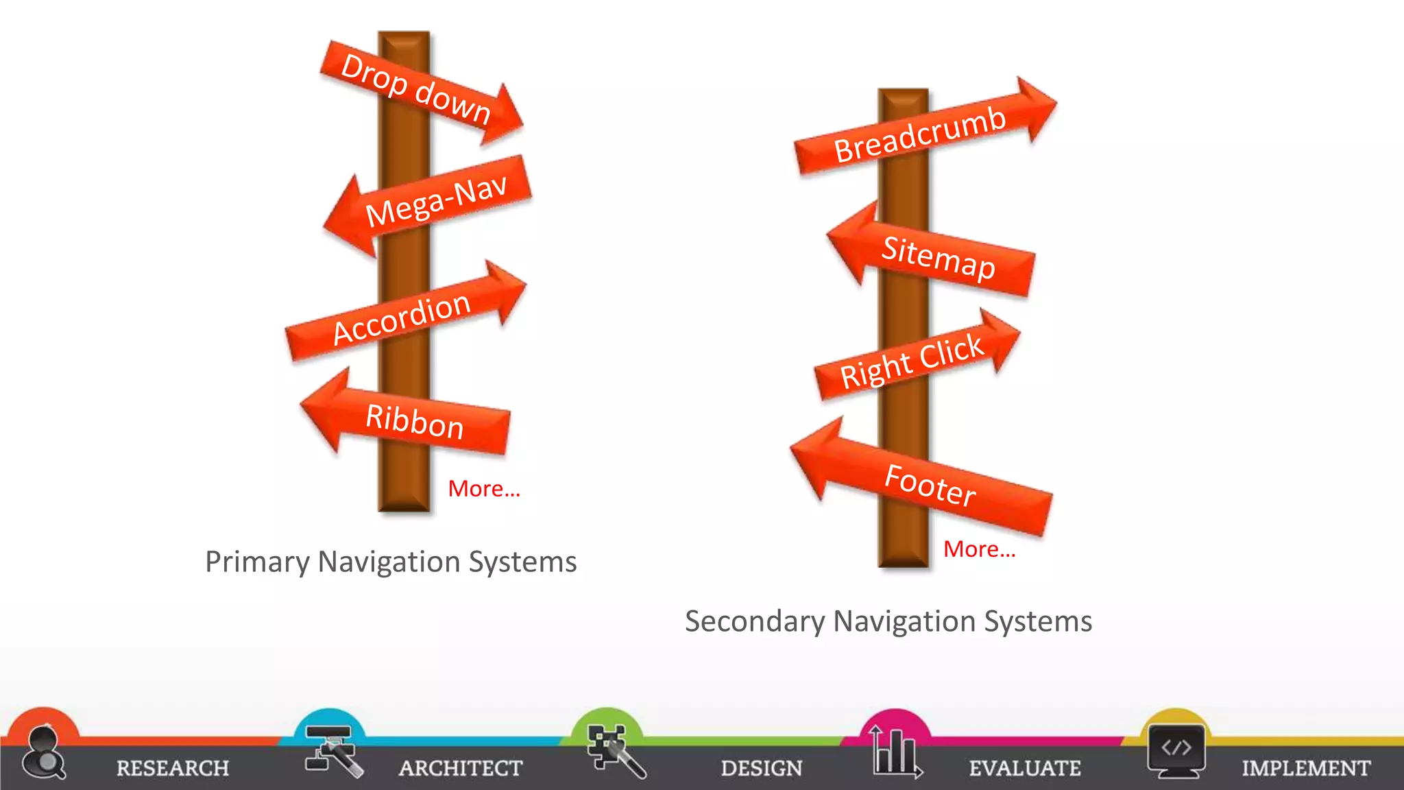
Primary Navigation Systems
                             Secondary Navigation Systems
Research

Primary Navigation Systems
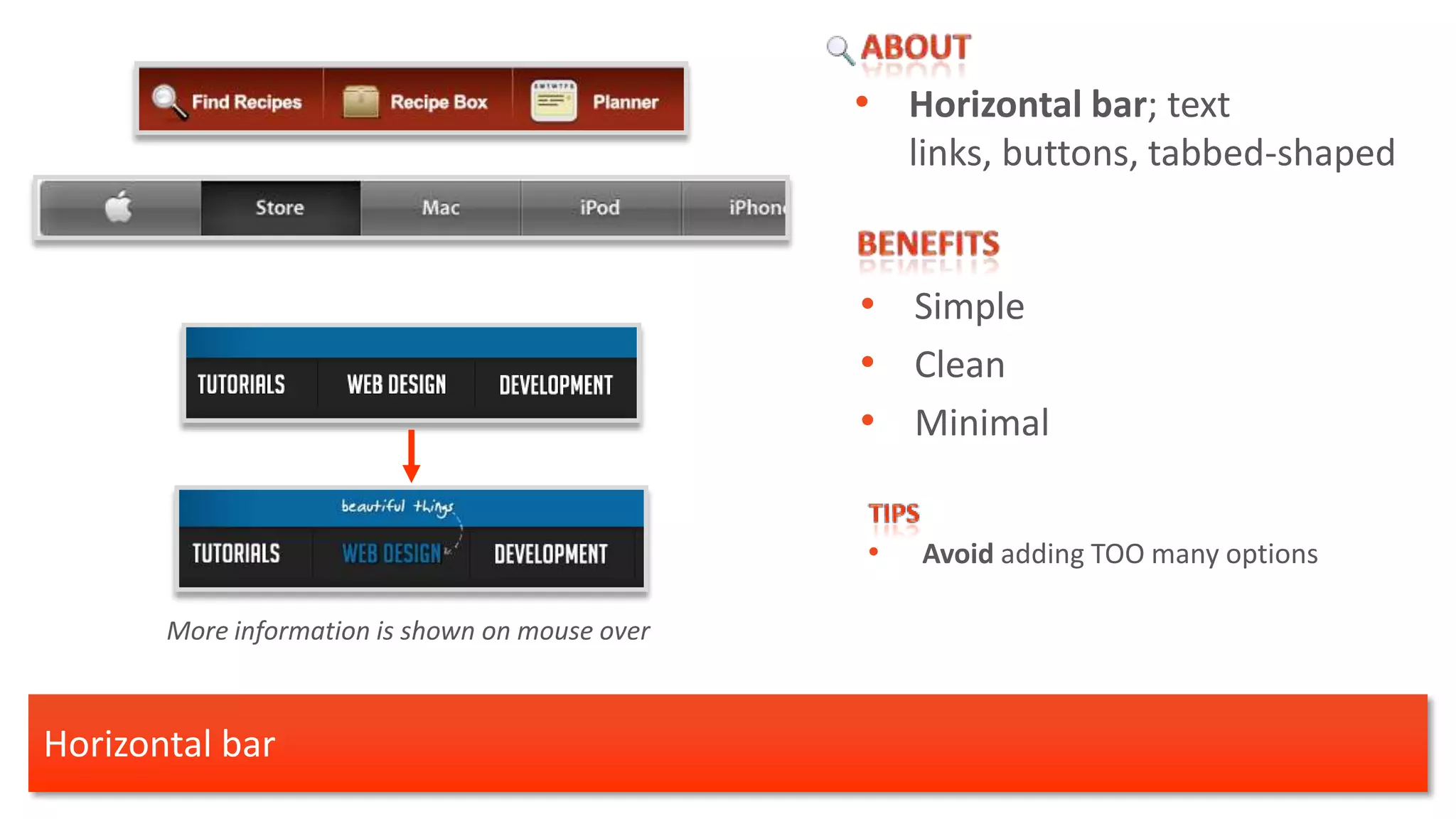
• Horizontal bar; text
                                                     links, buttons, tabbed-shaped


                                                 • Simple
                                                 • Clean
                                                 • Minimal

                                                 •   Avoid adding TOO many options

       More information is shown on mouse over


Horizontal bar
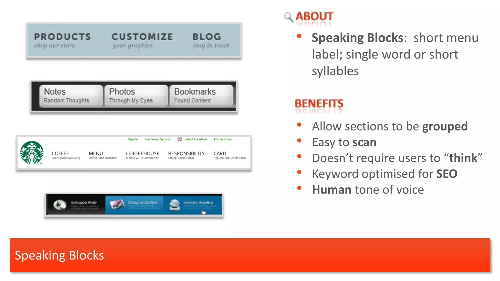
• Speaking Blocks: short menu
                      label; single word or short
                      syllables


                  •   Allow sections to be grouped
                  •   Easy to scan
                  •   Doesn’t require users to “think”
                  •   Keyword optimised for SEO
                  •   Human tone of voice


Speaking Blocks
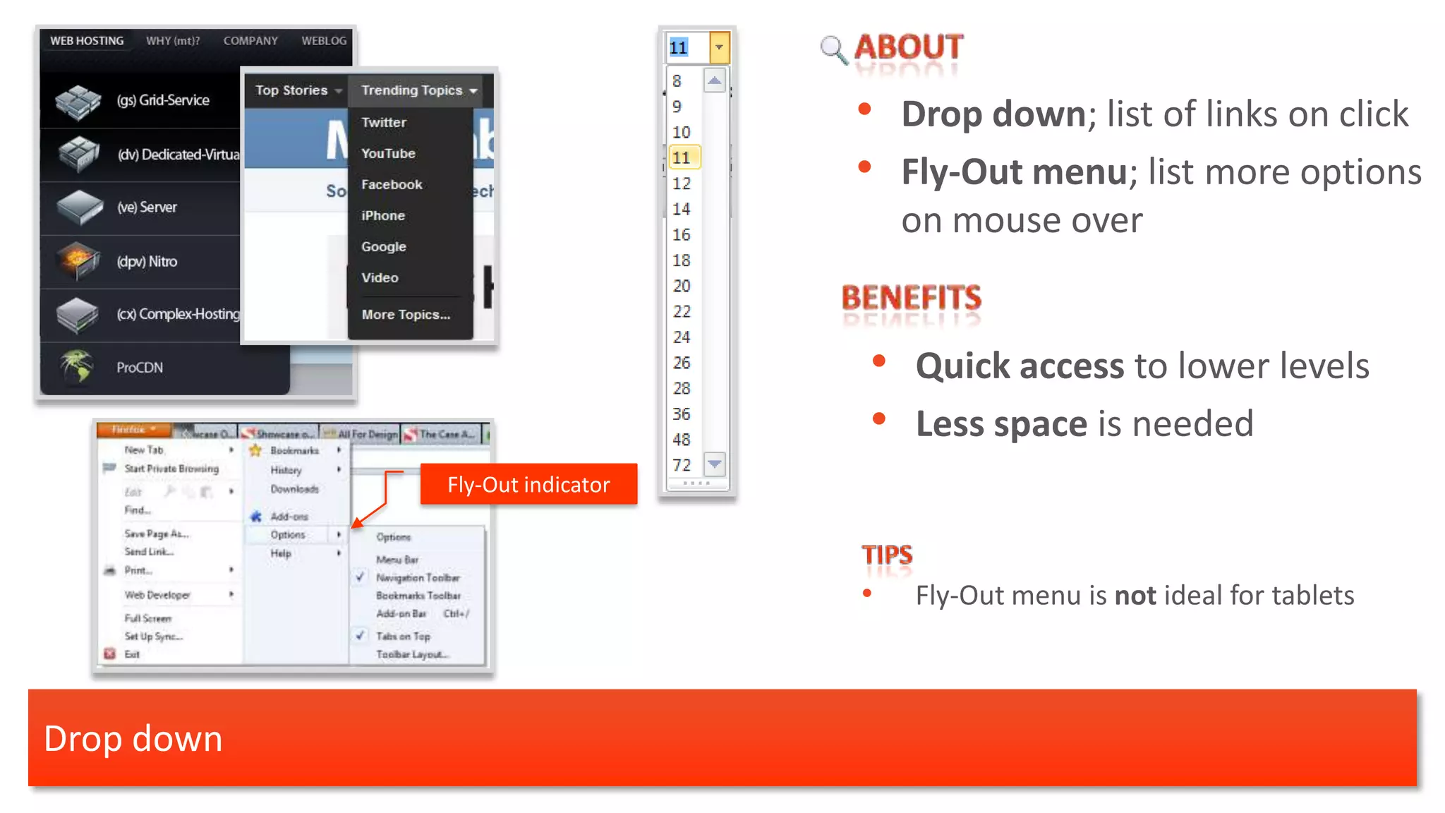
• Drop down; list of links on click
                                • Fly-Out menu; list more options
                                    on mouse over


                                • Quick access to lower levels
                                • Less space is needed
            Fly-Out indicator


                                •   Fly-Out menu is not ideal for tablets


Drop down
•      Mega-Nav; Big, two-dimensional
                                                         drop-down panels. [1]


                                                  • Expose more options
                                                  • Avoid landing pages
Nike
http://www.nike.com
                                                  • Eliminate scrolling [1]


                      Henleys                         [1] Jakob Nielsen
                      http://www.henleys.co.uk/       http://www.useit.com/alertbox/mega-dropdown-menus.html


 Mega-Nav
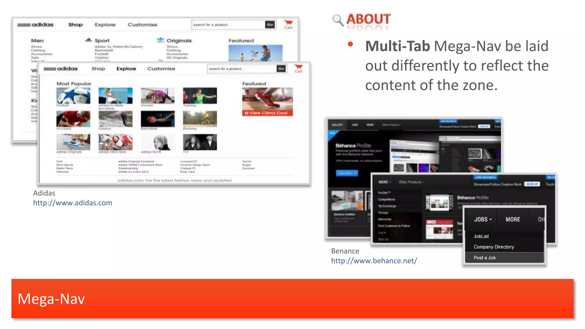
• Multi-Tab Mega-Nav be laid
                                  out differently to reflect the
                                  content of the zone.


 Adidas
 http://www.adidas.com


                         Benance
                         http://www.behance.net/


Mega-Nav
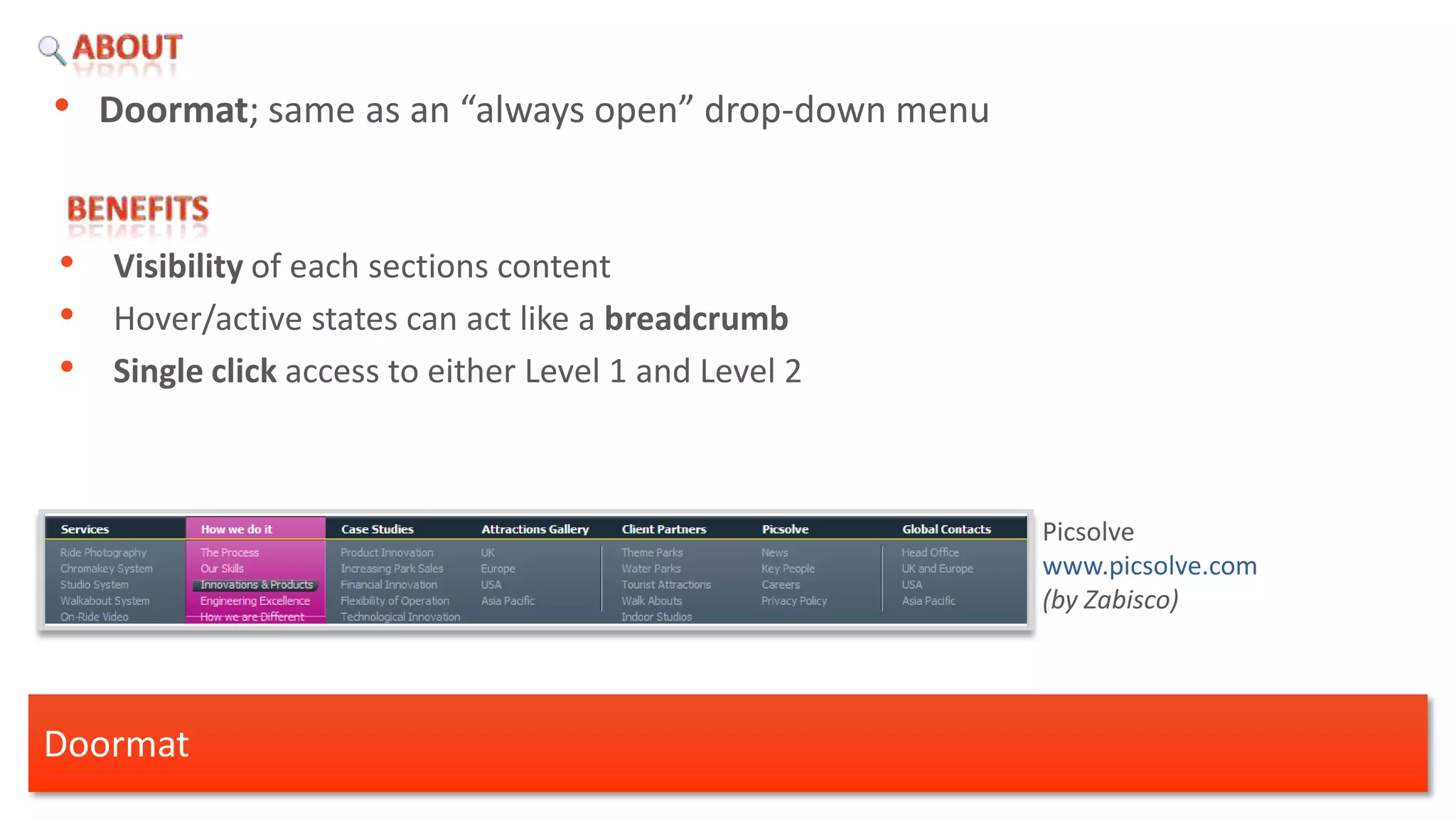
• Doormat; same as an “always open” drop-down menu


•   Visibility of each sections content
•   Hover/active states can act like a breadcrumb
•   Single click access to either Level 1 and Level 2


                                                        Picsolve
                                                        www.picsolve.com
                                                        (by Zabisco)


Doormat
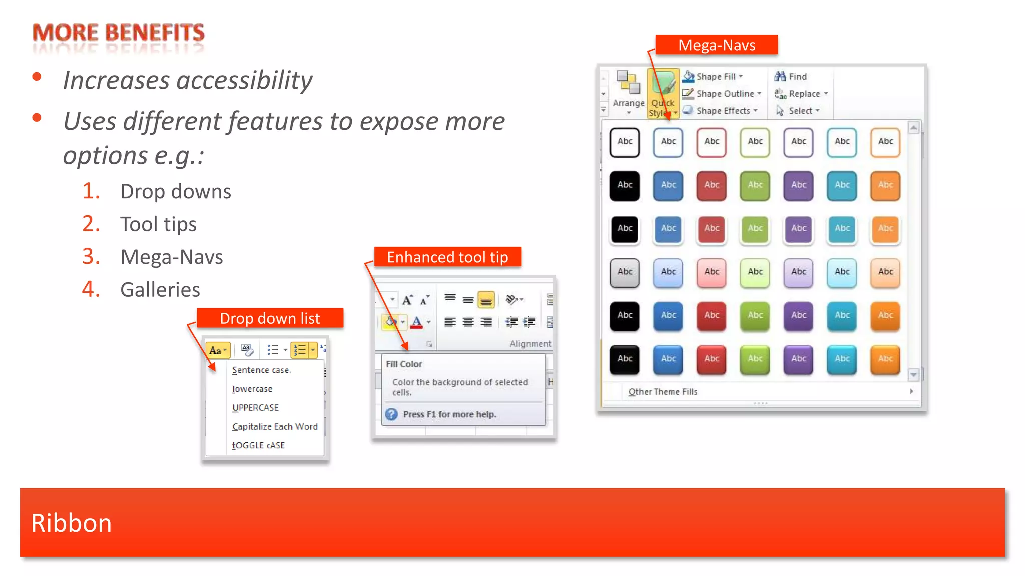
• Ribbon; introduced by Microsoft office

 •    “Word 2007 users are now using four times as many features as they used in
      previous versions” [1]

     Quick Access Toolbar     Tabs
                                                           Gallery


                                                                             Microsoft Office Word
       Group                         Dialog box launcher

                                                                     [1] eBook Microsoft Office

Ribbon
Mega-Navs

• Increases accessibility
• Uses different features to expose more
  options e.g.:
    1.   Drop downs
    2.   Tool tips
    3.   Mega-Navs                 Enhanced tool tip

    4.   Galleries
                  Drop down list


Ribbon
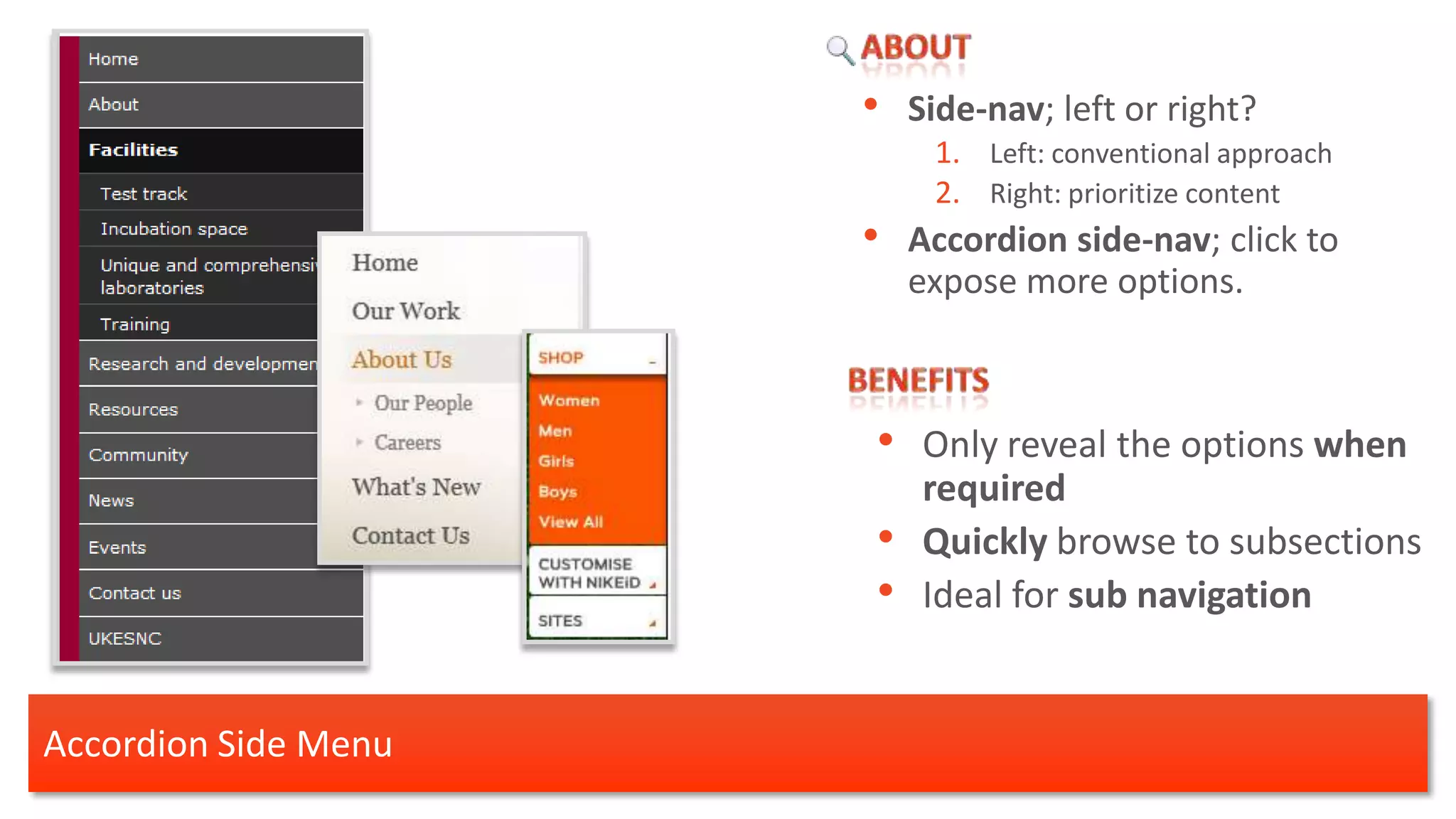
•   Side-nav; left or right?
                           1. Left: conventional approach
                           2. Right: prioritize content
                      •   Accordion side-nav; click to
                          expose more options.


                      • Only reveal the options when
                           required
                      •    Quickly browse to subsections
                      •    Ideal for sub navigation


Accordion Side Menu
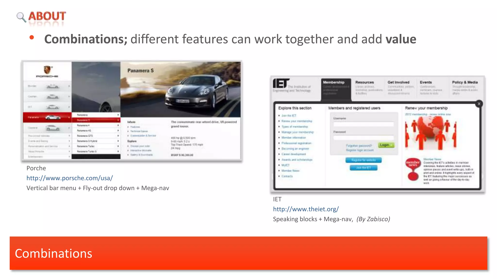
• Combinations; different features can work together and add value


 Porche
 http://www.porsche.com/usa/
 Vertical bar menu + Fly-out drop down + Mega-nav
                                                    IET
                                                    http://www.theiet.org/
                                                    Speaking blocks + Mega-nav, (By Zabisco)


Combinations
Research

Secondary Navigation Systems
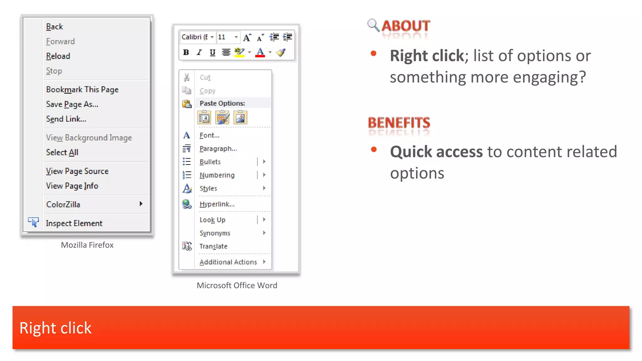
• Right click; list of options or
                                                  something more engaging?


                                                • Quick access to content related
                                                   options


      Mozilla Firefox


                        Microsoft Office Word


Right click
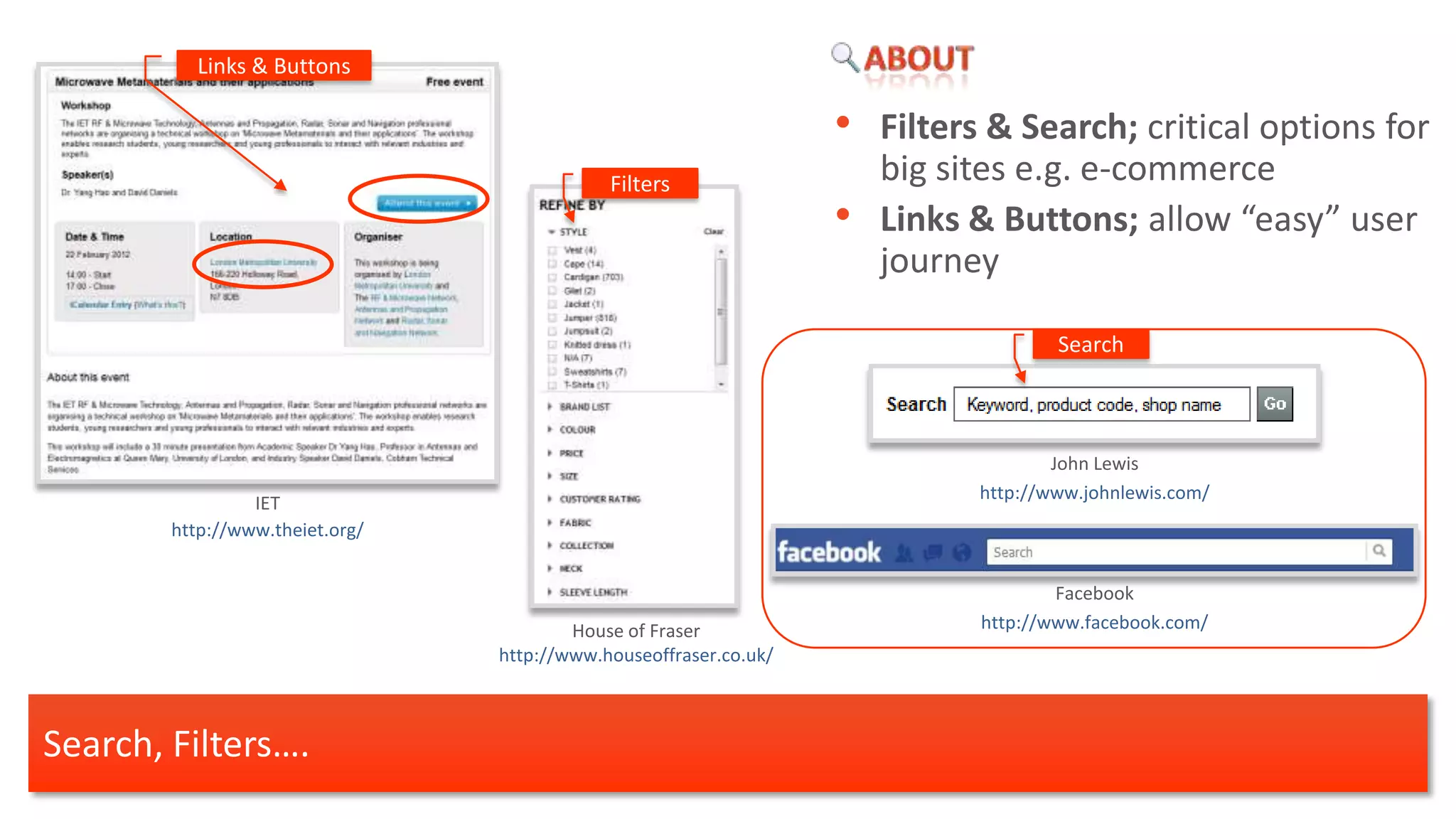
Links & Buttons

                                                                   •   Filters & Search; critical options for
                                             Filters                   big sites e.g. e-commerce
                                                                   •   Links & Buttons; allow “easy” user
                                                                       journey

                                                                                     Search


                                                                                     John Lewis
                                                                             http://www.johnlewis.com/
                 IET
        http://www.theiet.org/


                                                                                     Facebook
                                         House of Fraser                     http://www.facebook.com/
                                 http://www.houseoffraser.co.uk/


Search, Filters….
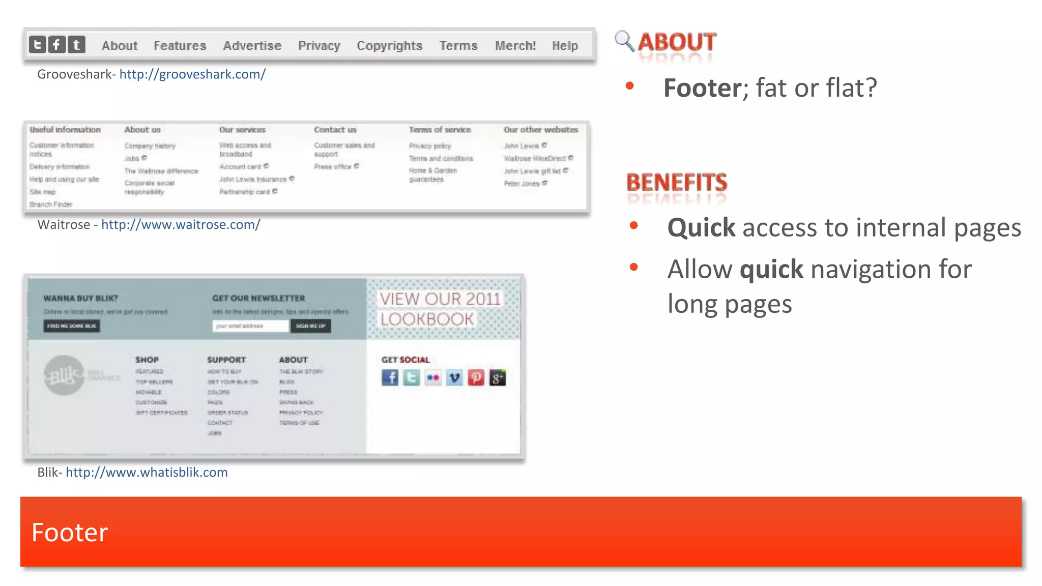
Grooveshark- http://grooveshark.com/
                                       • Footer; fat or flat?


Waitrose - http://www.waitrose.com/
                                       • Quick access to internal pages
                                       • Allow quick navigation for
                                          long pages


Blik- http://www.whatisblik.com


Footer
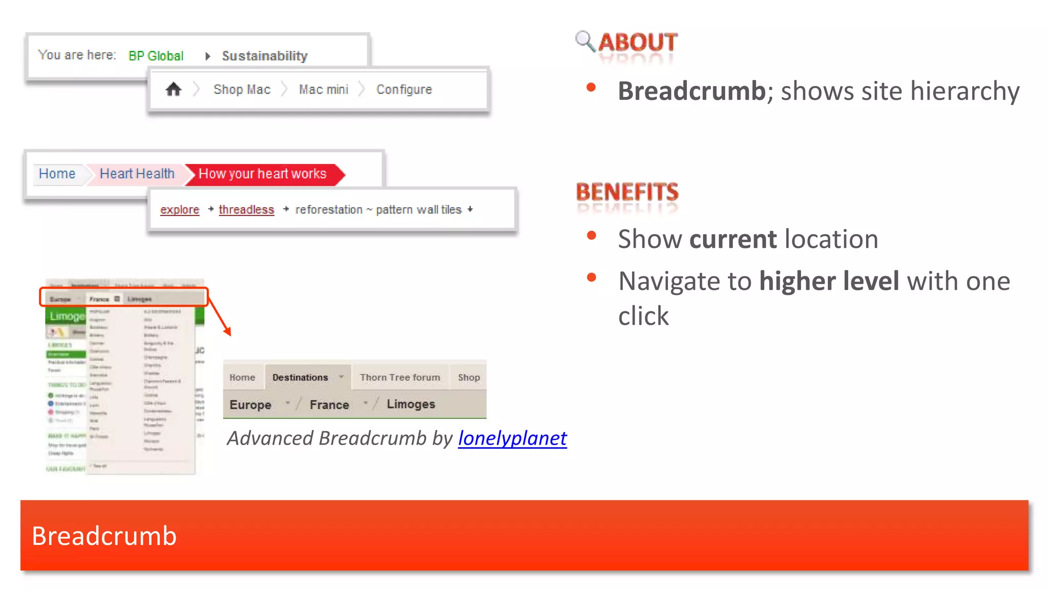
• Breadcrumb; shows site hierarchy


                                                   • Show current location
                                                   • Navigate to higher level with one
                                                     click


             Advanced Breadcrumb by lonelyplanet


Breadcrumb
• Sitemap; list all pages of your
                                                        website.
                                                    •   “Sitemaps are used rarely by
                                                        the users”. [1]


                                                    • “Users see all available content
                                                        areas on one page”. [1]

 Nestle
 http://www.nestle.co.uk

                           BHF
                                                         [1] Jakob Nielsen
                           http://www.bhf.org.uk/        http://www.useit.com/alertbox/sitemaps.html


Sitemap
Research

A few words…
Each navigation approach has pros & cons. All you need to do is satisfy business and users needs.

Overall
•   Mega-nav’s with speaking blocks seems to work well for big sites.
•   Advance search is needed for e-commerce sites.
•   Breadcrumbs are useful for deep sites.
•   Fat footers can pull out useful pages.
•   Microsoft office seems to overcome many usability issues with the ribbon and the right click.


• Do you need help with your website navigation system? Contact us


A few words…
Thank you!


Mariza Samartzi
User Experience Architect

mariza@zabisco.com

Website Navigation Systems

  • 1.
  • 2.
    Navigation Systems Mariza Samartzi UserExperience Architect mariza@zabisco.com
  • 3.
    More… More… Primary Navigation Systems Secondary Navigation Systems
  • 4.
  • 5.
    • Horizontal bar;text links, buttons, tabbed-shaped • Simple • Clean • Minimal • Avoid adding TOO many options More information is shown on mouse over Horizontal bar
  • 6.
    • Speaking Blocks:short menu label; single word or short syllables • Allow sections to be grouped • Easy to scan • Doesn’t require users to “think” • Keyword optimised for SEO • Human tone of voice Speaking Blocks
  • 7.
    • Drop down;list of links on click • Fly-Out menu; list more options on mouse over • Quick access to lower levels • Less space is needed Fly-Out indicator • Fly-Out menu is not ideal for tablets Drop down
  • 8.
    Mega-Nav; Big, two-dimensional drop-down panels. [1] • Expose more options • Avoid landing pages Nike http://www.nike.com • Eliminate scrolling [1] Henleys [1] Jakob Nielsen http://www.henleys.co.uk/ http://www.useit.com/alertbox/mega-dropdown-menus.html Mega-Nav
  • 9.
    • Multi-Tab Mega-Navbe laid out differently to reflect the content of the zone. Adidas http://www.adidas.com Benance http://www.behance.net/ Mega-Nav
  • 10.
    • Doormat; sameas an “always open” drop-down menu • Visibility of each sections content • Hover/active states can act like a breadcrumb • Single click access to either Level 1 and Level 2 Picsolve www.picsolve.com (by Zabisco) Doormat
  • 11.
    • Ribbon; introducedby Microsoft office • “Word 2007 users are now using four times as many features as they used in previous versions” [1] Quick Access Toolbar Tabs Gallery Microsoft Office Word Group Dialog box launcher [1] eBook Microsoft Office Ribbon
  • 12.
    Mega-Navs • Increases accessibility •Uses different features to expose more options e.g.: 1. Drop downs 2. Tool tips 3. Mega-Navs Enhanced tool tip 4. Galleries Drop down list Ribbon
  • 13.
    Side-nav; left or right? 1. Left: conventional approach 2. Right: prioritize content • Accordion side-nav; click to expose more options. • Only reveal the options when required • Quickly browse to subsections • Ideal for sub navigation Accordion Side Menu
  • 14.
    • Combinations; differentfeatures can work together and add value Porche http://www.porsche.com/usa/ Vertical bar menu + Fly-out drop down + Mega-nav IET http://www.theiet.org/ Speaking blocks + Mega-nav, (By Zabisco) Combinations
  • 15.
  • 16.
    • Right click;list of options or something more engaging? • Quick access to content related options Mozilla Firefox Microsoft Office Word Right click
  • 17.
    Links & Buttons • Filters & Search; critical options for Filters big sites e.g. e-commerce • Links & Buttons; allow “easy” user journey Search John Lewis http://www.johnlewis.com/ IET http://www.theiet.org/ Facebook House of Fraser http://www.facebook.com/ http://www.houseoffraser.co.uk/ Search, Filters….
  • 18.
    Grooveshark- http://grooveshark.com/ • Footer; fat or flat? Waitrose - http://www.waitrose.com/ • Quick access to internal pages • Allow quick navigation for long pages Blik- http://www.whatisblik.com Footer
  • 19.
    • Breadcrumb; showssite hierarchy • Show current location • Navigate to higher level with one click Advanced Breadcrumb by lonelyplanet Breadcrumb
  • 20.
    • Sitemap; listall pages of your website. • “Sitemaps are used rarely by the users”. [1] • “Users see all available content areas on one page”. [1] Nestle http://www.nestle.co.uk BHF [1] Jakob Nielsen http://www.bhf.org.uk/ http://www.useit.com/alertbox/sitemaps.html Sitemap
  • 21.
  • 22.
    Each navigation approachhas pros & cons. All you need to do is satisfy business and users needs. Overall • Mega-nav’s with speaking blocks seems to work well for big sites. • Advance search is needed for e-commerce sites. • Breadcrumbs are useful for deep sites. • Fat footers can pull out useful pages. • Microsoft office seems to overcome many usability issues with the ribbon and the right click. • Do you need help with your website navigation system? Contact us A few words…
  • 23.
    Thank you! Mariza Samartzi UserExperience Architect mariza@zabisco.com