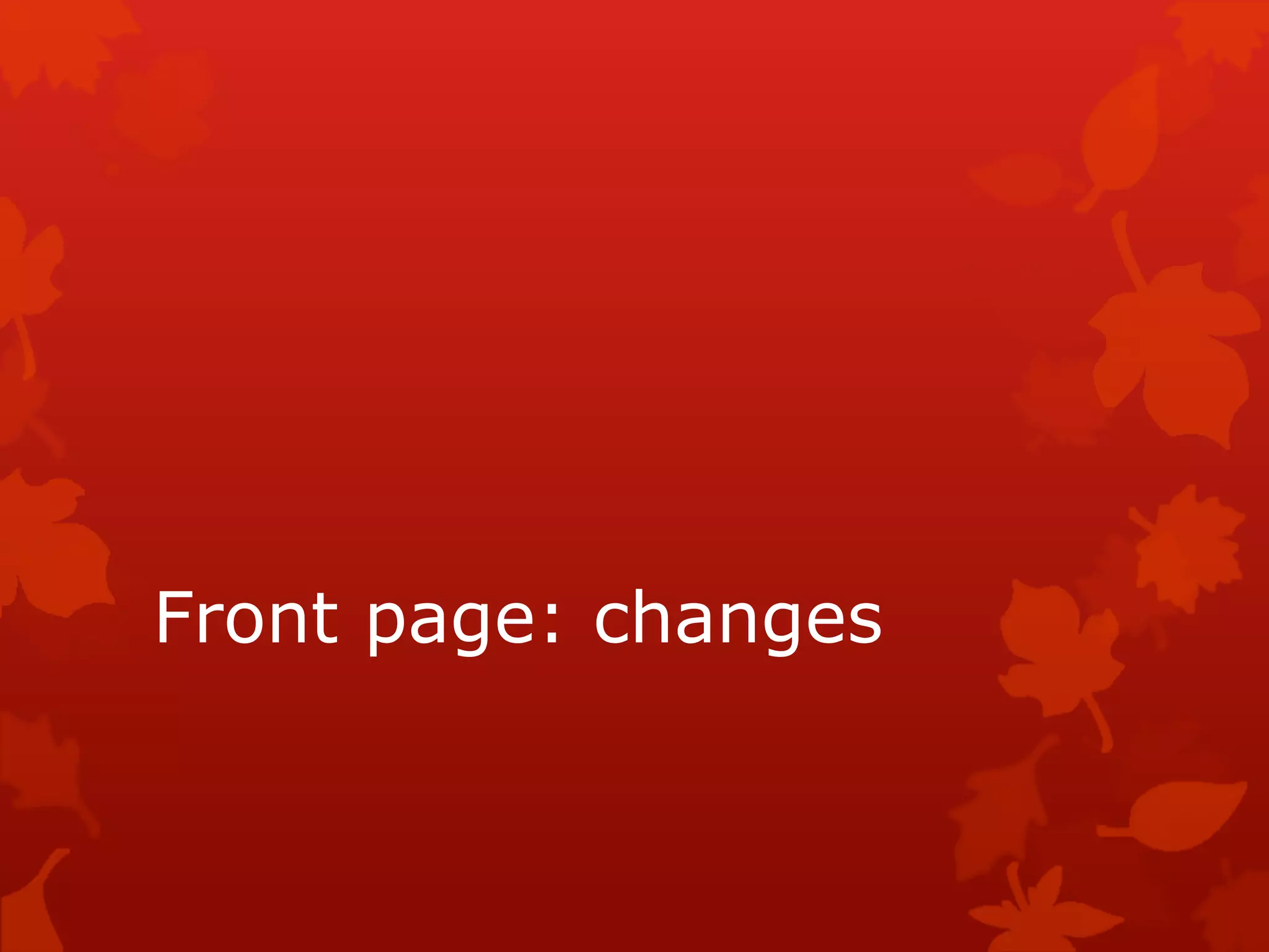
1) The document discusses changes made to the front page design of a magazine, including making the main text bolder and changing its color to better fit the color scheme and attract the target audience.
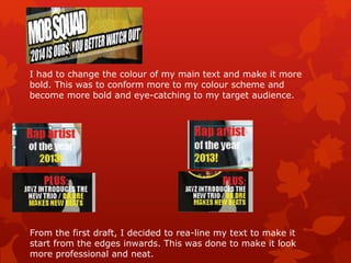
2) Social media icons were repositioned to look more professional and structured, and an arrow was added to imply following on social media.
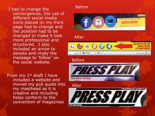
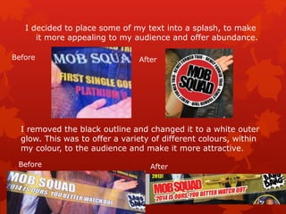
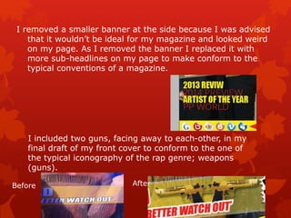
3) Some text was moved into a splash for more visual appeal and variety, and a smaller side banner was removed to conform to typical magazine conventions.