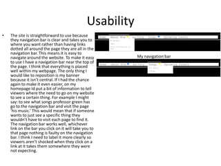
2. Purpose
• The purpose of my website was to advertise Professor Green and to
give recent updates to his fans. It was to also meant to inform
people on his tour dates. To achieve this I will use pictures, recent
news about him, I will use YouTube videos (movie clips) and
information I can get from Google about him. I think I was very
successful in achieving my aim because it does everything it is
meant to in a sophisticated way that looks professional. The only
thing I would change is add more information and what his is doing
at the moment as I have only said about his early life and about 2
pieces of news. This means that viewers do not know what he is up
to at the moment. My gallery page didn’t work as well as I would
have liked. I would have liked to put a play/pause button on this but
could not get it to work, so if I was to do this again I would try to
make these buttons work. My scroll bar on my news does not work
either put the text can still be scrolled to, so again if I was to do this
again I would try to make that work.
3. Audience
• My website is aimed at teenagers at 15+. This
is because it is modern music so is aimed at
the younger generation but because of the
language he uses it may offend younger
children and teenagers. To make it appeal to
this age group I used font that wasn’t boring to
look at and colours that were bold and stand
out, black background and white text. I also
used quite sophisticated language because
they will be old enough to understand it but I
didn’t use a lot of vocabulary that is hard to
understand, this is because it doesn’t appeal to
teenagers that listen to rap music as Professor
Green uses slag and taboo words. If I had the
chance to do it again I wouldn’t use as much
writing because teenagers don’t tend to like to
read be chunks of block information so I would
try to break it down with pictures or something
a little more interactive. I would have liked to
have put a merchandise page but I didn’t know
how to make tick boxes to choose the product
the customer wants. Like this.
4. Readability
• I think that the text is very legible because the
font is easy enough to read even though it is a
bit different the letter are obvious. The text
stands out from the background well, the
background is black and the text is white so the
contrast makes the text easy to see. The text I
chose to use was Letter Gothic Std, the size of
my text was 18px. My links are obvious as they
are a different colour and underlined, when you
highlight the ones in my navigation bar they
change colour. My text originally was going to be
bold but this made it hard to read to I changed it
back to normal. When there is a lot of text in a
block it is harder to read so if I did it again I
would use smaller paragraphs to separate my
text out making it easier to read. I think my text
contrast worked well and I think the style of my
text is good because it isn’t boring so its more
interesting to read.
• This is a small sample of my text to show the
contrast, the font and the size. It also shows that
it is hard to read in big chunks.
5. Usability
• The site is straightforward to use because
they navigation bar is clear and takes you to
where you want rather than having links
dotted all around the page they are all in the
navigation bar. This means it is easy to
navigate around the website. To make it easy
to use I have a navigation bar near the top of
the page. I think that everything is placed
well within my webpage. The only thing I
would like to reposition is my banner
because it isn’t central. If I had the chance
again to make it even easier, on my
homepage Id put a bit of information to tell
viewers where the need to go on my website
to see a certain thing. For example I might
say: to see what songs professor green has
go to the navigation bar and visit the page
‘his music.’ This would mean that if someone
wants to just see a specific thing they
wouldn’t have to visit each page to find it.
The navigation bar works well, whichever
link on the bar you click on it will take you to
that page nothing is faulty on the navigation
bar. I think I need to label it more clearly so
viewers aren’t shocked when they click on a
link at it takes them somewhere they were
not expecting.
My navigation bar
7. Overall
• Overall my website works efficiently and easily. All my
links on and off my navigation bar work and go to the
correct pages on my website and off my website. The
text stands off my background and is clear. Everything
is in line and looks professional and sophisticated. I
would like to get my scroll bars to work and put a
working play/pause button on my slide shows. Also if I
had the chance again I would add a merchandise page
where viewers can buy things. I would say that my
navigation bar is a strength because everything works
on it and my animation is a strength because I have
used a lot of it and it all looks well placed. A weakness
would be that my scrollbars do not work.