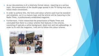
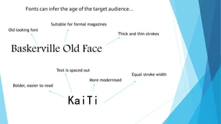
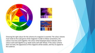
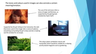
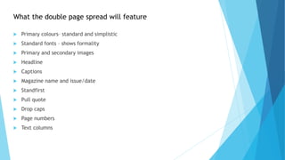
The document discusses font and color choices for magazines. It states that fonts and colors can influence how an audience perceives a magazine and that the choices must match the genre. It recommends using standard, simplistic fonts and colors for a documentary magazine article to achieve a formal, mature tone that is consistent with the established Radio Times magazine which typically features a white background, black text and red subheadings. The document also notes that font styles can indicate the intended age of a magazine's target audience.