Evaluation
Factual writing
Planning
Before I could start to produce my booklet I had to make sure that I knew what
information I would use in my final product, as well I needed to know what style I
would use for my final product. In order to make sure that I had covered all of
these bases I started out with researching the vegan lifestyle. What benefits there
are to having one, what the disadvantages are. What's wrong with my current diet,
and the ways that it’s affecting me.
I also wanted to know what people’s opinions are of the vegan diet and what
people know about it. In order to make sure that I received a wide and varied
amount of different opinions I created a survey on Survey monkey. With this tool I
was able to quickly and effectively create a survey that would be usable on a social
media platform in order to acquire people’s opinions on the subject. As a result
people surprisingly did not what to know about the different effects that being
vegan has on you. But instead wanted to know about the different foods that they
would be able to eat, where to eat and the current effect that their diet was having
on them.
As a result of this I received a significant amount of
answers from a wide range of different groups on my
questions. Ultimately non-vegans said that they would be
more interested in becoming vegan if they knew more
about the vegan lifestyle. As a result of this I concentrated
on researching what being vegan means for you as a
consumer mainly focusing on health aspects of the diets,
covering both the advantages and disadvantages of
veganism.
As a result of this I looked at the elements such as vitamin
/ protein deficiencies in vegans. As well the cancer risks
that are possible when consuming meats. As a result of all
this information. I had to ensure that I would have
sufficient information to educate the reader, as well as
enough content that would keep the booklet engaging.
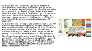
Thus I stated created a mood board, this would allowed
me to reference all of the different aspects that I wanted
to be implemented into my final product. Some of the
main aspects that I focused on were; the different visual
styles that I could use, the colour theme, the different
fonts and reference material.
Production
During the production stages I made sure that I
would utilise not only the skills that I have learned
from previous experiences and topics, but to also
ensure the use of any information that I might have
gathered / learned from my pre-production stages.
As a result of this during the production I had to
focus on picking a particular style to focus on using.
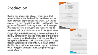
Originally I intended on using a colour scheme that
mainly consisted on a range of shades of both blue
and orange. I quickly decided that this would not
be a great scheme to stick to as the colours clashed
heavily when I used gradients. As a result of this I
decided to go with a more casual theme consisting
with a range of orange shades complimenting a
range of greys.
Content
The actual content that is displayed in my work is rather informative and visually
pleasing. Some of the main reasons for this is due to the fact that I have attempted
to make sure that the content that I have conveyed is not only gender neutral but so
that it is also easy to read in such a way that would guarantee that the reader would
be able to understand what I have written.
In terms of the visual content, I have attempted to ensure that any additional
observable graphics and effects are engaging and only serve to improve upon the
text. In order to achieve this I have made sure that I use a range of basic colours that
compliment any of the images / logos that I have included in the leaflet.
When creating my product I used my mood board as a reference when laying out my
design. One of the main refences that I used during the design stage was that of a
range of both infographics and other leaflets present and not on my mood board.
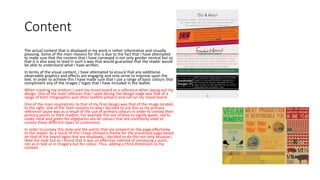
One of the main inspirations to that of my final design was that of the image located
to the right, one of the main reasons to why I decided to use this as my primary
reference sauce was as a result of the use of primary colours in order to convey their
primary points to their readers. For example the use of blue to signify water, red to
covey meat and green for vegetation are all colours that are commonly used to
convey these different types of sustenance.
In order to convey this style and the points that are present on the page effectively
to the reader. As a result of this I have utilised a theme for the presented page based
on that of the brand logos that are displayed, I decided to do this not only because I
liked the style but as I found that It was an effective method of conveying a point,
not as in text or in imagery but for colour. Thus adding a third dimension to my
content.
Skills
Whilst creating my content. I used a wide variety off different tools
and techniques in order to achieve the my final result. First of all I
had to utilise photoshop in order to create my content, as a result
of learning how to use photoshop over the course of the last 7
years I have come to have a good understanding on how to handle
to program. As a result of this I used photoshop in order to create
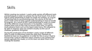
all of the different visual elements in my booklet, I used many
simples tools such as the ruler to ensure clean lines, as well as
more advance tools such as the layers style menu, this allowed to
be able to improve upon my content visually via the use of
shadows, gradients and glows.
During the production of my booklet I used a range of different
skills in order to effectively covey the style that I wanted my
booklet to have on my audience. In order for this is occur I had to
ensure that I used an effective colour scheme in my content that
would captivate the reader, or at the least not deter them from
reading the booklet.
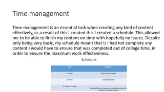
Time management
Time management is an essential task when creating any kind of content
effectively, as a result of this I created this I created a schedule. This allowed
me to be able to finish my content on time with hopefully no issues. Despite
only being very basic, my schedule meant that is I had not complete any
content I would have to ensure that was completed out of collage time, in
order to ensure the maximum work effectiveness.
Areas for improvement
One of the main areas of improvement that I needed to focus on was my time management. One of the main reasons for this is that I
was constantly changing my ideas of how I wanted my final products to look like. As a result of this some elements of my booklet do
not look how I regionally intended them to look. One of the key points that clearly show this is the theme that is visible on both the
infographic and the fact files. One of the main visual irregularity's that are evidently on these pages and no other, Is that of the
shaded squares that are visibly highlighting different titles. My original plan was to implement them into all of the pages and use the
texture as a place holder. Unfortunately I was not able to do this as a result of having to recreate this new pattern on each new asset.
The reason why I wanted to do this was that I enjoyed the final out come of this style despite the amount of time that It required me
to create.
Another area that I sound have improved upon was my file management. As a result of the fact that I was using my own laptop in
order to create all of the work that I have produced there were many different pre-existing files that were folders and files with
similar names. As a result of this a substantial amount of time was required of me to reorganise files, if I was to do this again from the
get go I would have created a naming scheme for my content, this would have allowed me to avoid the issues that I came into contact
with and possibly spent more time creating / improving upon my work.
Another area that was lacking was the colour scheme that I used. After the peer review of my content via online methods, a large
quantity of people came to the conclusion that the booklet was very business like, educational yet the overall booklet was very
monotonal in terms of the colour scheme, especially in terms of the colour scheme. This was not my original intent. One of my main
reasons to this is due to the fact that I intended to use a theme consisting of range of different blues and oranges, but early on in
development I decided that the colour scheme looked rather sickly, as well as being very hard to work with. Despite this the original
theme did suit my target audience better.
Final Product
To finish up my product, I converted every page from my booklet from a PDF to a PNG. I then
proceeded to place each image into a PowerPoint presentation so that the booklet would be in a
easy to access in one digital file. Overall I can confidently say that I am happy with my finished
product in terms of the leaflet and infographics.
One of the main reasons to why I have come to this conclusion is as a result of the fact that I have
completed all of the tasks that I have aimed to achieve by the end of my project. For example I
managed to complete my task by the set date, by completing all 12 pages to a quality that I would
expect to be present on a leaflet aimed at the targeted market that I have chosen.
Despite this if I was to make any major changes to the overall final product then the choosing my
original colour scheme would have been a good died, this is mainly due to the fact that the amount
of time that went into creating a new theme with in my already present layout was not worth the
final out come. Instead of going though a large range of different colour schemes. (Inevitably
ending in one similar to my original) I should have instead experimented with a range of different
tones and shades of the chosen blue and orange colour scheme, as this would have likely given me
a much faster outcome with what I wanted out of my final design.
My last point is also backed up from the use of external peer review via the use of survey monkey
as a use of for assessment / feedback from people other than my classmates. The overall
conclusion that I reached from listening to all of the feed back that I received was that the strong
use of greys in the majority of the slides present was evoking a very business message towards
them despite the leaflet being aimed at a young male audience.
If I was to ensure that my product is visually more appealing to my target audience I would ensure
that again, I would have used the original plan of a blue and orange colour theme this is as the
brighter and more attractive layout might have made it more attractive to look at.

Evaluation factual writing

  • 1.
  • 2.
    Planning Before I couldstart to produce my booklet I had to make sure that I knew what information I would use in my final product, as well I needed to know what style I would use for my final product. In order to make sure that I had covered all of these bases I started out with researching the vegan lifestyle. What benefits there are to having one, what the disadvantages are. What's wrong with my current diet, and the ways that it’s affecting me. I also wanted to know what people’s opinions are of the vegan diet and what people know about it. In order to make sure that I received a wide and varied amount of different opinions I created a survey on Survey monkey. With this tool I was able to quickly and effectively create a survey that would be usable on a social media platform in order to acquire people’s opinions on the subject. As a result people surprisingly did not what to know about the different effects that being vegan has on you. But instead wanted to know about the different foods that they would be able to eat, where to eat and the current effect that their diet was having on them.
  • 3.
    As a resultof this I received a significant amount of answers from a wide range of different groups on my questions. Ultimately non-vegans said that they would be more interested in becoming vegan if they knew more about the vegan lifestyle. As a result of this I concentrated on researching what being vegan means for you as a consumer mainly focusing on health aspects of the diets, covering both the advantages and disadvantages of veganism. As a result of this I looked at the elements such as vitamin / protein deficiencies in vegans. As well the cancer risks that are possible when consuming meats. As a result of all this information. I had to ensure that I would have sufficient information to educate the reader, as well as enough content that would keep the booklet engaging. Thus I stated created a mood board, this would allowed me to reference all of the different aspects that I wanted to be implemented into my final product. Some of the main aspects that I focused on were; the different visual styles that I could use, the colour theme, the different fonts and reference material.
  • 4.
    Production During the productionstages I made sure that I would utilise not only the skills that I have learned from previous experiences and topics, but to also ensure the use of any information that I might have gathered / learned from my pre-production stages. As a result of this during the production I had to focus on picking a particular style to focus on using. Originally I intended on using a colour scheme that mainly consisted on a range of shades of both blue and orange. I quickly decided that this would not be a great scheme to stick to as the colours clashed heavily when I used gradients. As a result of this I decided to go with a more casual theme consisting with a range of orange shades complimenting a range of greys.
  • 5.
    Content The actual contentthat is displayed in my work is rather informative and visually pleasing. Some of the main reasons for this is due to the fact that I have attempted to make sure that the content that I have conveyed is not only gender neutral but so that it is also easy to read in such a way that would guarantee that the reader would be able to understand what I have written. In terms of the visual content, I have attempted to ensure that any additional observable graphics and effects are engaging and only serve to improve upon the text. In order to achieve this I have made sure that I use a range of basic colours that compliment any of the images / logos that I have included in the leaflet. When creating my product I used my mood board as a reference when laying out my design. One of the main refences that I used during the design stage was that of a range of both infographics and other leaflets present and not on my mood board. One of the main inspirations to that of my final design was that of the image located to the right, one of the main reasons to why I decided to use this as my primary reference sauce was as a result of the use of primary colours in order to convey their primary points to their readers. For example the use of blue to signify water, red to covey meat and green for vegetation are all colours that are commonly used to convey these different types of sustenance. In order to convey this style and the points that are present on the page effectively to the reader. As a result of this I have utilised a theme for the presented page based on that of the brand logos that are displayed, I decided to do this not only because I liked the style but as I found that It was an effective method of conveying a point, not as in text or in imagery but for colour. Thus adding a third dimension to my content.
  • 6.
    Skills Whilst creating mycontent. I used a wide variety off different tools and techniques in order to achieve the my final result. First of all I had to utilise photoshop in order to create my content, as a result of learning how to use photoshop over the course of the last 7 years I have come to have a good understanding on how to handle to program. As a result of this I used photoshop in order to create all of the different visual elements in my booklet, I used many simples tools such as the ruler to ensure clean lines, as well as more advance tools such as the layers style menu, this allowed to be able to improve upon my content visually via the use of shadows, gradients and glows. During the production of my booklet I used a range of different skills in order to effectively covey the style that I wanted my booklet to have on my audience. In order for this is occur I had to ensure that I used an effective colour scheme in my content that would captivate the reader, or at the least not deter them from reading the booklet.
  • 7.
    Time management Time managementis an essential task when creating any kind of content effectively, as a result of this I created this I created a schedule. This allowed me to be able to finish my content on time with hopefully no issues. Despite only being very basic, my schedule meant that is I had not complete any content I would have to ensure that was completed out of collage time, in order to ensure the maximum work effectiveness.
  • 8.
    Areas for improvement Oneof the main areas of improvement that I needed to focus on was my time management. One of the main reasons for this is that I was constantly changing my ideas of how I wanted my final products to look like. As a result of this some elements of my booklet do not look how I regionally intended them to look. One of the key points that clearly show this is the theme that is visible on both the infographic and the fact files. One of the main visual irregularity's that are evidently on these pages and no other, Is that of the shaded squares that are visibly highlighting different titles. My original plan was to implement them into all of the pages and use the texture as a place holder. Unfortunately I was not able to do this as a result of having to recreate this new pattern on each new asset. The reason why I wanted to do this was that I enjoyed the final out come of this style despite the amount of time that It required me to create. Another area that I sound have improved upon was my file management. As a result of the fact that I was using my own laptop in order to create all of the work that I have produced there were many different pre-existing files that were folders and files with similar names. As a result of this a substantial amount of time was required of me to reorganise files, if I was to do this again from the get go I would have created a naming scheme for my content, this would have allowed me to avoid the issues that I came into contact with and possibly spent more time creating / improving upon my work. Another area that was lacking was the colour scheme that I used. After the peer review of my content via online methods, a large quantity of people came to the conclusion that the booklet was very business like, educational yet the overall booklet was very monotonal in terms of the colour scheme, especially in terms of the colour scheme. This was not my original intent. One of my main reasons to this is due to the fact that I intended to use a theme consisting of range of different blues and oranges, but early on in development I decided that the colour scheme looked rather sickly, as well as being very hard to work with. Despite this the original theme did suit my target audience better.
  • 9.
    Final Product To finishup my product, I converted every page from my booklet from a PDF to a PNG. I then proceeded to place each image into a PowerPoint presentation so that the booklet would be in a easy to access in one digital file. Overall I can confidently say that I am happy with my finished product in terms of the leaflet and infographics. One of the main reasons to why I have come to this conclusion is as a result of the fact that I have completed all of the tasks that I have aimed to achieve by the end of my project. For example I managed to complete my task by the set date, by completing all 12 pages to a quality that I would expect to be present on a leaflet aimed at the targeted market that I have chosen. Despite this if I was to make any major changes to the overall final product then the choosing my original colour scheme would have been a good died, this is mainly due to the fact that the amount of time that went into creating a new theme with in my already present layout was not worth the final out come. Instead of going though a large range of different colour schemes. (Inevitably ending in one similar to my original) I should have instead experimented with a range of different tones and shades of the chosen blue and orange colour scheme, as this would have likely given me a much faster outcome with what I wanted out of my final design. My last point is also backed up from the use of external peer review via the use of survey monkey as a use of for assessment / feedback from people other than my classmates. The overall conclusion that I reached from listening to all of the feed back that I received was that the strong use of greys in the majority of the slides present was evoking a very business message towards them despite the leaflet being aimed at a young male audience. If I was to ensure that my product is visually more appealing to my target audience I would ensure that again, I would have used the original plan of a blue and orange colour theme this is as the brighter and more attractive layout might have made it more attractive to look at.