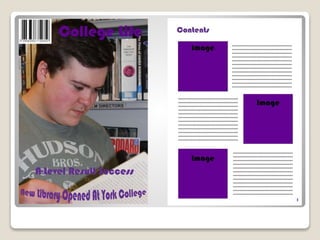
The document discusses the progression of the student's skills in creating a magazine from their preliminary college magazine to their final music magazine product. They learned important design skills like choosing readable fonts, using photo editing to improve image quality, incorporating branding through color schemes, and including buzzwords to attract audiences. The quality and audience-focus of the final magazine showed significant improvement from not considering these elements in their first magazine. The student gained valuable experience in magazine design and production techniques.
Instructions for Submissions thorugh G- Classroom.pptxJheel Barad
This presentation provides a briefing on how to upload submissions and documents in Google Classroom. It was prepared as part of an orientation for new Sainik School in-service teacher trainees. As a training officer, my goal is to ensure that you are comfortable and proficient with this essential tool for managing assignments and fostering student engagement.
How to Make a Field invisible in Odoo 17Celine George
It is possible to hide or invisible some fields in odoo. Commonly using “invisible” attribute in the field definition to invisible the fields. This slide will show how to make a field invisible in odoo 17.
The French Revolution, which began in 1789, was a period of radical social and political upheaval in France. It marked the decline of absolute monarchies, the rise of secular and democratic republics, and the eventual rise of Napoleon Bonaparte. This revolutionary period is crucial in understanding the transition from feudalism to modernity in Europe.
For more information, visit-www.vavaclasses.com
Embracing GenAI - A Strategic ImperativePeter Windle
Artificial Intelligence (AI) technologies such as Generative AI, Image Generators and Large Language Models have had a dramatic impact on teaching, learning and assessment over the past 18 months. The most immediate threat AI posed was to Academic Integrity with Higher Education Institutes (HEIs) focusing their efforts on combating the use of GenAI in assessment. Guidelines were developed for staff and students, policies put in place too. Innovative educators have forged paths in the use of Generative AI for teaching, learning and assessments leading to pockets of transformation springing up across HEIs, often with little or no top-down guidance, support or direction.
This Gasta posits a strategic approach to integrating AI into HEIs to prepare staff, students and the curriculum for an evolving world and workplace. We will highlight the advantages of working with these technologies beyond the realm of teaching, learning and assessment by considering prompt engineering skills, industry impact, curriculum changes, and the need for staff upskilling. In contrast, not engaging strategically with Generative AI poses risks, including falling behind peers, missed opportunities and failing to ensure our graduates remain employable. The rapid evolution of AI technologies necessitates a proactive and strategic approach if we are to remain relevant.
Palestine last event orientationfvgnh .pptxRaedMohamed3
An EFL lesson about the current events in Palestine. It is intended to be for intermediate students who wish to increase their listening skills through a short lesson in power point.
June 3, 2024 Anti-Semitism Letter Sent to MIT President Kornbluth and MIT Cor...Levi Shapiro
Letter from the Congress of the United States regarding Anti-Semitism sent June 3rd to MIT President Sally Kornbluth, MIT Corp Chair, Mark Gorenberg
Dear Dr. Kornbluth and Mr. Gorenberg,
The US House of Representatives is deeply concerned by ongoing and pervasive acts of antisemitic
harassment and intimidation at the Massachusetts Institute of Technology (MIT). Failing to act decisively to ensure a safe learning environment for all students would be a grave dereliction of your responsibilities as President of MIT and Chair of the MIT Corporation.
This Congress will not stand idly by and allow an environment hostile to Jewish students to persist. The House believes that your institution is in violation of Title VI of the Civil Rights Act, and the inability or
unwillingness to rectify this violation through action requires accountability.
Postsecondary education is a unique opportunity for students to learn and have their ideas and beliefs challenged. However, universities receiving hundreds of millions of federal funds annually have denied
students that opportunity and have been hijacked to become venues for the promotion of terrorism, antisemitic harassment and intimidation, unlawful encampments, and in some cases, assaults and riots.
The House of Representatives will not countenance the use of federal funds to indoctrinate students into hateful, antisemitic, anti-American supporters of terrorism. Investigations into campus antisemitism by the Committee on Education and the Workforce and the Committee on Ways and Means have been expanded into a Congress-wide probe across all relevant jurisdictions to address this national crisis. The undersigned Committees will conduct oversight into the use of federal funds at MIT and its learning environment under authorities granted to each Committee.
• The Committee on Education and the Workforce has been investigating your institution since December 7, 2023. The Committee has broad jurisdiction over postsecondary education, including its compliance with Title VI of the Civil Rights Act, campus safety concerns over disruptions to the learning environment, and the awarding of federal student aid under the Higher Education Act.
• The Committee on Oversight and Accountability is investigating the sources of funding and other support flowing to groups espousing pro-Hamas propaganda and engaged in antisemitic harassment and intimidation of students. The Committee on Oversight and Accountability is the principal oversight committee of the US House of Representatives and has broad authority to investigate “any matter” at “any time” under House Rule X.
• The Committee on Ways and Means has been investigating several universities since November 15, 2023, when the Committee held a hearing entitled From Ivory Towers to Dark Corners: Investigating the Nexus Between Antisemitism, Tax-Exempt Universities, and Terror Financing. The Committee followed the hearing with letters to those institutions on January 10, 202
5. In what ways does your media product
use, develop or challenge forms and
conventions of real media products?
6. FRONT COVER
The first convention that I have followed is the location of the masthead at the top of the page. Much like the
Kerrang! Example, I have decided to use a bold font, Bebas Neue, as this will make the magazine more
identifiable as it will be easier to read. I have also chosen to use a blue font as it is more stereotypically
associated with the male gender which is my target audience. I have chosen to use more vibrant colours in my
magazine as I believe it will be more attractive to teenagers as well as the fact that my magazine is being
published in march, linking it to the connotations of spring such as freshness and vibrancy.
I have also followed the convention of including the use of buzz words on my front cover. An example in my
magazine would include the use of “EXCLUSIVE” as it is likely to persuade the audience of my magazine that
they should purchase it as they will be unable to find the same stories anywhere else. It is also likely to make
the audience feel more involved as if they are one of the first to hear the latest news.
I have include a main image on my front cover which follows set magazine conventions. The person featured in
my image is using direct address to the audience which makes the audience feel connected with the image.
This is important as she is the main focus of the page, and so needs to interest the audience.
The layout of my magazine is vibrant but still represents the male genre through the use of blues, blacks and
reds which are typically associated with the male sex and as being more masculine. I have also linked my
colour scheme to the main image through the use of the same shade of red on the “Return” part of the main
cover line as is found on the woman's lipstick in the main image.
I have also included the convention of a barcode as without it, the consumer would be unable to purchase the
magazine.
I have included the commonly found convention of the date and price of the magazine. I have chosen to use a
smaller font than the masthead for example as I do not want to draw much attention to this feature. The price
of £1.99 also reflects my magazines audiences socioeconomic status as teenagers would not have as much
money to spend on magazines etc.
7. CONTENTS
The first convention that I have followed is the situation of the headerat the top of the page. I have done this
as it will be one of the first things that the reader will notice. It is an important feature as it allows the reader
to easily identify what section of the magazine they are currently on. I have used the Bebas Neue font as well
as it shows continuity throughout my magazine and as it is a bold font, making it very easy to read. The black
font colour that I have used also makes the masthead standout against the light grey colour that I have used
as the background, also making the magazine easier to read.
I have also followed the convention of including a menu along the left hand side of the page. This is useful as it
provides the reader of my magazine easy access to the different sections of the magazine. I have also used a
bold font on the band names as well as used capital letters as it will allow the reader to more easily identify the
articles that they are interested in. The headings labelling the different sections of my magazine have been
written in a white font and have been placed on a black background, further increasing the accessibility of my
magazine as the reader can look at sections that they are most interested in.
Also coinciding with the accessibility of my magazine, I have included the convention of page numbers at the
bottom of my magazine. This allows the reader to easily identify what section of the magazine they are
currently on and will allow the reader to identify what page they should be looking at in regards to what article
they would like to read. I have used a small font size as I did not want it to detract attention from the feature s
of the page it was situated on. I have however used a black font colour as it stands out against the light
background, making it easy to read.
I have not include the convention of featuring a main image on my contents page, I have instead included the
use of three equally sized images placed on the right side of the page. I have done this as I did not want to
detract the importance of one image by placing a much larger image next to it. This should attract the reader
equally to each of the images and their related articles. Linking to this is the use of page numbers situated on
the image. This has been done as it links the image with the article that it is representing, giving ease of access
to the reader as they can easily identify their favourite artists from the images provided.
I have also followed the same colour scheme as is found on front cover as it shows continuation in the
magazine. An example of this is the use of the same shade of blue that is found on the masthead on the front
cover, on the menu.
8. How does your media product
represent particular social groups?/
Who would be the audience for your
media product?
9. My magazine has been aimed at the age bracket of 10 – 20 with a largely male oriented audience who are
likely still in full time education.
This has been largely reflected in my magazine and the way it has been designed. Due to the gender of the
audience of my magazine, I decided that I should use a colour scheme that reflects the male gender more than
the female gender. This is shown through the use of colours such as red, blue and black, which tend to have
connotations of being more masculine than other colours such as pink for example which would be much more
typically associated with the female gender. My choice of images has also been affected by the audiences
gender as well. I have chosen to include a female of the same age range as my audience on my front cover as
to entice the male gaze. This attraction would likely persuade the reader to read the magazine and the use of
direct address would also likely create a link with my audience, persuading them to read it also.
The age and class of my audience also had an effect on my magazine. As my audience is likely to be in full time
education, they would likely be in the lower class due to a lack of money. This has been reflected in the price of
my magazine as I have set the price at £1.99, making it easily affordable by students. As my audience is quite
young, I have used a range of images as they are more likely to attract the attention of a younger audience
than perhaps an article would. I have also included bright colours in my header and masthead for example as
they are also likely to attract such an age ranges attention. In my contents for example, I have used short
sentences to describe the different articles and features as I believe that it would be more accessible to those
of this age range as they would prefer to get their information quickly.
This age range is likely to have a wide variety of social groups but as my magazine focuses mainly on the pop
punk and indie genres, they are they two types of social groups that I have focused on. This is evident through
the use of bright colours in my magazine to represent the more punk social classes and the use of filters for
example on my images to give the magazine an indie theme as well. My choice of bands to include in the
magazine also reflects these social groups as well for example, the use of Fall out Boy to represent the pop
punk genre and bands such as Paramore which are described as more indie. The mise en scene of my images
also reflects these social groups as the female that features in my double page spread is wearing clothes that
would be more associated with being indie.
10. What kind of media institution might
distribute your media product and
why?
11. I have chosen to use the media institution, Bauer. This is firstly due to the fact that they publish similar music
magazines such as Kerrang! Which I believe is an advantage as one magazine would be able to cover the
stories that the other would not be able to do. The differences between the two magazines would also mean
that Bauer would be able to reach a broader audience as my magazine focuses on the indie social group as well
as punk whereas Kerrang! does not. Bauer also publish a wide range of other magazines revolving around a
wide range of subjects, this could be an advantage as Bauer could advertise in these magazines which would
result in a much greater amount of public awareness and therefore more magazines being bought.
A disadvantage however would be the fact that both magazines share the pop punk genre. This could result in
some articles being very similar to one another as well as many of the stories that would be featured. As
Kerrang! Is the more well known magazine, it would likely be that any of the exclusive stories would be
featured in Kerrang! Due to it’s larger audience which would be a disadvantage to using Bauer.
Bauer also publishes the radio station, “Radioaire” as well as the television stations, “Kerrang!” and “Q”. This
would be an advantage as Bauer would be able to advertise my magazine on both the television stations and
the radio station. As Kerrang! And Q share a similar audience as my magazine, I believe the advertising would
be very effective as the audience will already be interested in the types of music that are featured in my
magazine, resulting in a greater amount of sales.
13. One of the first things I have used to attract my audience id the colour scheme. As my magazines audience is
the male gender, I have used colours that would generally be described as more masculine such as blue, red
and black. The use of a more bright blue colour however reflects the pop punk genre of which my magazine
features, as pop punk has connotations of bright colours. I have used this same colour scheme throughout my
magazine, be it on my masthead, contents numbers or headings.
The font I have chosen for my masthead will also attract my audience as it is very bold and therefore easily
read. The use of the blue from my colour scheme also helps to create a striking attraction on my front page as
well creates a sense of continuity throughout my magazine, making it more visually appealing towards my
audience.
My choice of image on the front cover is also there to attract my audience. As my audience is mainly of the
male gender, I have decided to use a female on the front who is of the same age range of my target audience.
This has been done to entice my audience as they will feel more connected to the magazine as it will appear
that the magazine has been designed around there age range. A female has also been choses as to entice the
male gaze, which should persuade the male readers to purchase the magazine. Direct address has also been
used on my image as it will create a link between my magazine and my audience, further persuading them that
they should purchase the magazine as it will feel more personal towards them. To address my audience, the
model is wearing clothes that would typically be found on someone of my audiences age range, thus attracting
them to the magazine. I have also created a link between the image and the heading, “The Scene Kids Return”
by using the same shade of red as is found on the woman's lipstick and placing it as a colour overlay on a
section of the heading. In the other images featured in my magazine, most of my models appear to be happy
and having a good time. I have done this as it will likely have an affect on the way that my audience feels when
looking at my magazine.
As another way of attracting and addressing my audience, I have used the buzz word “Exclusive” on my front
cover. This has been done as it will persuade my audience that they will have to purchase my magazine if they
want to read the exclusive story as they will not be able to find it in any other magazine. This will also make
my magazine stand out as I have used a bold black font on a light background, making it more striking towards
the audience.
I have also used pull quotes on my magazine as a way of attracting my audience. The aim of a pull quote is to
give a sense of the article that it is from to the audience and to hopefully attract them to read the magazine. I
have also placed the pull quote on a white background with a black font as it is much more likely to stand out
on the page and therefore attract the audience more.
14. What have you learnt about
technologies from the process of
constructing this product?
15. The different types of technology I have used include:
Photoshop
Microsoft PowerPoint
E-mail
Blogs
Cameras
Lighting
All of these pieces of technology have allowed me to create my magazine as well as do my research before
hand.
The most major piece of technology I have used is Photoshop. I had no prior experience of this software before
I began the production of my magazine. I have learnt a multitude of different skills including photo editing as a
way of making my images more visually appealing and the ability to use colour overlays if I did not believe that
a certain font was not as appealing as it could be.
While Photoshop was used to construct my magazine, I had to use a camera in order to capture the images
that would feature in my magazine. I have learnt about the rules of photography such as allowing the subject
of my image room to move so that they do not look too confined as well as the rule of thirds to help with
composition.
I also used the software, PowerPoint as a way of storing any data that I collected from my surveys or audience
research that I did. PowerPoint allowed easy formatting and an ease of sharing on to my blog whenever I
needed to through the use of the website slide share.
I widely used my e-mail as it allowed an easy source of organisation as I could store any work that I needed to
take home on it and access it whenever I needed it. This also acted as a failsafe as a digital copy of my work
would always be stored on the e-mail in case of loss or damage.
Another piece of technology I have used for the first time included the lighting in the photo studio. This allowed
me to create a variety of images and gave me the ability to choose an image based on light and shadow for
example.
16. Looking back at your preliminary task,
what do you feel you have learnt in
the progression from it to the full
product?
17. I believe that I have learnt a lot since I first started this task. In comparison with my college magazine, there
are many differences between the two. The main difference is the quality of the two magazines. It is evident
that I did not know much about making a magazine aesthetically pleasing when I first began.
The first improvement is my choice of font. The font that I used on my college magazine in quite difficult to
read in comparison with my music magazine. The colour that I have chosen for the font also has no link with
the image. At points, the colour also makes the font hard to read as the shadows on the image do not contrast
with the colour, they in fact blend with it, making reading it difficult. I have also just placed the text anywhere
on my college magazine which has blocked parts of the image which does not appear very pleasing.
The quality of the image has also vastly improved since I first started. On the college magazine I had no
experience of photo editing or acquiring the right composition of the image. I had not left the model much
headroom which resulted in him looking confined in the image. The shadows on the image are also not pleasing
as I had not used any studio lighting as I have done in my music magazine. I have also not left much space for
any headlines or buzz words as the background of the image would cause any text that I placed on the page, to
become difficult to read. On my music magazine I have used photo editing skills such as changing the
brightness, contrast and exposure of the image in order to create a better quality photo. I have also learnt how
to use tools such as the lasso tool which allowed me to erase any part of the image that would not look very
good on the finished magazine.
I have also learnt how to create a magazine for a specific audience or social group. In my college magazine, I
did not pay any attention to the colour scheme I was using so it wouldn’t have attracted a specific audience. As
I learnt that my music magazines audience was of the male gender, I was able to plan my colour scheme and
use colours that would attracts such a gender e.g. masculine colours such as red and blue. Another way I have
learnt to attract an audience is through the use of buzz words which I had not used on my college magazine.
This was an important feature that I used throughout my magazine as a way of enticing then to read and buy
the magazine.