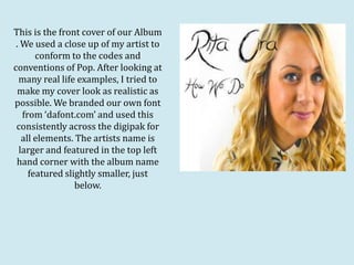
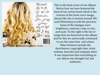
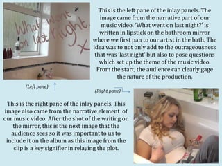
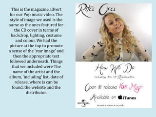
How effective is
the combination
of your main
product and
ancillary texts?
This is the front cover of our Album
 . We used a close up of my artist to
       conform to the codes and
conventions of Pop. After looking at
  many real life examples, I tried to
 make my cover look as realistic as
possible. We branded our own font
   from ‘dafont.com’ and used this
 consistently across the digipak for
   all elements. The artists name is
  larger and featured in the top left
 hand corner with the album name
     featured slightly smaller, just
                 below.
This is the back cover of our Album.
   Notice how we have featured the
back of our artists head which is the
   reverse of the front cover image,
almost like she is turned around. We
 used Photoshop to edit the pictures.
       Some of the changes were
   brightness, contrast, crop, re-size
  and scale. To the right is the list of
songs that are featured on the album
and for this we universally continued
   to use the same font and colour.
       Other features include the
  distributors, copyright date, artist
website, barcode and company label.
 It was important that everything on
    our album was thought out and
               authentic.
This is the left pane of the inlay panels. The
                                     image came from the narrative part of our
                                      music video. ‘What went on last night?’ is
                                     written in lipstick on the bathroom mirror
                                  where we first pan to our artist in the bath. The
                                  idea was to not only add to the outrageousness
                                   that was ‘last night’ but also to pose questions
                                     which set up the theme of the music video.
                                    From the start, the audience can clearly gage
                                             the nature of the production.
        (Left pane)
                                   (Right pane)

 This is the right pane of the inlay panels. This
image also came from the narrative element of
our music video. After the shot of the writing on
    the mirror, this is the next image that the
   audience sees so it was important to us to
 include it on the album as this image from the
    clip is a key signifier in relaying the plot.
This is the magazine advert
 for our Pop music video. The
 style of image we used is the
same as the ones featured for
    the CD cover in terms of
  backdrop, lighting, costume
     and colour. We had the
picture at the top to promote
a sense of the ‘star image’ and
   then the appropriate text
followed underneath. Things
  that we included were The
   name of the artist and the
album, ‘including’ list, date of
    release, where is can be
  found, the website and the
           distributor.
All of my ancillary texts link together really
       well in terms of permanence and
   continuity. Moreover, they represent the
  strong link between the digipak elements
  the music video itself. Collectively, it is an
    effective package. We created a strong
sense of brand identity by the overall use of
    the same font, photo type and relevant
   information. When we created them, we
   did not see them as individual elements,
 but a contributing area to a larger product.
  Critically speaking, a personal strength of
      ours was to create a brand identity
      however a weakness was that our
  characteristics of the product could have
   been more recognisable with instigating
factors such as a key colour or a memorable
              expression or stance.

Eval quest 2

  • 1.
    How effective is thecombination of your main product and ancillary texts?
  • 2.
    This is thefront cover of our Album . We used a close up of my artist to conform to the codes and conventions of Pop. After looking at many real life examples, I tried to make my cover look as realistic as possible. We branded our own font from ‘dafont.com’ and used this consistently across the digipak for all elements. The artists name is larger and featured in the top left hand corner with the album name featured slightly smaller, just below.
  • 3.
    This is theback cover of our Album. Notice how we have featured the back of our artists head which is the reverse of the front cover image, almost like she is turned around. We used Photoshop to edit the pictures. Some of the changes were brightness, contrast, crop, re-size and scale. To the right is the list of songs that are featured on the album and for this we universally continued to use the same font and colour. Other features include the distributors, copyright date, artist website, barcode and company label. It was important that everything on our album was thought out and authentic.
  • 4.
    This is theleft pane of the inlay panels. The image came from the narrative part of our music video. ‘What went on last night?’ is written in lipstick on the bathroom mirror where we first pan to our artist in the bath. The idea was to not only add to the outrageousness that was ‘last night’ but also to pose questions which set up the theme of the music video. From the start, the audience can clearly gage the nature of the production. (Left pane) (Right pane) This is the right pane of the inlay panels. This image also came from the narrative element of our music video. After the shot of the writing on the mirror, this is the next image that the audience sees so it was important to us to include it on the album as this image from the clip is a key signifier in relaying the plot.
  • 5.
    This is themagazine advert for our Pop music video. The style of image we used is the same as the ones featured for the CD cover in terms of backdrop, lighting, costume and colour. We had the picture at the top to promote a sense of the ‘star image’ and then the appropriate text followed underneath. Things that we included were The name of the artist and the album, ‘including’ list, date of release, where is can be found, the website and the distributor.
  • 6.
    All of myancillary texts link together really well in terms of permanence and continuity. Moreover, they represent the strong link between the digipak elements the music video itself. Collectively, it is an effective package. We created a strong sense of brand identity by the overall use of the same font, photo type and relevant information. When we created them, we did not see them as individual elements, but a contributing area to a larger product. Critically speaking, a personal strength of ours was to create a brand identity however a weakness was that our characteristics of the product could have been more recognisable with instigating factors such as a key colour or a memorable expression or stance.