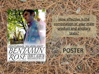
How effective is the
combination of your main
product and ancillary
texts?

POSTER
The representation of our artist in the poster is
more confident than in the music video, with a
low angle shot giving him more status, and an
expression that is more self-assured and
masculine than his more sensitive
representation in the video.

Also, although the artist is frowning slightly, the
sun spots and the white colour used creates an
innocence and a goodness that makes for a
more ‘boy next door’. This is in keeping with how
we represented our artist in the music video,
and how we decided to pursue his
representation after our target audience
research.

This makes him appeal more to
the female audience by creating
a stronger image. However,
there is still a hint of the more
emotional tone set in the video,
with the red shirt, which has
connotations of romance, and
the italic font which is more
delicate.
The synergy between the poster
and the music video is very clear,
as the photograph is taken from a
still in the video, and so uses the
same location and mise en scene.
The font is also similar to the fonts
used in the video, with a thin italic
font that we found often in our
similar product research. This font
we kept the same throughout our
ancillary products for cohesion.

The forest location not only matches
our music video, but also is suitable for
our genre as it suggests a folk-feel and
also has a strong green colour that
feels fresh and new, making it suitable
for a debut album. The brightness of
the colours throughout and the
natural sunlight streaming in also
suggests the album advertised will
have a lighter tone – a technique we
also used in our video to match the
sweet, floating tone of the song.
The inclusion of the CD cover is also
something we found from similar
product research, and really helps to
link our products together. As our
artist is new, it is especially
important to link products together
so audiences can start to recognise
the singer and the brand.
The inclusion of the ‘FEATURING
SILVERLIGHT’ also helps to make links for
audience members who have seen the
video or heard the first single – they can
then recognise the singer and be
encouraged to buy the album based on
their enjoyment of the video. The
inclusion of the release date and website
also helps the poster to feel modern fresh
and new, with further images, digital
downloads, videos and information
available online.

Evaluation 2

  • 1.
    How effective isthe combination of your main product and ancillary texts? POSTER
  • 2.
    The representation ofour artist in the poster is more confident than in the music video, with a low angle shot giving him more status, and an expression that is more self-assured and masculine than his more sensitive representation in the video. Also, although the artist is frowning slightly, the sun spots and the white colour used creates an innocence and a goodness that makes for a more ‘boy next door’. This is in keeping with how we represented our artist in the music video, and how we decided to pursue his representation after our target audience research. This makes him appeal more to the female audience by creating a stronger image. However, there is still a hint of the more emotional tone set in the video, with the red shirt, which has connotations of romance, and the italic font which is more delicate.
  • 3.
    The synergy betweenthe poster and the music video is very clear, as the photograph is taken from a still in the video, and so uses the same location and mise en scene. The font is also similar to the fonts used in the video, with a thin italic font that we found often in our similar product research. This font we kept the same throughout our ancillary products for cohesion. The forest location not only matches our music video, but also is suitable for our genre as it suggests a folk-feel and also has a strong green colour that feels fresh and new, making it suitable for a debut album. The brightness of the colours throughout and the natural sunlight streaming in also suggests the album advertised will have a lighter tone – a technique we also used in our video to match the sweet, floating tone of the song.
  • 4.
    The inclusion ofthe CD cover is also something we found from similar product research, and really helps to link our products together. As our artist is new, it is especially important to link products together so audiences can start to recognise the singer and the brand. The inclusion of the ‘FEATURING SILVERLIGHT’ also helps to make links for audience members who have seen the video or heard the first single – they can then recognise the singer and be encouraged to buy the album based on their enjoyment of the video. The inclusion of the release date and website also helps the poster to feel modern fresh and new, with further images, digital downloads, videos and information available online.