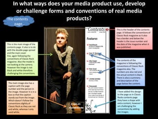
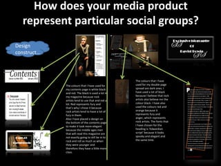
The document discusses the conventions of "Classic Rock" magazine and how the media product uses and challenges some of those conventions. It follows several conventions, such as placing the masthead in the center top, having a central cover image looking at the camera, and including only one main cover line in the center. However, it also challenges some conventions by making the masthead less bold and a different color, including the price next to the logo rather than just the logo, and adding designs above and below the cover line. The contents page follows conventions like numbered listings but challenges them by including images.