This document summarizes the key elements of a mock rock music magazine the author created for a class assignment. The summary includes:
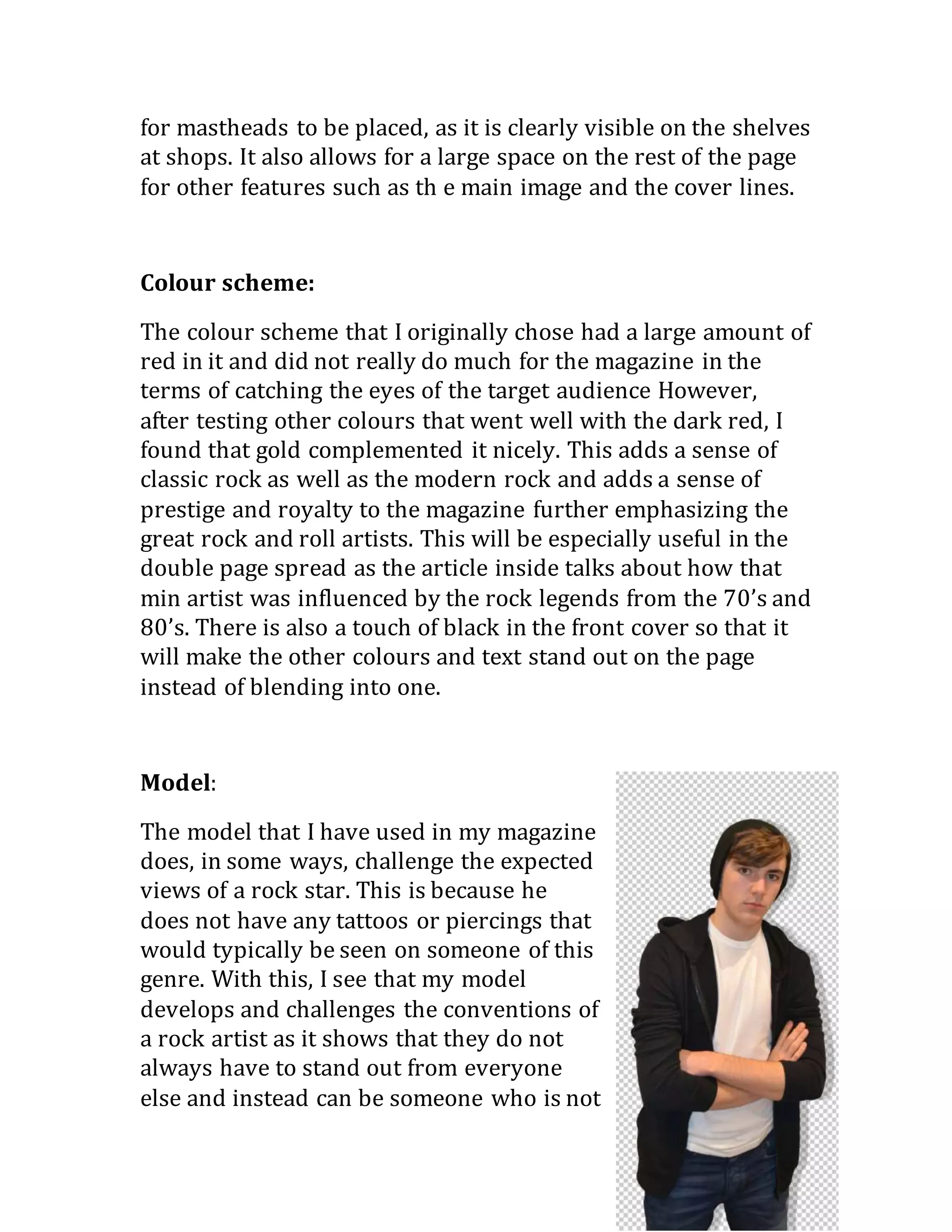
The masthead "Plectrum" was chosen to represent the genre and is displayed in a rugged font. A color scheme of red, gold, and black was selected.
The cover features a model challenging conventions by lacking tattoos but dressing appropriately in a white t-shirt and black hoodie.
Inside, the contents page layout and repeated use of the masthead and colors maintain consistency. A double-page spread tells the artist's backstory rather than a typical Q&A.


![Evaluation of my own music magazine production [autosaved]](https://cdn.slidesharecdn.com/ss_thumbnails/evaluationofmyownmusicmagazineproductionautosaved-130425151252-phpapp02-thumbnail.jpg?width=640&height=640&fit=bounds)