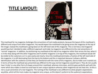
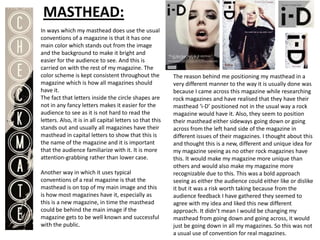
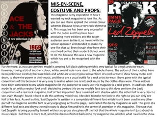
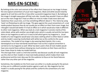
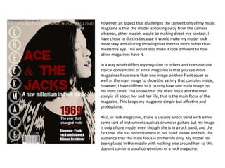
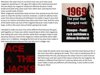
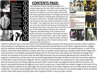
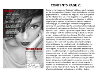
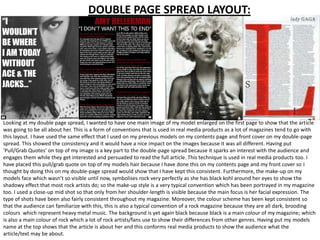
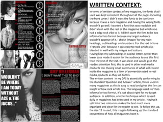
The document discusses how the author's media product uses and challenges conventions of real magazines. The masthead layout challenges conventions by being vertical on the left side rather than horizontal across the top. While some elements follow conventions, like a consistent color scheme and readable capital letters, other aspects are unique, such as circular shapes around the masthead. The author also discusses layouts and design elements of the cover, contents pages, and spreads, noting how some follow conventions of real magazines while others take unique approaches.
