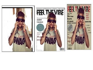
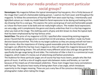
SlideShare a Scribd company logo
1 of 22
AS Media Studies
Coursework Evaluation
By Salim Jeylani Saeed
Introduction to essay
• In order to do this project, I had to undertake a lot of research, particularly into the conventions of a music magazine covers.
I had to analyse a number of existing magazine covers and see how they were related in terms of language, ideology,
institution, audience and representation. I also carried out research into which programs I could possibly use for my project
and what the advantages and disadvantages were.
•
• After the research, I had to plan my project accordingly, and I referred back to my research in the planning stages of my
magazine. I had to go out and take the pictures which I would need for my final design. These included a medium close up of
a student. Once I was happy that I had a good idea, I moved onto actually designing the cover.
•
• For my sixth form magazine cover, I decided to use Adobe Photoshop CS5. The advantage of this was that it allowed me to
arrange all of my work into layers. For this particular project, I had about 13 layers, all of which were either text, pictures or
shapes. In addition, Photoshop allowed me to produce a cover which looked professional, and I would not have achieved
this if I had used another form of software. I had a main image of a student in medium close up, which I cut out. The
advantage of cutting it out was that I could place her over, and other various items on the page. This made her stand out
from the page. This was something I picked up from doing the research, as I noticed that most magazines do this to present
the model to the audience as the main topic or subject.
•
• Overall, I think the final outcome was successful. This is for a number of reasons. Firstly, everything stands out on the page.
This is especially true for the picture of the student. Secondly, it has all the features of a typical magazine cover, including a
main title, main picture, appropriate headlines and a barcode. The layout of it is also quite similar to some of the ones I
analysed whilst doing my research, so therefore, it shows my research was effective. Finally, in terms of representation, it
actually looks like a college magazine.
•
• There are a number of different things I could do to improve my college magazine cover. I could do something more creative
and add other images, such as add a border, or make them into different shapes, and I could also space them out
throughout the page. However, as this is my first attempt at creating a magazine cover, I think I’ve created something that
looks quite professional
Upon using Photoshop cs5
• Firstly the first image that I used was a picture of my model but without any real colour scheme for context to ensure my target audiences of 18 were
the main target. This was the time that I was struggling the most when using Photoshop sc5 because I was struggling to erase the background
without damaging the pictures full affect.
• Secondly moving to the second design I thought really hard on what type of masthead that I wanted to make my target audiences interest in my
music magazine, therefore thinking back to vibe effect and how their front covers have developed a type of casual gangster look which motivated me
to use the word “vibe” in my masthead but in a different affection by isolating it and making sure my target audience focus more on the word “feel".
I also added on some sell lines and other cover line like “50 greatest songs for example to ensure that there is some context that is interesting in the
music magazine and the writing being bold and standing out ensures that the audiences are attached upon the release of the album. At this time of
the stage of my music magazine I also added a barcode which shows how professional compared to a vibe magazine or a hip hop rap music magazine
that there is always a bar code that is used. I also thought about the shape and sizes of certain objects like the circle and other stuff like the words at
the side of my music magazine which shows that there is certain things that stand out more than others to emphasise their importance to be noticed
by the audience type.one typical conventions that I feel I have followed is the placement of the image at stage 2of my front cover which is right at
the middle to show facial, expression the type of clothing their wearing and their overall background. This is very important in music magazine
because instantly the audience can relate back to a specific genre based on the clothing and this relates back to the picture because of the word
“swag” on his shirt shows that rap or hip hop music is the genre.
• Lastly being my final production of my music magazine was the important convention of were things should be placed and I thought really hard to be
aware that I notice this. Another key element was the title as it needed to stand out if I were to follow the conventions of a rap music magazine so
therefore in this case I used the affect of the colours red and black together as a mixture of the two in each letter so that the title (masthead) be the
most focused point out of all the other typical conventions shown in the music magazine. The most important out of all I thought were things should
be placed and also the different font affect as using the stylish font for the “legend of rap” as it signifies that legends are from past memories but also
to identify who they are more easily as this information is critical to the audience to notice.
• Following the same ideology of all music magazine having a male figure and being stereotypical of the male figure being a careless and attractive
person this was one convention that I followed throughout doing my front cover and my double spread page.
• This is were the colour scheme had played a big role into making my music magazine more realistic and more attractive because the use of red and
black mixing together does show brightness in colours but also the connotation of it being bold and has that fire affect and it being strict but also
that exciting feeling.
• Overall I have learnt a lot by using Photoshop cs5 because I have managed to use many different tools that I thought I wouldn’t be able to even
identify what they are like for example the crop tool or the pain bucket tool which all helped me to show colour contrast and make things stand out
to my target audience of 18.
In what ways does your media product use, develop or challenge forms and
conventions of real music magazines?
Masthead: One convention I have used is
having a large masthead, and placing it behind
the main image this is also done in ‘classic rock’
as you can see the main image is also in front of
the masthead, this is also common in many
other magazines like Kerrang, Rolling Stone etc.
The sell line links to the main
image this is similar to ‘classic
rock’ magazine as the sell lines
also links to the main image.
These are usually used in
magazines to attract audience to
buy and read magazine.
The main image: This image is a mid-
shot (MS), to show the whole of her
body language. This is common is all
magazines generally as they either have
a main image which is a mid-shot or a
close up of the models face. Similarly to
‘classic rock’ as the main image includes
the models whole body.
The bar code: This is used in all
magazines and usually on the front
page. I have also added the price,
date and issue number this shows
regularity.
Slogan: ‘the way to rock’ is aspirational
towards my audience as it implies that the
magazine can lead them to what they
want to be. Similarly to the magazine
“Classic Rock” their slogan is ‘High Voltage
& Rock ‘n’ Roll’ highlighting what the
magazine is about and creates a rock
audience, as it underlines their interests.
Main colours/ colour scheme: my
magazine colour scheme is red and
black as they work well together and
stand out front he background.
Similarly to ‘classic rock’ they have
also chosen a colour scheme of black
and grey. Both of the backgrounds
are white so the text stands out from
it this is common in most magazines.
Direct mode of address: She has
eye contact with the reader to
make it personal and shows the
artist is confident. In contrast
‘classic Rock’s’ main image doesn’t
use this so the reader is more
detached with the magazine.
Cover lines: I have used cover
lines to introduce what will be in
my magazine, in the same way
‘classic rock’ does .
Main Image: both magazines
have large images that links in
with the main article. Both
images have the cool
fashionable look and the clothes
are stylish and for summer
coolness and have text on top of
the image to explain the image
further.
Title: Differently to ‘NME’ instead of having the title of the
magazine name I have simply made the title ‘contents’ to make it
easier for audience to find pages they are looking for in the
magazine.
Image: vibe image of usher doesn't include
many pictures in contrast to my magazine. I
added 3 main images to make the page more
attractive to look at as too much text makes
the contents page look dull. However his
picture does show him being casual look and
having fashionable clothing. The swag
represent the type of fashion the artist is
trying to bring out to the targeted youth at the
age of 18 being stylish and the black standing
out being affective.
Bar code the barcode is important to show
that my front cover is preffessional and is
appropriate to be approved by the
goverments and its not a copy right of any
other music magazine.this shows the
realism.
The Media Language on here instantly tells us that this page is
based on hip hop music. Firstly, this is because of all the images,
which all have connotations of hip hop such as the hoodies and
flash jewellery, the smoking theme and the swag casual clothing.
Columns: I have used the
usual convention of three
columns down the page.
However I have added a twist
to the layout by making the
introduction paragraph go
across the two columns in a
red colour so it stands out
from the rest. I have also done
this with another paragraph
and the bottom of the page
and made the text size slightly
larger so that too stands out.
In both magazines there is a quote
which had a black background this
is also a common convention. This
is so it stands out from the whole
article and highlights that it is an
important bit of the article.
Title: I decided that I wanted my title to be plain with just the
artists name and a quote from them underneath. In a
different way for the ‘Kerrang’ double page spread where
they do not name the artists on the tile however underneath
the title with a description of them.
Page number: Both of the
magazines have the pages numbers.
They both also include a mini-logo
of the magazine, this is a common
convention used in magazine to
trade mark the magazine.
Both articles begin with the first letter of the
article to be much larger than the text that
follows it. It is also in a different colour.
Main images: Both images are on the left
covering half the page therefore having the
article on the other half of the page.
Effect of smoke
The smoke blown out of his mouth and
used as an effect of dimming fade effect so
that it foreshadows his cool facial
expression showing that his not concern
with anything like wise it was important to
show this dim effect in my music
magazine.
• My magazine uses conventions of real media products in many ways. I used Vibe magazine which is a hip hop magazine as a
influence. For my central image on my front page I used a mid shot angle. Mid shots and close ups are common for music
magazines. The difference between the two magazines is the masthead. a well known magazine like Vibe normally has the
top of the central image just covering the masthead, because the magazine is so well known. However my magazine
masthead has two words so it had to b separated and positioned differently to the Vibe magazine, they also differ with size
vibe is more bold and appealing than my masthead, although both mastheads are positioned at the top of the magazine. My
magazine includes a main story featured on the front of the magazine which attracts the audience. This feature is also
known as a kicker. It is normally in a bold appealing font. My magazines Feel the vibe is bold black with a blue outline that
matches the colour scheme of the magazine issue. Vibe magazine also has a kicker which is bold red writing attracting the
audience. The colour also matches the colour scheme of the magazine red and black. The kickers on both my magazine and
vibes magazine is to do with the central image. The artist on the front page is normally the main story within the magazine.
Features are the mini stories in the magazine. Similarities between my magazine and vibe magazine is that the features are
placed around the central image, using the colours of the magazine The difference between both magazines is the
backgrounds. Vibe magazine has a plain background of two shades of grey. However the background on my magazine is of a
brick wall which has bin edited with colours, this is because my magazine is a grime/urban magazine on the other hand vibe
is a hip hop magazine. The other difference between the magazines are the top and bottom strip. Vibe magazine includes a
top strip which includes information on ‘latest tracks’ nevertheless my magazine doesn’t include a bottom or top strip. Vibe
Magazine Online- http://www.vibe.com/music. My media product uses different forms and conventions from real magazines
such as the title of the magazine. On the title there is a strong bold font and related colour scheme that portrays the
magazine in a strong, powerful way. The Mis-en-scene used in my media product shows the artist as an intriguing character
with an indecisive look, a confident look to show he has a 'swag' attitude about him. the style of the glasses and the
expression on the artists face describes the magazine as laid back and established which is perfect for my designated target
audience. the use of the greyscale background makes the title and the red vibrant colours stand out which will attract the
audience too. The layout of the different features in the magazine are set out in a way to attract the reader and inform them
of the different points that the magazine will cover. for example the layout of 'EMINEM' and 'TI's' quote are positioned
to give the reader an insight of the magazine and tell them what will be coming up without giving too much of the
story away. In order to do this project, I had to undertake a lot of research, particularly into the conventions of a
music magazine cover. I had to analyse a number of existing magazine covers and see how they were related in terms of
language, ideology, institution, audience and representation. I also carried out research into which programs I could possibly
use for my project and what the advantages and disadvantages were. After the research, I had to plan my project
accordingly, and I referred back to my research in the planning stages of my magazine. I had to go out and take the pictures
which I would need for my final design. These included a medium close up of a student. Once I was happy that I had a good
idea, I moved onto actually designing the cover. For my college magazine cover, I decided to use Adobe Photoshop CS5. The
advantage of this was that it allowed me to arrange all of my work into layers. For this particular project, I had about 13
layers, all of which were either text, pictures or shapes. In addition, Photoshop allowed me to produce a cover which looked
professional, and I would not have achieved this if I had used another form of software. I had a main image of a student in
medium close up, which I cut out. The advantage of cutting it out was that I could place her over, and other various items on
the page. This made her stand out from the page. This was something I picked up from doing the research, as I noticed that
most magazines do this to present the model to the audience as the main topic or subject. Overall, I think the final outcome
was successful. This is for a number of reasons. Firstly, everything stands out on the page. This is especially true for the
picture of the student. Secondly, it has all the features of a typical magazine cover, including a main title, main picture,
appropriate headlines and a barcode. The layout of it is also quite similar to some of the ones I analysed whilst doing my
research, so therefore, it shows my research was effective. Finally, in terms of representation, it actually looks like a college
magazine.
How does your media product represent particular
social groups?
Stereotypes: My magazine follows the typical stereotypical hip hop genre, this is firstly because of
the image that I used of a fashionable looking person. I used on my front cover and throughout the
magazine. To follow the conventions of hip hop-RAP from west coast hip hop, I intentionally used
light/dark coluors.as I made my model faded his facial expression to be dozing and looking at the
sky showing that his a cool guy. This express the same social group of cool and fashionable people
as I chose the front cover to be bold and not really bright colours. The models facial expressions
are very edgy, and it complements the genre and clearly underlines that it is a hip hop magazine
when you look at the image. The clothing used is all grey and dim brown to show the typical style
that has been emphasised by hip hop famous artist.
Social Class: The price of my magazine is £2.50, I specified after researching existing magazine
prices I found that the average price is varied from £2.50 and above, therefore I made my finale
decision based around that. This links to my target audience as they are young and will not have a
high income. Also the importance of it being a good reasonable price be the fact that lots of
teenagers can afford this hip hop music magazine as they will target this magazine because of the
fashion and style being shown. This will attract many different social class and age also gender but
specifically the age range being 18 and older. The institution of Vibe is that it is a commercial music
magazine, which makes it's money out of advertising and fashion promotions.
The Audience for these particular pages are of course hip hop music lovers; people who like that
genre of music. It will be a mix of roughly equal ratio between males and females, as I can tell
because of the mixed use of interviewed celebrities. These main images have many connotations
with hip hop. The pictures have nearly all being taken from a low angle, which introduces
superiority to the images meaning. These are just a very few of the conscious decisions that the
photographer makes when taking the image.
What kind of media institution might distribute
your media product and why?
• In my magazine I have various features that address and attract my audience that were included for this
specific effect. magazines try to make the reader buy the product again and again so it is important that they
address and attract the audience in the correct way. IPC would be the publisher of my music magazine
because although it doesn't publish magazines of the hip hop genre it would open up a gap in the market and
maybe my magazine would be a big benefit to this type of industry. is a consumer magazine and digital
publisher in the United Kingdom, with a large portfolio selling over 350 million copies each year. IPC Media
produce magazines such as NME and other relevant magazines and although it is unusual for a magazine of
this type to use an institution like this i feel that it could be a massive success. The target audience would
increase if my magazine was published with IPC because they currently aim at indie audiences but however
this could increase to hip hop audiences if my magazine was produced. Bauer is a similar organisation that
produces hip hop magazines and so if i chose these it would be more beneficial as these have more
expertise's in this area. For my representation I looked at things that would interest young people who read
Vibe magazine. For the clothes I looked extensively into clothing and found that polo shirts and tank==
tops are popular within this genre. Vibe magazine has introduced some artists showing them smoking or
displaying a similar image, but however i overruled this decision as i decided it would be too much to include
on the font page and would take away some distinguished features from the page(s).
After browsing various music magazine covers I found the following to be interesting to me, as Lil Wayne
is posing he displays a look that typifies the generation I want to attract with my magazine and so I would
look into something similar for my magazines front cover. He ticks all the boxes for someone of the age and
genre that I am trying to persuade and so my artist will be based around her style and dress sense, giving
more representation.
when comparing Lil Wayne and Albion I noticed they had many similarities between them and so if I could
capture the correct pose in a picture then I might be able to make my magazine look like the professional one
• As you can see both are wearing a fashionable checkered shirts that typifies the generation. My research was
key and thorough when deciding how I should approach my magazine since I knew of the ruthless nature of
the magazine industry and the need to be competitive. So I thought that styling Osman like lil Wayne who
appears in Vibe magazine regularly would be a excellent way of reaching out to my readers profile and help
me to sell more magazines.
• IPC – www.ipcmedia.com
Who would be the audience for your media product?
The age group of my audience is the age group from 18 to about 21 years of age. The magazine will be aimed for
both genders, female and male. But I am mainly being specific to male people who I think will attract the most
attention from. Doing my questionnaire and research that most 18+ preferred a lot of pictures instead of a lot of
text to have tried to limit my words so that it can attract my target audiences.
My magazine is aimed at young adults studying in university or are young professionals, my magazine is suited
to this particular audience as conventions sometimes using lots of informal language used throughout my
magazine makes clearly states that this is magazine that follows many gossip news that might be interesting.
Therefore using informal and some formal language creates a mature and formal content to give an adult feel
however also creates the urban fashion and desghinsh style to all the street hood stereotypical brands that
might endure in being at a lower class .
The artists my target audience would listen to and prefer is Kanye West, T.I Wiz Khalifa, Lil Wayne 50 Cent,
My audiences fashion would be adventurous and colourful in what they wear, denim and comfortable clothing.
They will not have the stereotypical view of Rap genre wearing black constantly. They will be individualistic
through their fashion sense and personality. An urban youth culture associated with rap music and the fashions
of African-American residents of the inner city.
Thing they like doing is to unwind and "chill out" to and be fashionable. They will also spend time with friends
socialising and use social networking sites. They will be focused on there studies and could have a full time job.
The personality of my target audience will have a loud personality, and as I said before they will be very
individualistic. My Magazine is striking and it links back to the sub-genre of my magazine which is hip hop west
coast American rap as this type of music is emphasised on really loud and outgoing music like my target
audience.
How did you attract / address your audience?
Feel the vibe masthead is very striking and mind
boggling, the lines look as if the words are vibrating
and almost moving of the page. This links back to
the sub-genre of my magazine which is rock as this
type of music is emphasised on really loud and
outgoing music like the typeface.
My slogan attracts my audience who possibly have aspirations of
becoming a rock star themselves. Using a bold slogan like this
creates interest in my audience and will gradually form a
connection between the two, thus making them want to buy the
magazine every month.
It was very crucial to use a model with attitude and
ego that suite the genre of my magazine. The make-
up, clothing and facial expressions are key to the
images as the model appears to look like a
professional rock star. This draws audience to my
magazine as they too might have the ambition to
become a rock star in which they will look up to
professional artists.
In response to my questionnaire it is made evident that the
colour scheme red, black and white was preferred most, so I
used it throughout my magazine. As I have kept the same
colour scheme throughout my magazine so that the pages
flow together and it is constant. It also continuity of the
magazine and will be recognised easily by the audience. The
colour scheme I have used appeals to both genders so this will
attract a wider audience. The colours I have used contrast
from each other this is so they stand out, and is also eye
grabbing so the audience is attracted to the product.
My target
audience would
typically enjoy
going to concerts,
so I added a cover
line which
included a
concert to watch
a popular band.
My audience are
interested in
upcoming new
artists and music my
magazine offers this
information thus
attracting an
audience.
Listing the most popular
artist of rap music on the
front cover shows there
will be information
about them inside the
magazine, audience will
be attracted to this as
they are admired artists
that audience will like to
know more about.
The tag line attracts
audience as it is
linked to the main
artist in the magazine.
Audience will be
interested in this as
there is a chance for
them to find things in
detail about the
artist.
How did you attract / address your audience?
Audience Feedback
Audience feedback is essential to any music magazine as audience feedback informs
producers whether or not their magazine will be a success or not.
In order to receive audience feedback for my final product, I gave out questionnaires
for people of my target group to fill in. Through this I would get an understanding on
the strengths and limitations of my magazine, what was done well and what could be
improved.
In the questionnaire I asked key questions so that the questionnaire was not too
time consuming for audience, this would also allow me to get more detailed and
critical answers to get in depth feedback for the audience.
Audience Feedback Questionnaire –
1. How does the layout attract you?
2. Is my target audience made clear in the magazine?
3. Would you buy the magazine and why?
4. What is your favourite element of the magazine?
5. Does the magazine link back to the sub-genre of rock?
6. What can be improved?
Audience Feedback
Here is some of the Feedback from the questionnaires:
How does the layout attract you?
“I like the layout because it is easy to navigate throughout the magazine, all text and images are presented clearly.”
“The red and black colour scheme is consistent throughout the magazine, this makes the magazine look
professional.”
“The main image and the fonts are really eye grabbing and effective throughout.”
Is my target audience made clear in the magazine?
“Obviously your targeting rock fans! The pictures make that clear as they are so edgy.”
“I would say that your targeting quite a young audience from about 17-18 and above.”
“The language used shows that the audience is mature.”
Would you buy the magazine and why?
“The price of the magazine is affordable, so I would be more likely to buy it.”
“I’m not that into rock music so this magazine wouldn't be my first choice.”
“The cover lines make me interested, as they are artists I like.”
What is your favourite element of the magazine?
“I love the title, it’s really bold and different.”
“the main image emphasises the rock genre.”
“Everything is clear to read .”
Does the magazine link back to the sub-genre of rock?
“I think so, although it might get confused with a dance magazine.”
“Yeah everything in the magazine is bold and edgy.”
What can be improved?
“I think that you could have used a different model in your contents page.”
“The front cover has a lot of text maybe if there was less of it, it will look better.”
“Maybe you could put borders around the front cover and double page spread like you did for the contents page.”
Overall I am very happy with the feedback which I received for my final product. I believe everyone was very honest
whilst giving feedback, it has been extremely helpful and if I was to make another magazine I would understand the
concepts I need to improve.
What have you learnt about technologies from
the process of constructing this product?
I have never used Photoshop before so I have found it quite hard to work with the
program in the start however the preliminary task helped me to become more
comfortable using the program before staring the music magazine. Creating the music
magazine has helped me broaden my knowledge on how to use Photoshop. When
creating the music magazine Photoshop became more easier to use throughout the
production. By the end of the production of the music magazine I became greatly
familiarised with the program. When using Photoshop I found it easy to work with in
some aspects however there where other features that I found difficult to use and I
wasn’t sure how to apply them to my work. For example when putting my main image in
front of my masthead I found it difficult to put the image in front of the text without
complications, as the masthead kept erasing. I enjoyed using Photoshop as it made the
production of the music magazine much easier, this is because I was able to use a
professional program to create the magazine. Also when placing text and images on the
page it was easier to move them around the page and place them where I preferred
them on the magazine. The other programs I used for the first time was dropbox, this
helped me save my work throughout the production of my magazine and also blogger
this was to post my work up so that the examiners can see the stages of the production
of my magazine to the finale product.
What do you feel you have learnt in the progression from your
preliminary task to the full product?
Things I did well in my magazine is: that the main image reflects the magazine
purpose very well, the cover lines link to the magazine and the layout of cover is
presented well. Things I could improve on is: The background of the front cover
makes it look unimaginative overall , The fonts used are not constant does not look
professional and the colour scheme may be mistaken for one group (looks
feminine) of audience although I thought it would look neutral. The front cover
follows the codes and conventions of a school magazine. I have not used a bar
code as I would think school magazines are free that is also why I did not put a
price on it. However the typical conventions that are represented on a school
magazine have been applied to my cover, for example the issue number and the
date of the magazine is important. In addition the cover lines presented on the
front cover link to the purpose of the magazine. The main image of the magazine
also links to the themes of the magazine as the girl uses direct mode of address
and also is holding a book to make clear to the audience that it is a school
magazine. The colour scheme of the front cover is constant throughout the
magazine cover this also features in real magazines. I also used catchy tag lines like
“Be cool and go to school” which is another convention used in real magazines.
Compared to the music magazine there is a big contrast in the way they are
presented. For example the way the text is set out, it is much more neater
compared to the school magazine. This gives a more professional look and it is
made clear there has been an progression of Photoshop skills, editing skills and a
wider knowledge of music magazine conventions.
Things I did well in my magazine is: The colour scheme throughout the
front cover and the contents page are constant and create an realistic
effect, The page layout is clear to read this lets it be easily accessible to
find articles of interest and the contents page also follows the codes and
conventions of a school magazine. Also all the pages are separated into
sections this also makes the articles easily found for example I used "main
information", "reward", "extra" and "charity". I also added photos related
to the articles and put the page number beside them to show were the
articles linking to the photo can be found. This is similar to real magazines
as they too do this. Things I could improve on: The page looks plane, it is
common to have a lot of text on the contents page, also the colour scheme
doesn’t have any relation to the front cover therefore they do not look like
they are from the same magazine, there should be a sense of fluidity
throughout magazines.
Compared to my music magazine here again there is a clear understanding
of progression between the two contents pages. The music magazine
contents page layout is clear and also follows the codes and conventions of
a real magazine. The text is small and organised to give a professional feel,
also the colour scheme of the contents page link back to my front and
double page spread this contrasts from my preliminary task as there is no
link between the pages.
What do you feel you have learnt in the progression from
your preliminary task to the full product?
• All music magazine front pages tend to use the following conventions in a regular pattern to get the most out of the
magazine...
1) They have an image that really stands out from the page. They make it stand out further by putting it against a light
background and cutting it out and placing it partially over text or the logo of the magazine. This is especially true with the
Vibe magazine. The main picture is covering up half of the logo, yet you still recognise that it is Vibe from the distinguished
'V'. This is because it is a well established institution which people have heard of, so as long as you can see part of the logo,
people will know it is Vibe magazine.
• 2) Nearly all of the magazines I have looked at have at least one banner running across the top or the bottom. The banner
gives the reader extra information about what is inside the magazine such as posters, reviews and competitions. It also may
have a slogan on it.
3) Usually all of the magazines have similar positioning of the logo. They are at the top of the magazine front cover, and
usually on the left hand side. This is a typical convention of a magazine front cover mainly because it is easier to find the
magazine in a shop if they are stacked in the usual way.
4) The magazine covers have a main title, which is always related to the main image. This is usually short and brief, and gives
you a good indication to what the rest of that particular magazine article is about. With the title, there is nearly always a
subtitle, which basically gives you extra information about that story.
5) There are also a number of other stories 'scattered' around the page, along with relevant pictures and subtitles.
6) Also, I have noticed that all of these magazines have a particular colour scheme, which helps the magazine look better
visually. This colour scheme is usually continued throughout the entire magazine and especially onto the contents page and
the double page spread.
• Looking back at my Preliminary task , I firmly believe I have learnt a great deal regarding progression to the main task. When
I first made my college front cover, I only had a basic understanding of what conventions should be applied to the magazine.
This was because I had only done a limited amount of research. However, before creating my main media product, I
thoroughly researched a diversity of different music magazines, to maximise my understanding of the key concepts of a front
cover, contents page, and double page spread.
Looking back at my Preliminary task , I firmly believe I have learnt a great deal regarding progression to the main task. When
I first made my college front cover, I only had a basic understanding of what conventions should be applied to the magazine.
This was because I had only done a limited amount of research. However, before creating my main media product, I
thoroughly researched a diversity of different music magazines, to maximise my understanding of the key concepts of a front
cover, contents page, and double page spread.
In conclusion, I believe I have learnt a lot during this task, and as a result, have ended up with a professional looking
magazine piece. Firstly, I believe I have successfully applied a number of conventional elements of a magazine which I have
learnt from my research. Secondly, I have constructed the images and style of the magazine specifically to represent a
younger audience and to be aimed at them as well. In other words, there is a clear relationship between the representation
of the models portrayed and the audience it is aimed at. Thirdly, I believe I have learnt a lot of digital ICT technologies. I
believe I have learnt a lot during this task, and as a result, have ended up with a professional looking magazine piece. Firstly,
I believe I have successfully applied a number of conventional elements of a magazine which I have learnt from my research.
Secondly, I have constructed the images and style of the magazine specifically to represent a younger audience and to be
aimed at them as well. In other words, there is a clear relationship between the representation of the models portrayed and
This rapper would be popular for my
front cover because he has a urban
style. The connotation is that this
rapper (the game) is wearing a suit
which shows his formal side and his
background class therefore it
represents him as a higher working
class man. This is a typical style for
my target audience that are young
and love fashion. The close up shot
of his face shows his characteristic
and his smart look. Therefore
showing how professional he is. Also
the hat tilt on the side makes him
look stylish.
The picture that I am going to take is of a medium shot o
character being stylish and has his arms up just being
casual. The clothes that he would were would be
fashionable but I didn’t pick a suit for him to wear becau
of my target audience of 18 +
As I have mediated this picture Thorley and changed a lo
of its clothes and facial expression as also I concentrate o
the setting and light the picture should look.

More Related Content

What's hot

Michael m mag_media presentation final
Michael m mag_media presentation finalMichael m mag_media presentation final
Michael m mag_media presentation finalstriderldn
 
Evaluation 5 how did you attract your audience
Evaluation 5 how did you attract your audienceEvaluation 5 how did you attract your audience
Evaluation 5 how did you attract your audienceChloe Howcroft
 
As media studies evaluation
As media studies evaluation As media studies evaluation
As media studies evaluation taliagaye
 
Media as evaluation
Media as evaluationMedia as evaluation
Media as evaluationjoshfoo
 
Media as evaluation
Media as evaluationMedia as evaluation
Media as evaluationjoshfoo
 
AS Media Magazine Evaluation
AS Media Magazine EvaluationAS Media Magazine Evaluation
AS Media Magazine EvaluationNoctisStar
 
As media studies evaluation (1)
As media studies evaluation (1)As media studies evaluation (1)
As media studies evaluation (1)taliagaye
 
As media studies evaluation
As media studies evaluationAs media studies evaluation
As media studies evaluationtaliagaye
 
Evaluation of my magazine final
Evaluation of my magazine finalEvaluation of my magazine final
Evaluation of my magazine finalnatalieboylan
 
House style for my magazine
House style for my magazineHouse style for my magazine
House style for my magazinedoaa elmnayneh
 
As media studies evaluation
As media studies evaluationAs media studies evaluation
As media studies evaluationtaliagaye
 
G321 AS Media Studies
G321 AS Media Studies G321 AS Media Studies
G321 AS Media Studies Lauren Oakley
 

What's hot (18)

Michael m mag_media presentation final
Michael m mag_media presentation finalMichael m mag_media presentation final
Michael m mag_media presentation final
 
Evaluation 5 how did you attract your audience
Evaluation 5 how did you attract your audienceEvaluation 5 how did you attract your audience
Evaluation 5 how did you attract your audience
 
As media studies evaluation
As media studies evaluation As media studies evaluation
As media studies evaluation
 
Media as evaluation
Media as evaluationMedia as evaluation
Media as evaluation
 
Media as evaluation
Media as evaluationMedia as evaluation
Media as evaluation
 
Evaluation
EvaluationEvaluation
Evaluation
 
Evalu 111
Evalu 111Evalu 111
Evalu 111
 
AS Media Magazine Evaluation
AS Media Magazine EvaluationAS Media Magazine Evaluation
AS Media Magazine Evaluation
 
As media studies evaluation (1)
As media studies evaluation (1)As media studies evaluation (1)
As media studies evaluation (1)
 
As media studies evaluation
As media studies evaluationAs media studies evaluation
As media studies evaluation
 
Evaluation
EvaluationEvaluation
Evaluation
 
Evaluation final 3
Evaluation final 3Evaluation final 3
Evaluation final 3
 
Evaluation
EvaluationEvaluation
Evaluation
 
Evaluation of my magazine final
Evaluation of my magazine finalEvaluation of my magazine final
Evaluation of my magazine final
 
House style for my magazine
House style for my magazineHouse style for my magazine
House style for my magazine
 
As media studies evaluation
As media studies evaluationAs media studies evaluation
As media studies evaluation
 
G321 AS Media Studies
G321 AS Media Studies G321 AS Media Studies
G321 AS Media Studies
 
Evaluation
EvaluationEvaluation
Evaluation
 

Similar to As media studies-salimjeylanisaeed1

My classical music magazine
My classical music magazineMy classical music magazine
My classical music magazine2403Lucy
 
Music Magazine Evaluation
Music Magazine EvaluationMusic Magazine Evaluation
Music Magazine EvaluationAmy170494
 
Media Evaluation
Media EvaluationMedia Evaluation
Media Evaluationfitton92
 
Evaluation
EvaluationEvaluation
EvaluationGEeegi
 
Harry seager
Harry seagerHarry seager
Harry seagerafrench14
 
Question 1 Evaluation
Question 1 EvaluationQuestion 1 Evaluation
Question 1 Evaluationcherzza
 
Evaluation
EvaluationEvaluation
EvaluationPCaudy
 
Evaluation
EvaluationEvaluation
EvaluationPCaudy
 
Evaluation
EvaluationEvaluation
EvaluationPCaudy
 
Evaluation
EvaluationEvaluation
EvaluationPCaudy
 
Evaluation
EvaluationEvaluation
EvaluationPCaudy
 
E:\Final Evaluation Presentation
E:\Final Evaluation PresentationE:\Final Evaluation Presentation
E:\Final Evaluation PresentationAriel
 
E:\Final Evaluation Presentation
E:\Final Evaluation PresentationE:\Final Evaluation Presentation
E:\Final Evaluation Presentationguest2ae5873
 

Similar to As media studies-salimjeylanisaeed1 (20)

My classical music magazine
My classical music magazineMy classical music magazine
My classical music magazine
 
Evalu 111
Evalu 111Evalu 111
Evalu 111
 
Media Presentation
Media PresentationMedia Presentation
Media Presentation
 
Music Magazine Evaluation
Music Magazine EvaluationMusic Magazine Evaluation
Music Magazine Evaluation
 
Media Evaluation
Media EvaluationMedia Evaluation
Media Evaluation
 
Evaluation
EvaluationEvaluation
Evaluation
 
Evaluation
EvaluationEvaluation
Evaluation
 
Harry seager
Harry seagerHarry seager
Harry seager
 
Evaluation
EvaluationEvaluation
Evaluation
 
Question 1 Evaluation
Question 1 EvaluationQuestion 1 Evaluation
Question 1 Evaluation
 
AS Media
AS Media AS Media
AS Media
 
Evaluation
EvaluationEvaluation
Evaluation
 
Evaluation
EvaluationEvaluation
Evaluation
 
Evaluation
EvaluationEvaluation
Evaluation
 
Evaluation
EvaluationEvaluation
Evaluation
 
Evaluation
EvaluationEvaluation
Evaluation
 
Evaluation
EvaluationEvaluation
Evaluation
 
E:\Final Evaluation Presentation
E:\Final Evaluation PresentationE:\Final Evaluation Presentation
E:\Final Evaluation Presentation
 
E:\Final Evaluation Presentation
E:\Final Evaluation PresentationE:\Final Evaluation Presentation
E:\Final Evaluation Presentation
 
Evaluation
Evaluation Evaluation
Evaluation
 

Recently uploaded

FULL ENJOY - 9953040155 Call Girls in Mahipalpur | Delhi
FULL ENJOY - 9953040155 Call Girls in Mahipalpur | DelhiFULL ENJOY - 9953040155 Call Girls in Mahipalpur | Delhi
FULL ENJOY - 9953040155 Call Girls in Mahipalpur | DelhiMalviyaNagarCallGirl
 
Jeremy Casson - An Architectural and Historical Journey Around Europe
Jeremy Casson - An Architectural and Historical Journey Around EuropeJeremy Casson - An Architectural and Historical Journey Around Europe
Jeremy Casson - An Architectural and Historical Journey Around EuropeJeremy Casson
 
Alex and Chloe by Daniel Johnson Storyboard
Alex and Chloe by Daniel Johnson StoryboardAlex and Chloe by Daniel Johnson Storyboard
Alex and Chloe by Daniel Johnson Storyboardthephillipta
 
FULL ENJOY - 9953040155 Call Girls in Gtb Nagar | Delhi
FULL ENJOY - 9953040155 Call Girls in Gtb Nagar | DelhiFULL ENJOY - 9953040155 Call Girls in Gtb Nagar | Delhi
FULL ENJOY - 9953040155 Call Girls in Gtb Nagar | DelhiMalviyaNagarCallGirl
 
Young⚡Call Girls in Lajpat Nagar Delhi >༒9667401043 Escort Service
Young⚡Call Girls in Lajpat Nagar Delhi >༒9667401043 Escort ServiceYoung⚡Call Girls in Lajpat Nagar Delhi >༒9667401043 Escort Service
Young⚡Call Girls in Lajpat Nagar Delhi >༒9667401043 Escort Servicesonnydelhi1992
 
FULL ENJOY - 9953040155 Call Girls in Burari | Delhi
FULL ENJOY - 9953040155 Call Girls in Burari | DelhiFULL ENJOY - 9953040155 Call Girls in Burari | Delhi
FULL ENJOY - 9953040155 Call Girls in Burari | DelhiMalviyaNagarCallGirl
 
FULL ENJOY - 9953040155 Call Girls in Shaheen Bagh | Delhi
FULL ENJOY - 9953040155 Call Girls in Shaheen Bagh | DelhiFULL ENJOY - 9953040155 Call Girls in Shaheen Bagh | Delhi
FULL ENJOY - 9953040155 Call Girls in Shaheen Bagh | DelhiMalviyaNagarCallGirl
 
San Jon Motel, Motel/Residence, San Jon NM
San Jon Motel, Motel/Residence, San Jon NMSan Jon Motel, Motel/Residence, San Jon NM
San Jon Motel, Motel/Residence, San Jon NMroute66connected
 
exhuma plot and synopsis from the exhuma movie.pptx
exhuma plot and synopsis from the exhuma movie.pptxexhuma plot and synopsis from the exhuma movie.pptx
exhuma plot and synopsis from the exhuma movie.pptxKurikulumPenilaian
 
Gomti Nagar & High Profile Call Girls in Lucknow (Adult Only) 8923113531 Esc...
Gomti Nagar & High Profile Call Girls in Lucknow  (Adult Only) 8923113531 Esc...Gomti Nagar & High Profile Call Girls in Lucknow  (Adult Only) 8923113531 Esc...
Gomti Nagar & High Profile Call Girls in Lucknow (Adult Only) 8923113531 Esc...gurkirankumar98700
 
SHIVNA SAHITYIKI APRIL JUNE 2024 Magazine
SHIVNA SAHITYIKI APRIL JUNE 2024 MagazineSHIVNA SAHITYIKI APRIL JUNE 2024 Magazine
SHIVNA SAHITYIKI APRIL JUNE 2024 MagazineShivna Prakashan
 
MinSheng Gaofeng Estate commercial storyboard
MinSheng Gaofeng Estate commercial storyboardMinSheng Gaofeng Estate commercial storyboard
MinSheng Gaofeng Estate commercial storyboardjessica288382
 
Call Girl Service In Dubai #$# O56521286O #$# Dubai Call Girls
Call Girl Service In Dubai #$# O56521286O #$# Dubai Call GirlsCall Girl Service In Dubai #$# O56521286O #$# Dubai Call Girls
Call Girl Service In Dubai #$# O56521286O #$# Dubai Call Girlsparisharma5056
 
Hazratganj ] (Call Girls) in Lucknow - 450+ Call Girl Cash Payment 🧄 89231135...
Hazratganj ] (Call Girls) in Lucknow - 450+ Call Girl Cash Payment 🧄 89231135...Hazratganj ] (Call Girls) in Lucknow - 450+ Call Girl Cash Payment 🧄 89231135...
Hazratganj ] (Call Girls) in Lucknow - 450+ Call Girl Cash Payment 🧄 89231135...akbard9823
 
(NEHA) Call Girls Ahmedabad Booking Open 8617697112 Ahmedabad Escorts
(NEHA) Call Girls Ahmedabad Booking Open 8617697112 Ahmedabad Escorts(NEHA) Call Girls Ahmedabad Booking Open 8617697112 Ahmedabad Escorts
(NEHA) Call Girls Ahmedabad Booking Open 8617697112 Ahmedabad EscortsCall girls in Ahmedabad High profile
 
FULL ENJOY - 9953040155 Call Girls in Paschim Vihar | Delhi
FULL ENJOY - 9953040155 Call Girls in Paschim Vihar | DelhiFULL ENJOY - 9953040155 Call Girls in Paschim Vihar | Delhi
FULL ENJOY - 9953040155 Call Girls in Paschim Vihar | DelhiMalviyaNagarCallGirl
 
Charbagh / best call girls in Lucknow - Book 🥤 8923113531 🪗 Call Girls Availa...
Charbagh / best call girls in Lucknow - Book 🥤 8923113531 🪗 Call Girls Availa...Charbagh / best call girls in Lucknow - Book 🥤 8923113531 🪗 Call Girls Availa...
Charbagh / best call girls in Lucknow - Book 🥤 8923113531 🪗 Call Girls Availa...gurkirankumar98700
 
Downtown Call Girls O5O91O128O Pakistani Call Girls in Downtown
Downtown Call Girls O5O91O128O Pakistani Call Girls in DowntownDowntown Call Girls O5O91O128O Pakistani Call Girls in Downtown
Downtown Call Girls O5O91O128O Pakistani Call Girls in Downtowndajasot375
 
Vip Hisar Call Girls #9907093804 Contact Number Escorts Service Hisar
Vip Hisar Call Girls #9907093804 Contact Number Escorts Service HisarVip Hisar Call Girls #9907093804 Contact Number Escorts Service Hisar
Vip Hisar Call Girls #9907093804 Contact Number Escorts Service Hisarsrsj9000
 

Recently uploaded (20)

FULL ENJOY - 9953040155 Call Girls in Mahipalpur | Delhi
FULL ENJOY - 9953040155 Call Girls in Mahipalpur | DelhiFULL ENJOY - 9953040155 Call Girls in Mahipalpur | Delhi
FULL ENJOY - 9953040155 Call Girls in Mahipalpur | Delhi
 
Jeremy Casson - An Architectural and Historical Journey Around Europe
Jeremy Casson - An Architectural and Historical Journey Around EuropeJeremy Casson - An Architectural and Historical Journey Around Europe
Jeremy Casson - An Architectural and Historical Journey Around Europe
 
Alex and Chloe by Daniel Johnson Storyboard
Alex and Chloe by Daniel Johnson StoryboardAlex and Chloe by Daniel Johnson Storyboard
Alex and Chloe by Daniel Johnson Storyboard
 
FULL ENJOY - 9953040155 Call Girls in Gtb Nagar | Delhi
FULL ENJOY - 9953040155 Call Girls in Gtb Nagar | DelhiFULL ENJOY - 9953040155 Call Girls in Gtb Nagar | Delhi
FULL ENJOY - 9953040155 Call Girls in Gtb Nagar | Delhi
 
Young⚡Call Girls in Lajpat Nagar Delhi >༒9667401043 Escort Service
Young⚡Call Girls in Lajpat Nagar Delhi >༒9667401043 Escort ServiceYoung⚡Call Girls in Lajpat Nagar Delhi >༒9667401043 Escort Service
Young⚡Call Girls in Lajpat Nagar Delhi >༒9667401043 Escort Service
 
FULL ENJOY - 9953040155 Call Girls in Burari | Delhi
FULL ENJOY - 9953040155 Call Girls in Burari | DelhiFULL ENJOY - 9953040155 Call Girls in Burari | Delhi
FULL ENJOY - 9953040155 Call Girls in Burari | Delhi
 
FULL ENJOY - 9953040155 Call Girls in Shaheen Bagh | Delhi
FULL ENJOY - 9953040155 Call Girls in Shaheen Bagh | DelhiFULL ENJOY - 9953040155 Call Girls in Shaheen Bagh | Delhi
FULL ENJOY - 9953040155 Call Girls in Shaheen Bagh | Delhi
 
San Jon Motel, Motel/Residence, San Jon NM
San Jon Motel, Motel/Residence, San Jon NMSan Jon Motel, Motel/Residence, San Jon NM
San Jon Motel, Motel/Residence, San Jon NM
 
Dxb Call Girls # +971529501107 # Call Girls In Dxb Dubai || (UAE)
Dxb Call Girls # +971529501107 # Call Girls In Dxb Dubai || (UAE)Dxb Call Girls # +971529501107 # Call Girls In Dxb Dubai || (UAE)
Dxb Call Girls # +971529501107 # Call Girls In Dxb Dubai || (UAE)
 
exhuma plot and synopsis from the exhuma movie.pptx
exhuma plot and synopsis from the exhuma movie.pptxexhuma plot and synopsis from the exhuma movie.pptx
exhuma plot and synopsis from the exhuma movie.pptx
 
Gomti Nagar & High Profile Call Girls in Lucknow (Adult Only) 8923113531 Esc...
Gomti Nagar & High Profile Call Girls in Lucknow  (Adult Only) 8923113531 Esc...Gomti Nagar & High Profile Call Girls in Lucknow  (Adult Only) 8923113531 Esc...
Gomti Nagar & High Profile Call Girls in Lucknow (Adult Only) 8923113531 Esc...
 
SHIVNA SAHITYIKI APRIL JUNE 2024 Magazine
SHIVNA SAHITYIKI APRIL JUNE 2024 MagazineSHIVNA SAHITYIKI APRIL JUNE 2024 Magazine
SHIVNA SAHITYIKI APRIL JUNE 2024 Magazine
 
MinSheng Gaofeng Estate commercial storyboard
MinSheng Gaofeng Estate commercial storyboardMinSheng Gaofeng Estate commercial storyboard
MinSheng Gaofeng Estate commercial storyboard
 
Call Girl Service In Dubai #$# O56521286O #$# Dubai Call Girls
Call Girl Service In Dubai #$# O56521286O #$# Dubai Call GirlsCall Girl Service In Dubai #$# O56521286O #$# Dubai Call Girls
Call Girl Service In Dubai #$# O56521286O #$# Dubai Call Girls
 
Hazratganj ] (Call Girls) in Lucknow - 450+ Call Girl Cash Payment 🧄 89231135...
Hazratganj ] (Call Girls) in Lucknow - 450+ Call Girl Cash Payment 🧄 89231135...Hazratganj ] (Call Girls) in Lucknow - 450+ Call Girl Cash Payment 🧄 89231135...
Hazratganj ] (Call Girls) in Lucknow - 450+ Call Girl Cash Payment 🧄 89231135...
 
(NEHA) Call Girls Ahmedabad Booking Open 8617697112 Ahmedabad Escorts
(NEHA) Call Girls Ahmedabad Booking Open 8617697112 Ahmedabad Escorts(NEHA) Call Girls Ahmedabad Booking Open 8617697112 Ahmedabad Escorts
(NEHA) Call Girls Ahmedabad Booking Open 8617697112 Ahmedabad Escorts
 
FULL ENJOY - 9953040155 Call Girls in Paschim Vihar | Delhi
FULL ENJOY - 9953040155 Call Girls in Paschim Vihar | DelhiFULL ENJOY - 9953040155 Call Girls in Paschim Vihar | Delhi
FULL ENJOY - 9953040155 Call Girls in Paschim Vihar | Delhi
 
Charbagh / best call girls in Lucknow - Book 🥤 8923113531 🪗 Call Girls Availa...
Charbagh / best call girls in Lucknow - Book 🥤 8923113531 🪗 Call Girls Availa...Charbagh / best call girls in Lucknow - Book 🥤 8923113531 🪗 Call Girls Availa...
Charbagh / best call girls in Lucknow - Book 🥤 8923113531 🪗 Call Girls Availa...
 
Downtown Call Girls O5O91O128O Pakistani Call Girls in Downtown
Downtown Call Girls O5O91O128O Pakistani Call Girls in DowntownDowntown Call Girls O5O91O128O Pakistani Call Girls in Downtown
Downtown Call Girls O5O91O128O Pakistani Call Girls in Downtown
 
Vip Hisar Call Girls #9907093804 Contact Number Escorts Service Hisar
Vip Hisar Call Girls #9907093804 Contact Number Escorts Service HisarVip Hisar Call Girls #9907093804 Contact Number Escorts Service Hisar
Vip Hisar Call Girls #9907093804 Contact Number Escorts Service Hisar
 

As media studies-salimjeylanisaeed1

  • 1. AS Media Studies Coursework Evaluation By Salim Jeylani Saeed
  • 2. Introduction to essay • In order to do this project, I had to undertake a lot of research, particularly into the conventions of a music magazine covers. I had to analyse a number of existing magazine covers and see how they were related in terms of language, ideology, institution, audience and representation. I also carried out research into which programs I could possibly use for my project and what the advantages and disadvantages were. • • After the research, I had to plan my project accordingly, and I referred back to my research in the planning stages of my magazine. I had to go out and take the pictures which I would need for my final design. These included a medium close up of a student. Once I was happy that I had a good idea, I moved onto actually designing the cover. • • For my sixth form magazine cover, I decided to use Adobe Photoshop CS5. The advantage of this was that it allowed me to arrange all of my work into layers. For this particular project, I had about 13 layers, all of which were either text, pictures or shapes. In addition, Photoshop allowed me to produce a cover which looked professional, and I would not have achieved this if I had used another form of software. I had a main image of a student in medium close up, which I cut out. The advantage of cutting it out was that I could place her over, and other various items on the page. This made her stand out from the page. This was something I picked up from doing the research, as I noticed that most magazines do this to present the model to the audience as the main topic or subject. • • Overall, I think the final outcome was successful. This is for a number of reasons. Firstly, everything stands out on the page. This is especially true for the picture of the student. Secondly, it has all the features of a typical magazine cover, including a main title, main picture, appropriate headlines and a barcode. The layout of it is also quite similar to some of the ones I analysed whilst doing my research, so therefore, it shows my research was effective. Finally, in terms of representation, it actually looks like a college magazine. • • There are a number of different things I could do to improve my college magazine cover. I could do something more creative and add other images, such as add a border, or make them into different shapes, and I could also space them out throughout the page. However, as this is my first attempt at creating a magazine cover, I think I’ve created something that looks quite professional
  • 3.
  • 4. Upon using Photoshop cs5 • Firstly the first image that I used was a picture of my model but without any real colour scheme for context to ensure my target audiences of 18 were the main target. This was the time that I was struggling the most when using Photoshop sc5 because I was struggling to erase the background without damaging the pictures full affect. • Secondly moving to the second design I thought really hard on what type of masthead that I wanted to make my target audiences interest in my music magazine, therefore thinking back to vibe effect and how their front covers have developed a type of casual gangster look which motivated me to use the word “vibe” in my masthead but in a different affection by isolating it and making sure my target audience focus more on the word “feel". I also added on some sell lines and other cover line like “50 greatest songs for example to ensure that there is some context that is interesting in the music magazine and the writing being bold and standing out ensures that the audiences are attached upon the release of the album. At this time of the stage of my music magazine I also added a barcode which shows how professional compared to a vibe magazine or a hip hop rap music magazine that there is always a bar code that is used. I also thought about the shape and sizes of certain objects like the circle and other stuff like the words at the side of my music magazine which shows that there is certain things that stand out more than others to emphasise their importance to be noticed by the audience type.one typical conventions that I feel I have followed is the placement of the image at stage 2of my front cover which is right at the middle to show facial, expression the type of clothing their wearing and their overall background. This is very important in music magazine because instantly the audience can relate back to a specific genre based on the clothing and this relates back to the picture because of the word “swag” on his shirt shows that rap or hip hop music is the genre. • Lastly being my final production of my music magazine was the important convention of were things should be placed and I thought really hard to be aware that I notice this. Another key element was the title as it needed to stand out if I were to follow the conventions of a rap music magazine so therefore in this case I used the affect of the colours red and black together as a mixture of the two in each letter so that the title (masthead) be the most focused point out of all the other typical conventions shown in the music magazine. The most important out of all I thought were things should be placed and also the different font affect as using the stylish font for the “legend of rap” as it signifies that legends are from past memories but also to identify who they are more easily as this information is critical to the audience to notice. • Following the same ideology of all music magazine having a male figure and being stereotypical of the male figure being a careless and attractive person this was one convention that I followed throughout doing my front cover and my double spread page. • This is were the colour scheme had played a big role into making my music magazine more realistic and more attractive because the use of red and black mixing together does show brightness in colours but also the connotation of it being bold and has that fire affect and it being strict but also that exciting feeling. • Overall I have learnt a lot by using Photoshop cs5 because I have managed to use many different tools that I thought I wouldn’t be able to even identify what they are like for example the crop tool or the pain bucket tool which all helped me to show colour contrast and make things stand out to my target audience of 18.
  • 5. In what ways does your media product use, develop or challenge forms and conventions of real music magazines? Masthead: One convention I have used is having a large masthead, and placing it behind the main image this is also done in ‘classic rock’ as you can see the main image is also in front of the masthead, this is also common in many other magazines like Kerrang, Rolling Stone etc. The sell line links to the main image this is similar to ‘classic rock’ magazine as the sell lines also links to the main image. These are usually used in magazines to attract audience to buy and read magazine. The main image: This image is a mid- shot (MS), to show the whole of her body language. This is common is all magazines generally as they either have a main image which is a mid-shot or a close up of the models face. Similarly to ‘classic rock’ as the main image includes the models whole body. The bar code: This is used in all magazines and usually on the front page. I have also added the price, date and issue number this shows regularity. Slogan: ‘the way to rock’ is aspirational towards my audience as it implies that the magazine can lead them to what they want to be. Similarly to the magazine “Classic Rock” their slogan is ‘High Voltage & Rock ‘n’ Roll’ highlighting what the magazine is about and creates a rock audience, as it underlines their interests. Main colours/ colour scheme: my magazine colour scheme is red and black as they work well together and stand out front he background. Similarly to ‘classic rock’ they have also chosen a colour scheme of black and grey. Both of the backgrounds are white so the text stands out from it this is common in most magazines. Direct mode of address: She has eye contact with the reader to make it personal and shows the artist is confident. In contrast ‘classic Rock’s’ main image doesn’t use this so the reader is more detached with the magazine. Cover lines: I have used cover lines to introduce what will be in my magazine, in the same way ‘classic rock’ does .
  • 6. Main Image: both magazines have large images that links in with the main article. Both images have the cool fashionable look and the clothes are stylish and for summer coolness and have text on top of the image to explain the image further. Title: Differently to ‘NME’ instead of having the title of the magazine name I have simply made the title ‘contents’ to make it easier for audience to find pages they are looking for in the magazine. Image: vibe image of usher doesn't include many pictures in contrast to my magazine. I added 3 main images to make the page more attractive to look at as too much text makes the contents page look dull. However his picture does show him being casual look and having fashionable clothing. The swag represent the type of fashion the artist is trying to bring out to the targeted youth at the age of 18 being stylish and the black standing out being affective. Bar code the barcode is important to show that my front cover is preffessional and is appropriate to be approved by the goverments and its not a copy right of any other music magazine.this shows the realism. The Media Language on here instantly tells us that this page is based on hip hop music. Firstly, this is because of all the images, which all have connotations of hip hop such as the hoodies and flash jewellery, the smoking theme and the swag casual clothing.
  • 7. Columns: I have used the usual convention of three columns down the page. However I have added a twist to the layout by making the introduction paragraph go across the two columns in a red colour so it stands out from the rest. I have also done this with another paragraph and the bottom of the page and made the text size slightly larger so that too stands out. In both magazines there is a quote which had a black background this is also a common convention. This is so it stands out from the whole article and highlights that it is an important bit of the article. Title: I decided that I wanted my title to be plain with just the artists name and a quote from them underneath. In a different way for the ‘Kerrang’ double page spread where they do not name the artists on the tile however underneath the title with a description of them. Page number: Both of the magazines have the pages numbers. They both also include a mini-logo of the magazine, this is a common convention used in magazine to trade mark the magazine. Both articles begin with the first letter of the article to be much larger than the text that follows it. It is also in a different colour. Main images: Both images are on the left covering half the page therefore having the article on the other half of the page. Effect of smoke The smoke blown out of his mouth and used as an effect of dimming fade effect so that it foreshadows his cool facial expression showing that his not concern with anything like wise it was important to show this dim effect in my music magazine.
  • 8. • My magazine uses conventions of real media products in many ways. I used Vibe magazine which is a hip hop magazine as a influence. For my central image on my front page I used a mid shot angle. Mid shots and close ups are common for music magazines. The difference between the two magazines is the masthead. a well known magazine like Vibe normally has the top of the central image just covering the masthead, because the magazine is so well known. However my magazine masthead has two words so it had to b separated and positioned differently to the Vibe magazine, they also differ with size vibe is more bold and appealing than my masthead, although both mastheads are positioned at the top of the magazine. My magazine includes a main story featured on the front of the magazine which attracts the audience. This feature is also known as a kicker. It is normally in a bold appealing font. My magazines Feel the vibe is bold black with a blue outline that matches the colour scheme of the magazine issue. Vibe magazine also has a kicker which is bold red writing attracting the audience. The colour also matches the colour scheme of the magazine red and black. The kickers on both my magazine and vibes magazine is to do with the central image. The artist on the front page is normally the main story within the magazine. Features are the mini stories in the magazine. Similarities between my magazine and vibe magazine is that the features are placed around the central image, using the colours of the magazine The difference between both magazines is the backgrounds. Vibe magazine has a plain background of two shades of grey. However the background on my magazine is of a brick wall which has bin edited with colours, this is because my magazine is a grime/urban magazine on the other hand vibe is a hip hop magazine. The other difference between the magazines are the top and bottom strip. Vibe magazine includes a top strip which includes information on ‘latest tracks’ nevertheless my magazine doesn’t include a bottom or top strip. Vibe Magazine Online- http://www.vibe.com/music. My media product uses different forms and conventions from real magazines such as the title of the magazine. On the title there is a strong bold font and related colour scheme that portrays the magazine in a strong, powerful way. The Mis-en-scene used in my media product shows the artist as an intriguing character with an indecisive look, a confident look to show he has a 'swag' attitude about him. the style of the glasses and the expression on the artists face describes the magazine as laid back and established which is perfect for my designated target audience. the use of the greyscale background makes the title and the red vibrant colours stand out which will attract the audience too. The layout of the different features in the magazine are set out in a way to attract the reader and inform them of the different points that the magazine will cover. for example the layout of 'EMINEM' and 'TI's' quote are positioned to give the reader an insight of the magazine and tell them what will be coming up without giving too much of the story away. In order to do this project, I had to undertake a lot of research, particularly into the conventions of a music magazine cover. I had to analyse a number of existing magazine covers and see how they were related in terms of language, ideology, institution, audience and representation. I also carried out research into which programs I could possibly use for my project and what the advantages and disadvantages were. After the research, I had to plan my project accordingly, and I referred back to my research in the planning stages of my magazine. I had to go out and take the pictures which I would need for my final design. These included a medium close up of a student. Once I was happy that I had a good idea, I moved onto actually designing the cover. For my college magazine cover, I decided to use Adobe Photoshop CS5. The advantage of this was that it allowed me to arrange all of my work into layers. For this particular project, I had about 13 layers, all of which were either text, pictures or shapes. In addition, Photoshop allowed me to produce a cover which looked professional, and I would not have achieved this if I had used another form of software. I had a main image of a student in medium close up, which I cut out. The advantage of cutting it out was that I could place her over, and other various items on the page. This made her stand out from the page. This was something I picked up from doing the research, as I noticed that most magazines do this to present the model to the audience as the main topic or subject. Overall, I think the final outcome was successful. This is for a number of reasons. Firstly, everything stands out on the page. This is especially true for the picture of the student. Secondly, it has all the features of a typical magazine cover, including a main title, main picture, appropriate headlines and a barcode. The layout of it is also quite similar to some of the ones I analysed whilst doing my research, so therefore, it shows my research was effective. Finally, in terms of representation, it actually looks like a college magazine.
  • 9. How does your media product represent particular social groups? Stereotypes: My magazine follows the typical stereotypical hip hop genre, this is firstly because of the image that I used of a fashionable looking person. I used on my front cover and throughout the magazine. To follow the conventions of hip hop-RAP from west coast hip hop, I intentionally used light/dark coluors.as I made my model faded his facial expression to be dozing and looking at the sky showing that his a cool guy. This express the same social group of cool and fashionable people as I chose the front cover to be bold and not really bright colours. The models facial expressions are very edgy, and it complements the genre and clearly underlines that it is a hip hop magazine when you look at the image. The clothing used is all grey and dim brown to show the typical style that has been emphasised by hip hop famous artist. Social Class: The price of my magazine is £2.50, I specified after researching existing magazine prices I found that the average price is varied from £2.50 and above, therefore I made my finale decision based around that. This links to my target audience as they are young and will not have a high income. Also the importance of it being a good reasonable price be the fact that lots of teenagers can afford this hip hop music magazine as they will target this magazine because of the fashion and style being shown. This will attract many different social class and age also gender but specifically the age range being 18 and older. The institution of Vibe is that it is a commercial music magazine, which makes it's money out of advertising and fashion promotions. The Audience for these particular pages are of course hip hop music lovers; people who like that genre of music. It will be a mix of roughly equal ratio between males and females, as I can tell because of the mixed use of interviewed celebrities. These main images have many connotations with hip hop. The pictures have nearly all being taken from a low angle, which introduces superiority to the images meaning. These are just a very few of the conscious decisions that the photographer makes when taking the image.
  • 10. What kind of media institution might distribute your media product and why? • In my magazine I have various features that address and attract my audience that were included for this specific effect. magazines try to make the reader buy the product again and again so it is important that they address and attract the audience in the correct way. IPC would be the publisher of my music magazine because although it doesn't publish magazines of the hip hop genre it would open up a gap in the market and maybe my magazine would be a big benefit to this type of industry. is a consumer magazine and digital publisher in the United Kingdom, with a large portfolio selling over 350 million copies each year. IPC Media produce magazines such as NME and other relevant magazines and although it is unusual for a magazine of this type to use an institution like this i feel that it could be a massive success. The target audience would increase if my magazine was published with IPC because they currently aim at indie audiences but however this could increase to hip hop audiences if my magazine was produced. Bauer is a similar organisation that produces hip hop magazines and so if i chose these it would be more beneficial as these have more expertise's in this area. For my representation I looked at things that would interest young people who read Vibe magazine. For the clothes I looked extensively into clothing and found that polo shirts and tank== tops are popular within this genre. Vibe magazine has introduced some artists showing them smoking or displaying a similar image, but however i overruled this decision as i decided it would be too much to include on the font page and would take away some distinguished features from the page(s). After browsing various music magazine covers I found the following to be interesting to me, as Lil Wayne is posing he displays a look that typifies the generation I want to attract with my magazine and so I would look into something similar for my magazines front cover. He ticks all the boxes for someone of the age and genre that I am trying to persuade and so my artist will be based around her style and dress sense, giving more representation. when comparing Lil Wayne and Albion I noticed they had many similarities between them and so if I could capture the correct pose in a picture then I might be able to make my magazine look like the professional one • As you can see both are wearing a fashionable checkered shirts that typifies the generation. My research was key and thorough when deciding how I should approach my magazine since I knew of the ruthless nature of the magazine industry and the need to be competitive. So I thought that styling Osman like lil Wayne who appears in Vibe magazine regularly would be a excellent way of reaching out to my readers profile and help me to sell more magazines. • IPC – www.ipcmedia.com
  • 11. Who would be the audience for your media product? The age group of my audience is the age group from 18 to about 21 years of age. The magazine will be aimed for both genders, female and male. But I am mainly being specific to male people who I think will attract the most attention from. Doing my questionnaire and research that most 18+ preferred a lot of pictures instead of a lot of text to have tried to limit my words so that it can attract my target audiences. My magazine is aimed at young adults studying in university or are young professionals, my magazine is suited to this particular audience as conventions sometimes using lots of informal language used throughout my magazine makes clearly states that this is magazine that follows many gossip news that might be interesting. Therefore using informal and some formal language creates a mature and formal content to give an adult feel however also creates the urban fashion and desghinsh style to all the street hood stereotypical brands that might endure in being at a lower class . The artists my target audience would listen to and prefer is Kanye West, T.I Wiz Khalifa, Lil Wayne 50 Cent, My audiences fashion would be adventurous and colourful in what they wear, denim and comfortable clothing. They will not have the stereotypical view of Rap genre wearing black constantly. They will be individualistic through their fashion sense and personality. An urban youth culture associated with rap music and the fashions of African-American residents of the inner city. Thing they like doing is to unwind and "chill out" to and be fashionable. They will also spend time with friends socialising and use social networking sites. They will be focused on there studies and could have a full time job. The personality of my target audience will have a loud personality, and as I said before they will be very individualistic. My Magazine is striking and it links back to the sub-genre of my magazine which is hip hop west coast American rap as this type of music is emphasised on really loud and outgoing music like my target audience.
  • 12. How did you attract / address your audience? Feel the vibe masthead is very striking and mind boggling, the lines look as if the words are vibrating and almost moving of the page. This links back to the sub-genre of my magazine which is rock as this type of music is emphasised on really loud and outgoing music like the typeface. My slogan attracts my audience who possibly have aspirations of becoming a rock star themselves. Using a bold slogan like this creates interest in my audience and will gradually form a connection between the two, thus making them want to buy the magazine every month. It was very crucial to use a model with attitude and ego that suite the genre of my magazine. The make- up, clothing and facial expressions are key to the images as the model appears to look like a professional rock star. This draws audience to my magazine as they too might have the ambition to become a rock star in which they will look up to professional artists. In response to my questionnaire it is made evident that the colour scheme red, black and white was preferred most, so I used it throughout my magazine. As I have kept the same colour scheme throughout my magazine so that the pages flow together and it is constant. It also continuity of the magazine and will be recognised easily by the audience. The colour scheme I have used appeals to both genders so this will attract a wider audience. The colours I have used contrast from each other this is so they stand out, and is also eye grabbing so the audience is attracted to the product.
  • 13. My target audience would typically enjoy going to concerts, so I added a cover line which included a concert to watch a popular band. My audience are interested in upcoming new artists and music my magazine offers this information thus attracting an audience. Listing the most popular artist of rap music on the front cover shows there will be information about them inside the magazine, audience will be attracted to this as they are admired artists that audience will like to know more about. The tag line attracts audience as it is linked to the main artist in the magazine. Audience will be interested in this as there is a chance for them to find things in detail about the artist. How did you attract / address your audience?
  • 14. Audience Feedback Audience feedback is essential to any music magazine as audience feedback informs producers whether or not their magazine will be a success or not. In order to receive audience feedback for my final product, I gave out questionnaires for people of my target group to fill in. Through this I would get an understanding on the strengths and limitations of my magazine, what was done well and what could be improved. In the questionnaire I asked key questions so that the questionnaire was not too time consuming for audience, this would also allow me to get more detailed and critical answers to get in depth feedback for the audience. Audience Feedback Questionnaire – 1. How does the layout attract you? 2. Is my target audience made clear in the magazine? 3. Would you buy the magazine and why? 4. What is your favourite element of the magazine? 5. Does the magazine link back to the sub-genre of rock? 6. What can be improved?
  • 15. Audience Feedback Here is some of the Feedback from the questionnaires: How does the layout attract you? “I like the layout because it is easy to navigate throughout the magazine, all text and images are presented clearly.” “The red and black colour scheme is consistent throughout the magazine, this makes the magazine look professional.” “The main image and the fonts are really eye grabbing and effective throughout.” Is my target audience made clear in the magazine? “Obviously your targeting rock fans! The pictures make that clear as they are so edgy.” “I would say that your targeting quite a young audience from about 17-18 and above.” “The language used shows that the audience is mature.” Would you buy the magazine and why? “The price of the magazine is affordable, so I would be more likely to buy it.” “I’m not that into rock music so this magazine wouldn't be my first choice.” “The cover lines make me interested, as they are artists I like.” What is your favourite element of the magazine? “I love the title, it’s really bold and different.” “the main image emphasises the rock genre.” “Everything is clear to read .” Does the magazine link back to the sub-genre of rock? “I think so, although it might get confused with a dance magazine.” “Yeah everything in the magazine is bold and edgy.” What can be improved? “I think that you could have used a different model in your contents page.” “The front cover has a lot of text maybe if there was less of it, it will look better.” “Maybe you could put borders around the front cover and double page spread like you did for the contents page.” Overall I am very happy with the feedback which I received for my final product. I believe everyone was very honest whilst giving feedback, it has been extremely helpful and if I was to make another magazine I would understand the concepts I need to improve.
  • 16. What have you learnt about technologies from the process of constructing this product? I have never used Photoshop before so I have found it quite hard to work with the program in the start however the preliminary task helped me to become more comfortable using the program before staring the music magazine. Creating the music magazine has helped me broaden my knowledge on how to use Photoshop. When creating the music magazine Photoshop became more easier to use throughout the production. By the end of the production of the music magazine I became greatly familiarised with the program. When using Photoshop I found it easy to work with in some aspects however there where other features that I found difficult to use and I wasn’t sure how to apply them to my work. For example when putting my main image in front of my masthead I found it difficult to put the image in front of the text without complications, as the masthead kept erasing. I enjoyed using Photoshop as it made the production of the music magazine much easier, this is because I was able to use a professional program to create the magazine. Also when placing text and images on the page it was easier to move them around the page and place them where I preferred them on the magazine. The other programs I used for the first time was dropbox, this helped me save my work throughout the production of my magazine and also blogger this was to post my work up so that the examiners can see the stages of the production of my magazine to the finale product.
  • 17. What do you feel you have learnt in the progression from your preliminary task to the full product? Things I did well in my magazine is: that the main image reflects the magazine purpose very well, the cover lines link to the magazine and the layout of cover is presented well. Things I could improve on is: The background of the front cover makes it look unimaginative overall , The fonts used are not constant does not look professional and the colour scheme may be mistaken for one group (looks feminine) of audience although I thought it would look neutral. The front cover follows the codes and conventions of a school magazine. I have not used a bar code as I would think school magazines are free that is also why I did not put a price on it. However the typical conventions that are represented on a school magazine have been applied to my cover, for example the issue number and the date of the magazine is important. In addition the cover lines presented on the front cover link to the purpose of the magazine. The main image of the magazine also links to the themes of the magazine as the girl uses direct mode of address and also is holding a book to make clear to the audience that it is a school magazine. The colour scheme of the front cover is constant throughout the magazine cover this also features in real magazines. I also used catchy tag lines like “Be cool and go to school” which is another convention used in real magazines. Compared to the music magazine there is a big contrast in the way they are presented. For example the way the text is set out, it is much more neater compared to the school magazine. This gives a more professional look and it is made clear there has been an progression of Photoshop skills, editing skills and a wider knowledge of music magazine conventions.
  • 18. Things I did well in my magazine is: The colour scheme throughout the front cover and the contents page are constant and create an realistic effect, The page layout is clear to read this lets it be easily accessible to find articles of interest and the contents page also follows the codes and conventions of a school magazine. Also all the pages are separated into sections this also makes the articles easily found for example I used "main information", "reward", "extra" and "charity". I also added photos related to the articles and put the page number beside them to show were the articles linking to the photo can be found. This is similar to real magazines as they too do this. Things I could improve on: The page looks plane, it is common to have a lot of text on the contents page, also the colour scheme doesn’t have any relation to the front cover therefore they do not look like they are from the same magazine, there should be a sense of fluidity throughout magazines. Compared to my music magazine here again there is a clear understanding of progression between the two contents pages. The music magazine contents page layout is clear and also follows the codes and conventions of a real magazine. The text is small and organised to give a professional feel, also the colour scheme of the contents page link back to my front and double page spread this contrasts from my preliminary task as there is no link between the pages. What do you feel you have learnt in the progression from your preliminary task to the full product?
  • 19. • All music magazine front pages tend to use the following conventions in a regular pattern to get the most out of the magazine... 1) They have an image that really stands out from the page. They make it stand out further by putting it against a light background and cutting it out and placing it partially over text or the logo of the magazine. This is especially true with the Vibe magazine. The main picture is covering up half of the logo, yet you still recognise that it is Vibe from the distinguished 'V'. This is because it is a well established institution which people have heard of, so as long as you can see part of the logo, people will know it is Vibe magazine. • 2) Nearly all of the magazines I have looked at have at least one banner running across the top or the bottom. The banner gives the reader extra information about what is inside the magazine such as posters, reviews and competitions. It also may have a slogan on it. 3) Usually all of the magazines have similar positioning of the logo. They are at the top of the magazine front cover, and usually on the left hand side. This is a typical convention of a magazine front cover mainly because it is easier to find the magazine in a shop if they are stacked in the usual way. 4) The magazine covers have a main title, which is always related to the main image. This is usually short and brief, and gives you a good indication to what the rest of that particular magazine article is about. With the title, there is nearly always a subtitle, which basically gives you extra information about that story. 5) There are also a number of other stories 'scattered' around the page, along with relevant pictures and subtitles. 6) Also, I have noticed that all of these magazines have a particular colour scheme, which helps the magazine look better visually. This colour scheme is usually continued throughout the entire magazine and especially onto the contents page and the double page spread. • Looking back at my Preliminary task , I firmly believe I have learnt a great deal regarding progression to the main task. When I first made my college front cover, I only had a basic understanding of what conventions should be applied to the magazine. This was because I had only done a limited amount of research. However, before creating my main media product, I thoroughly researched a diversity of different music magazines, to maximise my understanding of the key concepts of a front cover, contents page, and double page spread. Looking back at my Preliminary task , I firmly believe I have learnt a great deal regarding progression to the main task. When I first made my college front cover, I only had a basic understanding of what conventions should be applied to the magazine. This was because I had only done a limited amount of research. However, before creating my main media product, I thoroughly researched a diversity of different music magazines, to maximise my understanding of the key concepts of a front cover, contents page, and double page spread. In conclusion, I believe I have learnt a lot during this task, and as a result, have ended up with a professional looking magazine piece. Firstly, I believe I have successfully applied a number of conventional elements of a magazine which I have learnt from my research. Secondly, I have constructed the images and style of the magazine specifically to represent a younger audience and to be aimed at them as well. In other words, there is a clear relationship between the representation of the models portrayed and the audience it is aimed at. Thirdly, I believe I have learnt a lot of digital ICT technologies. I believe I have learnt a lot during this task, and as a result, have ended up with a professional looking magazine piece. Firstly, I believe I have successfully applied a number of conventional elements of a magazine which I have learnt from my research. Secondly, I have constructed the images and style of the magazine specifically to represent a younger audience and to be aimed at them as well. In other words, there is a clear relationship between the representation of the models portrayed and
  • 20.
  • 21.
  • 22. This rapper would be popular for my front cover because he has a urban style. The connotation is that this rapper (the game) is wearing a suit which shows his formal side and his background class therefore it represents him as a higher working class man. This is a typical style for my target audience that are young and love fashion. The close up shot of his face shows his characteristic and his smart look. Therefore showing how professional he is. Also the hat tilt on the side makes him look stylish. The picture that I am going to take is of a medium shot o character being stylish and has his arms up just being casual. The clothes that he would were would be fashionable but I didn’t pick a suit for him to wear becau of my target audience of 18 + As I have mediated this picture Thorley and changed a lo of its clothes and facial expression as also I concentrate o the setting and light the picture should look.