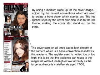
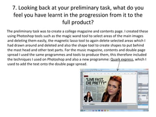
First of all in my preliminary exercise I created a
magazine cover and contents page for my college.
From doing this I learnt the basic techniques and
ways of creating an adequate cover and contents
  for my main task, along the way I was able to
        develop the techniques I had learnt.
1. In what ways does your media product use, develop
      or challenge forms and conventions of real media
                         products?
 The cover image on the
front cover follows the
typical convention as it has
a medium close- up image.
This is normally used as it
brings the cover star on eye
level with the reader. It fills
the page, with the tip of the
cover stars head just
covering part of the mast
head.
                                                                The banner at the bottom
 I chose the font off of                                        of the page shows the
‘DaFont.com’ as it was bold                                     extra information as in
and suited the word ‘chant’.                                    extra artists which are
The font size I chose was due                                   featured within the
to how it fitted across the width of the page with some room    magazine. This allows the
left on the right of it. I stayed with a black and red colour   reader to see what else is
theme as from the research questionnaire I found that red       within the magazine along
was the most popular colour.                                    with the main article.
The masthead also follows the conventions as it is
placed just near the top of the magazine, with space
left above for a banner also the word is just short of
the width of the page- so it stays on he left with a
slight gap on the right. I chose the title/magazine
name to be ‘Chant’ as the word is one which can be
associated with music. I chose the colour of the title
to be black with a black drop shadow as it made the
mast head stand out against the page, I had
preciously tried red writing with a black outline and
drop shadow, but the black was suited best.
On the contents page I again      The mast head is bold with the
   stayed with the red, black and     magazine name ‘Chant’ in red to
   white colour scheme also using a   stand out on the page.
   grey gradient across the page.

I used the shape tool to                  The typical conventions
create the rectangular                    for a contents page and
shapes behind the text.                   double page spread
For the pull quote                        were followed as the
beneath the artists face, I               use of columns was
used black shapes to                      followed as was the
make the quote stand out                  medium close-up
on the page and red                       image was used for the
shapes to make the sub                    feature image.
–headings stand out.
Using the text effects I                  The magazine name,
was able to increase the                  date and page number
spacing between the                       are shown at the
words so that the text                    bottom of the page in
wrapped around the                        the bottom right hand
image in the bottom right                 corner.
hand corner.
First the feature image was brought into Photoshop and effects such as
‘brightness/contrast’ and ‘levels’ were used to make the image look more professional.
Then another image, a filler image was placed on the page, I used the polygonal tool to
cut out the body and head of the image. Then placing this in the corner, I used the shape
tool to create a rectangle which was placed behind the image so that it could stand out. I
then used ‘drop shadow’ so that the rectangle could stand out against the text. I then used
shape tool to create a smaller rectangle to go in the top left corner for the category text to
then be placed in front of it. Using the text tool I then created the pull quote and header
which is in a large and bold font. I also used a black drop shadow to make the header
bolder. The kicker is placed just below the header and is all in black and normal font
except for the artists name: Saskia which is in red, bold and capitals. The magazine
name, Chant, is also in bold and back and is in italic.
In comparison to a professional magazine front cover, my magazine does have
similar qualities such as the large mast head which is on the left of the page and is
in a large font which makes it bold and stand out on the page so that it is
remembered, banners at the top and bottom of the page which feature extra
information, use of puffs and a medium close – up image.
2. How does your media product represent
                 particular social groups?
My magazine is aimed at male and females aged 17 to 30 who are interested in rock/indie
music. On the cover there is the image of a girl who is supposed to be at the age of twenty.
This fits her into the target audience age range of my magazine and makes her relatable to
readers of the magazine.                                        The front of my magazine is
                                                                able to represent different
From the front of the                                           genders as it promotes male
magazine, it would be hard                                      and female artists. ‘Tom
to tell if there was a specific                                 Verde’ and ‘Elisabeth
social class represented,                                       Bowen’ are examples of
however the lexis used on                                       this.
the double page spread
would suggest that the                                          The artist which is featured
magazine could aim to                                           on the double page spread
represent the working or                                        is also relatable to as she
middle class as the lexis                                       talks about recently turning
used is formal but generally                                    eighteen and releasing her
of a lower register.                                            new album in the double
                                                                page spread article.
3. What kind of media institution might distribute
         your media product and why?

    A media institution such as
 IPC may distribute and publish
 my magazine as they also
 publish NME and many other
 magazines within the media
 such as ‘Marie Claire’ and
 ‘Ideal Home’ as IPC is ‘UK's
 leading consumer magazine
 publisher with approximately
 90 brands’.
Music shops such as HMV may distribute my magazine
as could an independent music shop. A book shop such
as Waterstones, WHSmiths or Borders could also
distribute it. Ways to promote the magazine could be to
use free distribution. This could be done by handing out
copies outside of music gigs/concerts or at book
signings, or even just in city centre's so that the
magazine can be promoted as mush as possible.
4. Who would be the audience for your media
                    product?
 From previous research on various
magazines such as ‘Source’ and
‘NME’ I was able to see the
conventions and demographics in
relation to music magazines. By
looking at the demographic I was
able to see who the target audience
could be based around and how it
might change depending on what the
magazine features were. So from
information gathered, the audience
for my media product would be aged
between seventeen and thirty.
 My magazine would appeal to all
races and ethnicities as anyone can
like rock/indie music.
As the cover star on the front cover
is
5. How did you attract/address your
               audience?
On the front cover of my media product I attracted the audience
by using a colour scheme that was based on a red, black and
white. I chose these colours due to the questionnaire I had done
previously which showed red to be the most popular colour and
therefore the best choice as it would clearly catch peoples’ eyes.
By using a medium close up for the cover image, I
abided by the natural conventions which are used
to create a front cover which stands out. The red
lipstick used by the cover star also links to the red
theme, making the cover star stand out on the
page.


The cover stars on all three pages look directly at
the camera which is a basic convention as it draws
the reader in. The register used is not too low or too
high; this is so that the audience can relate to the
magazine without too high or low formality as the
target audience is male/female aged 17-30.
6. What have you learnt about technologies from the
       process of constructing this product?
From the preliminary magazine to the music magazine I had furthered my skills in Photoshop
along with techniques I have also learnt. I have also learned about a program called ‘Quark’
and how I could use it to add text onto a page and how it allows you to be able to shape the
text around objects on the page.
In Photoshop, I mainly used the following tools: shape, magic wand and text. I also used
effects such as, drop shadow, brightness/contrast and levels to add effects to the shapes,
text and images.


      From the original image on the left to the final image on the right you can see
      how I used Photoshop to brighten the image and darken it in places using
      ‘Levels’ so that overall it looked more professional. To add the text I then used
      quark so that I could wrap the text around the filler image and feature image.
Polygonal lasso                 Magic wand
This tool enables you to        I used this to select an area of
be able to cut out parts of     an image, similar areas then
an image or object. I used      also selected so that I could
it to cut out the               delete or use effects on the
background around the           area selected,
body and head on my
cover and filler images.        Gradient
                                This tool was used on my
Blur                            contents page as I used it to
This was used to blur the       create a dark grey to light
edges after I had cut out the   grey background.


                                Text
Shape                           The text tool was used on all
This tool was used to           pages for the general text.
create shapes on all of the     I used a website called
pages as part of the            ‘DaFont’ to download new
backgrounds to make text        fonts which I then used on my
stand out.                      pages.
                                http://www.dafont.com/
7. Looking back at your preliminary task, what do you
   feel you have learnt in the progression from it to the
                        full product?
The preliminary task was to create a college magazine and contents page. I created these
using Photoshop tools such as the magic wand tool to select areas of the main images
and deleting them easily, the magnetic lasso tool to again delete selected areas which I
had drawn around and deleted and also the shape tool to create shapes to put behind
the mast head and other text parts. For the music magazine, contents and double page
spread I used the same programmes and tools to produce them, this therefore included
the techniques I used on Photoshop and also a new programme: Quark express, which I
used to add the text onto the double page spread.
Looking back on the preliminary task, my
                                           college magazine cover has some aspects
                                           which make it look professional but others
                                           which make it look more unprofessional.
                                           The basic colour scheme, medium close –
                                           up and cover line all are typical
                                           conventions and elements which help it
                                           look more professional.
                                           My magazine progressed in comparison to
                                           my college magazine because I developed
                                           the techniques in Photoshop which I had
                                           used in the first project.

By using new techniques I learnt I was
able to create a more developed and
advanced magazine which maintained
the conventions of a professional
magazine. From the progression of my
college magazine, I have learnt a lot in
terms of techniques in Photoshop as I
was able to experiment and learn new
ways. I was able to make my music
magazine cover, contents and double
page spread all look more professional.
Along with the use of puffs and banners.

Evaluatio ndlwd

  • 1.
    First of allin my preliminary exercise I created a magazine cover and contents page for my college. From doing this I learnt the basic techniques and ways of creating an adequate cover and contents for my main task, along the way I was able to develop the techniques I had learnt.
  • 2.
    1. In whatways does your media product use, develop or challenge forms and conventions of real media products? The cover image on the front cover follows the typical convention as it has a medium close- up image. This is normally used as it brings the cover star on eye level with the reader. It fills the page, with the tip of the cover stars head just covering part of the mast head. The banner at the bottom I chose the font off of of the page shows the ‘DaFont.com’ as it was bold extra information as in and suited the word ‘chant’. extra artists which are The font size I chose was due featured within the to how it fitted across the width of the page with some room magazine. This allows the left on the right of it. I stayed with a black and red colour reader to see what else is theme as from the research questionnaire I found that red within the magazine along was the most popular colour. with the main article.
  • 3.
    The masthead alsofollows the conventions as it is placed just near the top of the magazine, with space left above for a banner also the word is just short of the width of the page- so it stays on he left with a slight gap on the right. I chose the title/magazine name to be ‘Chant’ as the word is one which can be associated with music. I chose the colour of the title to be black with a black drop shadow as it made the mast head stand out against the page, I had preciously tried red writing with a black outline and drop shadow, but the black was suited best.
  • 4.
    On the contentspage I again The mast head is bold with the stayed with the red, black and magazine name ‘Chant’ in red to white colour scheme also using a stand out on the page. grey gradient across the page. I used the shape tool to The typical conventions create the rectangular for a contents page and shapes behind the text. double page spread For the pull quote were followed as the beneath the artists face, I use of columns was used black shapes to followed as was the make the quote stand out medium close-up on the page and red image was used for the shapes to make the sub feature image. –headings stand out. Using the text effects I The magazine name, was able to increase the date and page number spacing between the are shown at the words so that the text bottom of the page in wrapped around the the bottom right hand image in the bottom right corner. hand corner.
  • 5.
    First the featureimage was brought into Photoshop and effects such as ‘brightness/contrast’ and ‘levels’ were used to make the image look more professional. Then another image, a filler image was placed on the page, I used the polygonal tool to cut out the body and head of the image. Then placing this in the corner, I used the shape tool to create a rectangle which was placed behind the image so that it could stand out. I then used ‘drop shadow’ so that the rectangle could stand out against the text. I then used shape tool to create a smaller rectangle to go in the top left corner for the category text to then be placed in front of it. Using the text tool I then created the pull quote and header which is in a large and bold font. I also used a black drop shadow to make the header bolder. The kicker is placed just below the header and is all in black and normal font except for the artists name: Saskia which is in red, bold and capitals. The magazine name, Chant, is also in bold and back and is in italic.
  • 6.
    In comparison toa professional magazine front cover, my magazine does have similar qualities such as the large mast head which is on the left of the page and is in a large font which makes it bold and stand out on the page so that it is remembered, banners at the top and bottom of the page which feature extra information, use of puffs and a medium close – up image.
  • 7.
    2. How doesyour media product represent particular social groups? My magazine is aimed at male and females aged 17 to 30 who are interested in rock/indie music. On the cover there is the image of a girl who is supposed to be at the age of twenty. This fits her into the target audience age range of my magazine and makes her relatable to readers of the magazine. The front of my magazine is able to represent different From the front of the genders as it promotes male magazine, it would be hard and female artists. ‘Tom to tell if there was a specific Verde’ and ‘Elisabeth social class represented, Bowen’ are examples of however the lexis used on this. the double page spread would suggest that the The artist which is featured magazine could aim to on the double page spread represent the working or is also relatable to as she middle class as the lexis talks about recently turning used is formal but generally eighteen and releasing her of a lower register. new album in the double page spread article.
  • 8.
    3. What kindof media institution might distribute your media product and why? A media institution such as IPC may distribute and publish my magazine as they also publish NME and many other magazines within the media such as ‘Marie Claire’ and ‘Ideal Home’ as IPC is ‘UK's leading consumer magazine publisher with approximately 90 brands’.
  • 9.
    Music shops suchas HMV may distribute my magazine as could an independent music shop. A book shop such as Waterstones, WHSmiths or Borders could also distribute it. Ways to promote the magazine could be to use free distribution. This could be done by handing out copies outside of music gigs/concerts or at book signings, or even just in city centre's so that the magazine can be promoted as mush as possible.
  • 10.
    4. Who wouldbe the audience for your media product? From previous research on various magazines such as ‘Source’ and ‘NME’ I was able to see the conventions and demographics in relation to music magazines. By looking at the demographic I was able to see who the target audience could be based around and how it might change depending on what the magazine features were. So from information gathered, the audience for my media product would be aged between seventeen and thirty. My magazine would appeal to all races and ethnicities as anyone can like rock/indie music. As the cover star on the front cover is
  • 11.
    5. How didyou attract/address your audience? On the front cover of my media product I attracted the audience by using a colour scheme that was based on a red, black and white. I chose these colours due to the questionnaire I had done previously which showed red to be the most popular colour and therefore the best choice as it would clearly catch peoples’ eyes.
  • 12.
    By using amedium close up for the cover image, I abided by the natural conventions which are used to create a front cover which stands out. The red lipstick used by the cover star also links to the red theme, making the cover star stand out on the page. The cover stars on all three pages look directly at the camera which is a basic convention as it draws the reader in. The register used is not too low or too high; this is so that the audience can relate to the magazine without too high or low formality as the target audience is male/female aged 17-30.
  • 13.
    6. What haveyou learnt about technologies from the process of constructing this product? From the preliminary magazine to the music magazine I had furthered my skills in Photoshop along with techniques I have also learnt. I have also learned about a program called ‘Quark’ and how I could use it to add text onto a page and how it allows you to be able to shape the text around objects on the page. In Photoshop, I mainly used the following tools: shape, magic wand and text. I also used effects such as, drop shadow, brightness/contrast and levels to add effects to the shapes, text and images. From the original image on the left to the final image on the right you can see how I used Photoshop to brighten the image and darken it in places using ‘Levels’ so that overall it looked more professional. To add the text I then used quark so that I could wrap the text around the filler image and feature image.
  • 14.
    Polygonal lasso Magic wand This tool enables you to I used this to select an area of be able to cut out parts of an image, similar areas then an image or object. I used also selected so that I could it to cut out the delete or use effects on the background around the area selected, body and head on my cover and filler images. Gradient This tool was used on my Blur contents page as I used it to This was used to blur the create a dark grey to light edges after I had cut out the grey background. Text Shape The text tool was used on all This tool was used to pages for the general text. create shapes on all of the I used a website called pages as part of the ‘DaFont’ to download new backgrounds to make text fonts which I then used on my stand out. pages. http://www.dafont.com/
  • 15.
    7. Looking backat your preliminary task, what do you feel you have learnt in the progression from it to the full product? The preliminary task was to create a college magazine and contents page. I created these using Photoshop tools such as the magic wand tool to select areas of the main images and deleting them easily, the magnetic lasso tool to again delete selected areas which I had drawn around and deleted and also the shape tool to create shapes to put behind the mast head and other text parts. For the music magazine, contents and double page spread I used the same programmes and tools to produce them, this therefore included the techniques I used on Photoshop and also a new programme: Quark express, which I used to add the text onto the double page spread.
  • 16.
    Looking back onthe preliminary task, my college magazine cover has some aspects which make it look professional but others which make it look more unprofessional. The basic colour scheme, medium close – up and cover line all are typical conventions and elements which help it look more professional. My magazine progressed in comparison to my college magazine because I developed the techniques in Photoshop which I had used in the first project. By using new techniques I learnt I was able to create a more developed and advanced magazine which maintained the conventions of a professional magazine. From the progression of my college magazine, I have learnt a lot in terms of techniques in Photoshop as I was able to experiment and learn new ways. I was able to make my music magazine cover, contents and double page spread all look more professional. Along with the use of puffs and banners.