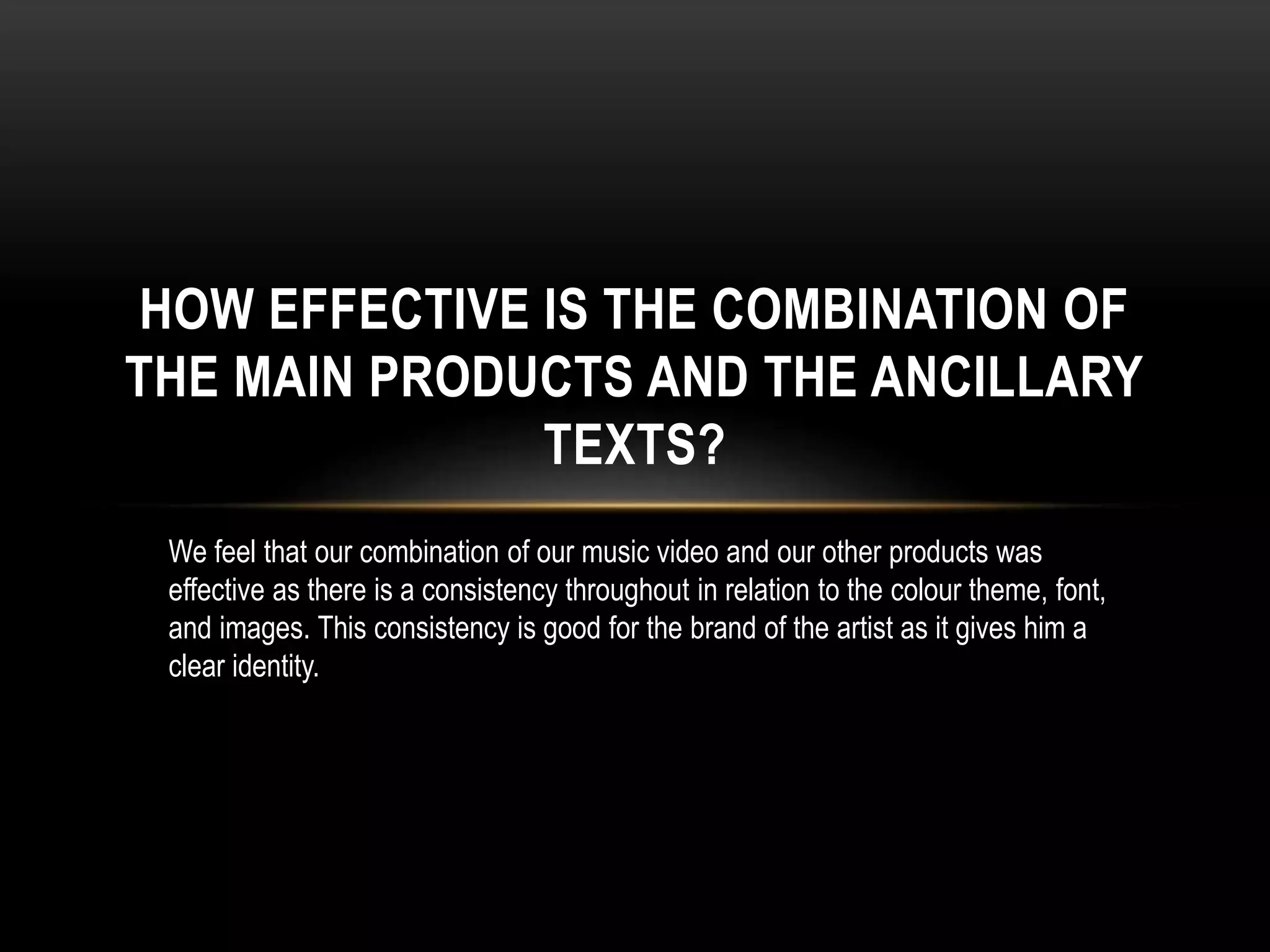
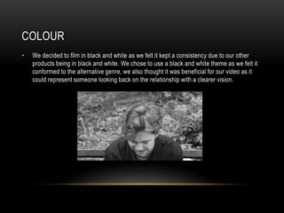
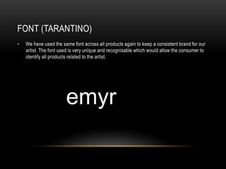
HOW EFFECTIVE IS THE COMBINATION OF
THE MAIN PRODUCTS AND THE ANCILLARY
TEXTS?
We feel that our combination of our music video and our other products was
effective as there is a consistency throughout in relation to the colour theme, font,
and images. This consistency is good for the brand of the artist as it gives him a
clear identity.
COLOUR
• We decided to film in black and white as we felt it kept a consistency due to our other
products being in black and white. We chose to use a black and white theme as we felt it
conformed to the alternative genre, we also thought it was beneficial for our video as it
could represent someone looking back on the relationship with a clearer vision.
FONT (TARANTINO)
• We have used the same font across all products again to keep a consistent brand for our
artist. The font used is very unique and recognisable which would allow the consumer to
identify all products related to the artist.
IMAGES
• When preparing for the artist photo shoot we thought about the costume the he would be
wearing, we chose to have him in the same outfits, as he would wear in the video to
create a clear link between the two. We did to keep a consistency throughout the video,
the website, digipak and posters.

Evaluation Question 2

  • 1.
    HOW EFFECTIVE ISTHE COMBINATION OF THE MAIN PRODUCTS AND THE ANCILLARY TEXTS? We feel that our combination of our music video and our other products was effective as there is a consistency throughout in relation to the colour theme, font, and images. This consistency is good for the brand of the artist as it gives him a clear identity.
  • 2.
    COLOUR • We decidedto film in black and white as we felt it kept a consistency due to our other products being in black and white. We chose to use a black and white theme as we felt it conformed to the alternative genre, we also thought it was beneficial for our video as it could represent someone looking back on the relationship with a clearer vision.
  • 3.
    FONT (TARANTINO) • Wehave used the same font across all products again to keep a consistent brand for our artist. The font used is very unique and recognisable which would allow the consumer to identify all products related to the artist.
  • 4.
    IMAGES • When preparingfor the artist photo shoot we thought about the costume the he would be wearing, we chose to have him in the same outfits, as he would wear in the video to create a clear link between the two. We did to keep a consistency throughout the video, the website, digipak and posters.