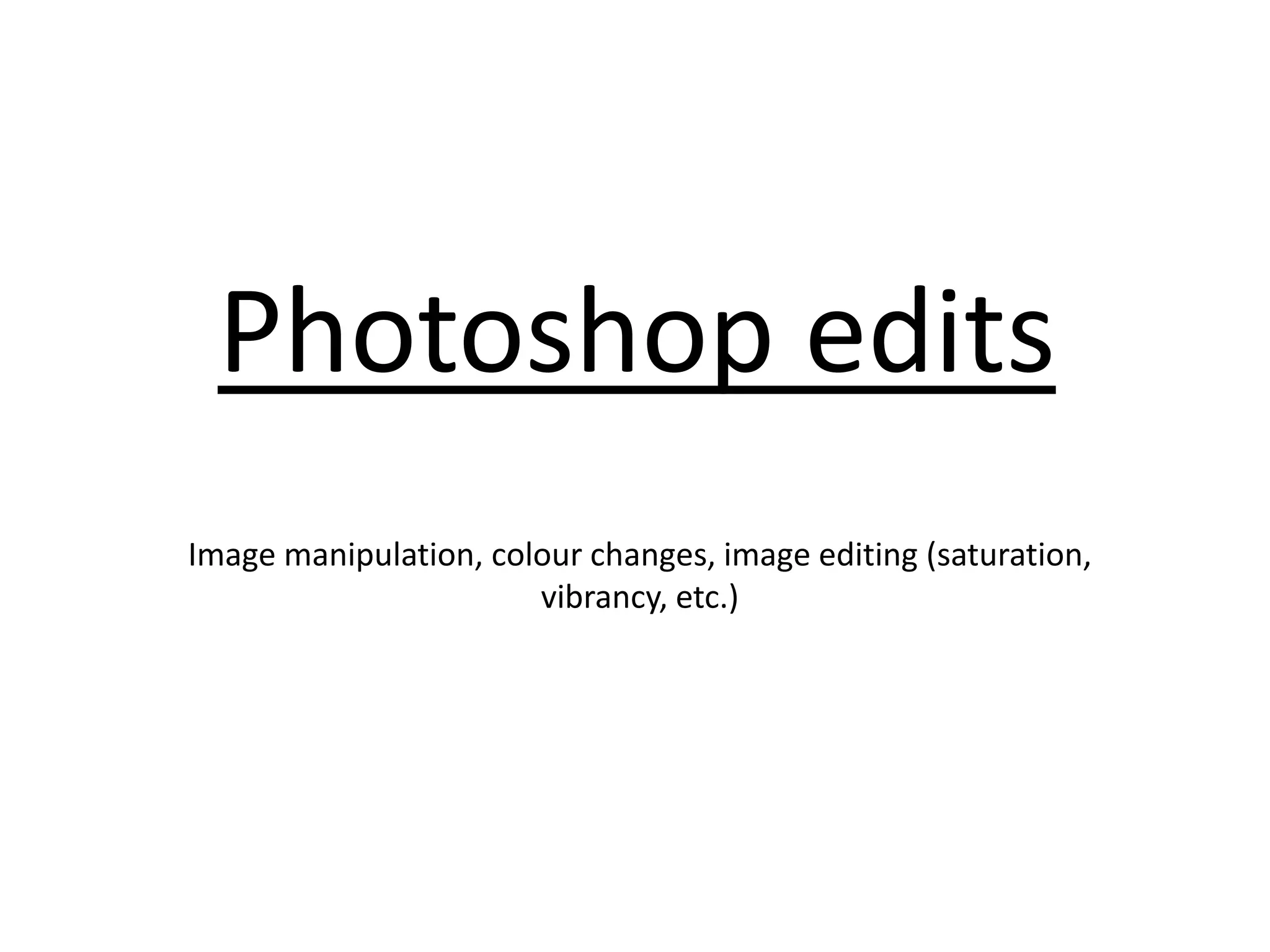
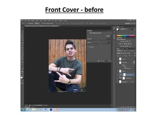
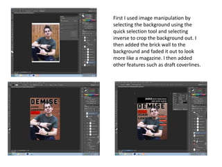
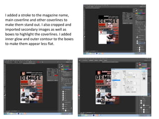
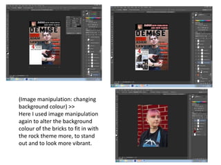
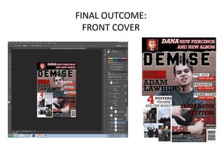
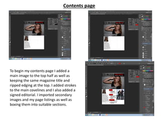
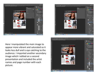
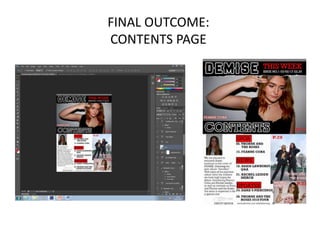
Photoshop edits
Image manipulation, colour changes, image editing (saturation,
vibrancy, etc.)
Example front cover and contents page
Front Cover - before
Here I began to edit my main
image for my front cover. I
adjusted the exposure and offset
to make the image brighter.
Here I adjusted the colour undertones to
make the image appear more vibrant and
slightly less warm toned as I feel this
suited my magazine more.
First I used image manipulation by
selecting the background using the
quick selection tool and selecting
inverse to crop the background out. I
then added the brick wall to the
background and faded it out to look
more like a magazine. I then added
other features such as draft coverlines.
I added a stroke to the magazine name,
main coverline and other coverlines to
make them stand out. I also cropped and
imported secondary images as well as
boxes to highlight the coverlines. I added
inner glow and outer contour to the boxes
to make them appear less flat.
(Image manipulation: changing
background colour) >>
Here I used image manipulation
again to alter the background
colour of the bricks to fit in with
the rock theme more, to stand
out and to look more vibrant.
FINAL OUTCOME:
FRONT COVER
Contents page
To begin my contents page I added a
main image to the top half as well as
keeping the same magazine title and
ripped edging at the top. I added strokes
to the main covelines and I also added a
signed editorial. I imported secondary
images and my page listings as well as
boxing them into suitable sections.
Here I manipulated the main image to
appear more vibrant and saturated so it
looks less dull and is eye catching to the
audience. I imported another secondary
image which I edited on a second
presentation and included the artist
names and page number with each
picture.
FINAL OUTCOME:
CONTENTS PAGE

Ps edits Lydia Rosado

  • 1.
    Photoshop edits Image manipulation,colour changes, image editing (saturation, vibrancy, etc.)
  • 2.
    Example front coverand contents page
  • 3.
  • 4.
    Here I beganto edit my main image for my front cover. I adjusted the exposure and offset to make the image brighter. Here I adjusted the colour undertones to make the image appear more vibrant and slightly less warm toned as I feel this suited my magazine more.
  • 5.
    First I usedimage manipulation by selecting the background using the quick selection tool and selecting inverse to crop the background out. I then added the brick wall to the background and faded it out to look more like a magazine. I then added other features such as draft coverlines.
  • 6.
    I added astroke to the magazine name, main coverline and other coverlines to make them stand out. I also cropped and imported secondary images as well as boxes to highlight the coverlines. I added inner glow and outer contour to the boxes to make them appear less flat.
  • 7.
    (Image manipulation: changing backgroundcolour) >> Here I used image manipulation again to alter the background colour of the bricks to fit in with the rock theme more, to stand out and to look more vibrant.
  • 8.
  • 9.
    Contents page To beginmy contents page I added a main image to the top half as well as keeping the same magazine title and ripped edging at the top. I added strokes to the main covelines and I also added a signed editorial. I imported secondary images and my page listings as well as boxing them into suitable sections.
  • 10.
    Here I manipulatedthe main image to appear more vibrant and saturated so it looks less dull and is eye catching to the audience. I imported another secondary image which I edited on a second presentation and included the artist names and page number with each picture.
  • 11.