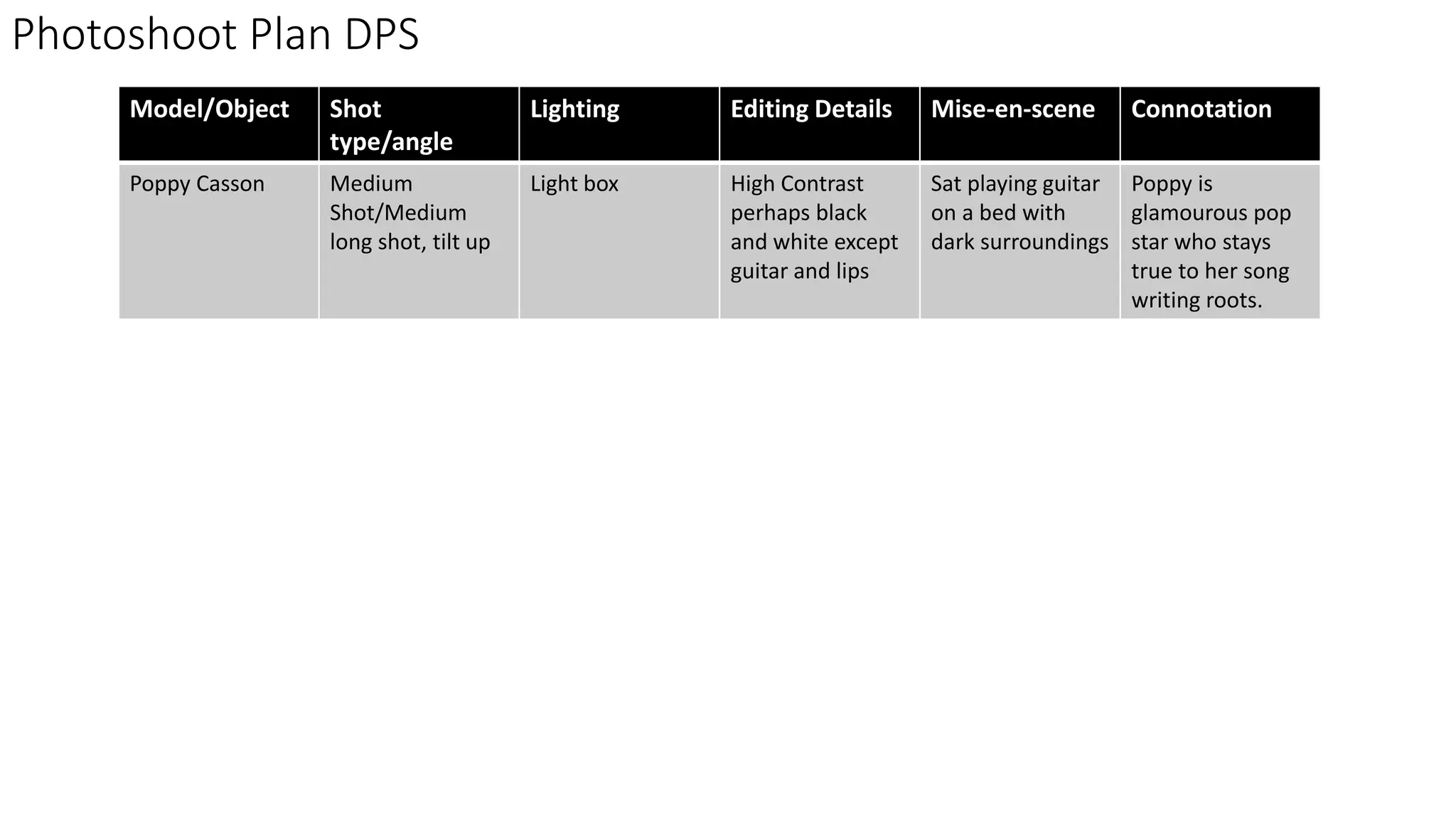
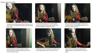
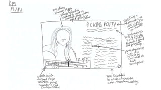
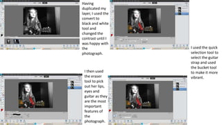
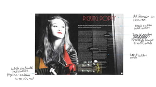
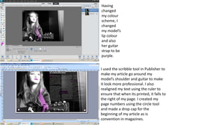
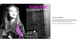
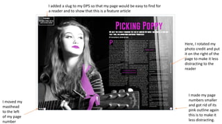
Photoshoot Plan DPS
Model/Object Shot
type/angle
Lighting Editing Details Mise-en-scene Connotation
Poppy Casson Medium
Shot/Medium
long shot, tilt up
Light box High Contrast
perhaps black
and white except
guitar and lips
Sat playing guitar
on a bed with
dark surroundings
Poppy is
glamourous pop
star who stays
true to her song
writing roots.
Photo Selection DPS
I discarded this photo because I don’t like how it cuts
off the top of my model’s head and I don’t like the tilt
down angle
I chose this photo because it has the perfect
amount of space for me to put my article and I
love how bright the model’s face looks
Although I love this photograph, I didn’t use it
because it doesn’t have enough space for me to
work with to put my article.
I don’t feel like my model is the focus of this
photo and that the green wall distracts from her
so I don’t want to use it.
I really like this photo however for my DPS, there
isn’t enough space to put my article over her.
I didn’t want to use this photo because the
lighting makes my model’s eyeliner look a bit
weird.
Having
duplicated my
layer, I used the
convert to
black and white
tool and
changed the
contrast until I
was happy with
the
photograph.
I then used
the eraser
tool to pick
out her lips,
eyes and
guitar as they
are the most
important
features of
the
photograph.
I used the quick
selection tool to
select the guitar
strap and used
the bucket tool
to make it more
vibrant.
Feedback
I used the scribble tool in Publisher to
make my article go around my
model’s shoulder and guitar to make
it look more professional. I also
realigned my text using the ruler to
ensure that when its printed, it falls to
the right of my page. I created my
page numbers using the circle tool
and made a drop cap for the
beginning of my article as is
convention in magazines.
Having
changed
my colour
scheme, I
changed
my model’s
lip colour
and also
her guitar
strap to be
purple.
Teacher Feedback:
Here, I rotated my
photo credit and put
it on the right of the
page to make it less
distracting to the
reader
I made my page
numbers smaller
and got rid of its
pink outline again
this is to make it
less distracting.
I moved my
masthead
to the left
of my page
number
I added a slug to my DPS so that my page would be easy to find for
a reader and to show that this is a feature article

Dps

  • 1.
    Photoshoot Plan DPS Model/ObjectShot type/angle Lighting Editing Details Mise-en-scene Connotation Poppy Casson Medium Shot/Medium long shot, tilt up Light box High Contrast perhaps black and white except guitar and lips Sat playing guitar on a bed with dark surroundings Poppy is glamourous pop star who stays true to her song writing roots.
  • 2.
    Photo Selection DPS Idiscarded this photo because I don’t like how it cuts off the top of my model’s head and I don’t like the tilt down angle I chose this photo because it has the perfect amount of space for me to put my article and I love how bright the model’s face looks Although I love this photograph, I didn’t use it because it doesn’t have enough space for me to work with to put my article. I don’t feel like my model is the focus of this photo and that the green wall distracts from her so I don’t want to use it. I really like this photo however for my DPS, there isn’t enough space to put my article over her. I didn’t want to use this photo because the lighting makes my model’s eyeliner look a bit weird.
  • 4.
    Having duplicated my layer, Iused the convert to black and white tool and changed the contrast until I was happy with the photograph. I then used the eraser tool to pick out her lips, eyes and guitar as they are the most important features of the photograph. I used the quick selection tool to select the guitar strap and used the bucket tool to make it more vibrant.
  • 6.
  • 7.
    I used thescribble tool in Publisher to make my article go around my model’s shoulder and guitar to make it look more professional. I also realigned my text using the ruler to ensure that when its printed, it falls to the right of my page. I created my page numbers using the circle tool and made a drop cap for the beginning of my article as is convention in magazines. Having changed my colour scheme, I changed my model’s lip colour and also her guitar strap to be purple.
  • 8.
  • 9.
    Here, I rotatedmy photo credit and put it on the right of the page to make it less distracting to the reader I made my page numbers smaller and got rid of its pink outline again this is to make it less distracting. I moved my masthead to the left of my page number I added a slug to my DPS so that my page would be easy to find for a reader and to show that this is a feature article