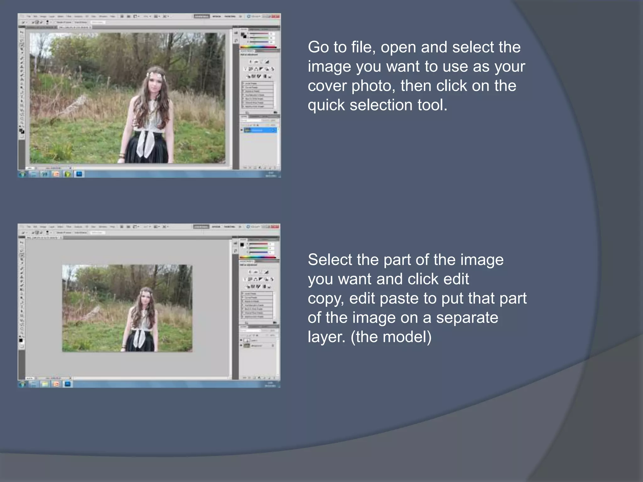
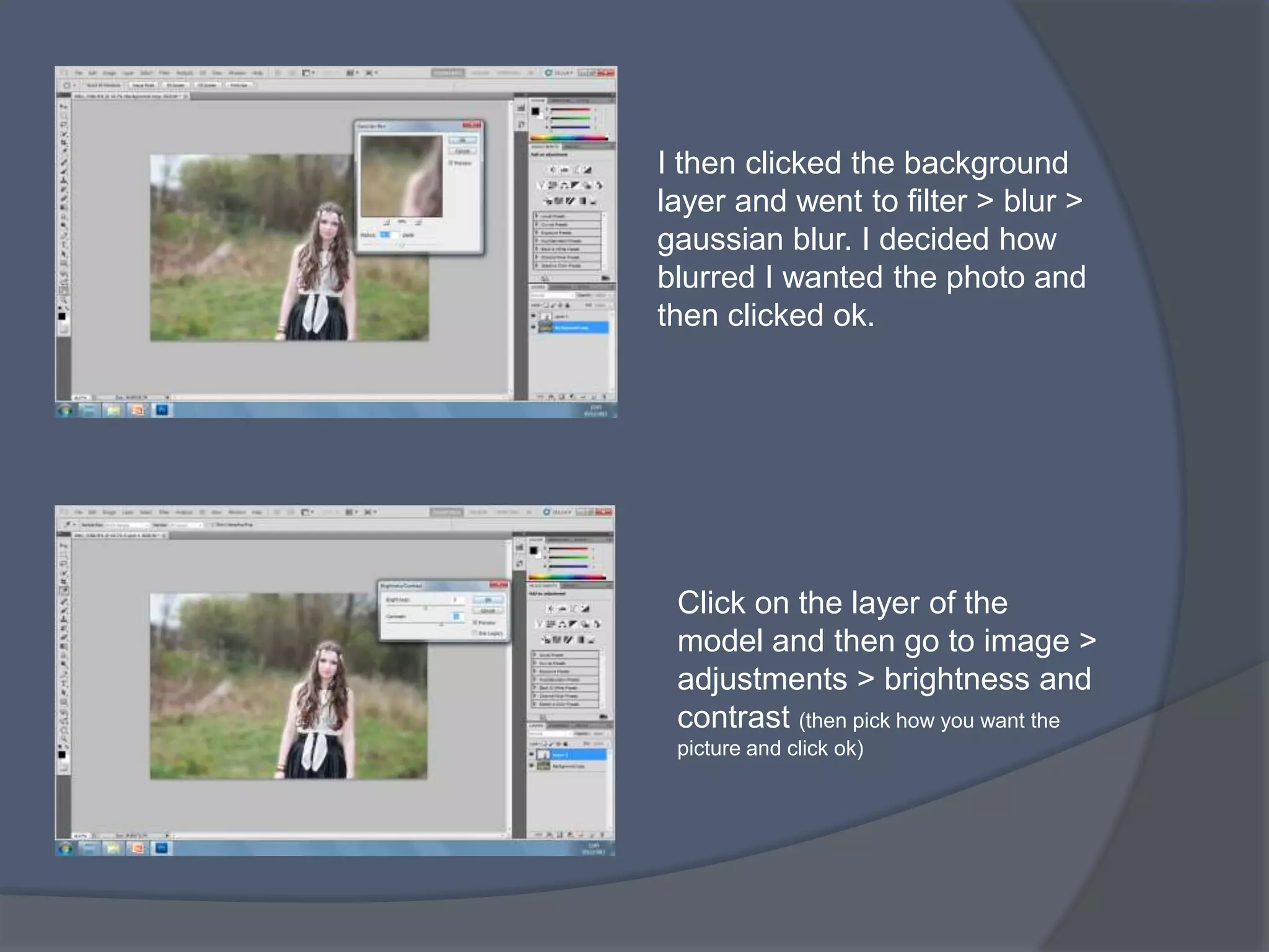
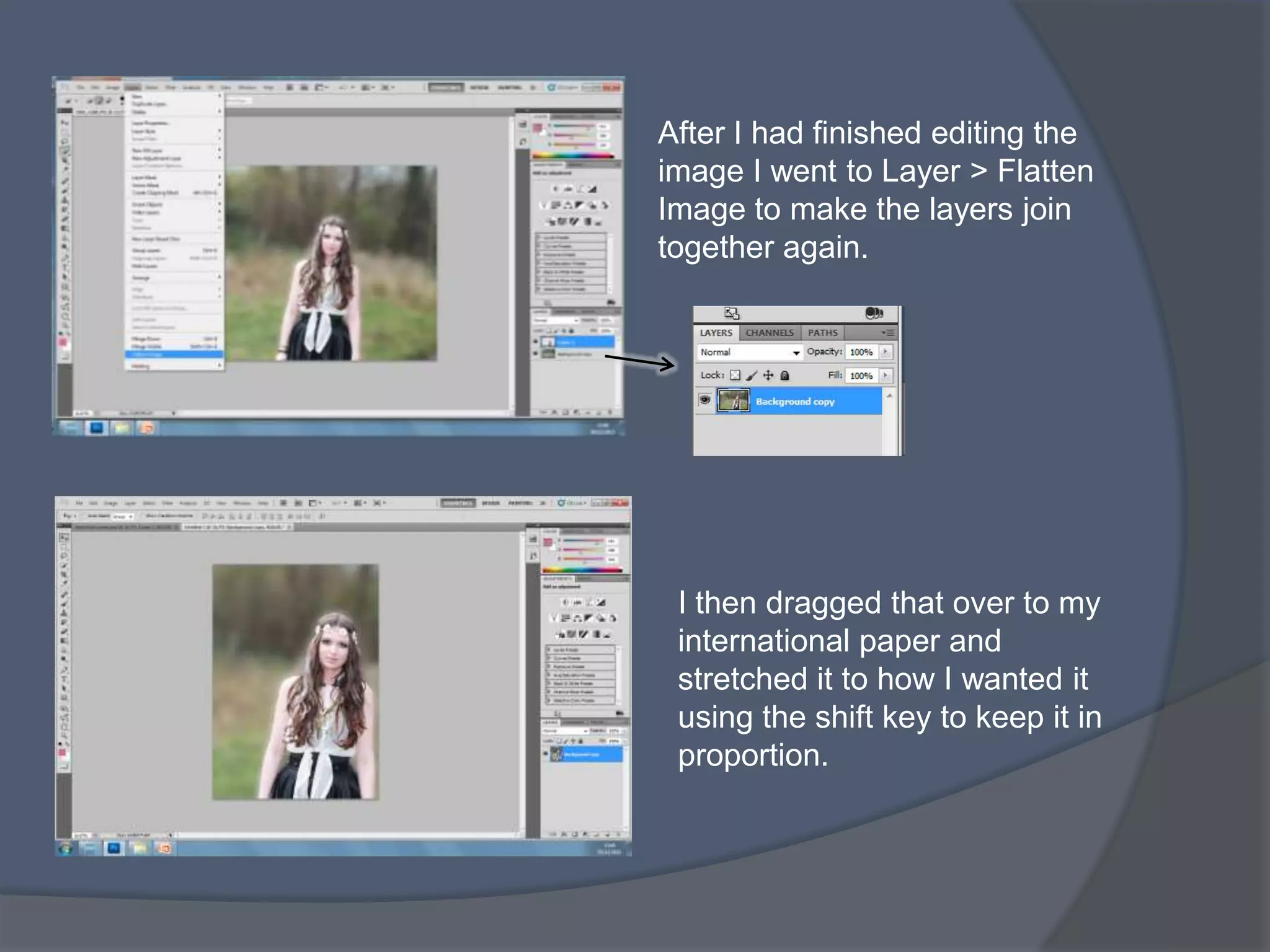
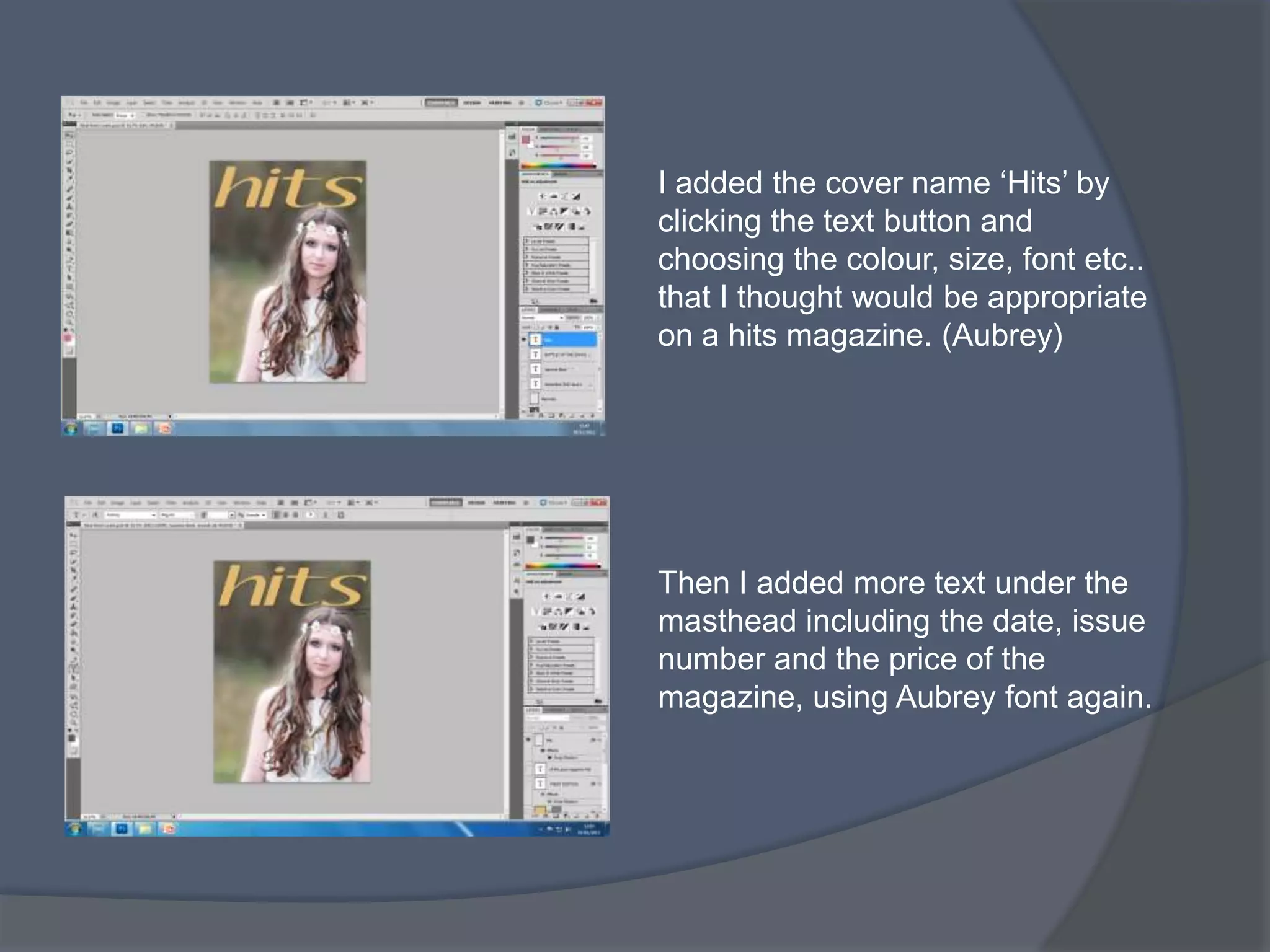
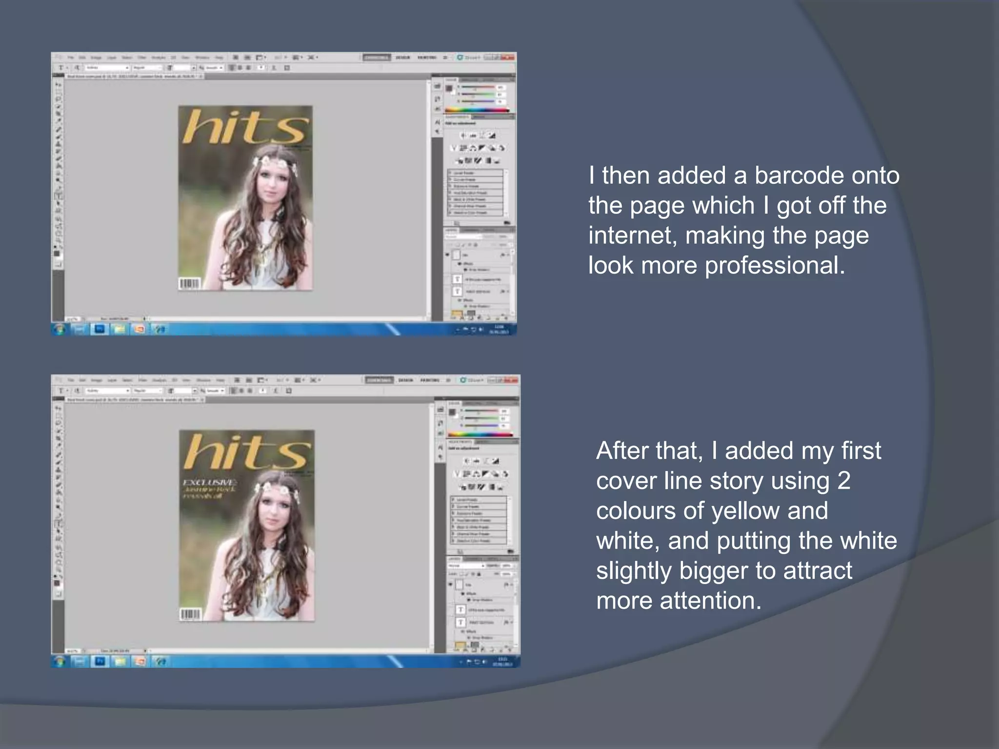
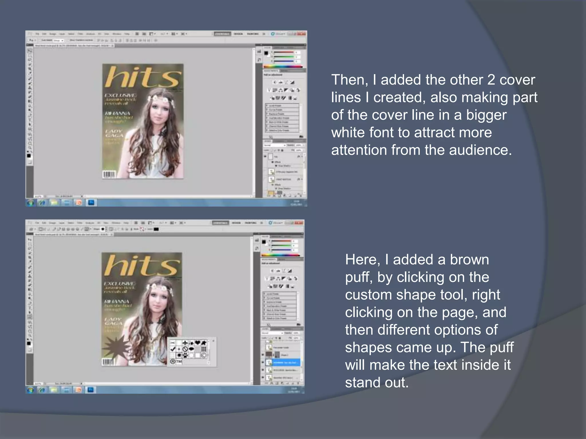
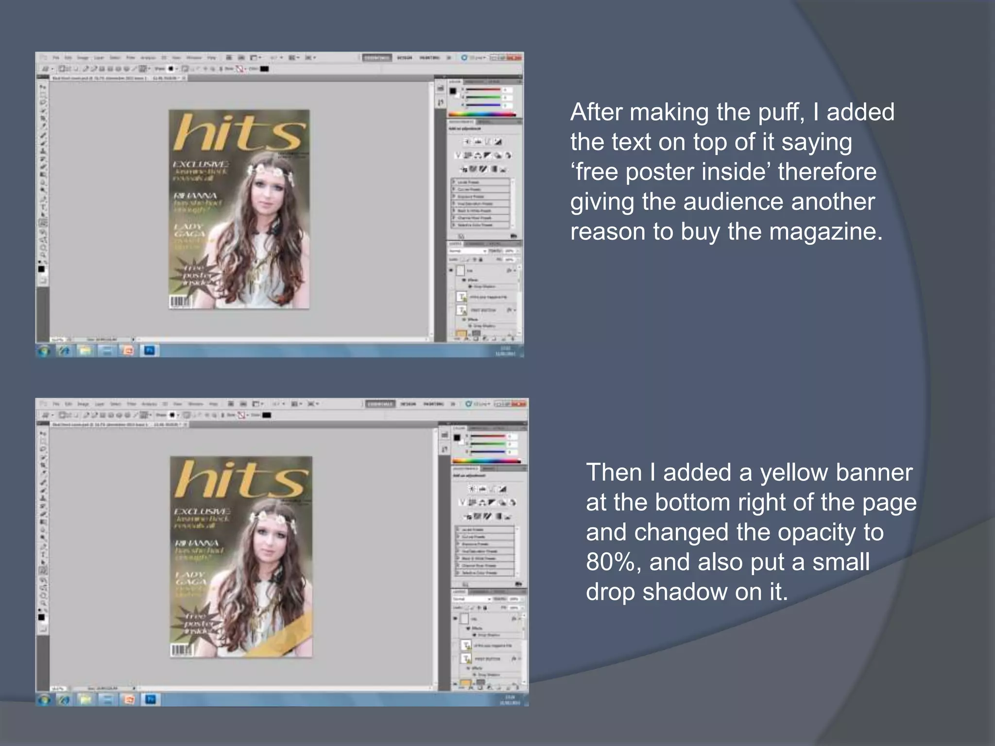
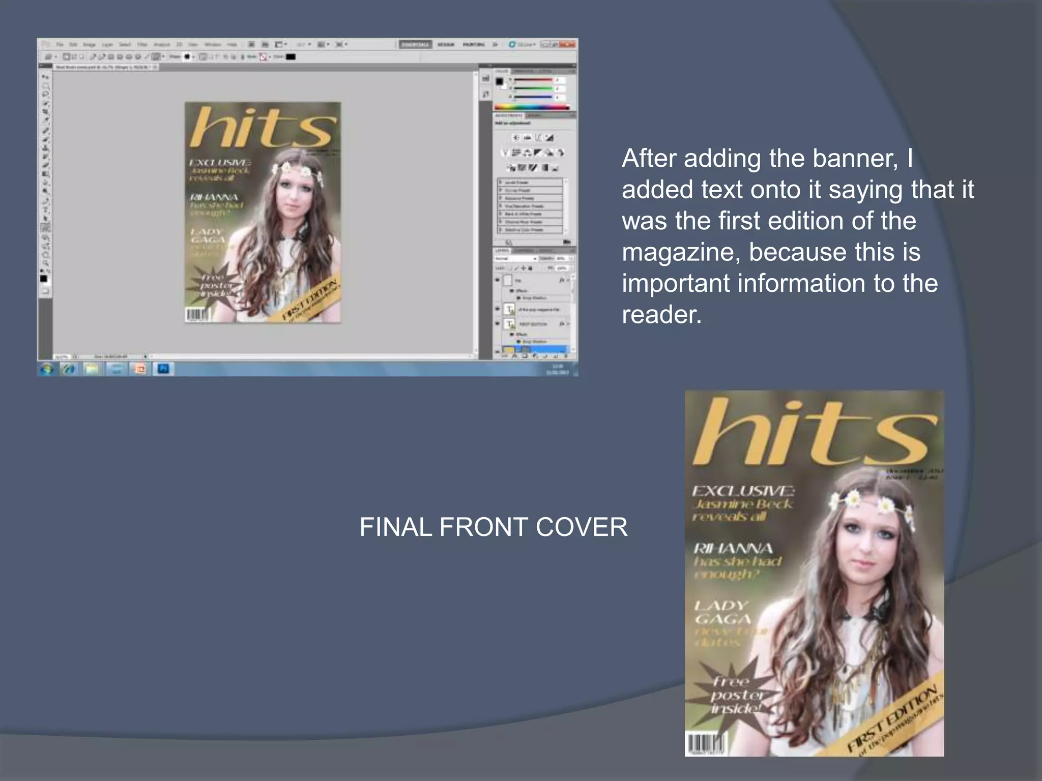
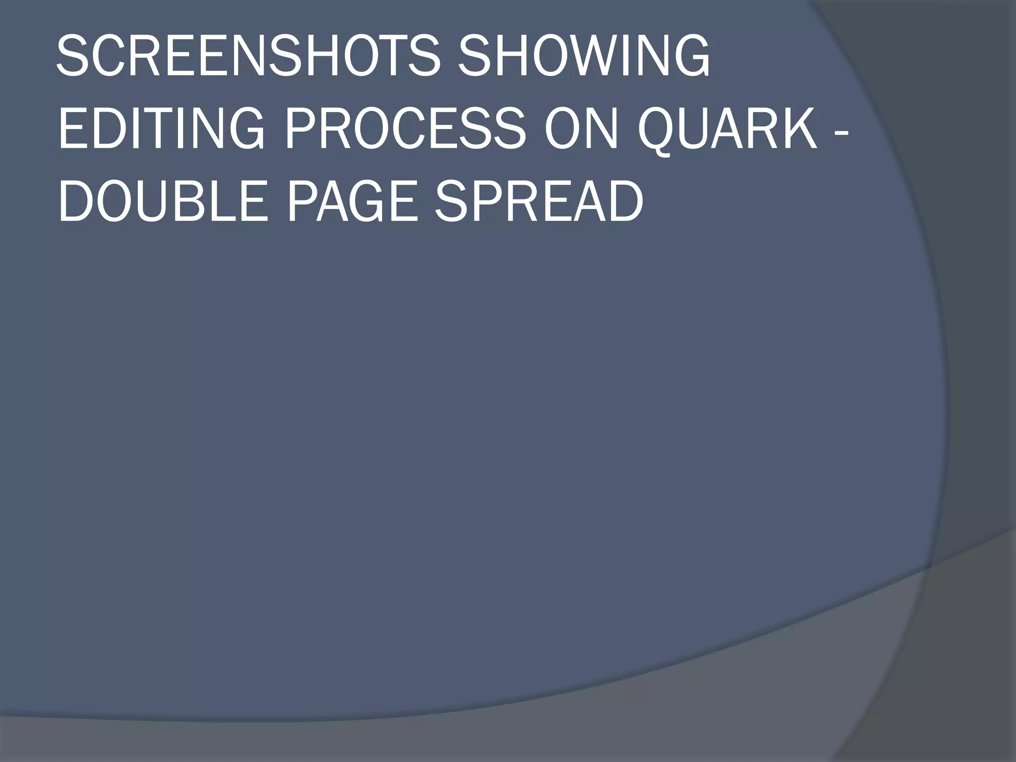
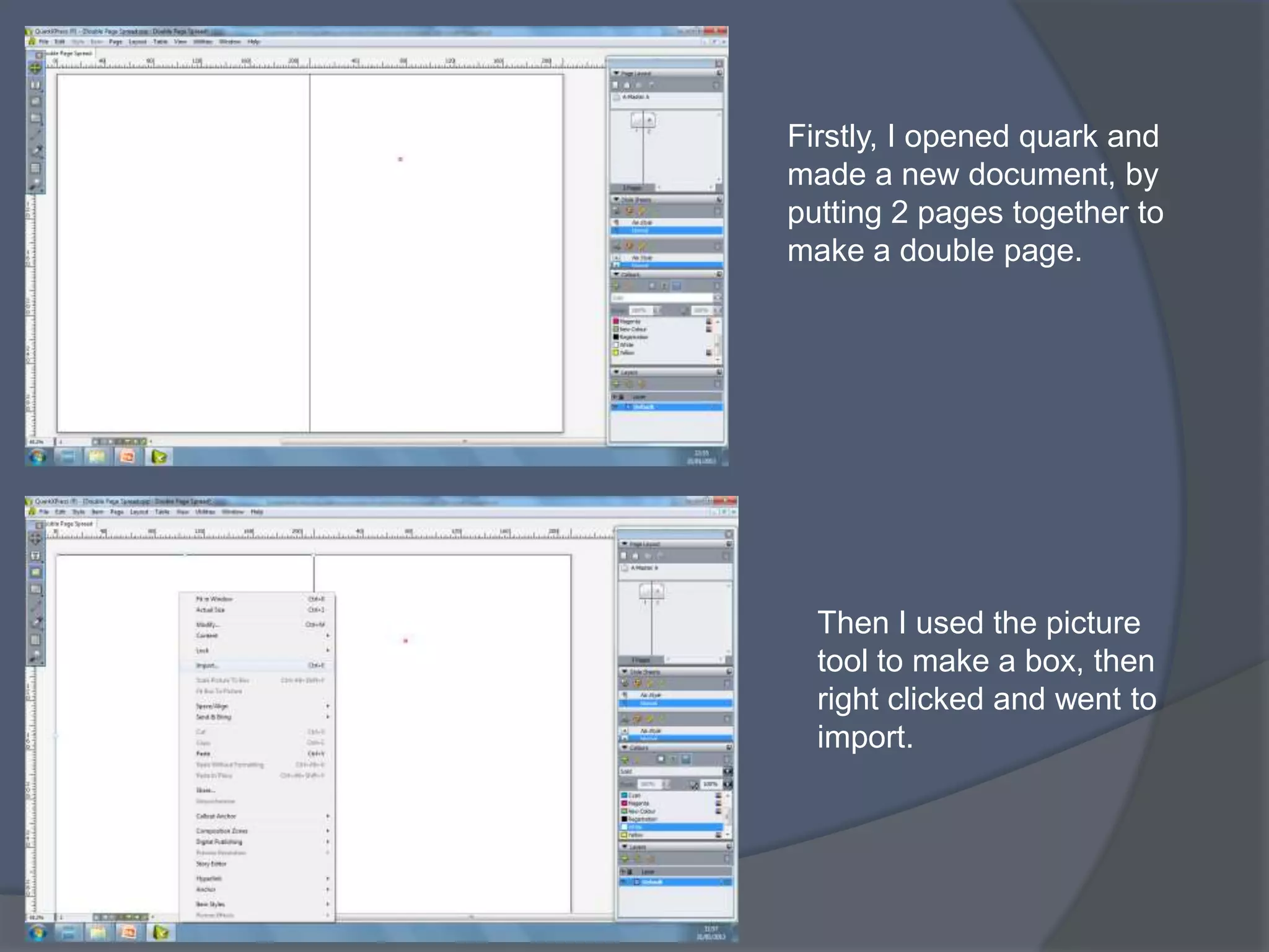
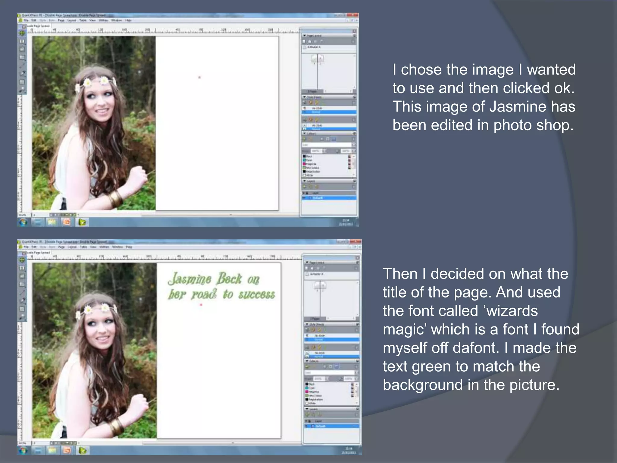
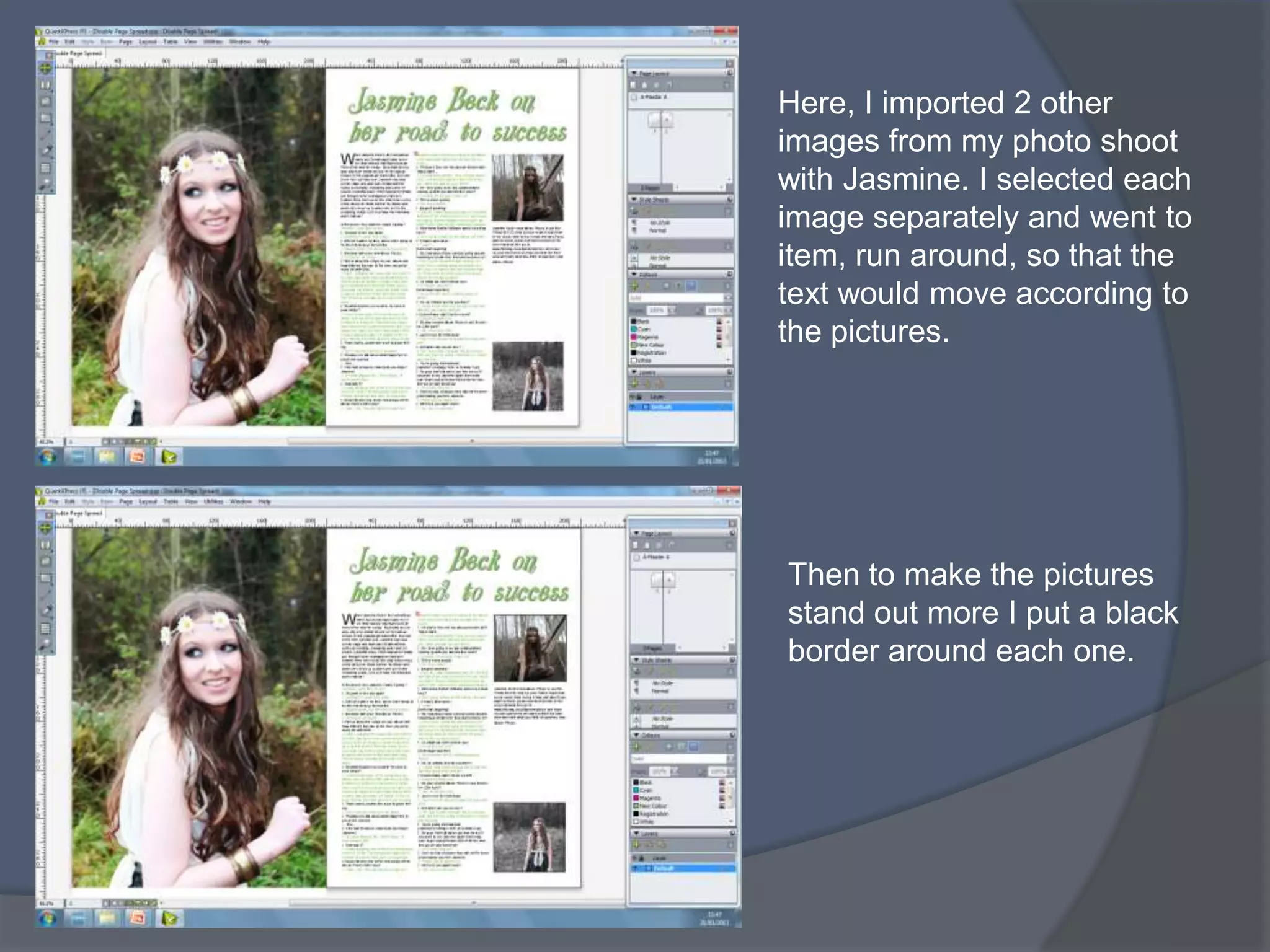
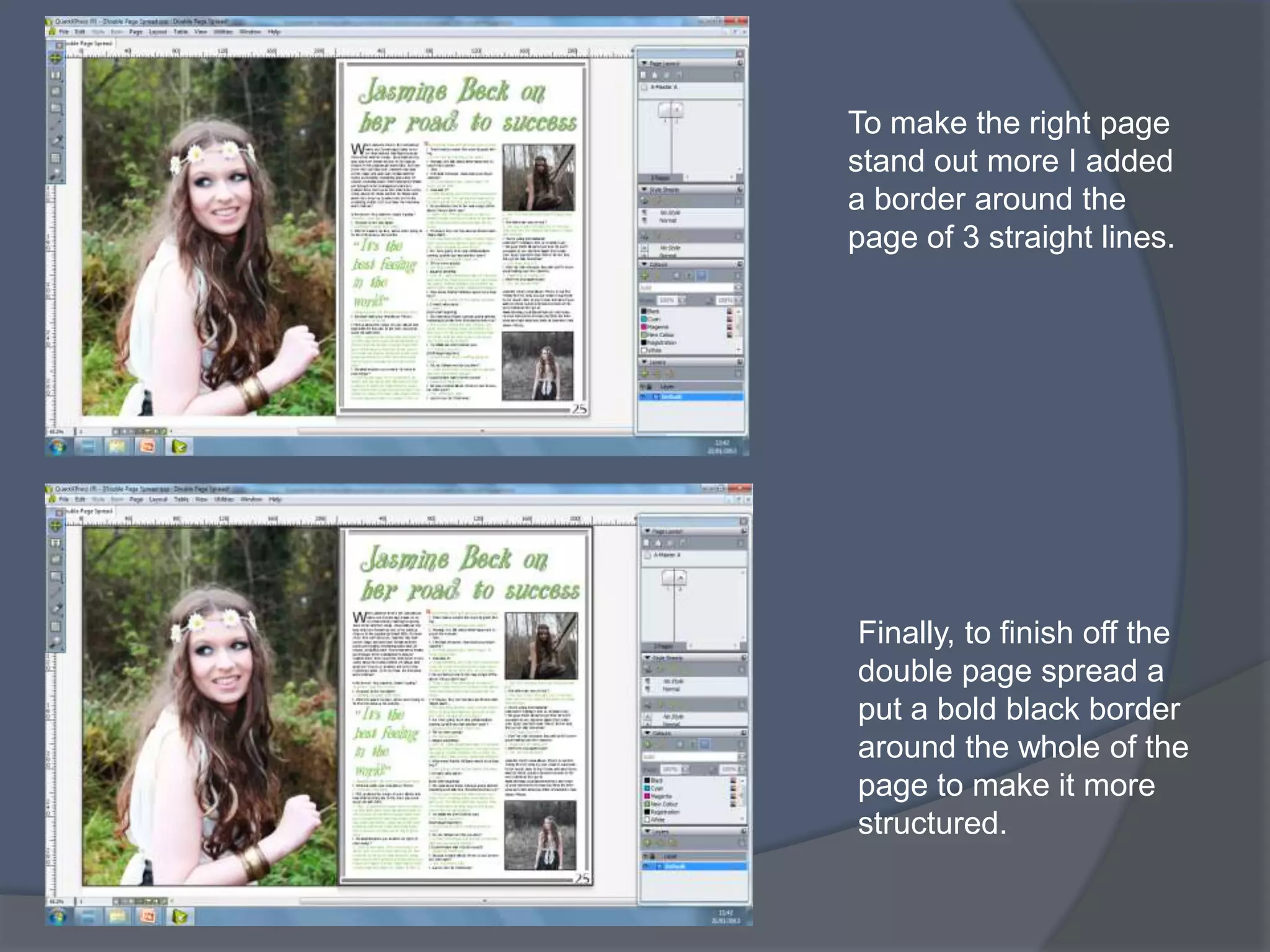
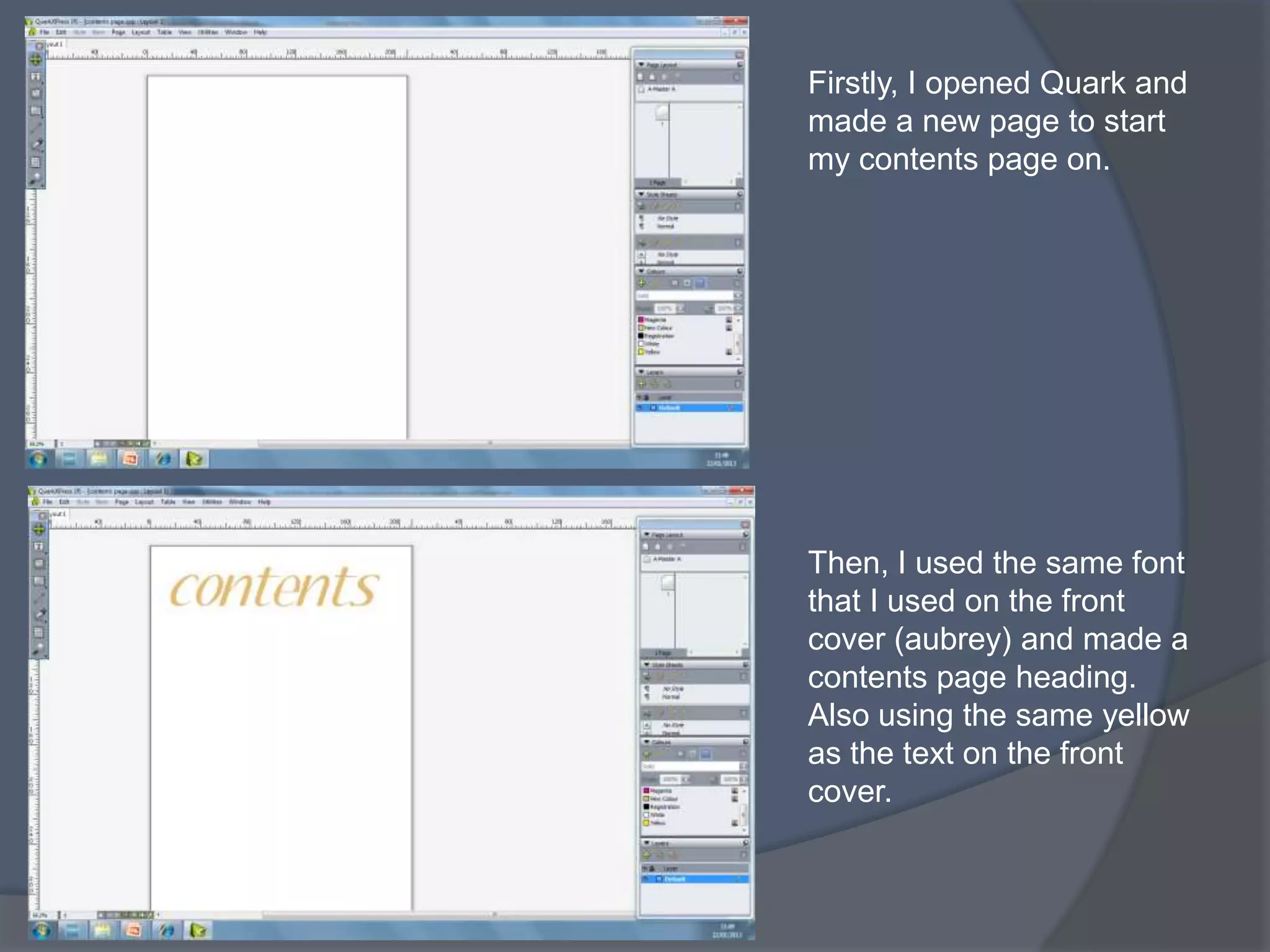
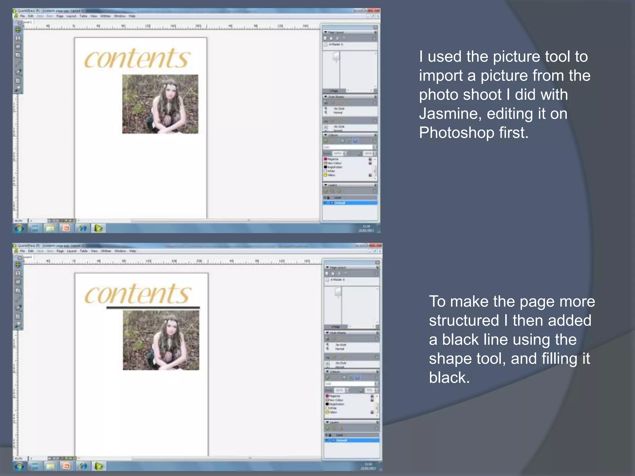
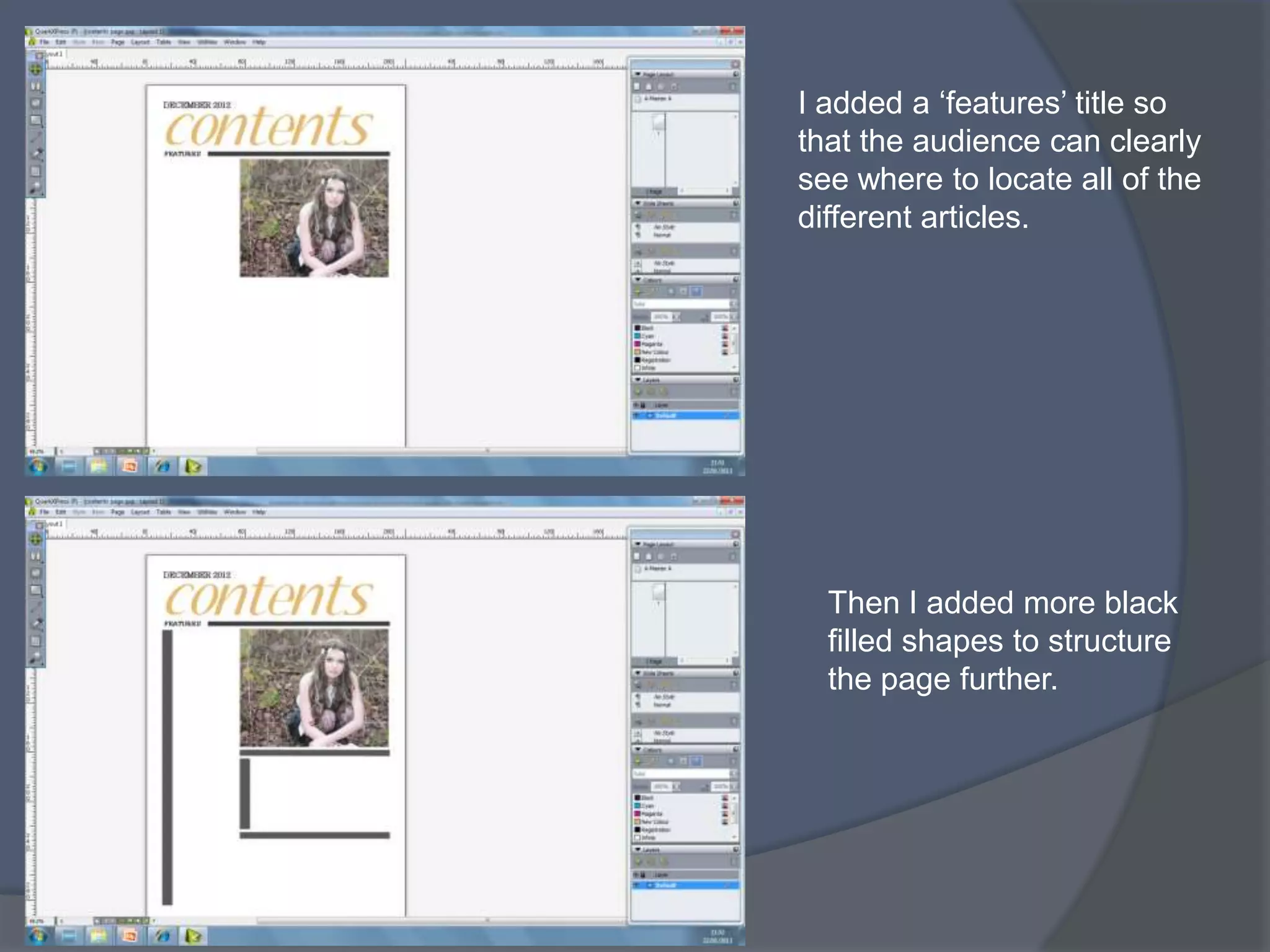
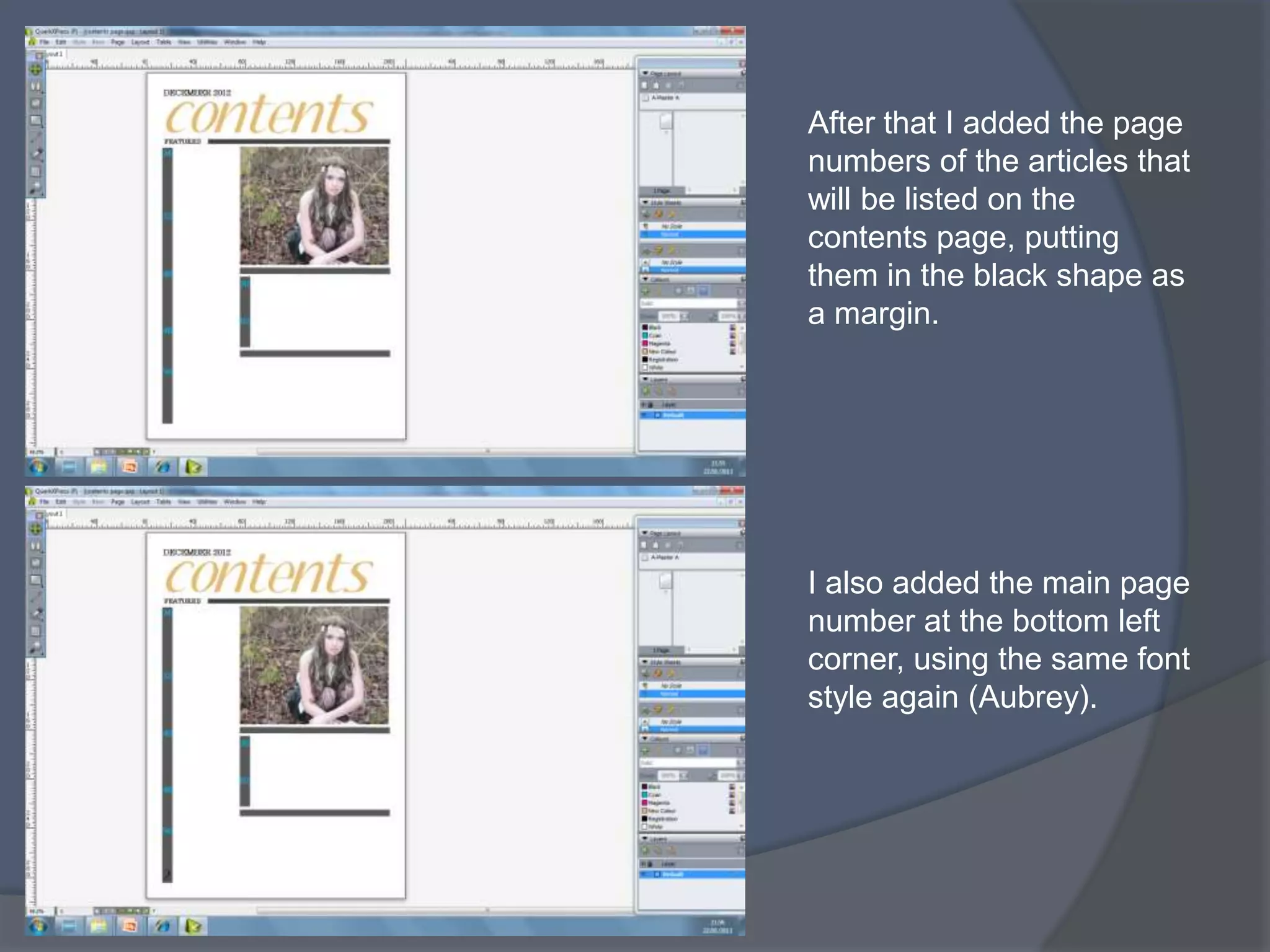
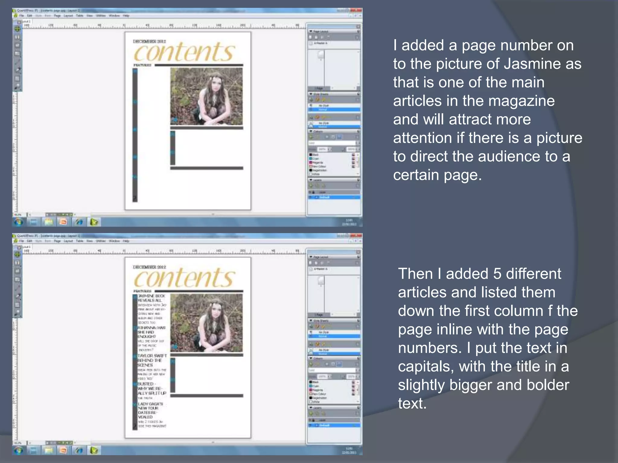
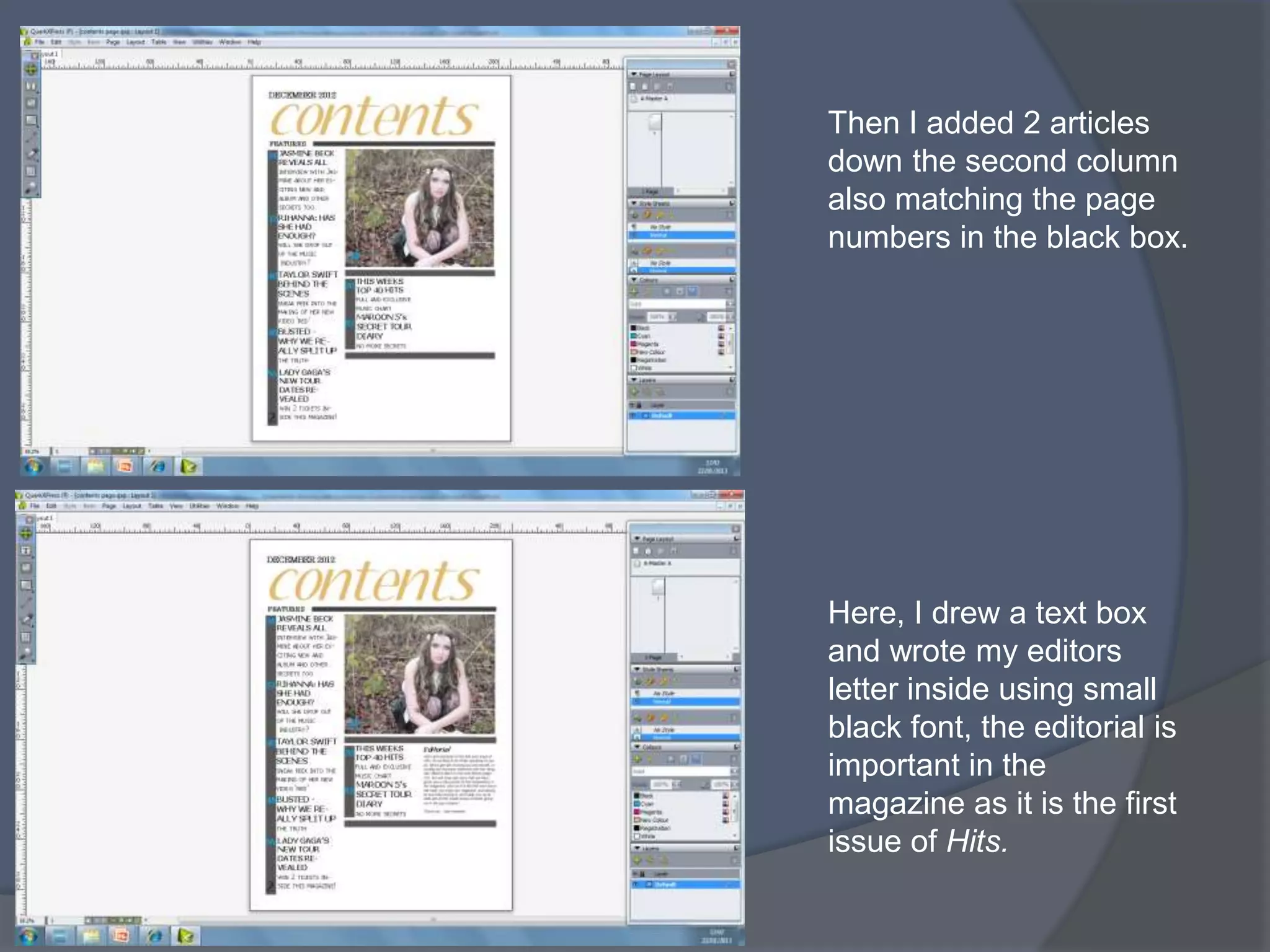
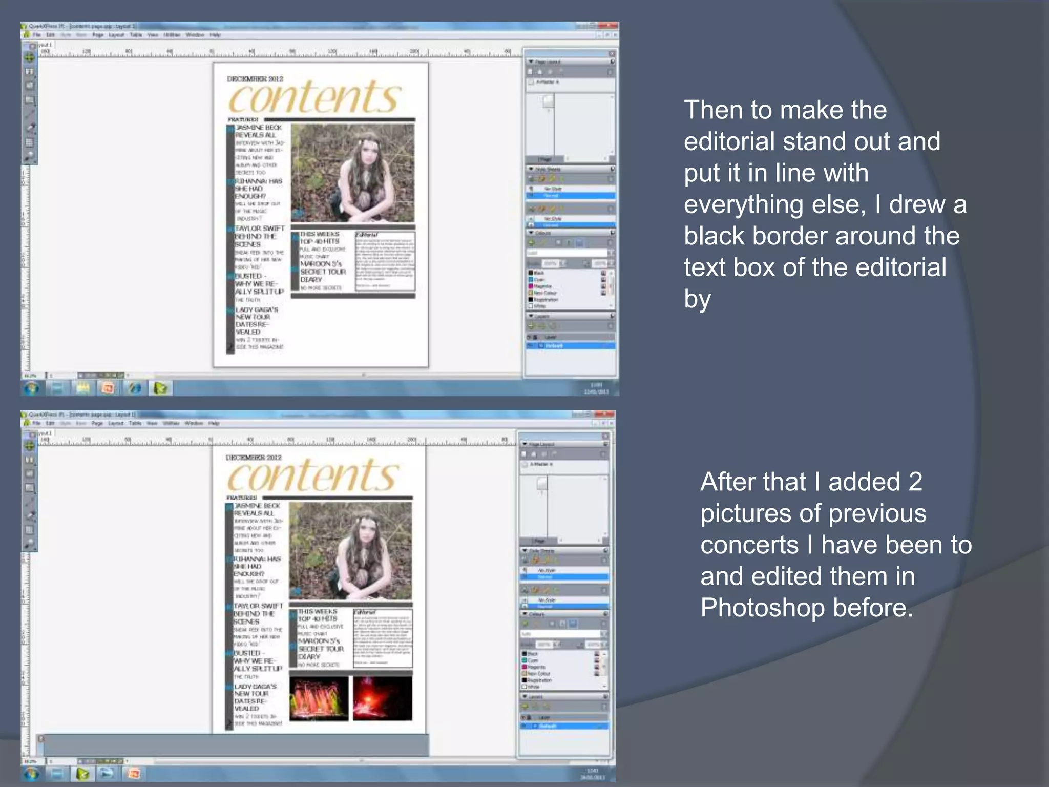
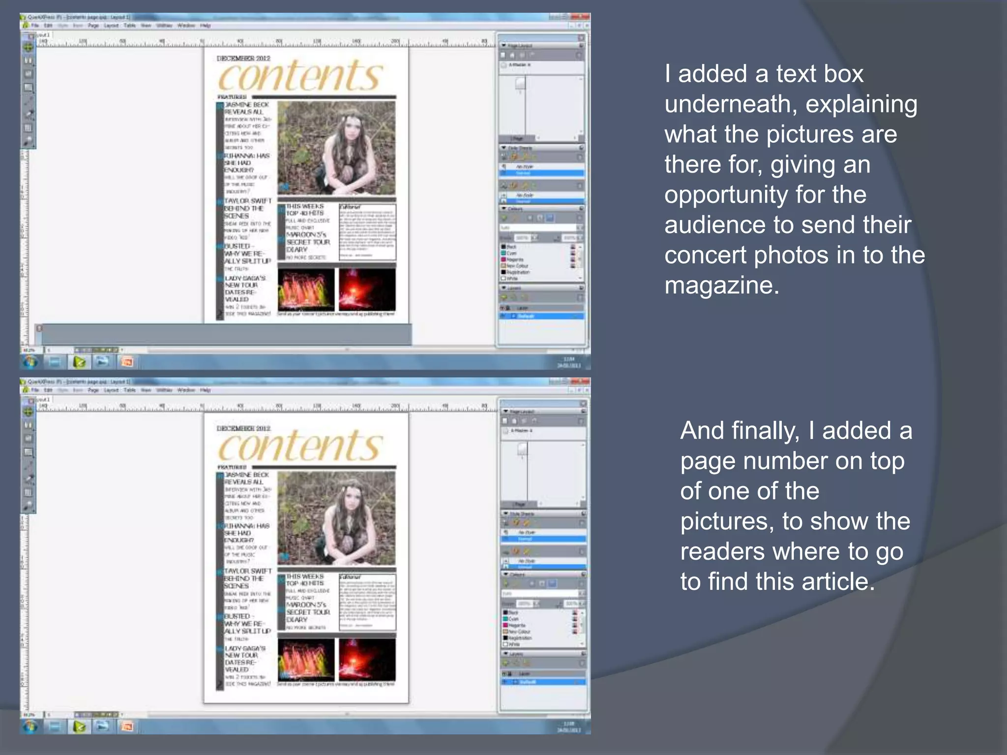
SCREENSHOTS SHOWING EDITING
PROCESS ON PHOTOSHOP –
FRONT COVER
Go to file, open and select the
image you want to use as your
cover photo, then click on the
quick selection tool.


Select the part of the image
you want and click edit
copy, edit paste to put that part
of the image on a separate
layer. (the model)
I then clicked the background
layer and went to filter > blur >
gaussian blur. I decided how
blurred I wanted the photo and
then clicked ok.


 Click on the layer of the
 model and then go to image >
 adjustments > brightness and
 contrast (then pick how you want the
 picture and click ok)
After I had finished editing the
image I went to Layer > Flatten
Image to make the layers join
together again.


 I then dragged that over to my
 international paper and
 stretched it to how I wanted it
 using the shift key to keep it in
 proportion.
I added the cover name ‘Hits’ by
clicking the text button and
choosing the colour, size, font etc..
that I thought would be appropriate
on a hits magazine. (Aubrey)


Then I added more text under the
masthead including the date, issue
number and the price of the
magazine, using Aubrey font again.
I then added a barcode onto
the page which I got off the
internet, making the page
look more professional.


After that, I added my first
cover line story using 2
colours of yellow and
white, and putting the white
slightly bigger to attract
more attention.
Then, I added the other 2 cover
lines I created, also making part
of the cover line in a bigger
white font to attract more
attention from the audience.


  Here, I added a brown
  puff, by clicking on the
  custom shape tool, right
  clicking on the page, and
  then different options of
  shapes came up. The puff
  will make the text inside it
  stand out.
After making the puff, I added
the text on top of it saying
‘free poster inside’ therefore
giving the audience another
reason to buy the magazine.


 Then I added a yellow banner
 at the bottom right of the page
 and changed the opacity to
 80%, and also put a small
 drop shadow on it.
After adding the banner, I
                added text onto it saying that it
                was the first edition of the
                magazine, because this is
                important information to the
                reader.


FINAL FRONT COVER
SCREENSHOTS SHOWING
EDITING PROCESS ON QUARK -
DOUBLE PAGE SPREAD
Firstly, I opened quark and
made a new document, by
putting 2 pages together to
make a double page.


  Then I used the picture
  tool to make a box, then
  right clicked and went to
  import.
I chose the image I wanted
 to use and then clicked ok.
 This image of Jasmine has
 been edited in photo shop.


Then I decided on what the
title of the page. And used
the font called ‘wizards
magic’ which is a font I found
myself off dafont. I made the
text green to match the
background in the picture.
I made a text box under the
title and then pasted my
interview with Jasmine in off
my blog, changing the colour
Jasmines replies to make it
catchier and easier to follow.
(8pt text used)


Then I made the W a drop
capital by highlighting the first 3
lines, then going to
style, formats. I ticked the drop
shadow box and made it 3
deep and clicked ok.
Here, I imported 2 other
images from my photo shoot
with Jasmine. I selected each
image separately and went to
item, run around, so that the
text would move according to
the pictures.


Then to make the pictures
stand out more I put a black
border around each one.
After that I used
Item, Run-around again
and made a text box to
put in a pull quote from
the interview, using the
same font style as the
title.


Then I added page
numbers to match the
ones on the contents
page.
To make the right page
stand out more I added
a border around the
page of 3 straight lines.


Finally, to finish off the
double page spread a
put a bold black border
around the whole of the
page to make it more
structured.
SCREENSHOTS SHOWING
EDITING PROCESS ON QUARK –
CONTENTS PAGE
Firstly, I opened Quark and
made a new page to start
my contents page on.


Then, I used the same font
that I used on the front
cover (aubrey) and made a
contents page heading.
Also using the same yellow
as the text on the front
cover.
I used the picture tool to
import a picture from the
photo shoot I did with
Jasmine, editing it on
Photoshop first.


 To make the page more
 structured I then added
 a black line using the
 shape tool, and filling it
 black.
I added a ‘features’ title so
that the audience can clearly
see where to locate all of the
different articles.


  Then I added more black
  filled shapes to structure
  the page further.
After that I added the page
numbers of the articles that
will be listed on the
contents page, putting
them in the black shape as
a margin.


I also added the main page
number at the bottom left
corner, using the same font
style again (Aubrey).
I added a page number on
to the picture of Jasmine as
that is one of the main
articles in the magazine
and will attract more
attention if there is a picture
to direct the audience to a
certain page.


Then I added 5 different
articles and listed them
down the first column f the
page inline with the page
numbers. I put the text in
capitals, with the title in a
slightly bigger and bolder
text.
Then I added 2 articles
down the second column
also matching the page
numbers in the black box.


Here, I drew a text box
and wrote my editors
letter inside using small
black font, the editorial is
important in the
magazine as it is the first
issue of Hits.
Then to make the
editorial stand out and
put it in line with
everything else, I drew a
black border around the
text box of the editorial
by


 After that I added 2
 pictures of previous
 concerts I have been to
 and edited them in
 Photoshop before.
I added a text box
underneath, explaining
what the pictures are
there for, giving an
opportunity for the
audience to send their
concert photos in to the
magazine.


 And finally, I added a
 page number on top
 of one of the
 pictures, to show the
 readers where to go
 to find this article.

Screenshots showing editing processes on photoshop and quark

  • 1.
    SCREENSHOTS SHOWING EDITING PROCESSON PHOTOSHOP – FRONT COVER
  • 2.
    Go to file,open and select the image you want to use as your cover photo, then click on the quick selection tool. Select the part of the image you want and click edit copy, edit paste to put that part of the image on a separate layer. (the model)
  • 3.
    I then clickedthe background layer and went to filter > blur > gaussian blur. I decided how blurred I wanted the photo and then clicked ok. Click on the layer of the model and then go to image > adjustments > brightness and contrast (then pick how you want the picture and click ok)
  • 4.
    After I hadfinished editing the image I went to Layer > Flatten Image to make the layers join together again. I then dragged that over to my international paper and stretched it to how I wanted it using the shift key to keep it in proportion.
  • 5.
    I added thecover name ‘Hits’ by clicking the text button and choosing the colour, size, font etc.. that I thought would be appropriate on a hits magazine. (Aubrey) Then I added more text under the masthead including the date, issue number and the price of the magazine, using Aubrey font again.
  • 6.
    I then addeda barcode onto the page which I got off the internet, making the page look more professional. After that, I added my first cover line story using 2 colours of yellow and white, and putting the white slightly bigger to attract more attention.
  • 7.
    Then, I addedthe other 2 cover lines I created, also making part of the cover line in a bigger white font to attract more attention from the audience. Here, I added a brown puff, by clicking on the custom shape tool, right clicking on the page, and then different options of shapes came up. The puff will make the text inside it stand out.
  • 8.
    After making thepuff, I added the text on top of it saying ‘free poster inside’ therefore giving the audience another reason to buy the magazine. Then I added a yellow banner at the bottom right of the page and changed the opacity to 80%, and also put a small drop shadow on it.
  • 9.
    After adding thebanner, I added text onto it saying that it was the first edition of the magazine, because this is important information to the reader. FINAL FRONT COVER
  • 10.
    SCREENSHOTS SHOWING EDITING PROCESSON QUARK - DOUBLE PAGE SPREAD
  • 11.
    Firstly, I openedquark and made a new document, by putting 2 pages together to make a double page. Then I used the picture tool to make a box, then right clicked and went to import.
  • 12.
    I chose theimage I wanted to use and then clicked ok. This image of Jasmine has been edited in photo shop. Then I decided on what the title of the page. And used the font called ‘wizards magic’ which is a font I found myself off dafont. I made the text green to match the background in the picture.
  • 13.
    I made atext box under the title and then pasted my interview with Jasmine in off my blog, changing the colour Jasmines replies to make it catchier and easier to follow. (8pt text used) Then I made the W a drop capital by highlighting the first 3 lines, then going to style, formats. I ticked the drop shadow box and made it 3 deep and clicked ok.
  • 14.
    Here, I imported2 other images from my photo shoot with Jasmine. I selected each image separately and went to item, run around, so that the text would move according to the pictures. Then to make the pictures stand out more I put a black border around each one.
  • 15.
    After that Iused Item, Run-around again and made a text box to put in a pull quote from the interview, using the same font style as the title. Then I added page numbers to match the ones on the contents page.
  • 16.
    To make theright page stand out more I added a border around the page of 3 straight lines. Finally, to finish off the double page spread a put a bold black border around the whole of the page to make it more structured.
  • 17.
    SCREENSHOTS SHOWING EDITING PROCESSON QUARK – CONTENTS PAGE
  • 18.
    Firstly, I openedQuark and made a new page to start my contents page on. Then, I used the same font that I used on the front cover (aubrey) and made a contents page heading. Also using the same yellow as the text on the front cover.
  • 19.
    I used thepicture tool to import a picture from the photo shoot I did with Jasmine, editing it on Photoshop first. To make the page more structured I then added a black line using the shape tool, and filling it black.
  • 20.
    I added a‘features’ title so that the audience can clearly see where to locate all of the different articles. Then I added more black filled shapes to structure the page further.
  • 21.
    After that Iadded the page numbers of the articles that will be listed on the contents page, putting them in the black shape as a margin. I also added the main page number at the bottom left corner, using the same font style again (Aubrey).
  • 22.
    I added apage number on to the picture of Jasmine as that is one of the main articles in the magazine and will attract more attention if there is a picture to direct the audience to a certain page. Then I added 5 different articles and listed them down the first column f the page inline with the page numbers. I put the text in capitals, with the title in a slightly bigger and bolder text.
  • 23.
    Then I added2 articles down the second column also matching the page numbers in the black box. Here, I drew a text box and wrote my editors letter inside using small black font, the editorial is important in the magazine as it is the first issue of Hits.
  • 24.
    Then to makethe editorial stand out and put it in line with everything else, I drew a black border around the text box of the editorial by After that I added 2 pictures of previous concerts I have been to and edited them in Photoshop before.
  • 25.
    I added atext box underneath, explaining what the pictures are there for, giving an opportunity for the audience to send their concert photos in to the magazine. And finally, I added a page number on top of one of the pictures, to show the readers where to go to find this article.