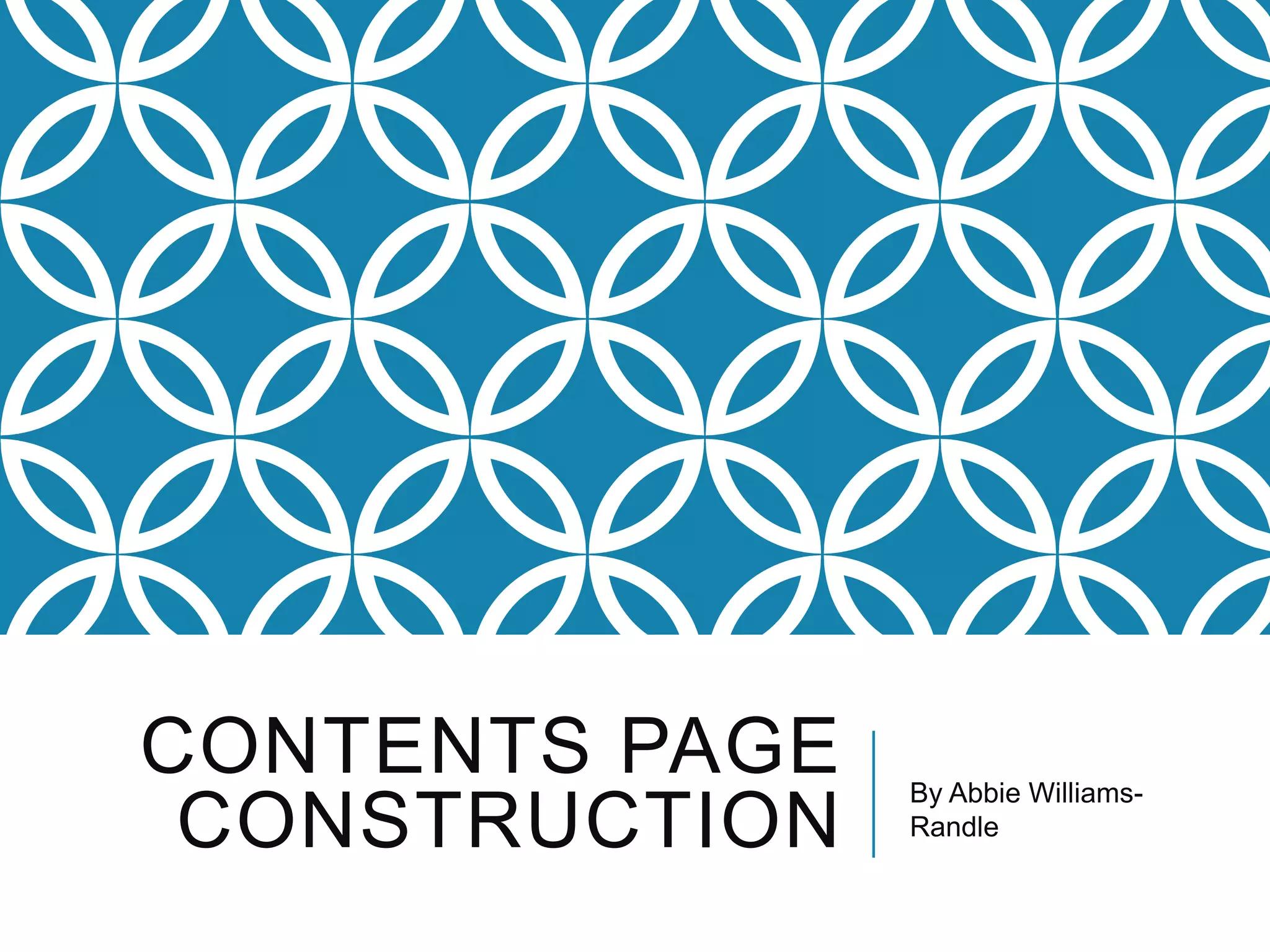
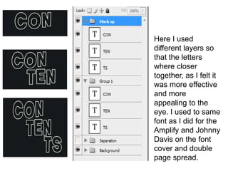
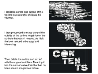
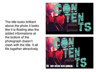
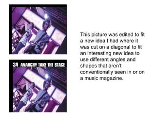
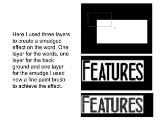
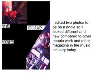
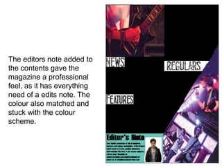
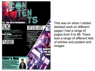
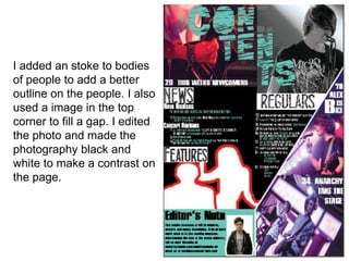
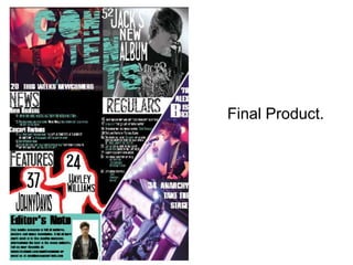
The document describes the process of constructing a magazine. It discusses using layers to bring letters closer together and maintain consistency with fonts used on the cover. It also describes scribbling an outline to give a graffiti effect, erasing around the outside to leave just the needed scribbles, giving an innovative look. Blue was added as an overlay to increase readability and stick to the color scheme. Photographs were edited, such as cutting one on a diagonal, to create interesting angles and shapes not conventionally seen. Multiple layers were used to create a smudged effect on a word. The end result was a magazine with a range of pages containing articles, posters, and images.