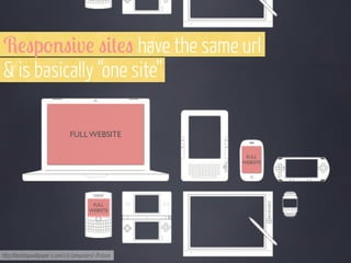
Downloaded 431 times


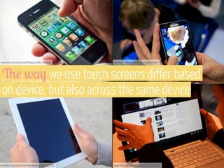
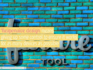
![“ D!"#$% & )!v!('p3!%+ "0'*() r!"p'%) to the
user’s behaviour & environment based on screen size,
platform & orientation. [It’s]...a mix of flexible grids &
layouts, images & an intelligent use of media queries. “
- S3,"0#%$ M,$7#%!
www.flickr.com/photos/adactio/5818096043](https://image.slidesharecdn.com/dwsdesigningformultipledevicesoct2013-131031044256-phpapp02/85/Designing-For-Multiple-Devices-Dublin-Web-Summit-Oct-2013-70-320.jpg)
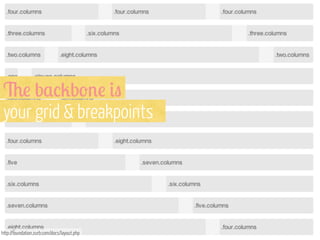


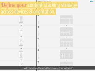
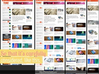


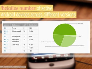
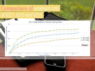
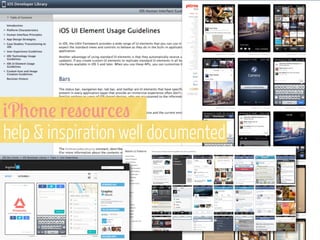
The document discusses the increasing significance of mobile devices in accessing the internet, highlighting that mobile phones are expected to surpass PCs as the most common web access device. It emphasizes the need for a responsive design that provides a uniform user experience across diverse devices, as users increasingly expect consistency in functionality and accessibility. Various strategies for mobile design, including defining mobile strategies and app development, are also outlined to enhance user engagement and experience.