Download as PDF, PPTX

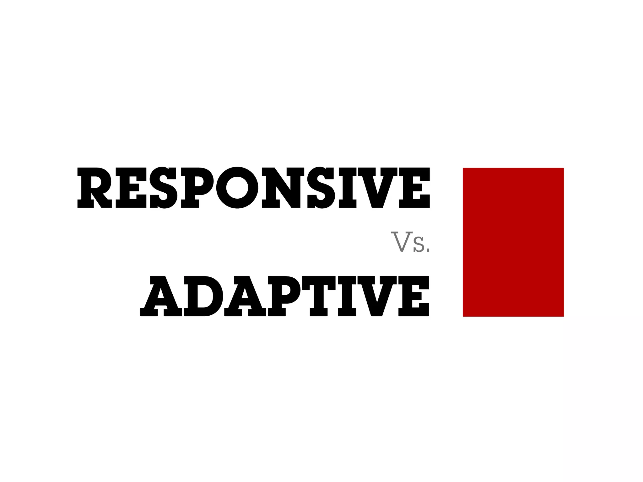
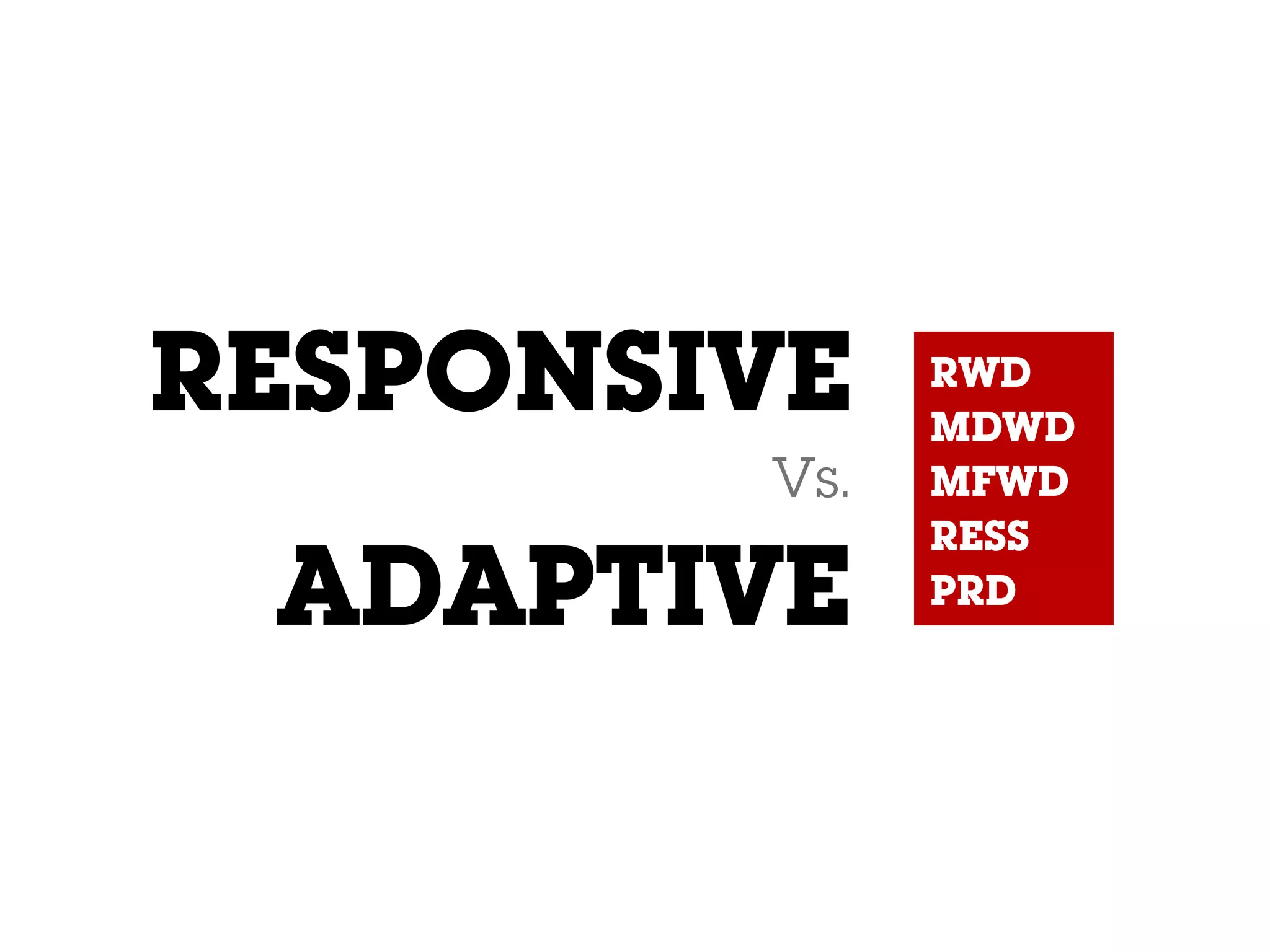
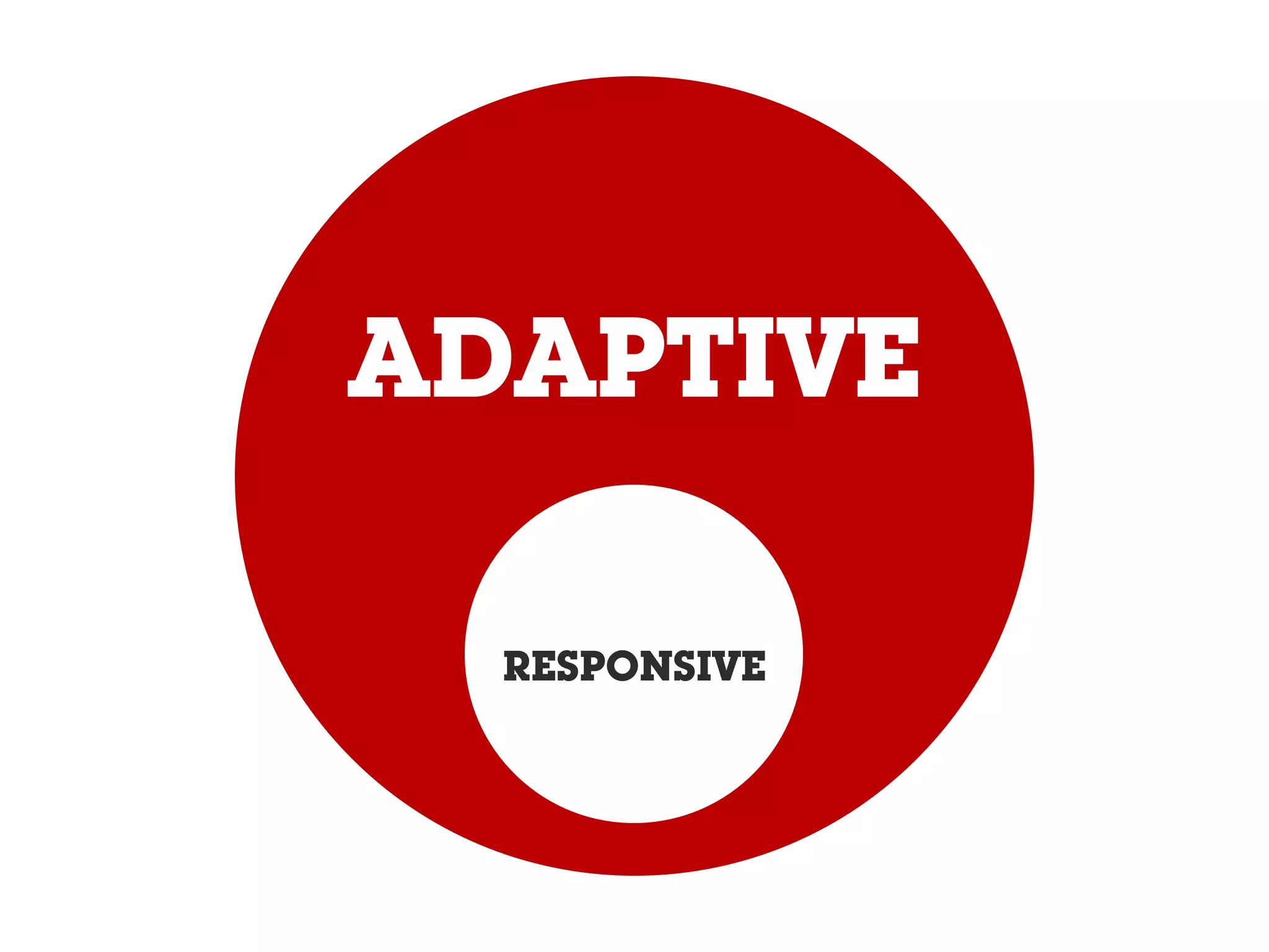
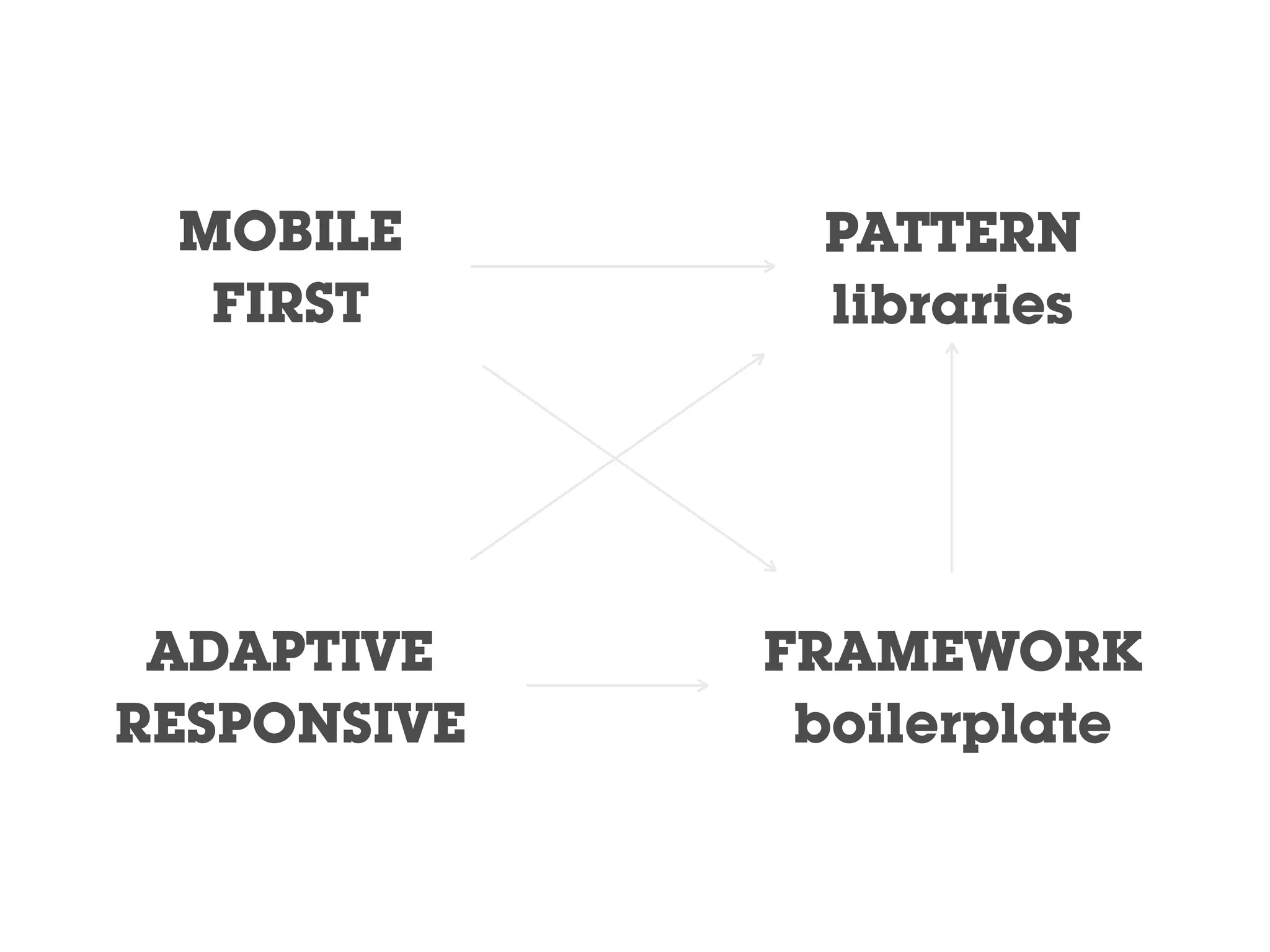


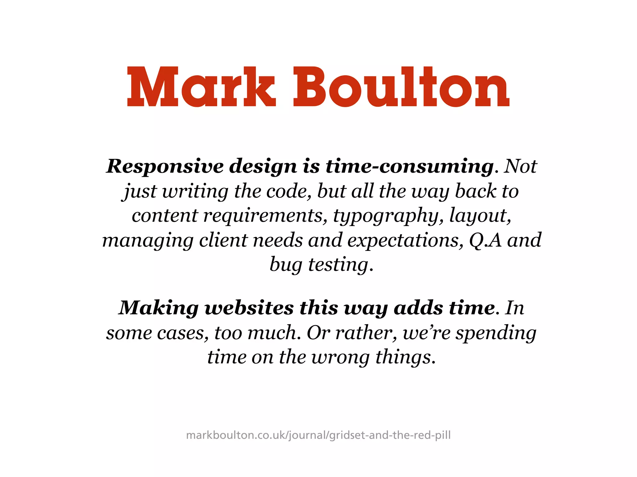
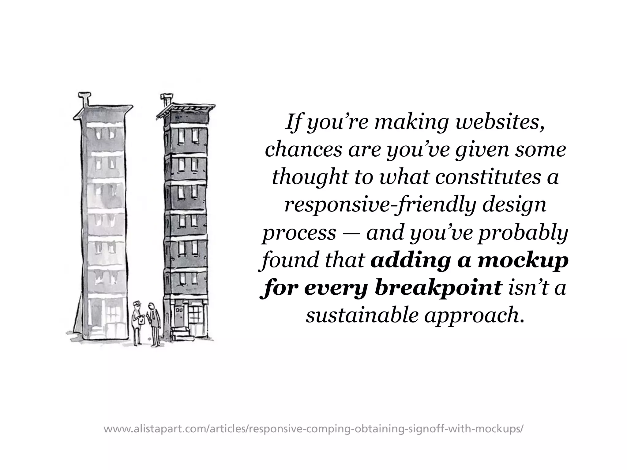

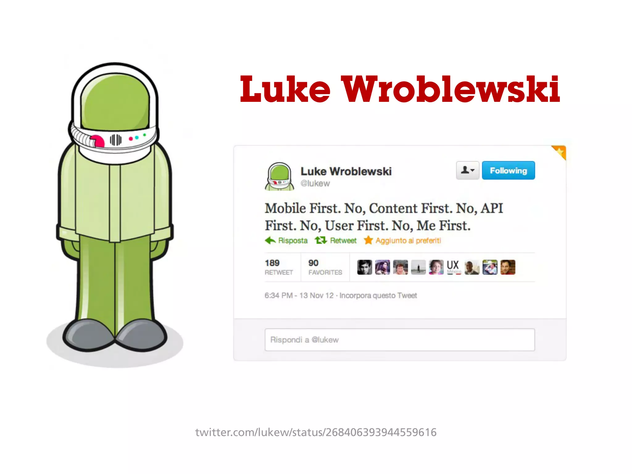

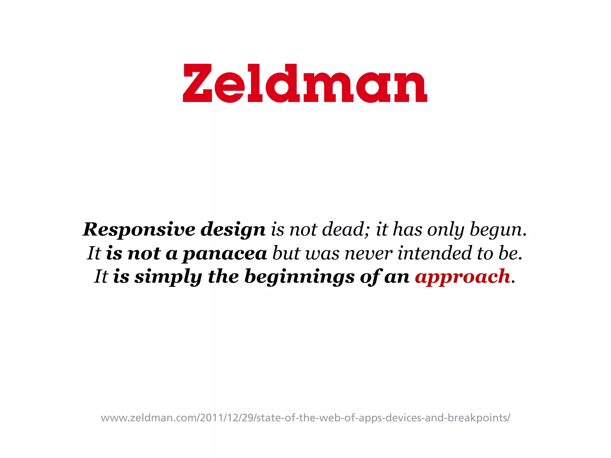


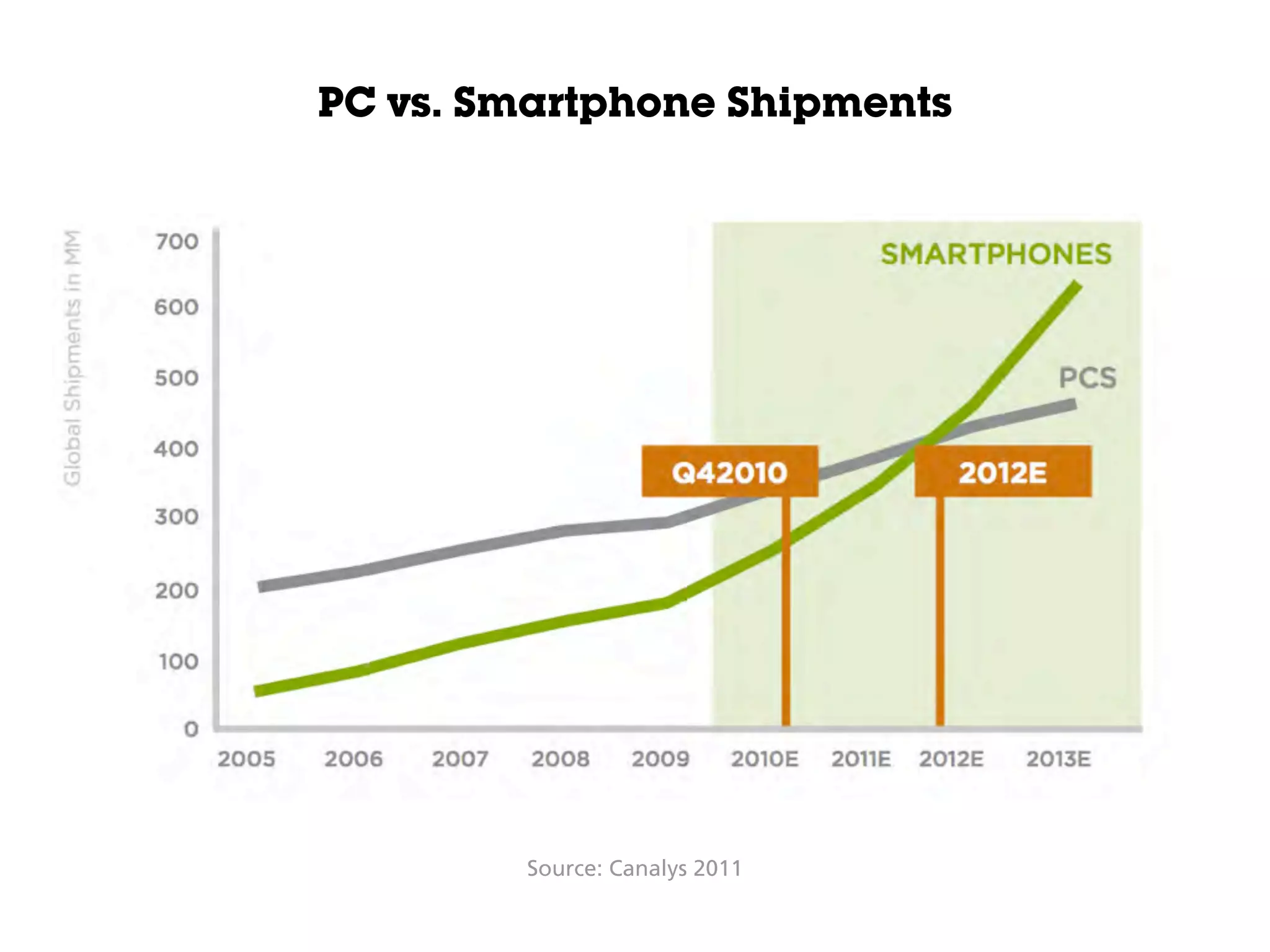
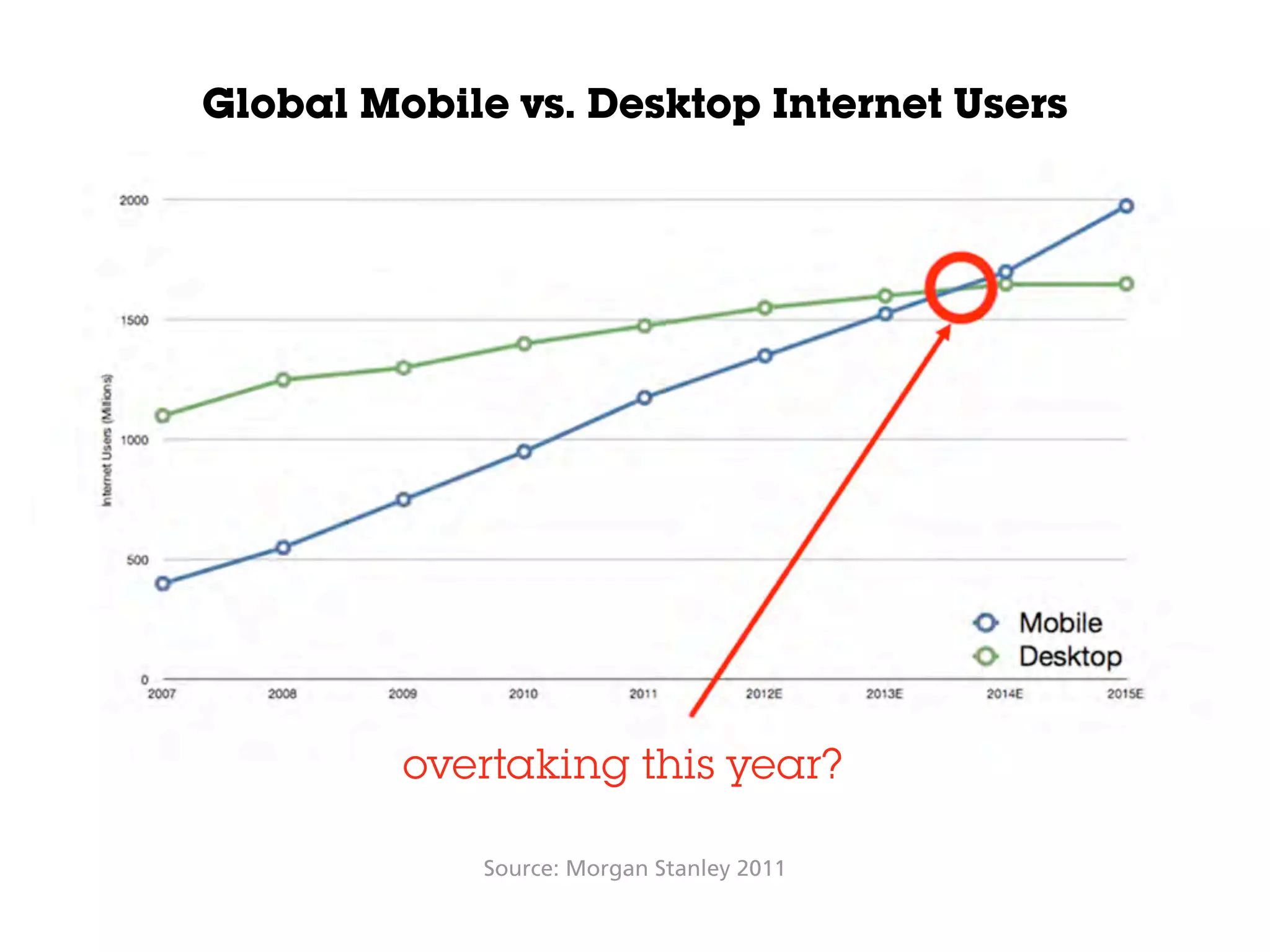
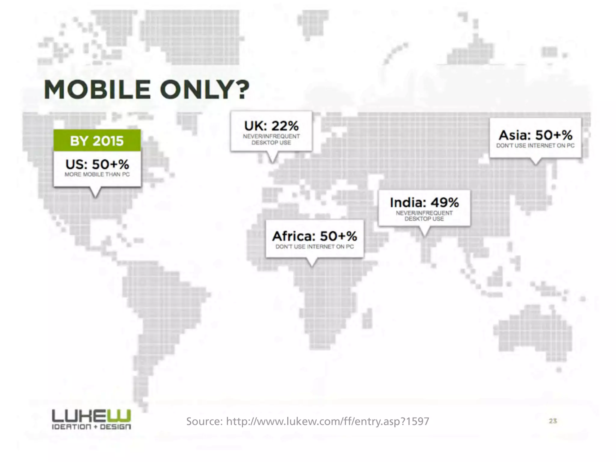
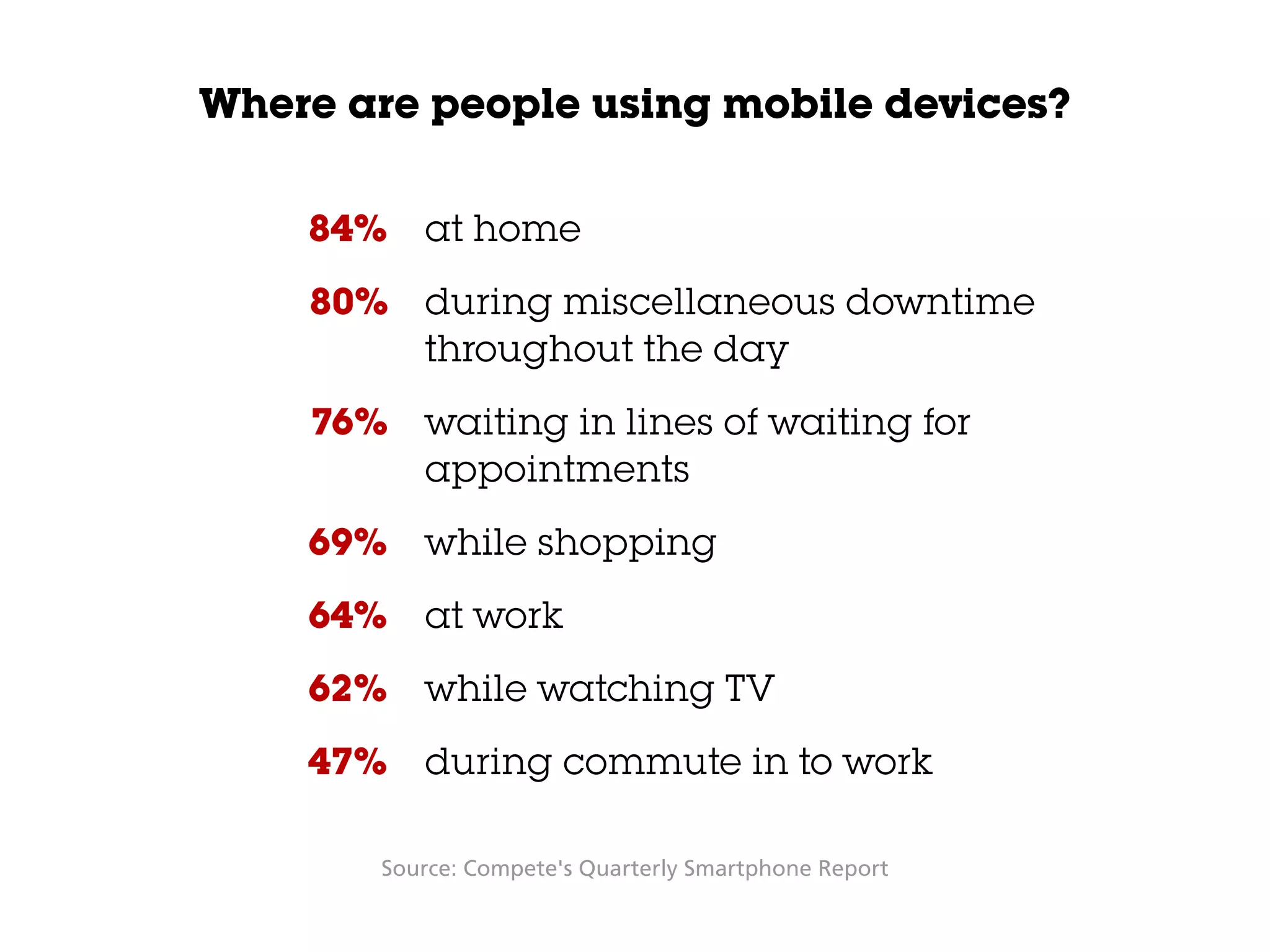

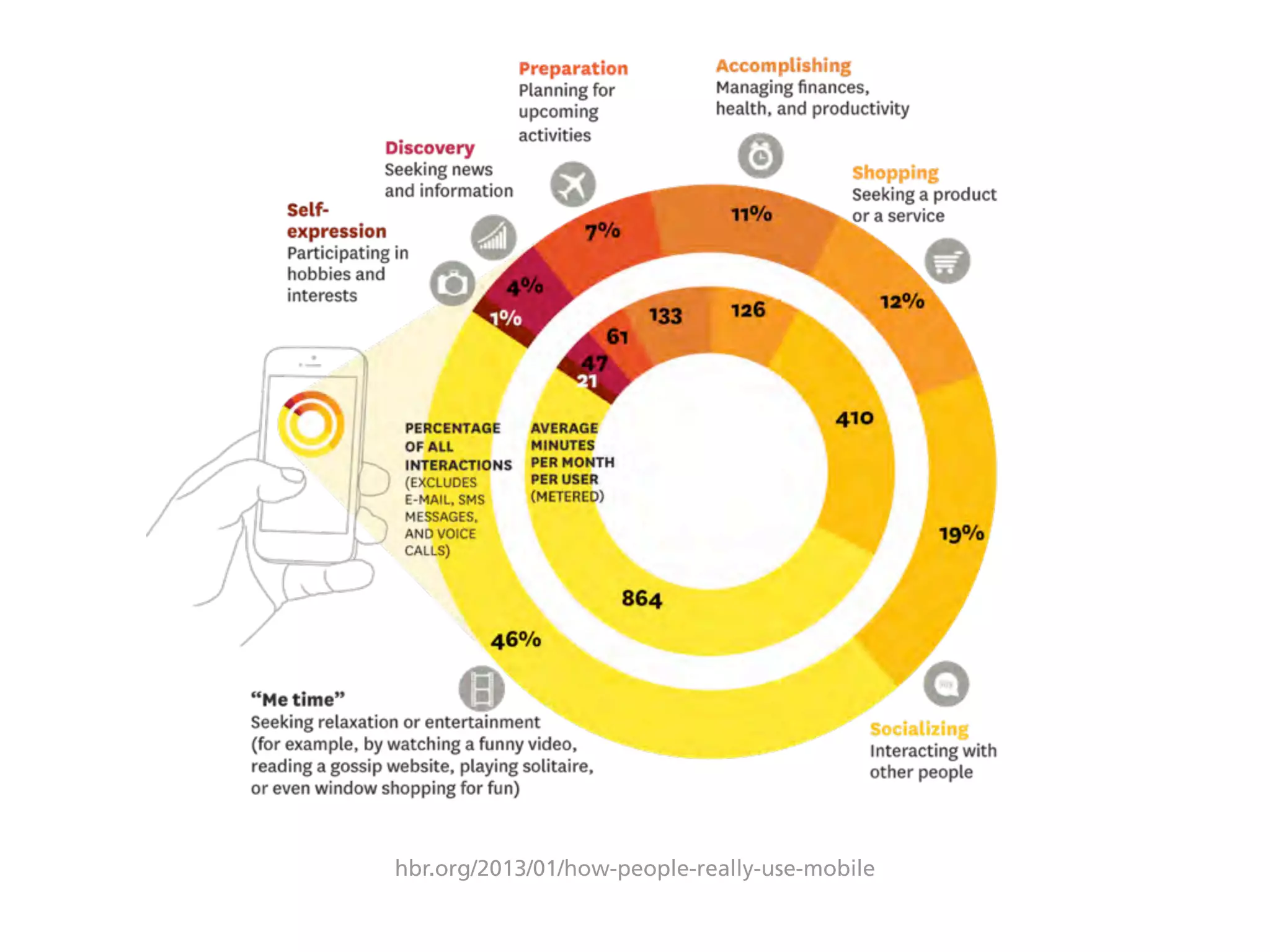
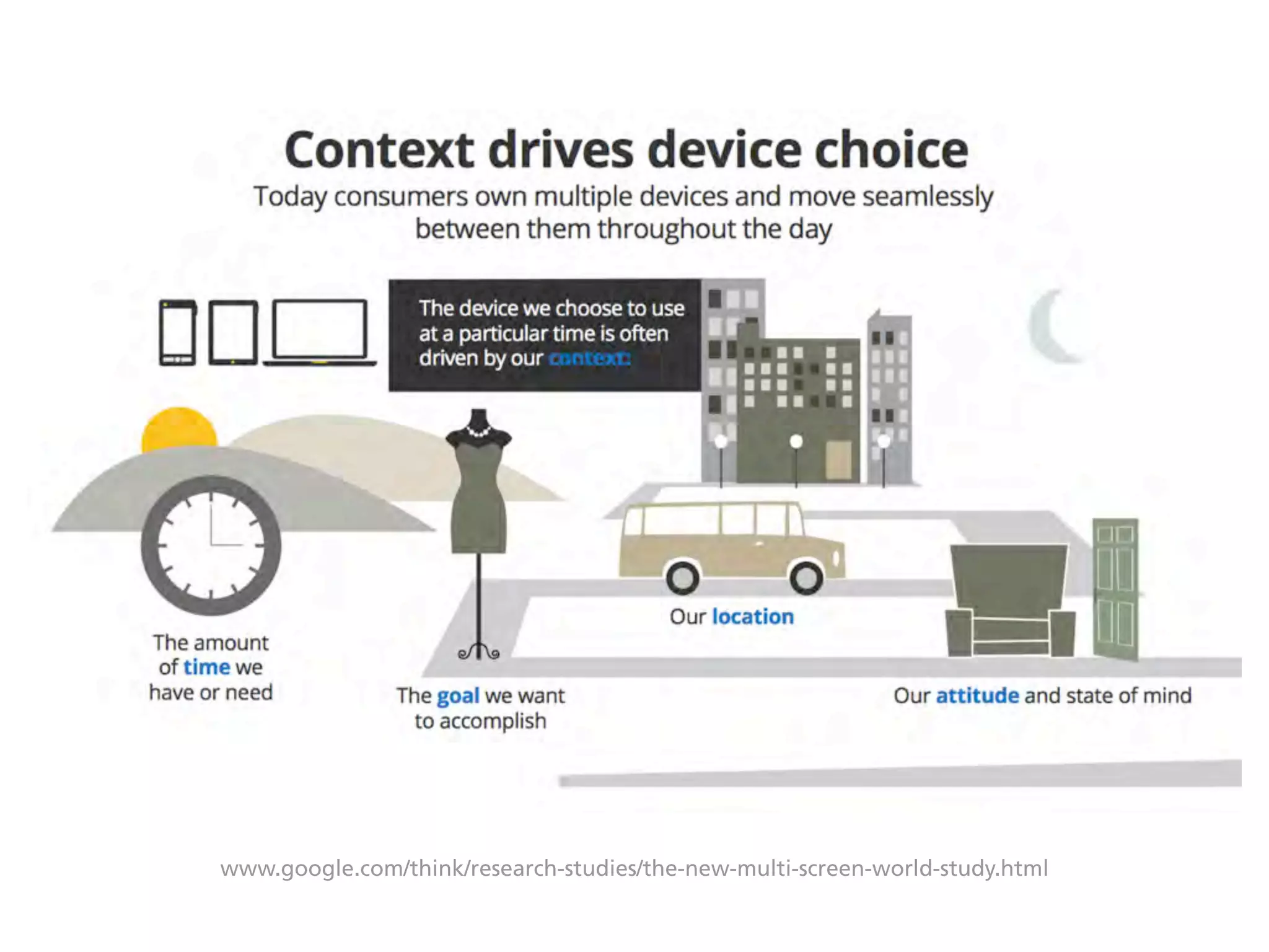
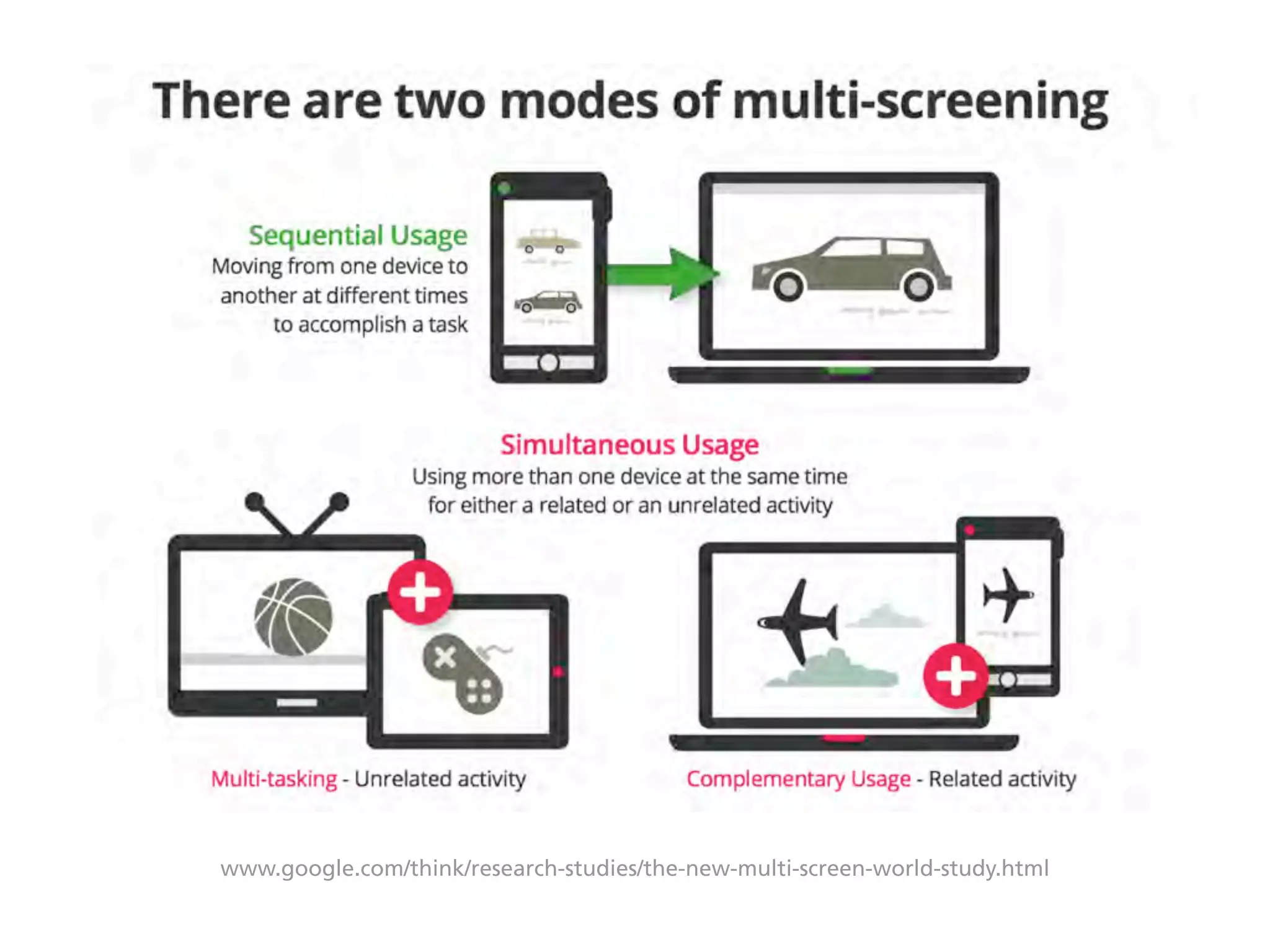
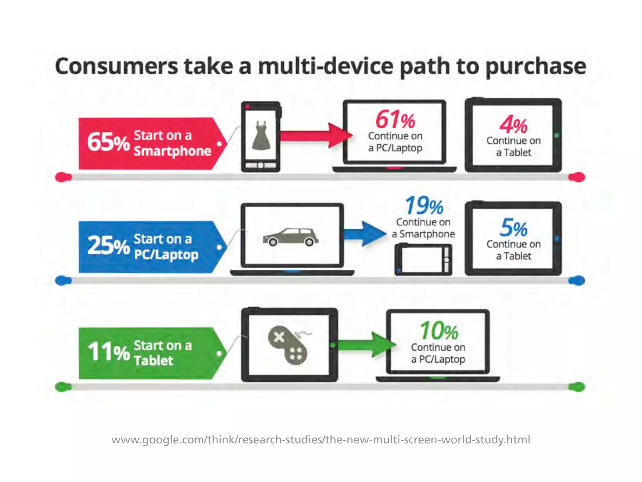


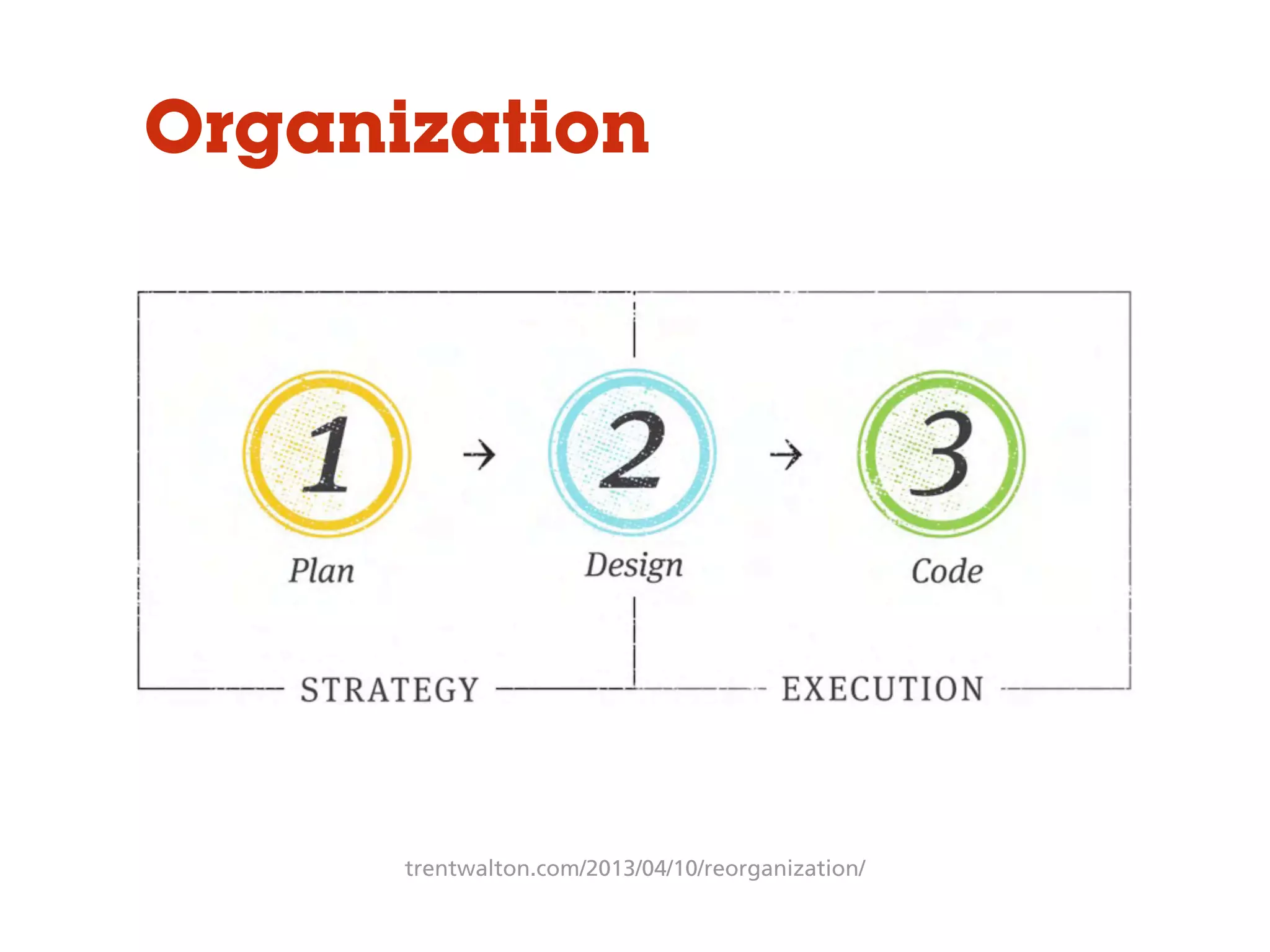
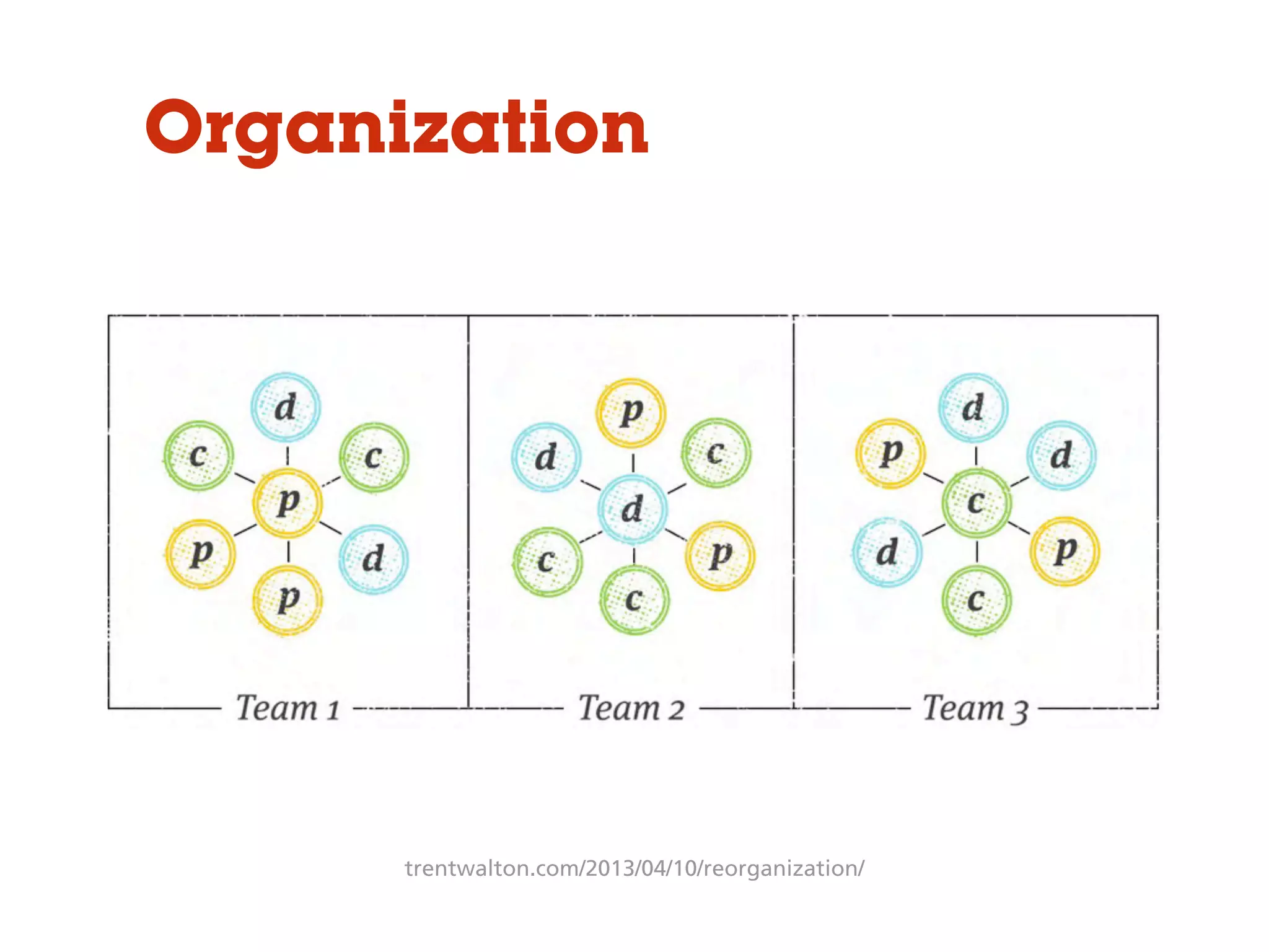
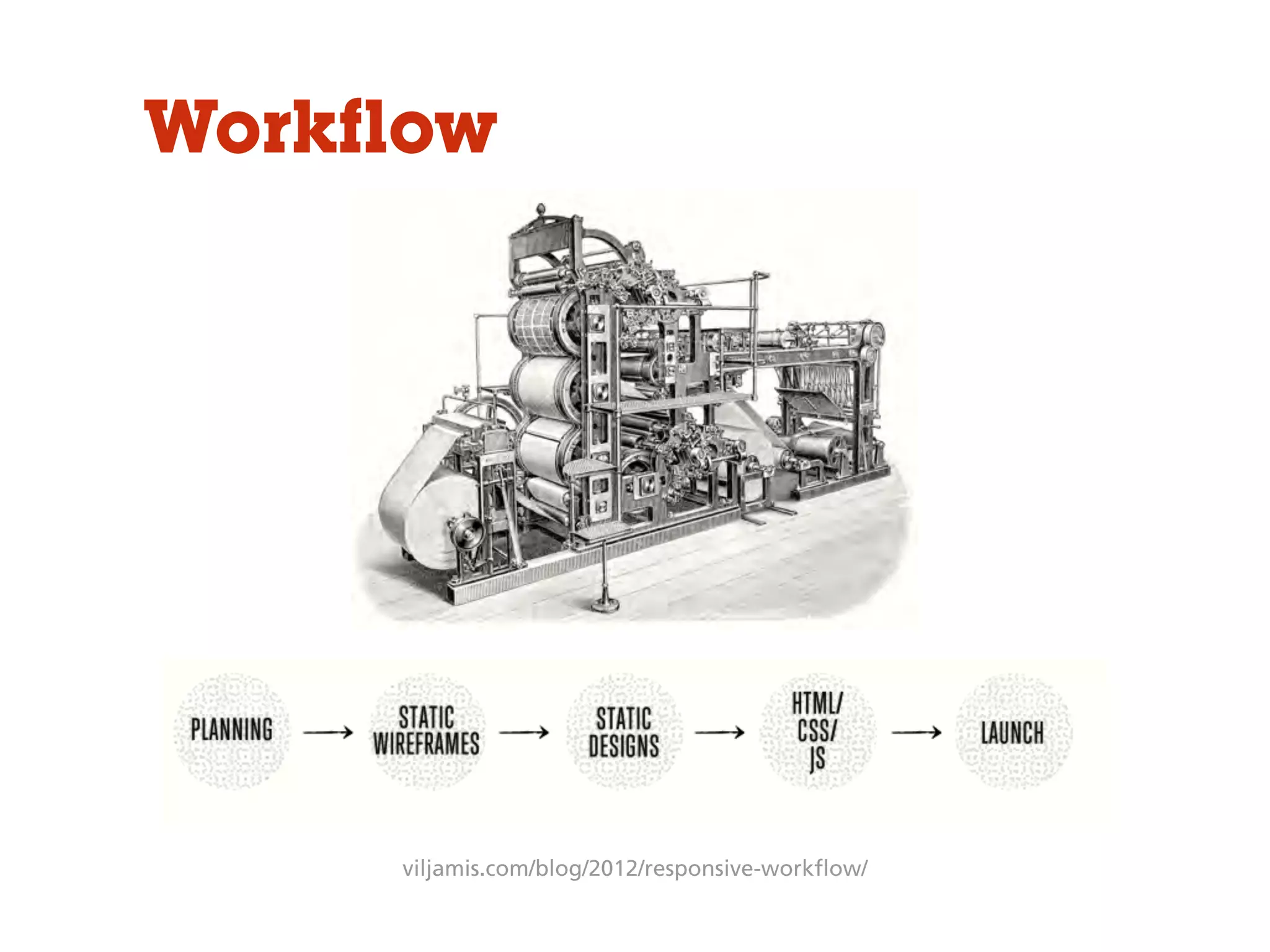
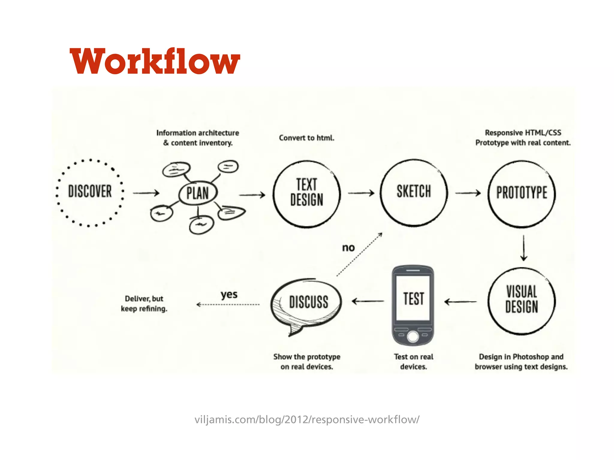


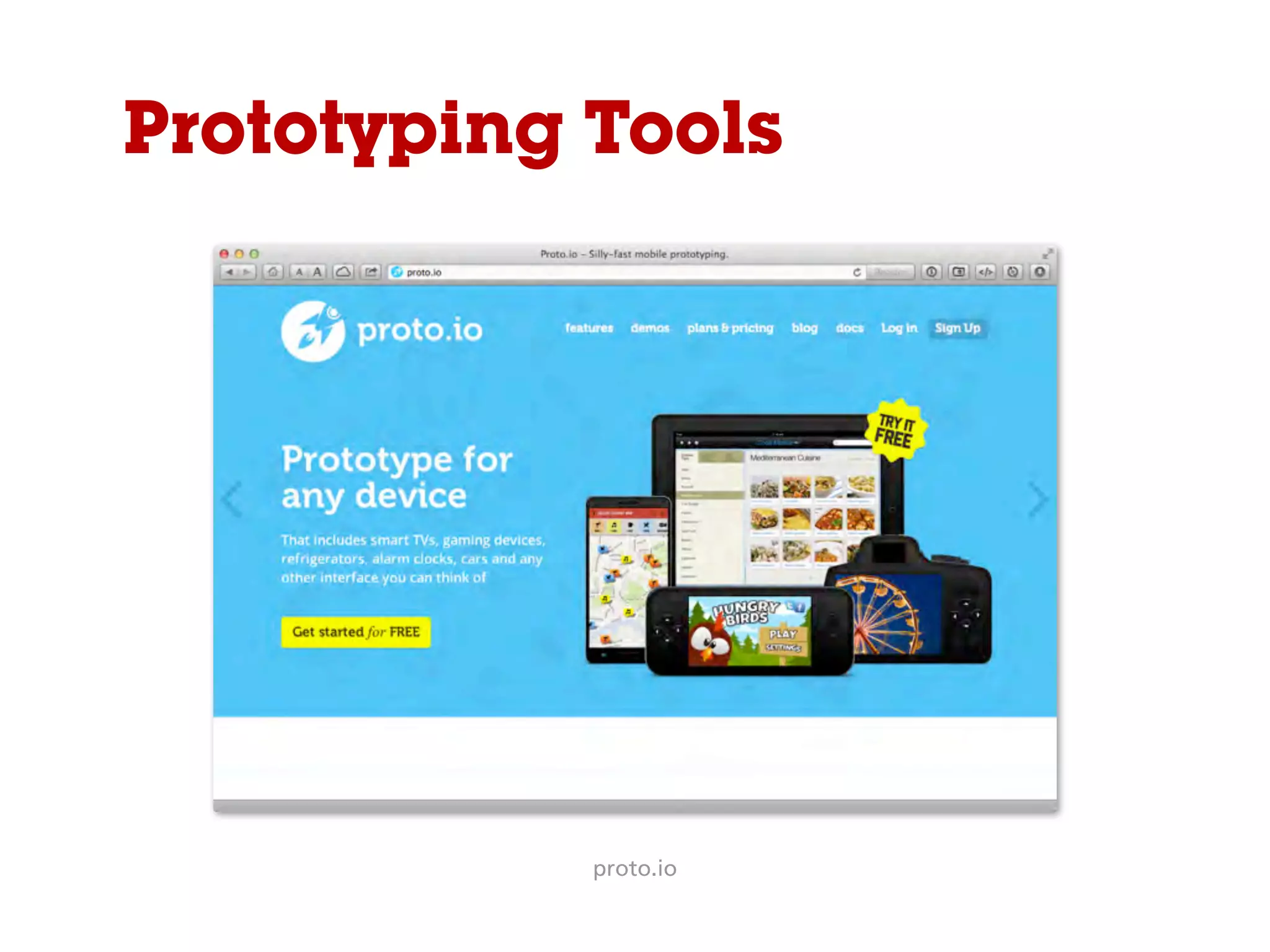
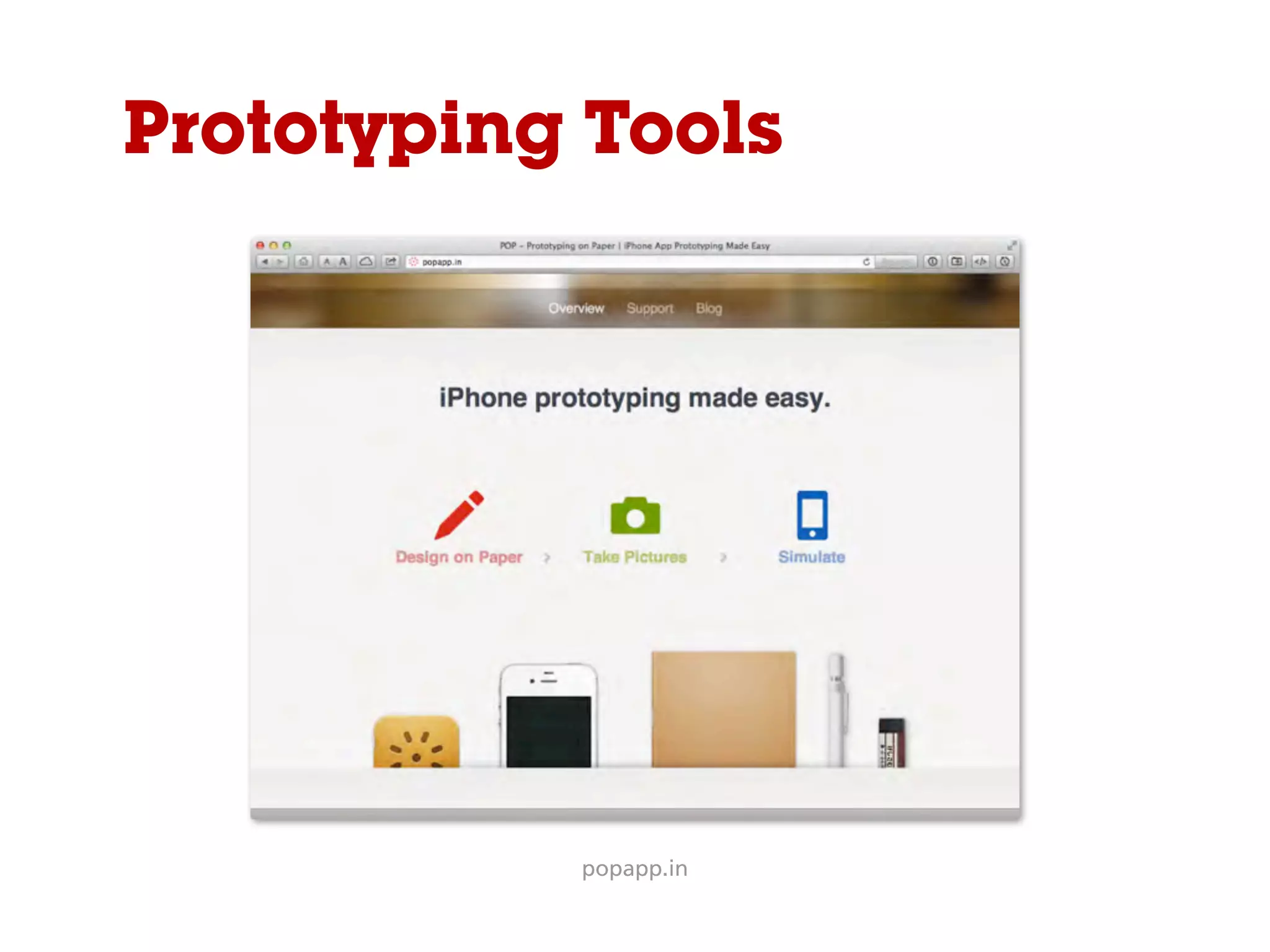
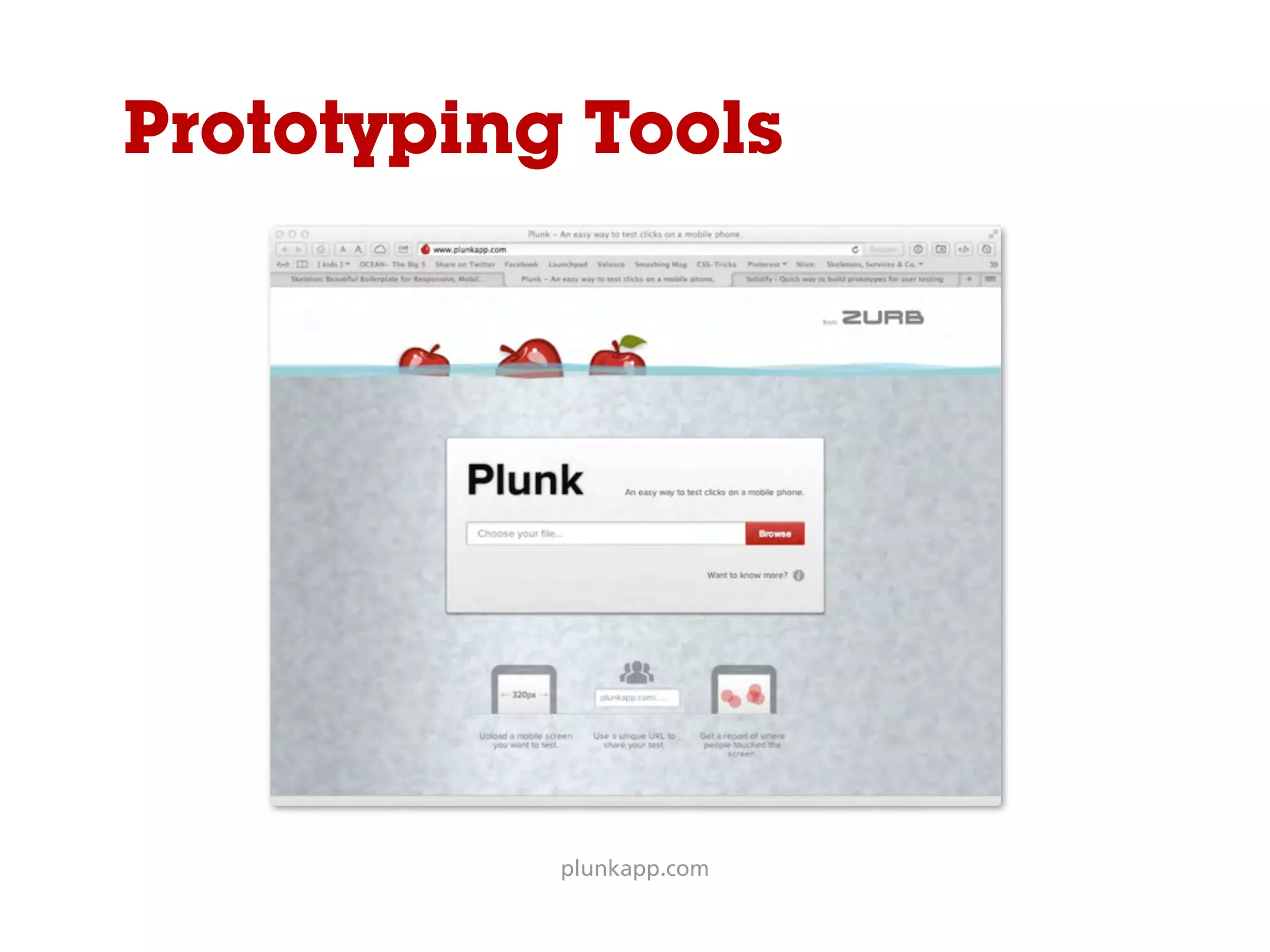
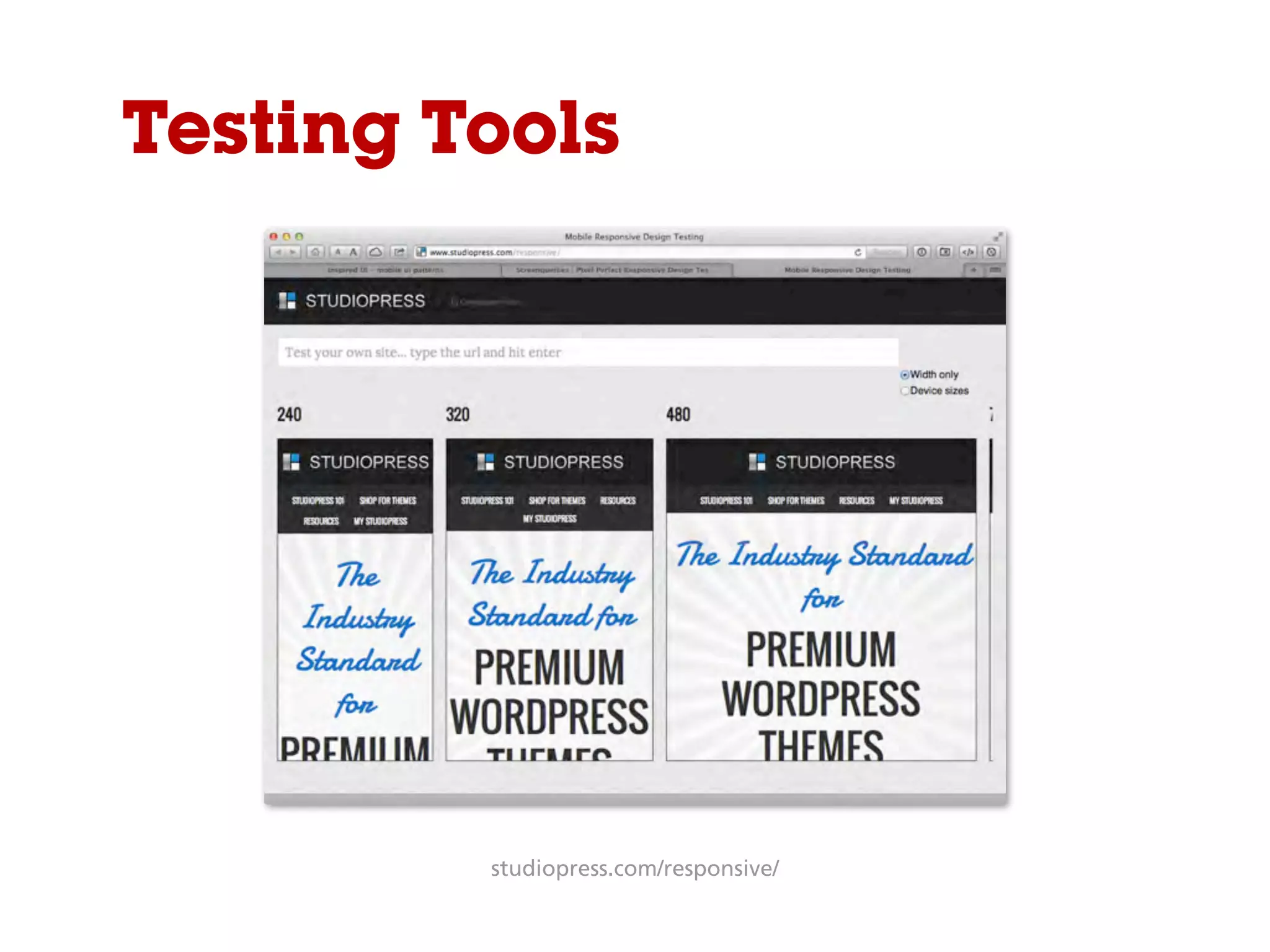
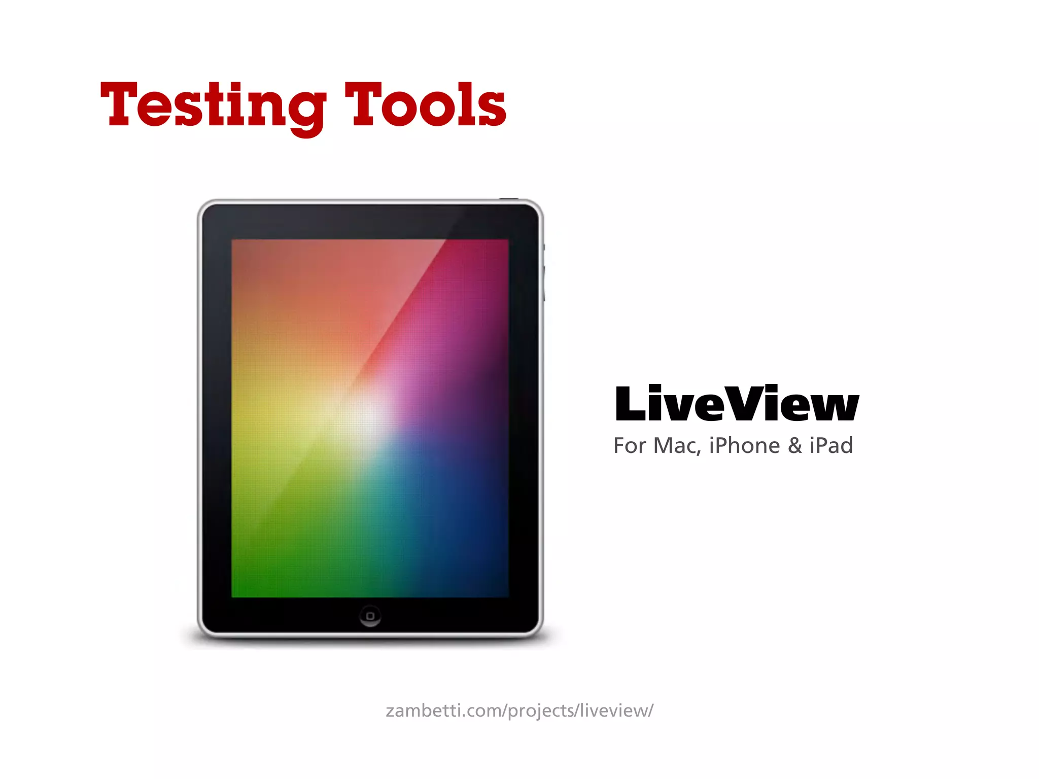


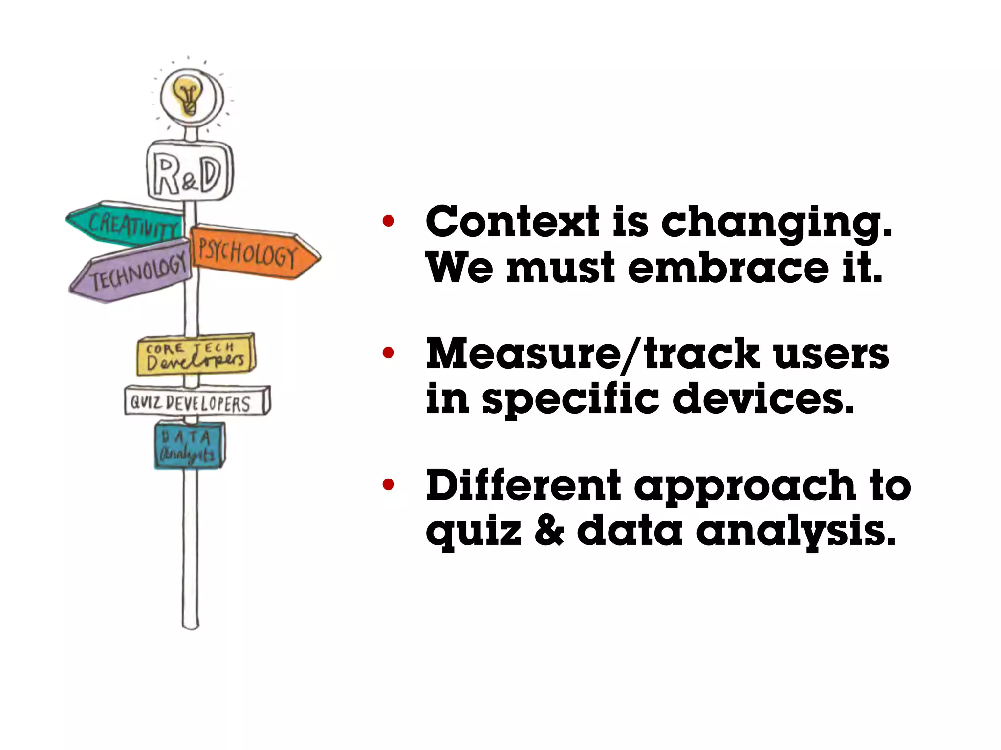
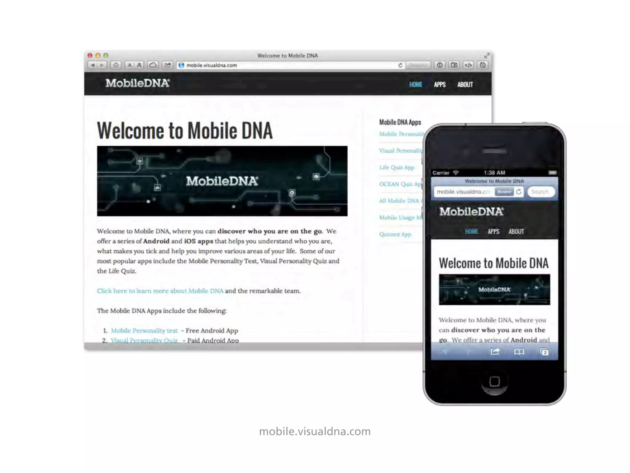


The document discusses responsive, adaptive, and mobile web design. It provides an overview of the differences between responsive and adaptive approaches. It notes that context is changing as mobile usage increases and discusses tools and techniques for liquid, responsive design including visual frameworks, prototyping tools, and testing on real devices. The document recommends embracing this changing context by measuring user behavior across devices and taking a different approach to data analysis and content delivery.


![Responsive Design Studio [Mountain View 2013]](https://cdn.slidesharecdn.com/ss_thumbnails/responsivedesignstudiomountainview-131018101452-phpapp01-thumbnail.jpg?width=640&height=640&fit=bounds)


![Responsive Design & Beyond [Code & Creativity Workshop]](https://cdn.slidesharecdn.com/ss_thumbnails/codecreativityworkshop1-140506164731-phpapp01-thumbnail.jpg?width=640&height=640&fit=bounds)


