Download as PDF, PPTX
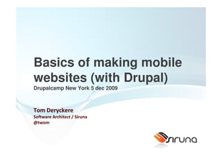

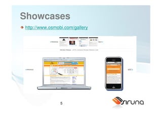
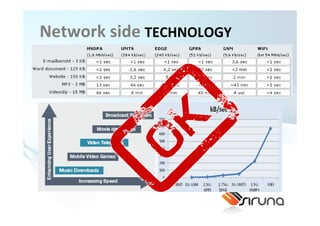
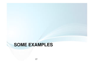

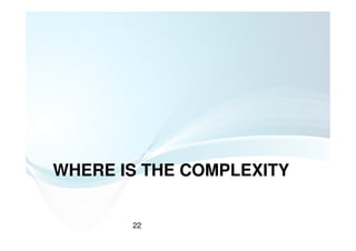
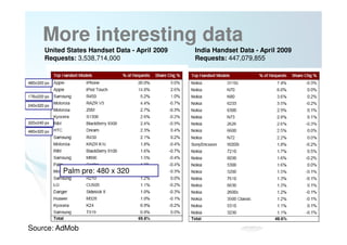
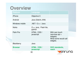

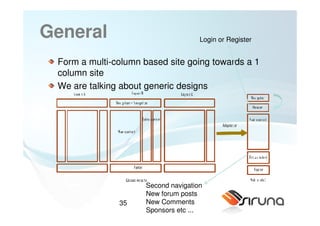
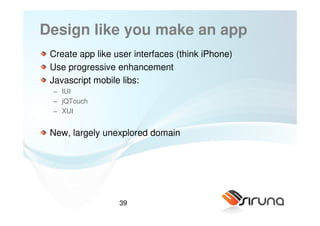
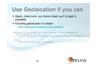
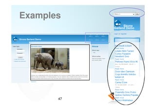
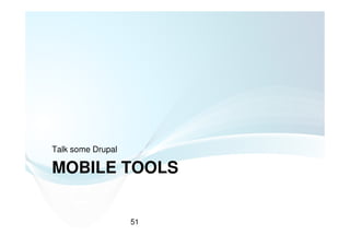
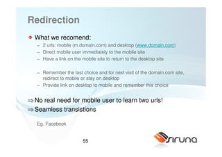

![XML scripting language:
syntax
<map:transform />
means you want to define a transformation on the content.
<map:transform type=“sirunaElementTransformer” />
means you want to use an “Element Transformer”
(http://open.siruna.org/documentation/sitemap-api for more
transformers.
<map:transform type=“sirunaElementTransformer>
<map:parameter name="task0"
value="remove(//p:form[@id='comment-form']//p:fieldset)" />
</map:transform>
=> Means you want to remove the fieldset of the form](https://image.slidesharecdn.com/drupalcampnewyork-091207134056-phpapp02/85/Drupalcamp-New-York-2009-64-320.jpg)
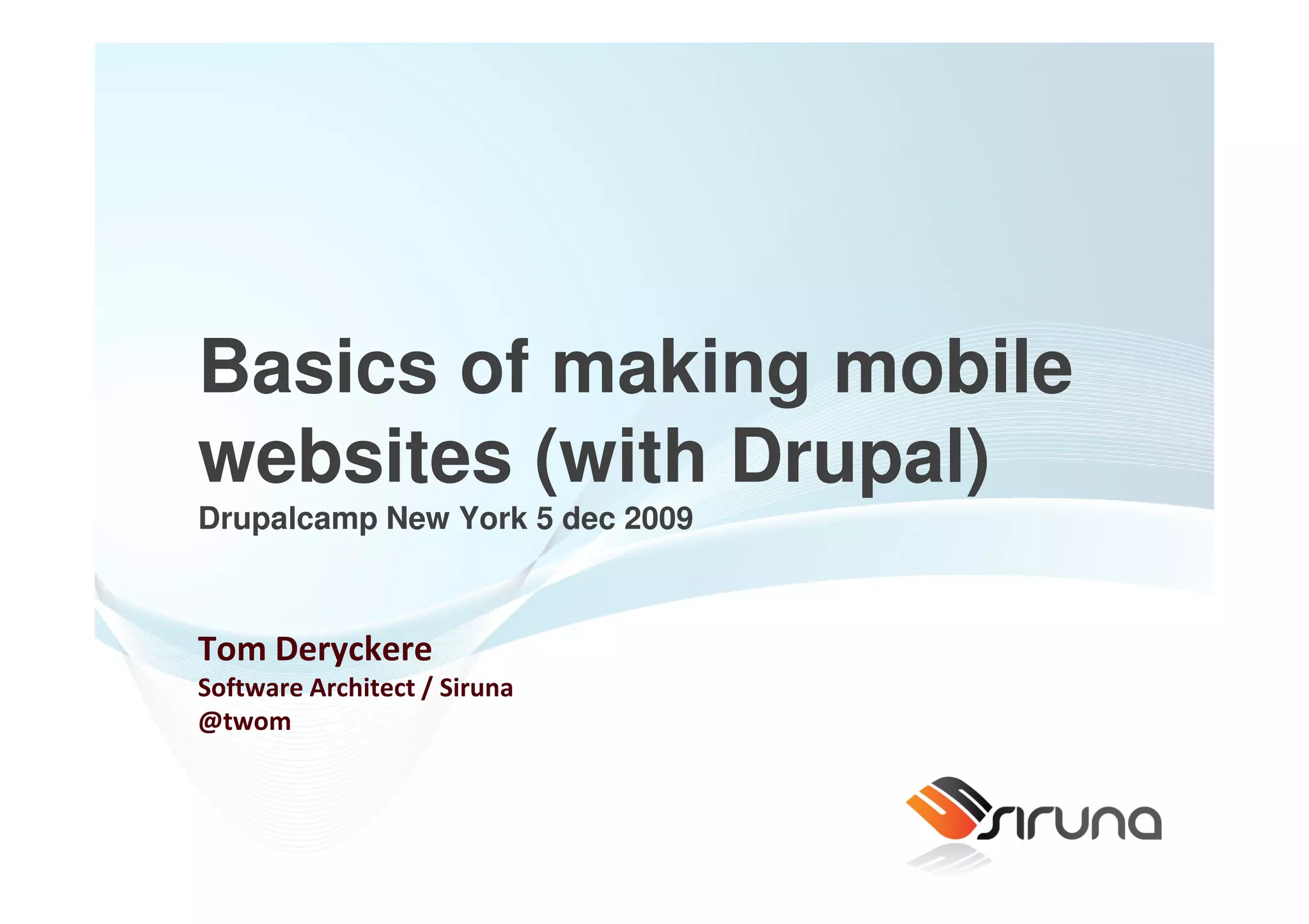
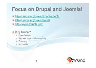
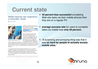
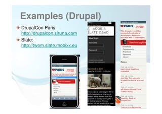
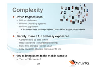
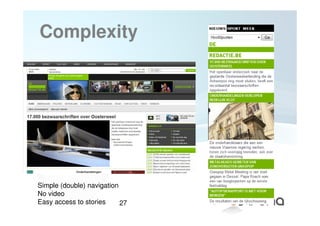
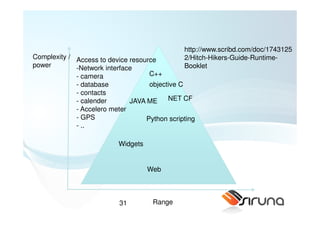
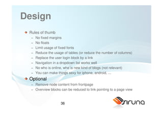
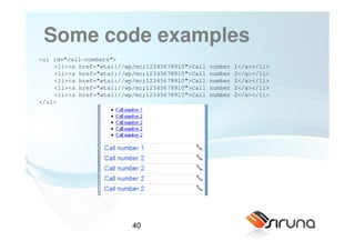
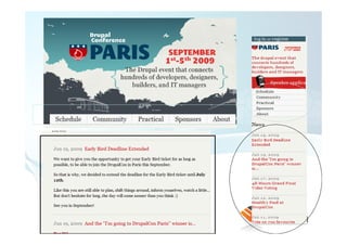
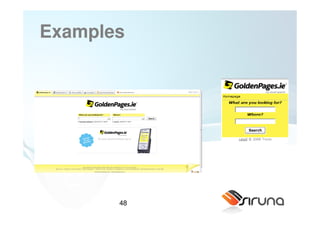
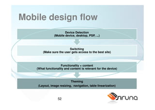
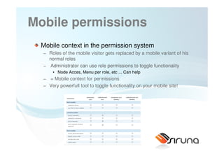
![Adaptations (some examples)
Remove content (example remove content of nodes on
frontpage)
< <map:transform type="sirunaElementTransformer">
<map:parameter name="task0" value="remove(//p:div[@class='views-field-teaser'])" />
</map:transform>
Make drupal forms mobile friendly:
<map:transform type="sirunaElementTransformer">
<map:parameter name="task0" value="remove(//p:form[@id='comment-form']//p:fieldset)" />
<map:parameter name="task1" value="removeAttribute(//p:textarea, cols)" />
<map:parameter name="task2" value="removeAttribute(//p:input, size)" />
<map:parameter name="task3" value="setAttribute(//p:textarea, rows, 3)" />
<map:parameter name="task4" value="setAttribute(//p:textarea, style, width:90%)" />
<map:parameter name="task5" value="setAttribute(//p:form[@id='comment-form']//p:input, style, width:90%)"
/>
</map:transform>
65](https://image.slidesharecdn.com/drupalcampnewyork-091207134056-phpapp02/85/Drupalcamp-New-York-2009-65-320.jpg)
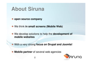
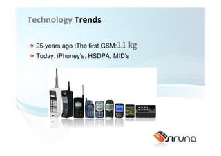
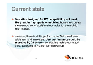
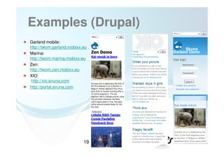
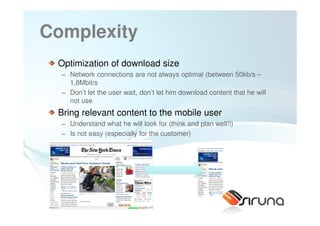
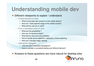
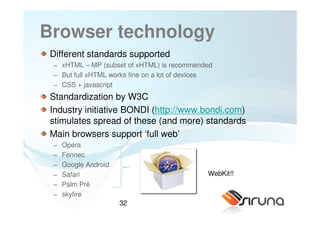
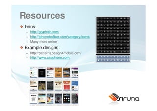
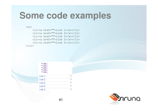
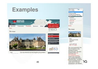
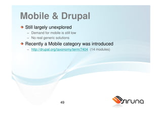
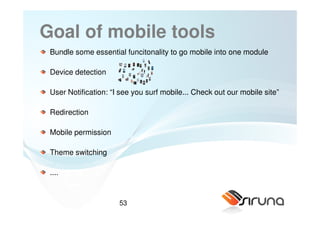
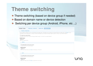
![Adaptations (examples)
Extract several menu structures and collect as dropdown
<map:transform type="sirunaMenuExtractor">
<map:parameter name="task0" value="extract(//p:ul[@class='links primary-links'], false, false, true)" />
<map:parameter name="task1" value="extract(//p:ul[@class='links secondary-links'], false, false, true)" />
</map:transform>
<map:transform type="sirunaMenuInserter">
<map:parameter name="select_current_url" value="true" />
</map:transform>
Change / remove CSS attributes
<map:transform type="sirunaCSSTransformer">
<map:parameter name="task0" value="addCSSItemAttribute(.front #block-block-13, background-position, center)" />
<map:parameter name="task1" value="removeCSSItemAttribute(#block-block-13, height)" />
<map:parameter name="task2" value="removeCSSItemAttribute(#block-block-13, margin-bottom)" />
<map:parameter name="task3" value="removeCSSItemAttribute(#block-block-13, margin-top)" />
<map:parameter name="task4" value="removeCSSItemAttribute(#block-block-13, padding-top)" />
<map:parameter name="task5" value="addCSSItemAttribute(#block-block-13, background-position, center)" />
</map:transform>
66](https://image.slidesharecdn.com/drupalcampnewyork-091207134056-phpapp02/85/Drupalcamp-New-York-2009-66-320.jpg)
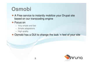
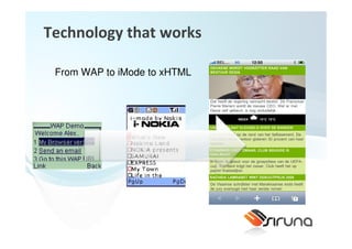
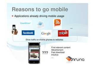
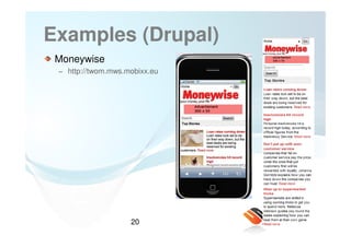
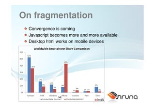
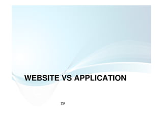
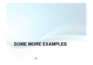
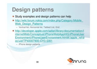
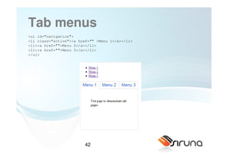
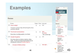
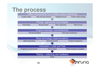
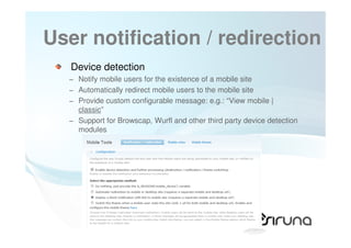
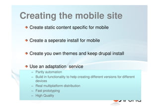
![Adaptations (examples)
Different adaptations for different devices:
<map:select type="sirunaExpressionSelector">
<map:when test="width < 160 || !imageSupported">
<map:transform type="sirunaElementTransformer">
<map:parameter name="task0" value="remove(//p:div[@id='contentsurround']//p:img)" />
</map:transform>
</map:when>
</map:select>
Analtyics inserter
<map:transform type="sirunaGoogleAnalyticsInserter">
<map:parameter name="identifier" value="UA-2883003-5"/>
</map:transform>
67](https://image.slidesharecdn.com/drupalcampnewyork-091207134056-phpapp02/85/Drupalcamp-New-York-2009-67-320.jpg)


The document discusses the importance of mobile websites and provides insights on developing mobile solutions using Drupal and Joomla! It highlights the challenges and complexities involved in mobile web design, including device fragmentation and user experience optimization. The presentation also emphasizes the potential benefits of creating mobile-optimized sites, citing statistics that suggest improved user performance and increased mobile internet usage.


![[En] the Orange website generator](https://cdn.slidesharecdn.com/ss_thumbnails/ezconference-cologne-010313-yag-v2-130228163435-phpapp01-thumbnail.jpg?width=640&height=640&fit=bounds)

![Iab glossary 2009[1]](https://cdn.slidesharecdn.com/ss_thumbnails/iabglossary20091-130212080829-phpapp02-thumbnail.jpg?width=640&height=640&fit=bounds)


