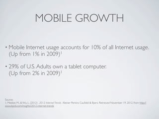
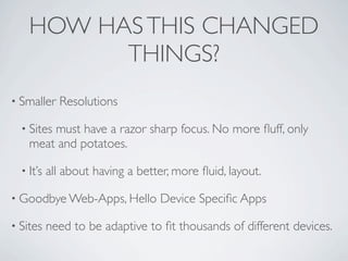
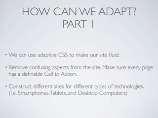
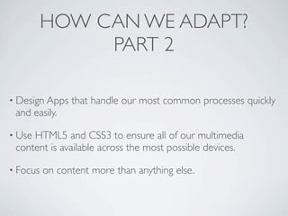
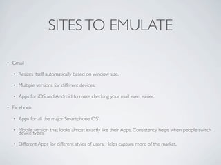
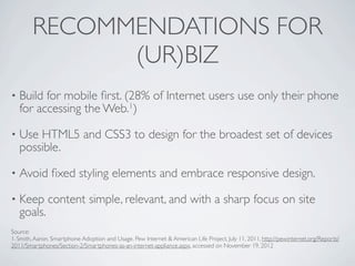
MOBILE/TABLET IMPORTANCE
         Prepared for: (ur)biz
       Prepared by: William Fay
MOBILE GROWTH

• Mobile  Internet usage accounts for 10% of all Internet usage.
   (Up from 1% in 2009)1

• 29%   of U.S. Adults own a tablet computer.
   (Up from 2% in 2009)1


Source:
1. Meeker, M., & Wu, L. (2012) . 2012 Internet Trends . Kleiner Perkins Caufield & Byers. Retrieved November 19, 2012, from http://
www.kpcb.com/insights/2012-internet-trends
HOW HAS THIS CHANGED
          THINGS?
• Smaller    Resolutions

  • Sites
        must have a razor sharp focus. No more fluff, only
    meat and potatoes.

  • It’s   all about having a better, more fluid, layout.

• Goodbye Web-Apps, Hello         Device Specific Apps

• Sites    need to be adaptive to fit thousands of different devices.
HOW CAN WE ADAPT?
             PART 1

• We   can use adaptive CSS to make our site fluid.

• Remove  confusing aspects from the site. Make sure every page
 has a definable Call to Action.

• Construct  different sites for different types of technologies.
 (i.e. Smartphones, Tablets, and Desktop Computers)
HOW CAN WE ADAPT?
               PART 2

• Design Apps   that handle our most common processes quickly
 and easily.

• UseHTML5 and CSS3 to ensure all of our multimedia
 content is available across the most possible devices.

• Focus   on content more than anything else.
SITES TO EMULATE
SITES TO EMULATE

•   Gmail

    •   Resizes itself automatically based on window size.

    •   Multiple versions for different devices.

    •   Apps for iOS and Android to make checking your mail even easier.

•   Facebook

    •   Apps for all the major Smartphone OS’.

    •   Mobile version that looks almost exactly like their Apps. Consistency helps when people switch
        device types.

    •   Different Apps for different styles of users. Helps capture more of the market.
RECOMMENDATIONS FOR
              (UR)BIZ
•   Build for mobile first. (28% of Internet users use only their phone
    for accessing the Web.1)

•   Use HTML5 and CSS3 to design for the broadest set of devices
    possible.

•   Avoid fixed styling elements and embrace responsive design.

•   Keep content simple, relevant, and with a sharp focus on site
    goals.
Source:
1. Smith, Aaron. Smartphone Adoption and Usage. Pew Internet & American Life Project, July 11, 2011, http://pewinternet.org/Reports/
2011/Smartphones/Section-2/Smartphones-as-an-internet-appliance.aspx, accessed on November 19, 2012

Mobile/Tablet Design Implications

  • 1.
    MOBILE/TABLET IMPORTANCE Prepared for: (ur)biz Prepared by: William Fay
  • 2.
    MOBILE GROWTH • Mobile Internet usage accounts for 10% of all Internet usage. (Up from 1% in 2009)1 • 29% of U.S. Adults own a tablet computer. (Up from 2% in 2009)1 Source: 1. Meeker, M., & Wu, L. (2012) . 2012 Internet Trends . Kleiner Perkins Caufield & Byers. Retrieved November 19, 2012, from http:// www.kpcb.com/insights/2012-internet-trends
  • 3.
    HOW HAS THISCHANGED THINGS? • Smaller Resolutions • Sites must have a razor sharp focus. No more fluff, only meat and potatoes. • It’s all about having a better, more fluid, layout. • Goodbye Web-Apps, Hello Device Specific Apps • Sites need to be adaptive to fit thousands of different devices.
  • 4.
    HOW CAN WEADAPT? PART 1 • We can use adaptive CSS to make our site fluid. • Remove confusing aspects from the site. Make sure every page has a definable Call to Action. • Construct different sites for different types of technologies. (i.e. Smartphones, Tablets, and Desktop Computers)
  • 5.
    HOW CAN WEADAPT? PART 2 • Design Apps that handle our most common processes quickly and easily. • UseHTML5 and CSS3 to ensure all of our multimedia content is available across the most possible devices. • Focus on content more than anything else.
  • 6.
  • 7.
    SITES TO EMULATE • Gmail • Resizes itself automatically based on window size. • Multiple versions for different devices. • Apps for iOS and Android to make checking your mail even easier. • Facebook • Apps for all the major Smartphone OS’. • Mobile version that looks almost exactly like their Apps. Consistency helps when people switch device types. • Different Apps for different styles of users. Helps capture more of the market.
  • 8.
    RECOMMENDATIONS FOR (UR)BIZ • Build for mobile first. (28% of Internet users use only their phone for accessing the Web.1) • Use HTML5 and CSS3 to design for the broadest set of devices possible. • Avoid fixed styling elements and embrace responsive design. • Keep content simple, relevant, and with a sharp focus on site goals. Source: 1. Smith, Aaron. Smartphone Adoption and Usage. Pew Internet & American Life Project, July 11, 2011, http://pewinternet.org/Reports/ 2011/Smartphones/Section-2/Smartphones-as-an-internet-appliance.aspx, accessed on November 19, 2012

Editor's Notes