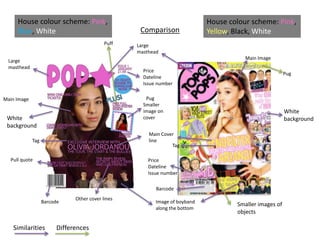
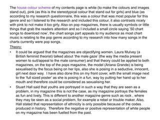
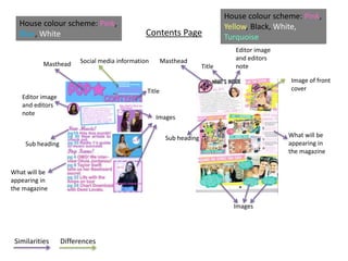
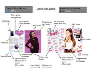
Evaluation question 1
In what ways does your media product use,
develop or challenge forms and conventions
of real media products?
s.f
Comparison
Large
masthead
Price
Dateline
Issue number
Price
Dateline
Issue number
Main Image
Main Image
Smaller
image on
cover
Image of boyband
along the bottom
Main Cover
line
Barcode
Barcode
Pug
Pug
Tag
Tag
Pull quote
Puff
House colour scheme: Pink,
Yellow, Black, White
House colour scheme: Pink,
Blue, White
White
background
White
background
Other cover lines
Similarities Differences
Large
masthead
Smaller images of
objects
Front cover
• On the cover of my magazine, I tried to stick to conventions of other magazines. For example
the top of the pops magazine had one solo female on the main image, this could be to show
the target audience as young females. I think that the main image has to give the audience
direct address in order to grab the reader’s attention and it also gives a more personal feel. I
have also used a smaller image on the cover to promote the puff of the free posters, this is to
attract the audience to the magazine, however this is something that the top of the pops
magazine has not done and I felt that it would be more appealing to buy this magazine rather
than another one of the same genre. The masthead on my magazine is large and covers the
main image slightly, this is as my magazine is new and the first issue, there is no brand
identity and so the magazine has to stand out in order to make the audience become familiar
with the new brand. On the top of the pops magazine the masthead is slightly behind and this
is because it is already an established brand and well known. This part therefore doesn’t really
conform to that convention. I have also included a boyband as in my research I found out that
boybands are mentioned and included frequently in pop magazines as this is what appeals to
the target audience. As standard convention to most magazines, I have included the dateline
and other necessary objects like the barcode and price. When constructing my magazine, I
tried to use as many pull quotes and tags as I could to attract the reader and to influence them
to buy this magazine. I also used a plain background when doing my construction as I wanted
the focus to purely be on the main image and the cover lines, also the plain background helps
to make the masthead stand out. I also found it essential to anchor the main cover line to the
main image as this would help to bring the whole front cover together. For my genre of music,
pop, unlike some other magazines, usually has smaller images of other celebrities to make it
stand out and attract a broader range of the target audience, for example if they didn’t like the
main image star, seeing an image promoting an article of another artist may influence them to
buy it anyway.
The house colour scheme of my contents page is white (to make the colours and images
stand out), pink (as this is the stereotypical colour that stand out for girls) and blue (as
according to my research questionnaire, this was a colour that was most popular for this
genre and so I listened to the research and included this colour, it also contrasts nicely
with pink to not make it too girly. Also on pop magazines, there is usually symbols or little
things that grab the readers attention and so I included a small circle saying ’50 chart
songs to download now’, the chart songs part appeals to my audience as most chart
music is relating to the pop genre according to my research into how many songs in the
charts currently were pop songs.
Theory:
• It could be argued that the magazines are objectifying women. Laura Mulvey (a
British feminist theorist) talked about ‘the male gaze’ (the way the media present
women to suit/appeal to the male consumer) and that theory could be applied to both
magazines, on the top of the pops magazine, the model (Ariana Grande) is being
sexualised by the focus being on her lips, also she is posing in a seductive, innocent,
girl next door way. I have also done this on my front cover, with the small image next
to the ‘full sized poster’ as she is posing in a fun, way by putting her hand up to her
mouth and therefore could be considered as sexualising her.
• Stuart Hall said that youths are portrayed in such a way that they are seen as a
problem, in my magazine this is not the case, as my magazine portrays the females
as fun and lively. This is different to another magazine genre such as rock , where
they may be seen as a social problem, for example a rebel or trouble maker. Also,
Hall stated that representation of ethnicity is only possible because of the codes
produced in history. Therefore the negative or positive representation of white people
on my magazine has been fuelled from the past.
Contents Page
Masthead Masthead
Editor image
and editors
note
Editor image
and editors
note
Images
Social media information
Sub heading
Images
What will be
appearing in
the magazine
What will be
appearing in
the magazine
House colour scheme: Pink,
Blue, White
House colour scheme: Pink,
Yellow, Black, White,
Turquoise
Sub heading
Title
Title
Image of front
cover
Similarities Differences
Contents Page
• For my contents page I have used the house colour scheme as the same as my
cover page, white, pink and blue to promote continuity in the magazine, which is also
done in other pop magazines, for example the top of the pops, however they have
added another colour, I decided not to follow this as it would have made the page
look too busy with colour. I have used the editors message to the reader and also an
image which is a convention in pop magazines, and therefore I have followed this
convention. I have included 3 sub images to the contents page to add more about
what is going to be included and it adds more interest to the magazine. Other
magazines have also done this which makes it a convention that I have followed,
however some others have included an image of the cover page to the contents page
and added arrows explaining each part and what it relates to, I decided not to do this
as it was mainly what another magazine does and I wanted it to be different and
slightly more sophisticated. The title on my contents page says ‘contents’ and this
makes it clear whereas others have changed the words slightly, I decided to keep it
simple as contents to make it the same as all other magazines not just pop music
ones. I have also challenged the convention of using the Rule of 3rds, for my
magazine, as I felt that the rule didn’t fit in what I wanted it to without making it
smaller and look different, also this rule, I feel is for older audiences who may prefer
structure to what they are reading. Although I have kept some structure by keeping all
the images to one side and in a row. Stereotypically young people enjoy structure and
this would give that.
On my contents page I have included a duo girl group,
this is to create diversity to my magazine and not just
have solo females, as Propp said that women usually
tend to take the role of the helper or represented as
part of a team. This is shown in my image as they are
part of a duo and supportive of each other. Also, this
links to Laura Mulvey’s theory that women are
perceived in the media for the male consumer, having
two females in one image proves this. However, to try
to detract from that I have included a boy band on the
cover of my magazine.
Double Page Spread
Cartoon style
shape with title
Cartoon style
shape with title
Main image
Main image
Smaller image
inside text
Article text with
different colour
text to
differentiate
Article text with
different colour
text to
differentiate
Masthead
House colour scheme: Pink,
Blue, White
House colour scheme: Pink,
Black, White
Drop cap
Plain white
background
smaller images
Cartoon style
shapes
Page numbers
Page numbers
Similarities Differences
Image covers
both pages
Text goes over
both pages
Double page spread
• For my double page spread, I have accepted the convention of keeping the same
house colour scheme, this is a convention for most magazines, especially pop music
ones. I did this to create familiarity in the magazine and also to match both the front
cov3er and the contents page. I have decided to keep a white background to make
sure the text is easy to read and stands out, the colours used for the text also helps it
to stand out. I have also used the main image which fills most of the right hand page,
I chose the right page as it is what other magazines have done and I didn’t want to
challenge the codes and conventions. I have also mad the image big to add a
different type of shot, from a close up on the front cover, to a medium shot, this gives
a broader view of the main model. For the actual article, I have used a question and
answer style one, this style is very popular amongst pop magazines as it makes it
easier for the younger target audience to read and it also gives a clearer layout. I
have used a drop cap which is a convention for all magazines, to mark the start of the
article. I have also included page numbers along the bottom, but that is standard for
magazines to easily find the page or refer to a page. For the title, I was going to make
it standard, which meant not including shapes of any sort, but after referring back to
my research I found that most of the titles for pop magazines were large and fun, so I
decided to add a different, more fun type of text and a heart to give a comical feel to
the double page spread. Also on the double page spread, I added accent of little
symbols like flowers as I had seen this with other magazines and it would be
appealing to the target audience, also.

Evaluation question 1

  • 1.
    Evaluation question 1 Inwhat ways does your media product use, develop or challenge forms and conventions of real media products? s.f
  • 2.
    Comparison Large masthead Price Dateline Issue number Price Dateline Issue number MainImage Main Image Smaller image on cover Image of boyband along the bottom Main Cover line Barcode Barcode Pug Pug Tag Tag Pull quote Puff House colour scheme: Pink, Yellow, Black, White House colour scheme: Pink, Blue, White White background White background Other cover lines Similarities Differences Large masthead Smaller images of objects
  • 3.
    Front cover • Onthe cover of my magazine, I tried to stick to conventions of other magazines. For example the top of the pops magazine had one solo female on the main image, this could be to show the target audience as young females. I think that the main image has to give the audience direct address in order to grab the reader’s attention and it also gives a more personal feel. I have also used a smaller image on the cover to promote the puff of the free posters, this is to attract the audience to the magazine, however this is something that the top of the pops magazine has not done and I felt that it would be more appealing to buy this magazine rather than another one of the same genre. The masthead on my magazine is large and covers the main image slightly, this is as my magazine is new and the first issue, there is no brand identity and so the magazine has to stand out in order to make the audience become familiar with the new brand. On the top of the pops magazine the masthead is slightly behind and this is because it is already an established brand and well known. This part therefore doesn’t really conform to that convention. I have also included a boyband as in my research I found out that boybands are mentioned and included frequently in pop magazines as this is what appeals to the target audience. As standard convention to most magazines, I have included the dateline and other necessary objects like the barcode and price. When constructing my magazine, I tried to use as many pull quotes and tags as I could to attract the reader and to influence them to buy this magazine. I also used a plain background when doing my construction as I wanted the focus to purely be on the main image and the cover lines, also the plain background helps to make the masthead stand out. I also found it essential to anchor the main cover line to the main image as this would help to bring the whole front cover together. For my genre of music, pop, unlike some other magazines, usually has smaller images of other celebrities to make it stand out and attract a broader range of the target audience, for example if they didn’t like the main image star, seeing an image promoting an article of another artist may influence them to buy it anyway.
  • 4.
    The house colourscheme of my contents page is white (to make the colours and images stand out), pink (as this is the stereotypical colour that stand out for girls) and blue (as according to my research questionnaire, this was a colour that was most popular for this genre and so I listened to the research and included this colour, it also contrasts nicely with pink to not make it too girly. Also on pop magazines, there is usually symbols or little things that grab the readers attention and so I included a small circle saying ’50 chart songs to download now’, the chart songs part appeals to my audience as most chart music is relating to the pop genre according to my research into how many songs in the charts currently were pop songs. Theory: • It could be argued that the magazines are objectifying women. Laura Mulvey (a British feminist theorist) talked about ‘the male gaze’ (the way the media present women to suit/appeal to the male consumer) and that theory could be applied to both magazines, on the top of the pops magazine, the model (Ariana Grande) is being sexualised by the focus being on her lips, also she is posing in a seductive, innocent, girl next door way. I have also done this on my front cover, with the small image next to the ‘full sized poster’ as she is posing in a fun, way by putting her hand up to her mouth and therefore could be considered as sexualising her. • Stuart Hall said that youths are portrayed in such a way that they are seen as a problem, in my magazine this is not the case, as my magazine portrays the females as fun and lively. This is different to another magazine genre such as rock , where they may be seen as a social problem, for example a rebel or trouble maker. Also, Hall stated that representation of ethnicity is only possible because of the codes produced in history. Therefore the negative or positive representation of white people on my magazine has been fuelled from the past.
  • 5.
    Contents Page Masthead Masthead Editorimage and editors note Editor image and editors note Images Social media information Sub heading Images What will be appearing in the magazine What will be appearing in the magazine House colour scheme: Pink, Blue, White House colour scheme: Pink, Yellow, Black, White, Turquoise Sub heading Title Title Image of front cover Similarities Differences
  • 6.
    Contents Page • Formy contents page I have used the house colour scheme as the same as my cover page, white, pink and blue to promote continuity in the magazine, which is also done in other pop magazines, for example the top of the pops, however they have added another colour, I decided not to follow this as it would have made the page look too busy with colour. I have used the editors message to the reader and also an image which is a convention in pop magazines, and therefore I have followed this convention. I have included 3 sub images to the contents page to add more about what is going to be included and it adds more interest to the magazine. Other magazines have also done this which makes it a convention that I have followed, however some others have included an image of the cover page to the contents page and added arrows explaining each part and what it relates to, I decided not to do this as it was mainly what another magazine does and I wanted it to be different and slightly more sophisticated. The title on my contents page says ‘contents’ and this makes it clear whereas others have changed the words slightly, I decided to keep it simple as contents to make it the same as all other magazines not just pop music ones. I have also challenged the convention of using the Rule of 3rds, for my magazine, as I felt that the rule didn’t fit in what I wanted it to without making it smaller and look different, also this rule, I feel is for older audiences who may prefer structure to what they are reading. Although I have kept some structure by keeping all the images to one side and in a row. Stereotypically young people enjoy structure and this would give that.
  • 7.
    On my contentspage I have included a duo girl group, this is to create diversity to my magazine and not just have solo females, as Propp said that women usually tend to take the role of the helper or represented as part of a team. This is shown in my image as they are part of a duo and supportive of each other. Also, this links to Laura Mulvey’s theory that women are perceived in the media for the male consumer, having two females in one image proves this. However, to try to detract from that I have included a boy band on the cover of my magazine.
  • 8.
    Double Page Spread Cartoonstyle shape with title Cartoon style shape with title Main image Main image Smaller image inside text Article text with different colour text to differentiate Article text with different colour text to differentiate Masthead House colour scheme: Pink, Blue, White House colour scheme: Pink, Black, White Drop cap Plain white background smaller images Cartoon style shapes Page numbers Page numbers Similarities Differences Image covers both pages Text goes over both pages
  • 9.
    Double page spread •For my double page spread, I have accepted the convention of keeping the same house colour scheme, this is a convention for most magazines, especially pop music ones. I did this to create familiarity in the magazine and also to match both the front cov3er and the contents page. I have decided to keep a white background to make sure the text is easy to read and stands out, the colours used for the text also helps it to stand out. I have also used the main image which fills most of the right hand page, I chose the right page as it is what other magazines have done and I didn’t want to challenge the codes and conventions. I have also mad the image big to add a different type of shot, from a close up on the front cover, to a medium shot, this gives a broader view of the main model. For the actual article, I have used a question and answer style one, this style is very popular amongst pop magazines as it makes it easier for the younger target audience to read and it also gives a clearer layout. I have used a drop cap which is a convention for all magazines, to mark the start of the article. I have also included page numbers along the bottom, but that is standard for magazines to easily find the page or refer to a page. For the title, I was going to make it standard, which meant not including shapes of any sort, but after referring back to my research I found that most of the titles for pop magazines were large and fun, so I decided to add a different, more fun type of text and a heart to give a comical feel to the double page spread. Also on the double page spread, I added accent of little symbols like flowers as I had seen this with other magazines and it would be appealing to the target audience, also.