Download to read offline
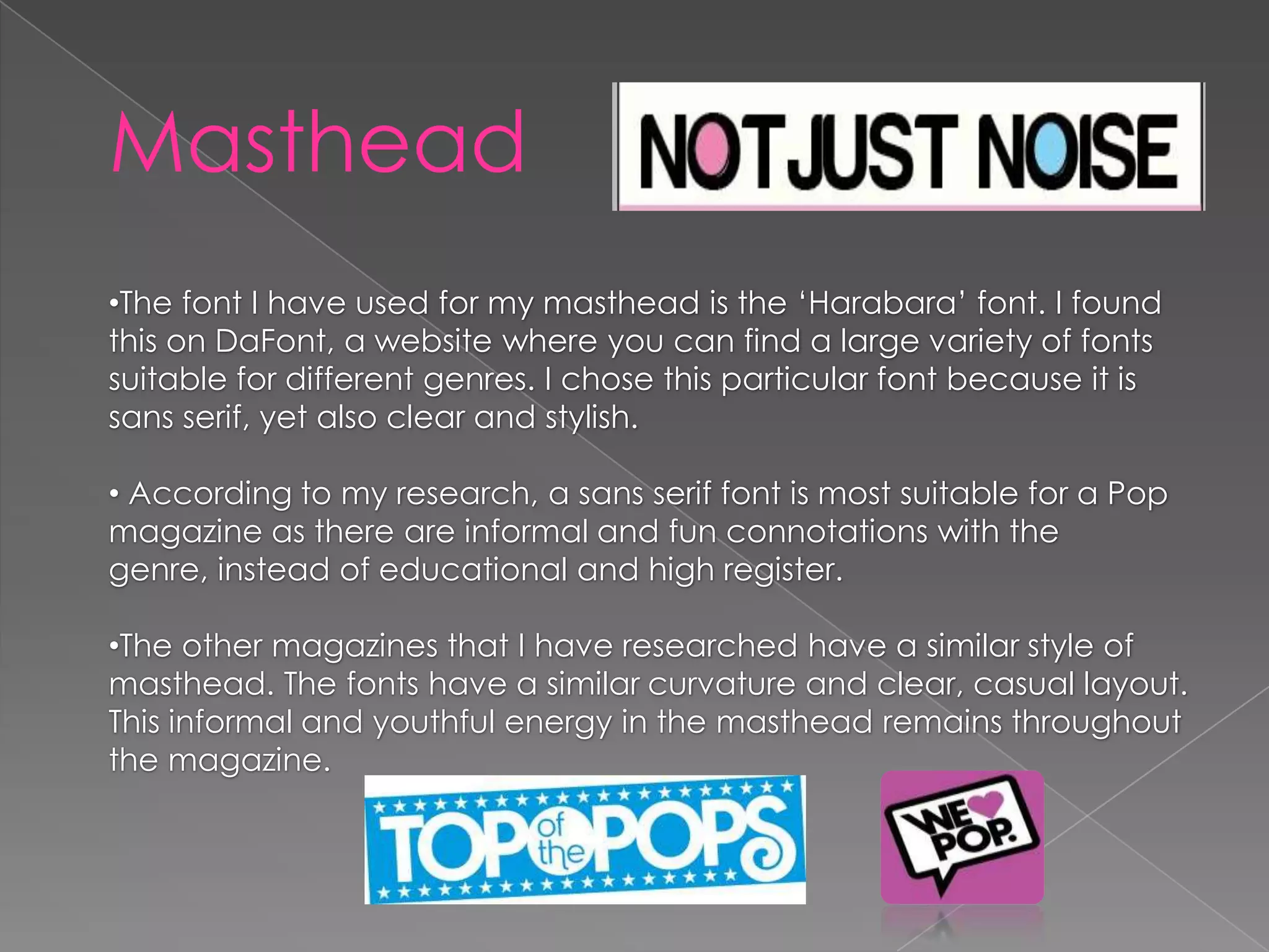
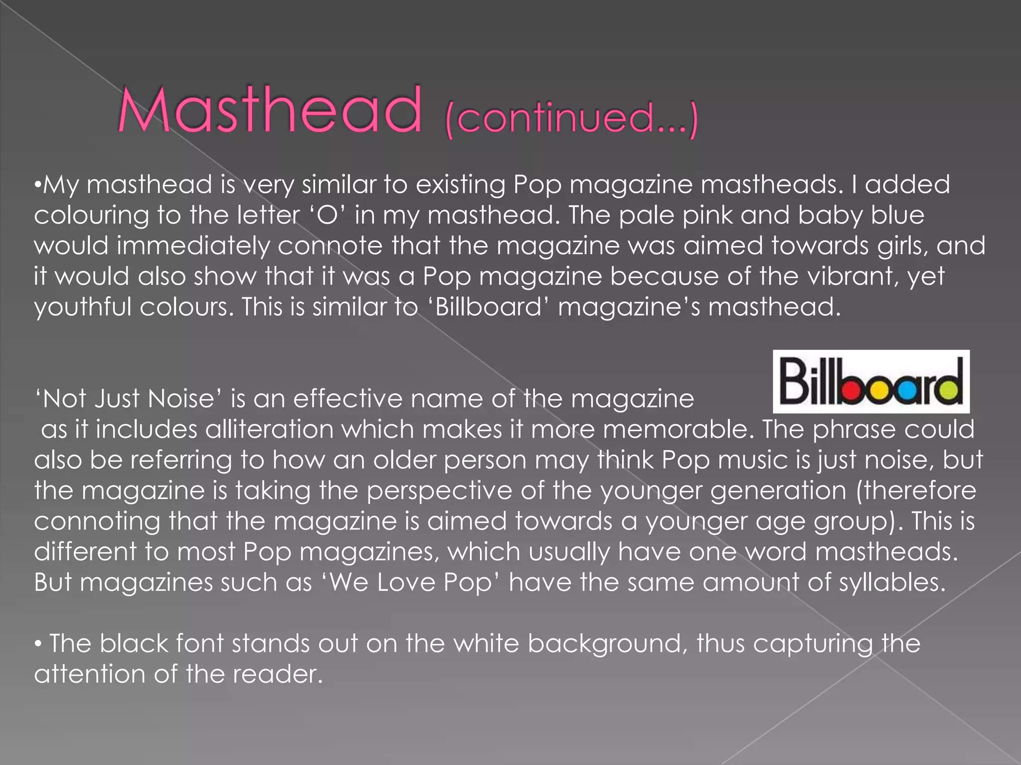
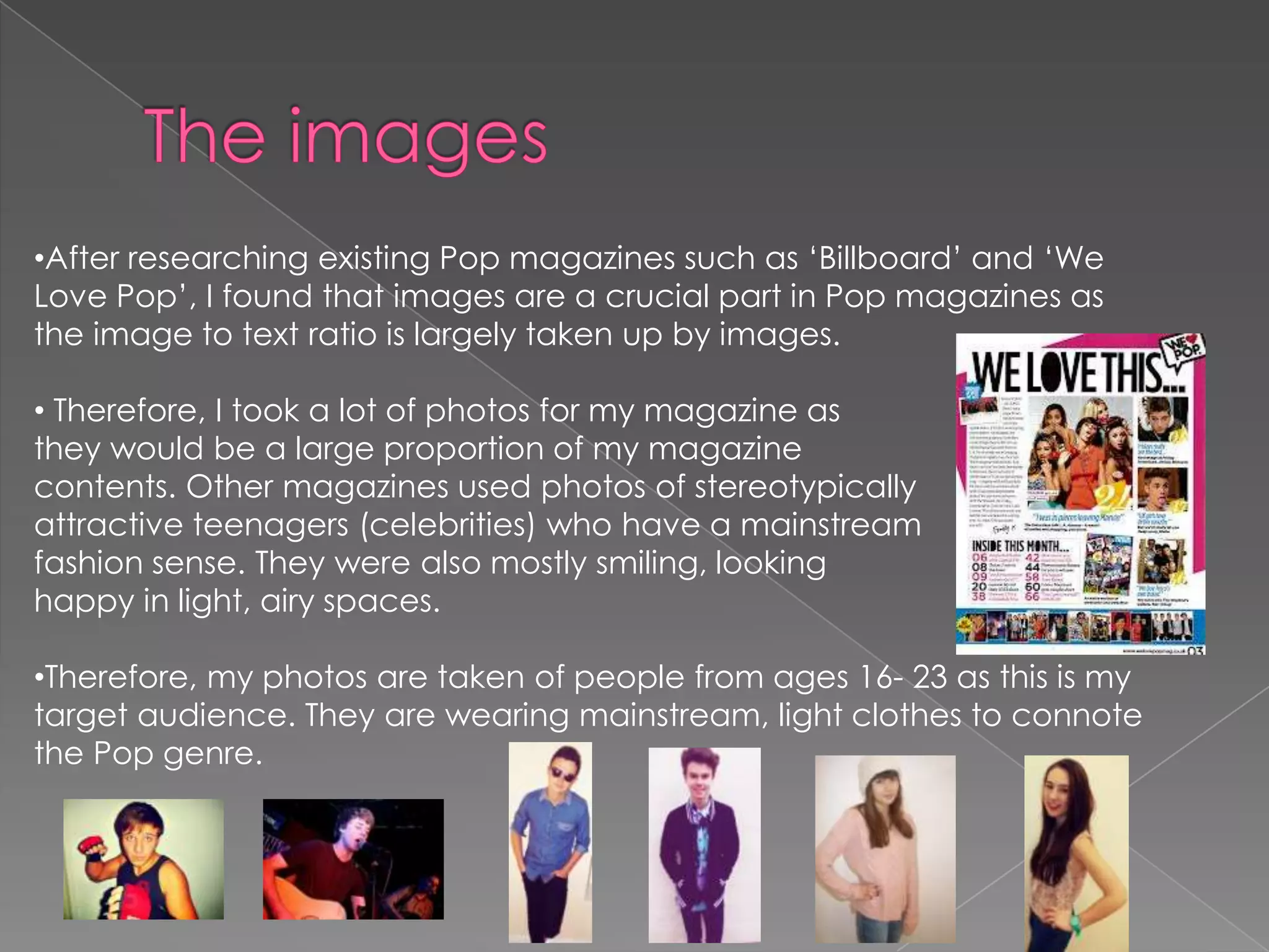
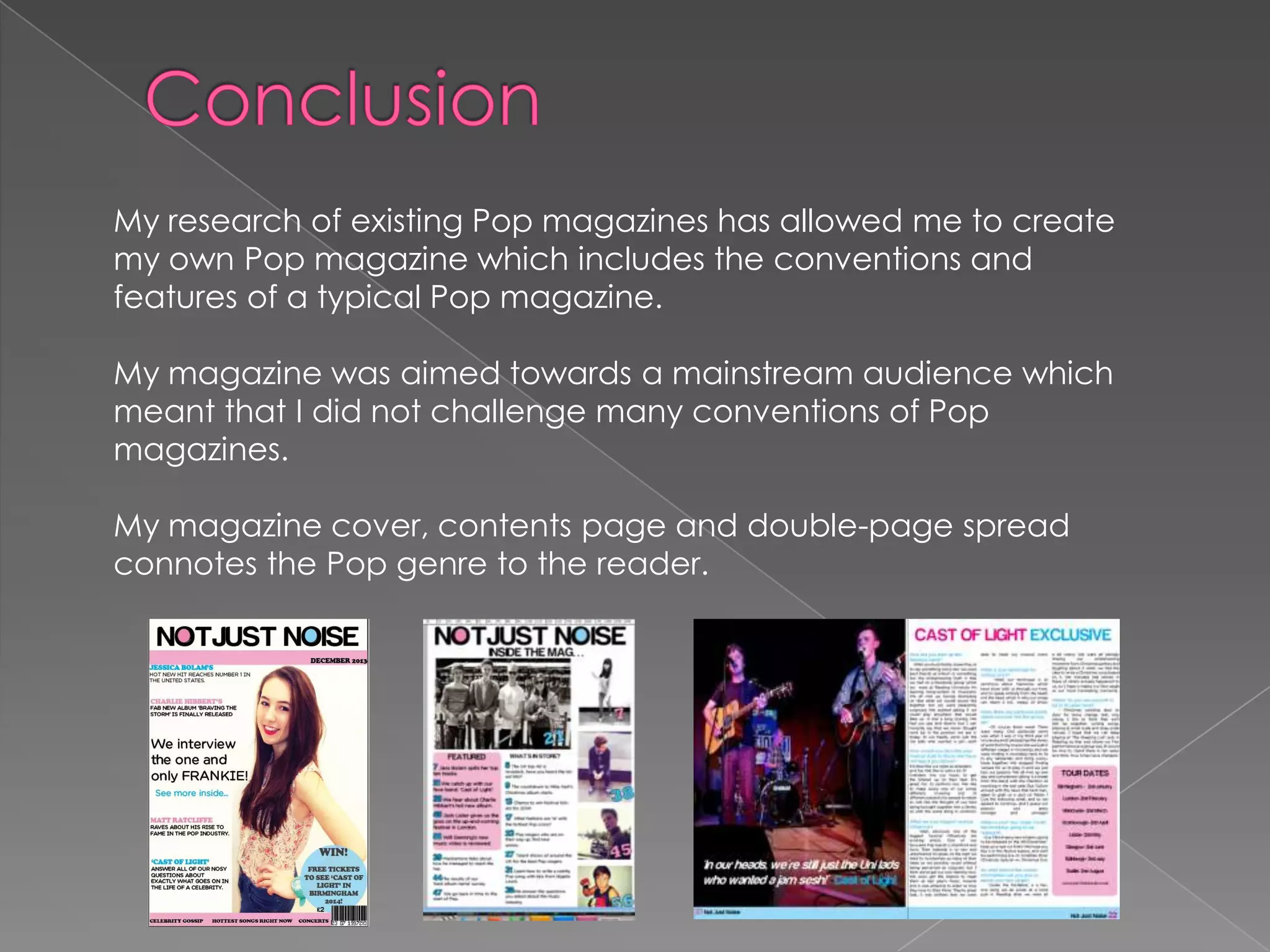

The document discusses the design and layout of a Pop magazine created by the author. It summarizes: - The masthead font and color scheme were chosen to convey an informal, youthful style suitable for a Pop genre magazine. Images make up most of the layout to engage readers. - The $2 price point, placement of the barcode, and styles/poses of models in photos were designed with the target 16-23 year old audience in mind based on research of existing magazines. - Consistent use of pink, blue, and white throughout the magazine along with smiling, fashionable photos aim to portray happiness and self-pride fitting the Pop genre. The magazine replicates conventions of popular magazines to appeal


