The document discusses the layout and design choices for a magazine double page spread interview. Key points:
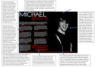
- The title of the interviewee is prominently displayed to clearly identify who is being interviewed.
- A simple logo and color scheme (red and white text on black background) are used to give the magazine a consistent visual identity and make it easy for readers to navigate.
- The interview questions are formatted in columns to guide the reader through the interview in an accessible way, with questions highlighted in red for emphasis.
- An image of the interviewee is included to help visualize and engage readers in the interview.