I have analysed 3 front covers, 3 contents pages and 3 double page spreads. I have said what is good and bad about them, and the things that i like and dislike about them.
This is a presentation analysing existing music magazine front covers, contents pages and double spreads. I have said what is good about them and how they have used certain effects to make it unique.
This is a presentation analysing existing music magazine front covers, contents pages and double spreads. I have said what is good about them and how they have used certain effects to make it unique.
Exploring Factors Affecting the Success of TVET-Industry Partnership: A Case ...AJHSSR Journal
ABSTRACT: The purpose of this study was to explore factors affecting the success of TVET-industry
partnerships. A case study design of the qualitative research method was used to achieve this objective. For the
study, one polytechnic college of Oromia regional state, and two industries were purposively selected. From the
sample polytechnic college and industries, a total of 17 sample respondents were selected. Out of 17
respondents, 10 respondents were selected using the snowball sampling method, and the rest 7 respondents were
selected using the purposive sampling technique. The qualitative data were collected through an in-depth
interview and document analysis. The data were analyzed using thematic approaches. The findings revealed that
TVET-industry partnerships were found weak. Lack of key stakeholder‟s awareness shortage of improved
training equipment and machines in polytechnic colleges, absence of trainee health insurance policy, lack of
incentive mechanisms for private industries, lack of employer industries involvement in designing and
developing occupational standards, and preparation of curriculum were some of the impediments of TVETindustry partnership. Based on the findings it was recommended that the Oromia TVET bureau in collaboration
with other relevant concerned regional authorities and TVET colleges, set new strategies for creating strong
awareness for industries, companies, and other relevant stakeholders on the purpose and advantages of
implementing successful TVET-industry partnership. Finally, the Oromia regional government in collaboration
with the TVET bureau needs to create policy-supported incentive strategies such as giving occasional privileges
of duty-free import, tax reduction, and regional government recognition awards based on the level of partnership
contribution to TVET institutions in promoting TVET-industry partnership.
KEY WORDS: employability skills, industries, and partnership
Get Ahead with YouTube Growth Services....SocioCosmos
Get noticed on YouTube by buying authentic engagement. Sociocosmos helps you grow your channel quickly and effectively.
https://www.sociocosmos.com/product-category/youtube/
Multilingual SEO Services | Multilingual Keyword Research | Filosemadisonsmith478075
Multilingual SEO services are essential for businesses aiming to expand their global presence. They involve optimizing a website for search engines in multiple languages, enhancing visibility, and reaching diverse audiences. Filose offers comprehensive multilingual SEO services designed to help businesses optimize their websites for search engines in various languages, enhancing their global reach and market presence. These services ensure that your content is not only translated but also culturally and contextually adapted to resonate with local audiences.
Visit us at -https://www.filose.com/
Enhance your social media strategy with the best digital marketing agency in Kolkata. This PPT covers 7 essential tips for effective social media marketing, offering practical advice and actionable insights to help you boost engagement, reach your target audience, and grow your online presence.
The Challenges of Good Governance and Project Implementation in Nigeria: A Re...AJHSSR Journal
ABSTRACT : This study reveals that systemic corruption and other factors including poor leadership,
leadership recruitment processes, ethnic and regional politics, tribalism and mediocrity, poor planning, and
variation of project design have been the causative factors that undermine projects implementation in postindependence African states, particularly in Nigeria. The study, thus, argued that successive governments of
African states, using Nigeria as a case study, have been deeply engrossed in this obnoxious practice that has
undermined infrastructure sector development as well as enthroned impoverishment and mass poverty in these
African countries. This study, therefore, is posed to examine the similarities in causative factors, effects and
consequences of corruption and how it affects governance, projects implementation and national growth. To
achieve this, the study adopted historical research design which is qualitative and explorative in nature. The
study among others suggests that the governments of developing countries should shun corruption and other
forms of obnoxious practices in order to operate effective and efficient systems that promote good governance
and ensure there is adequate projects implementation which are the attributes of a responsible government and
good leadership. Policy makers should also prioritize policy objectives and competence to ensure that policies
are fully implemented within stipulated time frame.
KEYWORDS: Developing Countries, Nigeria, Government, Project Implementation, Project Failure
Your Path to YouTube Stardom Starts HereSocioCosmos
Skyrocket your YouTube presence with Sociocosmos' proven methods. Gain real engagement and build a loyal audience. Join us now.
https://www.sociocosmos.com/product-category/youtube/
Grow Your Reddit Community Fast.........SocioCosmos
Sociocosmos helps you gain Reddit followers quickly and easily. Build your community and expand your influence.
https://www.sociocosmos.com/product-category/reddit/
Unlock TikTok Success with Sociocosmos..SocioCosmos
Discover how Sociocosmos can boost your TikTok presence with real followers and engagement. Achieve your social media goals today!
https://www.sociocosmos.com/product-category/tiktok/
Social media refers to online platforms and tools that enable users to create, share, and exchange information, ideas, and content in virtual communities and networks. These platforms have revolutionized the way people communicate, interact, and consume information. Here are some key aspects and descriptions of social media:
“To be integrated is to feel secure, to feel connected.” The views and experi...AJHSSR Journal
ABSTRACT: Although a significant amount of literature exists on Morocco's migration policies and their
successes and failures since their implementation in 2014, there is limited research on the integration of subSaharan African children into schools. This paperis part of a Ph.D. research project that aims to fill this gap. It
reports the main findings of a study conducted with migrant children enrolled in two public schools in Rabat,
Morocco, exploring how integration is defined by the children themselves and identifying the obstacles that they
have encountered thus far. The following paper uses an inductive approach and primarily focuses on the
relationships of children with their teachers and peers as a key aspect of integration for students with a migration
background. The study has led to several crucial findings. It emphasizes the significance of speaking Colloquial
Moroccan Arabic (Darija) and being part of a community for effective integration. Moreover, it reveals that the
use of Modern Standard Arabic as the language of instruction in schools is a source of frustration for students,
indicating the need for language policy reform. The study underlines the importanceof considering the
children‟s agency when being integrated into mainstream public schools.
.
KEYWORDS: migration, education, integration, sub-Saharan African children, public school
Non-Financial Information and Firm Risk Non-Financial Information and Firm RiskAJHSSR Journal
ABSTRACT: This research aims to examine how ESG disclosure and risk disclosure affect the total risk of
companies. Using cross section data from 355 companies listed in Indonesia Stock Exchange, data regarding
ESG disclosure and risk was collected. In this research, ESG and risk disclosures are measured based on content
analysis using GRI 4 guidelines for ESG disclosures and COSO ERM for risk disclosures. Using multiple
regression, it is concluded that only risk disclosure can reduce the company's total risk, while ESG disclosure
cannot affect the company's total risk. This shows that only risk disclosure is relevant in determining a
company's total risk.
KEYWORDS: ESG disclosure, risk disclosure, firm risk
How social media marketing helps businesses in 2024.pdfpramodkumar2310
Social media marketing refers to the process of utilizing social media platforms to promote products, services, or brands. It involves creating and sharing valuable content, engaging with followers, analyzing data, and running targeted advertising campaigns.
www.nidmindia.com
How social media marketing helps businesses in 2024.pdf
Final contents page analysis
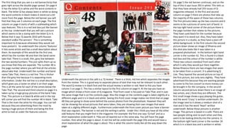
1. The first thing that you see is a red banner/strip that
goes right across the double page spread. On page 4
it has the letter Q in white and the word contents in
black. The letter Q has always been in white so doing
the word contents in black makes it stand out a bit
more from the page. Below the red banner you will
find that they use 3 columns on each page. The first
column on page 4 starts of with a subheading which
says features. This is in a red text box just like banner
at the top. Underneath that you will see a picture
which seems to be a stamp with the letter Q in it.
Below that it says ‘Q awards 2010 with Russian
standard vodka-The winners’. This is something
important to Q because otherwise they would not
have posted it. So underneath the column ‘features’
it lists some artists and has a small description about
them. An example of this would be the first one,
which has the number 48 and then the band name
take that. There is a small, thin, grey line between
the two words/numbers. This just splits them up so
you know that they are separate. The number 48 is
the page number where you will find all the articles
about take that. Underneath the number and band
name Take That, there is a red line. This is thicker
than the grey line because it is separating more
information. Under the red line is a small description,
which gives you a taster on what is on their page.
This is all the same for each of the artists below the
Take That. The second and third column on page 4 is
taken up by a huge group pictures of the band Take
That. This picture is in black & white and in the top
left corner you will find the number 48 in black. Take
That is the main the artist for this page. You can tell
because they are advertising them the most by
having a huge picture of them and being the first
artist to look at under the features column.
On page 5 the red banner continues, and on the
top of this it says Issue 293 in white. This tells us
that they have already had 293 issues of Q
magazines released. In the first and second
column on page 5 there are photos that take up
the majority of the space of these two columns.
The first pictures takes up the two columns and it
seems to be a pictures of some sort of band. In
the top right hand corner of the picture there is
the page number that relates to the pictures.
They have used black for the number because
they want it to stand out. Also, they have taken
this picture in a studio, as they have a plain off
white background. In the first column the second
picture down shows an image of Rhianna and
this shot also looks like it was taken in a
prepared photoshoot. In the bottom right hand
corner is the number 42. This is found in a black
text box and the colour of the number is white.
These two colours standout from each other
which is why they would put them together.
Below Rhianna there are two images that seem
to be taken from a concert. It is advertising Q
Live. They layered the second picture on top of
the first picture, but only very slightly. They have
advertised this because they are wanting people
to come to the live concert so more money can
be brought in for the company. In the second
column second picture down there is an image of
two artists, and I think they are different. The
first small image shows a guy playing the guitar,
and the word ‘Crazy’ is written underneath. On
the image next to it shows a medium shot of a
man and it has the word ‘Heart’ written
underneath. Below these pictures is another
image. This picture is based in a café. There are
two people sitting next to each other and they
seem to be looking directly into the camera. In
the bottom right hand corner is the number 34
which is in a black box and is written in white.
Underneath the picture in the café is a ‘Q review’. There is a thick, red line which separates the images
from the review. This is a good way to separate pieces of text that may not be relevant to each other.
The word Q review is in black font and the actual review is written in red. Next to this you have
column 3 on page 5. This has a similar layout to the first column on page 4. At the top you have an
image which shows a front cover of Q magazine. That front cover is focused on Take That, and it uses
the same image that is on the contents page. Also the image on the contents page is taken slightly at a
different angle and it is in black and white. Seeing this front cover image makes me think that on page
48 they are going to show some behind the scenes photos from the photoshoot. However they will
not be showing the actual pictures that were taken, they are showing their own images that were
taken at a slightly different angle. Furthermore underneath the front cover picture you have a banner
that says regulars. The banner is red and the writing is white. Under this I think you have all the other
odd features that you might find in the magazine. For example: the first one says ‘Q mail’ and as a
short explanation underneath it. They are all layered out in the same way. You will have the page
number, then what the page is about. A red line will be underneath the page title and would have a
short explanation of what the page is about. This is what the column looks like all the way down the
page.
2. This is also a Q magazine so it is set out in a similar way
to the other magazine contents page. At the top of the
page is a banner which has the letter Q on the right
hand side, which is in white, and the word contents is
written next to it which is in the colour black. This
banner goes right across page 4 and 5. In the first
column you have the features. There is red banner
which has ‘Features’ in white written on it. Below this
you have an image which seems to be a picture of the
band Queen. The image seems to have been taken
from a concert but its taken from the side of the stage.
After the image you have the word Queen written in
black with a small explanation of what is in the picture
etc.. This writing is in red. Using these two colours
means that they are more noticeable because they
stand out from each other. Underneath you have a
range of artists names/features and a small description
which relates to the artist/feature written underneath.
So for example: the third one down says the number
62 with the name Adele written next to it. There is a
thin grey line between the number and the name
which separates them and adds effect to the page.
Below the name and number is a short description,
which probably talks about what is going to be on that
page about Adele. The description is separated by a
thicker red line. As I said before this just separates the
information and adds effect to the page. This is carried
on all the way down the page for the following artist
(in order from top to bottom), ‘Ready Eye, Linkin Park,
Adele, Handwritten Lyrics, and Noah and The Whale’.
Next to the features there is a image which takes up
two whole columns. This image is a close up photo of a
singers face. The camera is angled high up above his
head and has probably been zoomed in a bit. You can
tell that he has a very serious expression when taking
this photo. In the bottom left hand side of the photo
there is the number 46 in white. This is the page
number. You can tell that this image is the main focus
of the contents page because is it the biggest image on
the two pages.
On page 5 you also have three columns. At the
top of the page you have the red banner which
reaches across both pages. On this it says ‘Issue
296. The first image takes us two columns and is a
picture of a band. This seems to be set in a lounge
or sitting room. The image has a slight vintage
vibe to it. There are four people in band and they
are all spread on in the photo. Below this image in
the first column there are two more images, and
one is below the other. They seem to show a page
in a magazine, whether that’s Q magazine or a
different magazine. It is hard to tell what is on in
the image but on the left hand side of the image
there is a whole article. On the picture below
there is a man sitting don but you can’t see his
whole body. On the right hand side on the image
there is another article. The first image has the
number 74 written in the bottom left hand
corner, and the image below has the number 40
written in the bottom right hand corner. Beside
these two images is a photo of Adele, and this
photo is in the second column. In this picture
Adele is sitting down, but the photo is cropped so
you can’t see her legs. She is laughing in this
photo and the actual photograph has been taken
in a studio. You can tell because they have used a
plain white background. On the right hand side,
half way up is the number 62. Having these
numbers on each artist helps the reader because
it means that they can go straight to the page
they want, which talks about the artist they want
to read about. This is the page number for Adele.
Below the image of Adele you have the Q review.
This is accompanied by an image, unlike the other
one. The image is in the first column and the
review is in the second column. There is a small
red line which separates the images above from
the review. On the red line you have the phrase
‘The Q Review’ written in white. The image for
the review is a picture of Paul McCartney.
The last column on page 5 shows the regulars. Just above them is an image of the a Q front cover,
and the artist used for the front cover is the singer in the big image of page 4. The front cover is just
a typical front cover page for Q magazine. They have used that front cover image, because they are
trying to advertise their magazine more so that if anyone who likes that artist can go get that
certain magazine. Below the picture you have the regulars. This is layered out in exactly the same
way as the features, but for this they just talk about different things. At the very bottom of the page
they have the page numbers and the year the issue came out. The page numbers are in a black box
with white writing.
The colour scheme for this page is quite simple, but effective. The colours used are red, black and
white. They are a good mixture of colours because they all stand out from each other, but at the
same time they work well as a colour scheme.
3. This is a contents page for billboard magazine. On the
left hand side of the page you will see a charts lists. This
features a range of artists who's songs and or albums
have got in the chart. At the top of the charts lists is has
number one written in white and is against a black
background. In much smaller font the words ‘on the
charts’ is written next to ‘No.1’. They have written
number one in much bigger front because they want to
try grab peoples attention. For example: Those who are
interested in the charts will see the word number one
and will instantly look at that section of the page. Using
black and white is a good idea because these two
shades stand out from each other the most than any
other colour. Below the title, is has two lists for the
charts. The first column says either the artist, band
name or song title, but for the other column, I am
unable to read it as the picture is too pixelated to read
it. The words albums, artist, songs and the phrase ‘this
week on’… are all in yellow and are in a grey box. Using
the colour yellow makes the writing stand out more,
which makes it more obvious for the reader.
Furthermore, at the very top of the page nearer the
right hand side, is the word contents. This is in the same
font as the word number one and also it is in black font.
There is a thick blue line which separates the word
contents from the writing and images that are below it.
You could say that this makes the word ‘contents’ stand
out more because you could say that it is on its own.
What I mean by this is that there is nothing surrounding
the words contents that could distract the reader from
looking at it, therefore its stands out more. There is also
another blue line, (this one is thinner), which separates
the charts from the other information and images on
the right hand side of the page.
Below the word contents there are three column and at the top
of theses columns there were three images, which all seem to
be photos of artists. I don’t know any of the artist featured so I
can’t give their names. The first image is a photo of a man
singing with a microphone. It seems a if the image was taken
from a concert or something similar. It is a medium shot and
the artist is looking towards the left of the page. On the picture
you have the number 12 written in white. This gives you the
page number. Inducing the page number on the picture is a
very good idea because if someone sees the photo of the artist
they like, they might want tot go straight tot the page with
them on, so this gives the reader a quicker and easier way to
find the page they like. The next image is a photo of a man
holding a guitar. This photo is more zoomed in than the other
one. I would say that due to the guitar and vintage feel the
photo gives me, the style of music this man does could be
either, folk or country music. Just like the one next to it, this
image has the page number written on it in white. Looking at
the third image, I can tell straight away that this is to do with
rock music. I can tell because of the outfit the artist is wearing.
Just like the other two, this picture also has the page number at
the bottom. Below these three images is a whole section of
text, and to the right of the text is a photo of an artist. This is
medium shot which is in black and white. Using this colour
scheme shows a sense of professionalism. You can tell by the
background that this photo was taken within a studio. Also, the
background for the image also counts as the background for
page. Starting at the top of the text, the first heading is
‘Upfront’. This is in capital letters, which makes it stand out
more. The subheading then says Time to dance followed by a
bunch of text below. The next heading is features. Like the
other heading, this one has several subheadings with some
information underneath. Beside each subheading it has a
number. This much be the page number. The last two headings
of this section are, ‘music’ and ‘in every issue’. Unlike the other
two these ones only have subheadings a no information
underneath each one. At the very bottom of the magazine, it is
advertising their online website and events that will be
happening. It also tells you about touring and futuresound,
which is an event that billboard hosts.
The overall colour scheme for this contents page is quite simple. The use of
cool tones gives the magazine a cool and higher end feel. The black was mainly
used for headings, subheadings, text and the masthead, and the blue was
mainly used for the dividers that split up each section of the page.