The document provides details on the layout, design elements, and symbolism within a magazine article and photo spread about musician Ed Sheeran. Key points discussed include:
- The photo of Ed Sheeran is meant to portray him as casual and relatable to emphasize his down-to-earth persona. Landmarks in the background and his clothing also help associate him as British.
- Various design choices like the drop capital letter, column layout, and pull quotes are intended to guide the reader's eye and break up the text in an engaging way.
- Symbols like the guitar, orange hair and belt, and simple photo style reflect and reinforce themes about Sheeran's music and performances being straightforward.
In what ways does your media product useCharris369
This is an evaluation question for my a2 ocr media coursework film trailer, poster and magazine cover. In what ways does your media product use develop or challenge media conventions referring to real texts
this is my analysis of the advertising campaign for the film insidious; including the trailer, poster and magazine cover for my ocr a2 media studies coursework.
In what ways does your media product use, develop or challenge forms and con...Charris369
In what ways does your media product use, develop or challenge forms and conventions of real media products is question 4 on the ocr evaluation questions for my as media coursework
In what ways does your media product use, develop or challenge forms and conv...Charris369
In what ways does your media product use, develop or challenge forms and conventions of real media products, evaluation question for a2 media coursework
Unit 8 - Information and Communication Technology (Paper I).pdfThiyagu K
This slides describes the basic concepts of ICT, basics of Email, Emerging Technology and Digital Initiatives in Education. This presentations aligns with the UGC Paper I syllabus.
Embracing GenAI - A Strategic ImperativePeter Windle
Artificial Intelligence (AI) technologies such as Generative AI, Image Generators and Large Language Models have had a dramatic impact on teaching, learning and assessment over the past 18 months. The most immediate threat AI posed was to Academic Integrity with Higher Education Institutes (HEIs) focusing their efforts on combating the use of GenAI in assessment. Guidelines were developed for staff and students, policies put in place too. Innovative educators have forged paths in the use of Generative AI for teaching, learning and assessments leading to pockets of transformation springing up across HEIs, often with little or no top-down guidance, support or direction.
This Gasta posits a strategic approach to integrating AI into HEIs to prepare staff, students and the curriculum for an evolving world and workplace. We will highlight the advantages of working with these technologies beyond the realm of teaching, learning and assessment by considering prompt engineering skills, industry impact, curriculum changes, and the need for staff upskilling. In contrast, not engaging strategically with Generative AI poses risks, including falling behind peers, missed opportunities and failing to ensure our graduates remain employable. The rapid evolution of AI technologies necessitates a proactive and strategic approach if we are to remain relevant.
Biological screening of herbal drugs: Introduction and Need for
Phyto-Pharmacological Screening, New Strategies for evaluating
Natural Products, In vitro evaluation techniques for Antioxidants, Antimicrobial and Anticancer drugs. In vivo evaluation techniques
for Anti-inflammatory, Antiulcer, Anticancer, Wound healing, Antidiabetic, Hepatoprotective, Cardio protective, Diuretics and
Antifertility, Toxicity studies as per OECD guidelines
Welcome to TechSoup New Member Orientation and Q&A (May 2024).pdfTechSoup
In this webinar you will learn how your organization can access TechSoup's wide variety of product discount and donation programs. From hardware to software, we'll give you a tour of the tools available to help your nonprofit with productivity, collaboration, financial management, donor tracking, security, and more.
Read| The latest issue of The Challenger is here! We are thrilled to announce that our school paper has qualified for the NATIONAL SCHOOLS PRESS CONFERENCE (NSPC) 2024. Thank you for your unwavering support and trust. Dive into the stories that made us stand out!
Safalta Digital marketing institute in Noida, provide complete applications that encompass a huge range of virtual advertising and marketing additives, which includes search engine optimization, virtual communication advertising, pay-per-click on marketing, content material advertising, internet analytics, and greater. These university courses are designed for students who possess a comprehensive understanding of virtual marketing strategies and attributes.Safalta Digital Marketing Institute in Noida is a first choice for young individuals or students who are looking to start their careers in the field of digital advertising. The institute gives specialized courses designed and certification.
for beginners, providing thorough training in areas such as SEO, digital communication marketing, and PPC training in Noida. After finishing the program, students receive the certifications recognised by top different universitie, setting a strong foundation for a successful career in digital marketing.
Model Attribute Check Company Auto PropertyCeline George
In Odoo, the multi-company feature allows you to manage multiple companies within a single Odoo database instance. Each company can have its own configurations while still sharing common resources such as products, customers, and suppliers.
Synthetic Fiber Construction in lab .pptxPavel ( NSTU)
Synthetic fiber production is a fascinating and complex field that blends chemistry, engineering, and environmental science. By understanding these aspects, students can gain a comprehensive view of synthetic fiber production, its impact on society and the environment, and the potential for future innovations. Synthetic fibers play a crucial role in modern society, impacting various aspects of daily life, industry, and the environment. ynthetic fibers are integral to modern life, offering a range of benefits from cost-effectiveness and versatility to innovative applications and performance characteristics. While they pose environmental challenges, ongoing research and development aim to create more sustainable and eco-friendly alternatives. Understanding the importance of synthetic fibers helps in appreciating their role in the economy, industry, and daily life, while also emphasizing the need for sustainable practices and innovation.
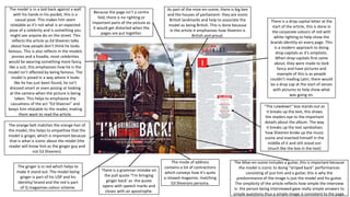
1. The ginger is in red which helps to
make it stand out. The model being
ginger is part of his USP and his
identity/ brand and the red is part
of Q magazines colour scheme.
The model is in a laid back against a wall
with his hands in his pocket, this is a
casual pose. This makes him seem
relatable as it’s not what is an expected
pose of a celebrity and is something you
might see anyone do on the street. This
reflects the article as Ed Sheeren talks
about how people don’t think he looks
famous. This is also reflects in the models
jennies and a hoodie, most celebrities
would be wearing something more fancy,
like a suit, this emphasises how he is the
model isn’t affected by being famous. The
model is posed in a way where it looks
like he has just been found, he isn’t
dressed smart or even posing ot looking
at the camera when the picture is being
taken. This helps to emphasise the
casualness of the act “Ed Sheeran” and
keeps him relatable to the reader, making
them want to read the article.
Because the page isn’t a centre
fold, there is no righting or
important parts of the picture as
it would get distorted when the
pages are put together.
As part of the mise-en-scene, there is big ben
and the houses of parliament- they are iconic
British landmarks and help to associate the
model as being British. This is done because
in the article it emphasises how Sheeren is
British and proud.
“The Lowdown” box stands out as
it breaks up the text, this draws
the readers eye to the important
details about the album. The way
it breaks up the text symbolises
how Sheeren broke up the music
scene and inserted himself in the
middle of it and still stood out
(much like the box in the text)
The Mise-en-scene includes a guitar, this is important because
the model is iconic to doing “striped back” performances
consisting of just him and a guitar, this is why the
predominance of the image is just the model and his guitar.
The simplicity of the article reflects how simple the interview
is- the person being interviewed gave really simple answers to
simple questions thus a simple image is consistent to the page.
There is a drop capital letter at the
start of the article, this is done in
the corporate colours of red with
white righting to help show the
brands identity on every page. This
is a modern approach to doing
drop capitals as it’s simplistic.
When drop capitals first came
about, they were made to look
fancy and have pictures and
example of this is as people
couldn’t reading Latin, there would
be a drop cap at the start of verses
with pictures to help show what
was going on.
There is a grammar mistake on
the pull quote “I’m bringing
ginger back’ as the quote
opens with speech marks and
closes with an apostrophe.
The mode of address
contains a lot of contractions
which conveys how it’s quite
a relaxed magazine, matching
Ed Sheerans persona.
The orange belt matches the orange hair of
the model, this helps to empathise that the
model is ginger, which is important because
that is what is iconic about the model (the
reader will know him as the ginger guy and
not Ed Sheeren).
2. Korrang uses a drop capital to start the article to help draw the readers
eye to the start. The Drop capital uses it’s bright colour to stand out as
there is no box or pattern around the letter. As well as having a drop
capital, the first 2 words (the band name) is in a bigger font size and in a
red colour, this helps to show the influence of the band.
The article is split into 3 columns.
It’s important to split the article into
the columns as to keep the number
of characters to a line down. By
dong this, a normal character count
is around 75 letters to a average
page but the writer has made it so
they can use a smaller font (to fit
more in) and have less than 50
characters to a line which is a good
number, as not to deter a reader
who doesn’t like to read to much.
The title “TEEN SPIRIT” is an allusion to the
Nirvana song “smells like teen spirit” which
is celebrating the wreck less of the youth.
Teen spirit is part of a lexicon field and was
created by Kurt Cobain who was referencing
the perfume of his then girlfriend. She then
spray painted the words “Kurt smells like
teen spirit” in spray paint on the wall which
is why the title looks like it’s in spray paint.
However, this white “paint” is broken and
more of an off white conveying that to
become successful, the band couldn’t follow
the team spirit way of life and had to work
hard.
The models are doing posed in a full body
action shot (probably taken with a high
exposure) which symbolises how fast pace
their life is. The pose that there in shows the
aggression teenagers are stereotyped to
have and the rabbit symbolises how crazy
their life is by becoming famous in such a
short space of time. The shoot was done in a
studio, which means the grey background
was obviously a choice to show how the
band are no longer pure (connotations of
the colour white). The models are wearing
casual clothes which help to keep them
relatable top the reader. The camera is
looking up to them which conveys to the
reader that they are powerful.
The pull quote cross the centre fold,
the “screaming” is both
representative of the youthful ness
of the band but also of rock music
and it’s fans. The red righting
matches the colour scheme and
helps to continue the magazine’s
identity across the magazine. The math symbols exaggerate youth of the band
as connotations or maths include kids. It also
uses a short direct of address which is more
attractive to the young target audience who
don’t like heavy reading when it’s not necessary.
The mode of address includes saying
“blinding performance” this is quite
informal which is appealing to the
target audience of 56% 15-24 who
won’t be able to relate to formal
language